Neutral Sans Workhorse

Boreg + Hermano
Lets Boreg own the focal silhouette while handling secondary copy, sizing and subheads cleanly.
Inspect Hermano specimenDisclosure: MakerFileHub may earn a commission from qualifying purchases via paid links on this page. How our links work.
Stout heavy block urban display with rounded corners and tilted counters
Boreg is a stout urban display face in which the letters are short and wide, the strokes are fat and the counters tilt, so a short word reads as a painted hoarding rather than as a sign.
Paid link
Get this fontProject & layout blueprintsAt-a-glance maker compatibility
Sturdy stroke walls and open counters weed cleanly on adhesive vinyl, HTV apparel film, and cut cardstock.
Visual anatomy & craft review
The B closes two heavy lobes of uneven size, the O holds an oval counter set slightly off centre, the R keeps a fat bowl and a short leg and the E carries three thick arms, all at a maximal weight with rounded corners and a low contrast. The tilt in the counters is deliberate: nothing sits perfectly level, which is what keeps the face from reading as a mechanical grotesque at 80 pt and gives it the look of lettering painted quickly on a wall. The fit is tight, so a five-letter word fills a wide format on its own. Counters are small, so the face needs 30 pt minimum and belongs on posters rather than on labels. The dark crowd photograph, the white ink, the small caption are presentation; the display face is the word.
Stout · Urban · Heavy
Two-font hierarchy recipes
Tested contrast partners — pairing Boreg with grounded secondary typography.
Boreg + Hermano
Lets Boreg own the focal silhouette while handling secondary copy, sizing and subheads cleanly.
Inspect Hermano specimen
Boreg + Resquel
Grounds bold display lettering with classic typographic authority on posters, badges and apparel.
Inspect Resquel specimenPractical applications
Concrete hierarchy, scale and production guidance tailored to Boreg’s stroke geometry.
The stout blocks read at 120 pt from across a street, and the tilted counters give a short event name the look of a painted hoarding.
Hierarchy & layout recipe
Print an A2 poster: set the event name at 120 pt across the middle, set the venue and date in a 16 pt caps sans beneath, and keep 25 mm of margin so the rounded corners are not trimmed by the bleed.
Pre-production check
A heavy face at 120 pt printed on a matte stock fills its own counters; check the press proof and open the smallest bowl before the run.
The stout weight reads at 14 pt on a woven label and at 200 mm on a wall, so one mark covers garment and retail without a second cut.
Hierarchy & layout recipe
Weave a 45 by 20 mm label: set the brand at 14 pt, keep the size in a 5 pt sans beneath, and keep 3 mm of margin so the rounded corners survive the woven edge and the fold.
Pre-production check
A woven label rounds off every corner; check a woven sample and keep the counter tilt above 1 mm so it still reads as intentional.
The urban blocks give a release cover weight at 70 pt, and the uneven counters keep a short title from looking like a corporate logo on the shelf.
Hierarchy & layout recipe
Print a 120 mm square sleeve: set the title at 70 pt across the centre, set the artist in a 9 pt caps sans at the foot, and keep 12 mm of margin so the block stays inside the square crop.
Pre-production check
A square sleeve trimmed after printing can clip a rounded corner; check the trim against the artwork and pull the title in by 3 mm.
Technical & licence verification
Confirm included OTF/TTF/WOFF formats, full glyph tables and licence coverage on the live store page before batch production.
Closest visual alternatives
Matched across letterform anatomy, stroke behaviour and craft applications.

Heavy graffiti bubble caps with rough edges and paint splatter
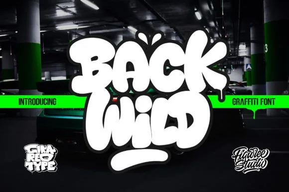
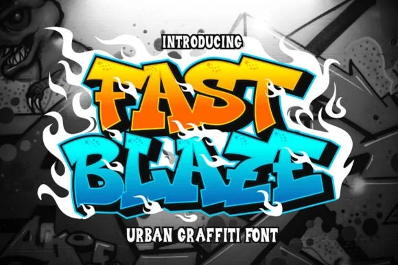
Street Blaze is a heavy graffiti capital alphabet in which the letters swell into bubbles, the contours chip and the stems carry a rough inner edge, so a two-word title reads as something sprayed on a wall.
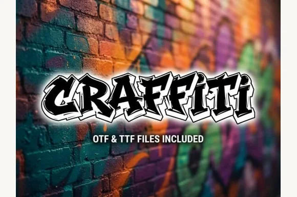
Explosive wildstyle arrow-bar urban graffiti display (OTF & TTF)
Graffiti (by clipartguru) is an energetic wildstyle street-art font armed with interlocking arrow extensions, sharp bevels, and OTF/TTF files.
Ideas for this font
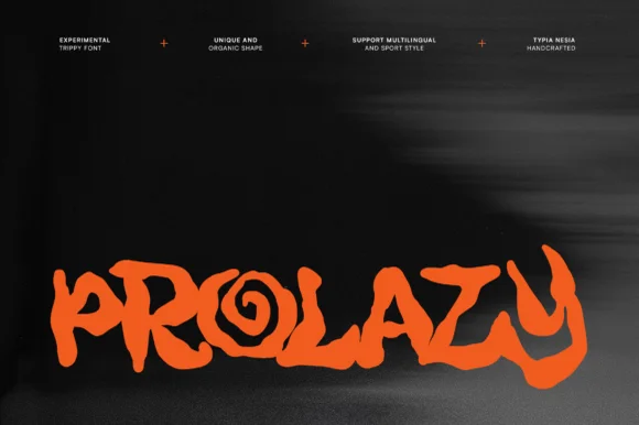
Experimental organic hand-drawn display
Prolazy is an experimental hand-drawn display in orange on black: letterforms reduced to irregular blobs with a spiral inside the o, uneven webbing between strokes, and a baseline that wanders, so the word reads as a painted tag rather than as typography.
Ideas for this font
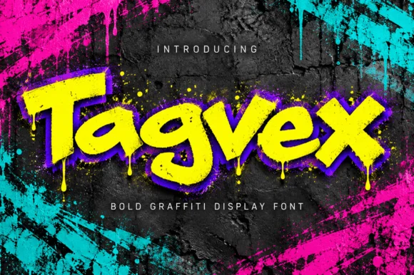
Dripping chisel-tip marker street-graffiti font
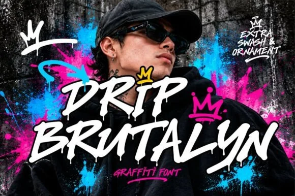
Tagvex is a chunky mixed-case graffiti display font combining wide chisel-marker strokes with hanging wet-paint drips.
Ideas for this font
Same independent foundry
Allow optional Google Analytics to measure visits and catalogue actions. Your search words and notes are not included. Privacy & storage