High-Contrast Display Serif

Hello Sunshine Mama + Stanza
Pairs sculptural editorial warmth with Hello Sunshine Mama's clean modern geometry.
Inspect Stanza specimenDisclosure: MakerFileHub may earn a commission from qualifying purchases via paid links on this page. How our links work.
Chunky rounded caps in mixed colours with a fine monoline script above and below
Hello Sunshine Mama pairs chunky rounded caps that can each take a different colour with a fine monoline script that runs above and below the caps in long flat strokes.
Paid link
Get this fontProject & layout blueprintsAt-a-glance maker compatibility
Weld or Unite overlapping script joins into one continuous vector path before sending to the blade.
Visual anatomy & craft review
The cap half is heavy and soft: the S swells through two fat curves, the U holds a deep bowl, the N keeps one thick diagonal and the E carries three even arms, all rounded and even in weight. Because each letter is a separate shape of equal weight, the sample fills them in different colours, which is how the pair is meant to be used on children's pieces. The script half is a light monoline with flat entry and exit strokes that extend well past the caps on both sides, and that sweep is what holds the composition together. Contrast comes from weight, not from style, so the two layers never fight. The white ground, the pink script, the pastel fills and the two caption lines are presentation; the duo is the lettering.
Chunky · Colourful · Paired
Two-font hierarchy recipes
Tested contrast partners — pairing Hello Sunshine Mama with grounded secondary typography.
Hello Sunshine Mama + Stanza
Pairs sculptural editorial warmth with Hello Sunshine Mama's clean modern geometry.
Inspect Stanza specimen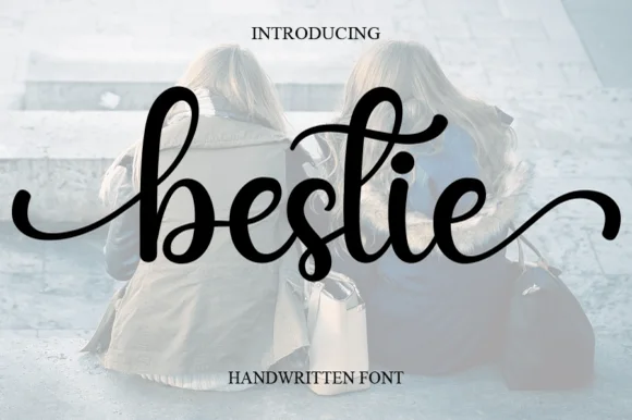
Hello Sunshine Mama + Bestie
Introduces organic movement on pull-quotes, signatures and gift tags.
Inspect Bestie specimenPractical applications
Concrete hierarchy, scale and production guidance tailored to Hello Sunshine Mama’s stroke geometry.
The chunky caps read across a room at 70 mm, and the flat script sweep keeps a long banner from looking like separate pieces of type.
Hierarchy & layout recipe
Print a 1.5 m paper banner: set the name in the caps at 70 mm, run the script greeting at 35 mm along the line above, and leave 25 mm at each end so the flat sweep finishes inside the paper edge.
Pre-production check
A light monoline printed on thin banner paper ripples when hung; check the hung banner and mount it on a board if the script begins to wave.
The script carries the sentiment at 20 pt while the chunky caps hold the name, which is the split a birth announcement needs.
Hierarchy & layout recipe
Print a 148 by 148 mm square card: set the greeting in the script at 20 pt across the upper half, set the baby's name in the caps at 28 pt beneath, and keep 15 mm of margin so the flat script stroke does not touch the trim.
Pre-production check
Two weights this different can look disconnected; check the card at final size and keep the two lines no more than 8 mm apart.
The caps survive a coarse screen print at 55 mm while the fine script needs a finer mesh, so the pair documents two print requirements on one bag.
Hierarchy & layout recipe
Screen a 350 by 400 mm canvas tote: print the caps at 55 mm through a 110-thread mesh, print the script at 30 mm through a 180-thread mesh, and stay 40 mm below the handle seam so the bag does not distort in the press.
Pre-production check
A fine monoline breaks on a coarse weave; check a pull on the actual canvas and change mesh rather than thickening the script line.
Technical & licence verification
Confirm included OTF/TTF/WOFF formats, full glyph tables and licence coverage on the live store page before batch production.
Closest visual alternatives
Matched across letterform anatomy, stroke behaviour and craft applications.
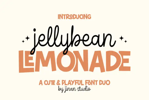
Looped monoline script stacked over a squared playful sans in flat capitals
Jellybean Lemonade pairs a looped monoline script with a squared playful sans, so one lockup carries a light handwritten first line and a flat block second line in the same colour.
Ideas for this font
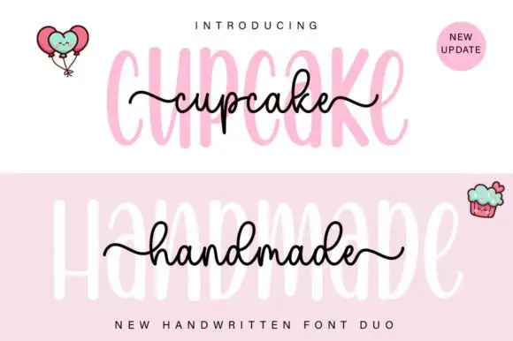
Tall rounded sans with fine extended script
Cupcake Handmade Duo places tall narrow rounded letters in pale pink behind a smaller connected script line in black, twice on one cover, where the script carries long outer tails and looped k and h forms while a balloon pair, a cupcake drawing and an update badge sit in the corners.
Ideas for this font
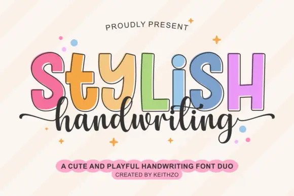
Colourful outlined capitals above a thin script
Stylish Handwriting is a duo on cream: fat outlined capitals with a black contour, each in a different pastel, and a thin joined script that runs beneath them with long tails.
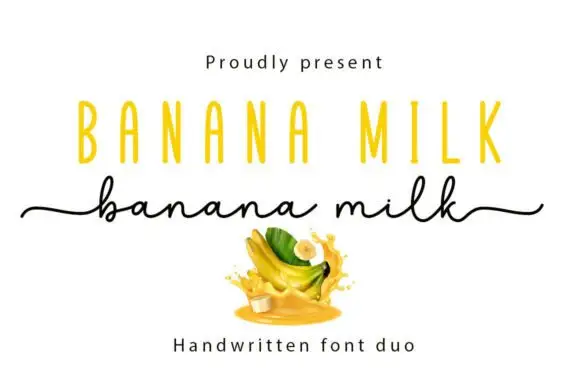
Casual marker handwriting with a bouncing baseline
Banana Milk is casual handwriting drawn with a rounded marker weight, its baseline bouncing up and down between letters, the ascenders short and the joins broken, so a word looks written quickly on a note rather than set on a line.
Ideas for this font
Same independent foundry
Allow optional Google Analytics to measure visits and catalogue actions. Your search words and notes are not included. Privacy & storage