Editorial Serif Anchor

Milkbutter + Cronelo
Anchors Milkbutter's fluid strokes with crisp Roman proportions on wedding suites, headers and packaging.
Inspect Cronelo specimenDisclosure: MakerFileHub may earn a commission from qualifying purchases via paid links on this page. How our links work.
Bouncy fat handwriting with a tall waist
Milkbutter is a bouncy handwritten face in black on white: fat rounded letters with a tall waist, stems that lean and lift, and a baseline that rises and falls across the word, shown over soft lilac wavy bands.
Paid link
Get this fontProject & layout blueprintsAt-a-glance maker compatibility
Weld or Unite overlapping script joins into one continuous vector path before sending to the blade.
Visual anatomy & craft review
The word is set on one line across a pale, softly banded ground, and the face is a bouncy handwriting: the stroke is thick with a brush-like swell on the downstrokes, the waist sits high so the lowercase reads as fat arches, the l and the k rise into tall blunt stems, the k kicks its leg out to the right, and the i and the t sit at different heights as the line bounces. Letters touch where the bounce brings them together and separate where it lifts, which is what gives the word its rhythm rather than a connected flow. The ends are rounded and slightly blunt, closer to a felt-tip than a brush, and the contrast is low, so the word stays solid at a distance. A tracked capital line names the product at the foot and the ground is a pale wash of soft waves. Milkbutter is a handwritten face for packaging, cards, labels and social graphics, and it suits short words at a generous size and a quiet ground.
Bouncy, fat, casual
Two-font hierarchy recipes
Tested contrast partners — pairing Milkbutter with grounded secondary typography.
Milkbutter + Cronelo
Anchors Milkbutter's fluid strokes with crisp Roman proportions on wedding suites, headers and packaging.
Inspect Cronelo specimen
Milkbutter + Mansory
Keeps small-scale dates, URLs, nutrition facts and care instructions crisp and legible below script titles.
Inspect Mansory specimenPractical applications
Concrete hierarchy, scale and production guidance tailored to Milkbutter’s stroke geometry.
A bouncy hand makes a small producer look approachable, and the fat stroke stays visible on a narrow label where a thin script would fade.
Hierarchy & layout recipe
Print a 55 by 80 mm label: set the brand at 18 pt on one line, keep 6 mm of clear ground beneath before the weight at 5 pt, and hold 4 mm of margin on all four sides.
Pre-production check
A bouncy baseline on a narrow label can look crooked; centre the block optically and print one label before the batch.
A fat rounded hand reads at the size of a small sticker, and the bounce gives a plain favour a personal look without an illustration.
Hierarchy & layout recipe
Print a 50 mm round sticker: set the word at 17 pt on one line, keep 6 mm of clear ground inside the die, and hold the artwork 5 mm clear of the circle edge.
Pre-production check
A bouncy word can drift toward the die line; check the spacing on one cut sticker before running the sheet.
A casual fat hand signals an informal story about a small kitchen, and the even weight holds up against food photography at page size.
Hierarchy & layout recipe
Print a 210 by 280 mm feature page: set the heading at 40 pt over one line, keep 16 mm of clear ground beneath before the standfirst at 11 pt, and hold 20 mm of margin on all four sides.
Pre-production check
A thick hand above small serif text can overpower the page; compare the two weights in proof before signing it off.
Technical & licence verification
Confirm included OTF/TTF/WOFF formats, full glyph tables and licence coverage on the live store page before batch production.
Closest visual alternatives
Matched across letterform anatomy, stroke behaviour and craft applications.
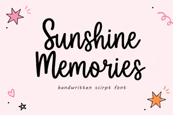
Rounded connected handwritten script
Sunshine Memories is a rounded connected script in black on pale pink: fat even strokes, a moderate bounce and small drawn hearts, dots and stars scattered around the two words.
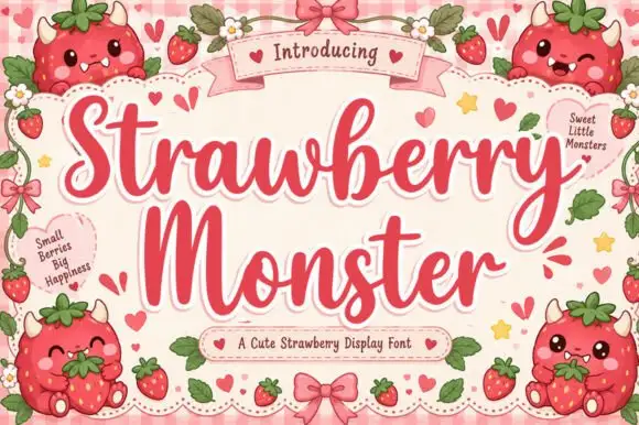
Sweet display script with heart flourishes
Strawberry Monster is a display script in strawberry red on pink gingham: fat rounded strokes, tight loops, hearts worked into the flourishes and small berry characters drawn around the frame.
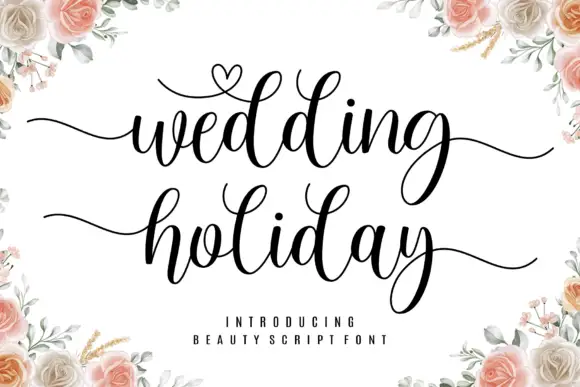
Brush script with a heart flourish
Wedding Holiday is a brush script in black on white: thick connected letters with high contrast at the joins, tall loops on the ascenders and a small heart drawn into the flourish above the first word, framed by peach roses.
Ideas for this font

Bouncing tail script with long entry and exit swashes
Farmhouse is a bouncing tail script in which the letters sit at different heights, the strokes swell on the downstroke and long swashes enter and leave the word, so a name reads as hand lettering on a painted board.
Ideas for this font
Same independent foundry
Allow optional Google Analytics to measure visits and catalogue actions. Your search words and notes are not included. Privacy & storage