 #1 · Best Overall
Boreg
Stout heavy block urban display with rounded corners and tilted counters
Get fontPaid link
Read review ↓Disclosure: MakerFileHub may earn a commission from qualifying purchases via paid links on this page. How our links work.
Dry brush, marker blocks & urban poster weight
Streetwear lettering has to look like it was painted fast and printed well, which is a harder combination than either alone. Boreg and Street Blaze deliver the stout marker block, Street Crack and Blazefang keep the dry-brush raggedness, and Moreli and Celapha Bakhars add bubble and flat-chisel variants that hold up on a garment. Urban Clash and Teacher Handmade cover the plainer print side of a collection.
Quick verdict
Boreg is the strongest drop-day block for hoodies, Blazefang carries the dry-brush energy, and Moreli works when the design needs a two-layer bubble. Urban Clash is the safest simple option for a first apparel range.
Quick answer
Short on time? Start with our three highest-rated brush & streetwear standouts before scrolling the full breakdown.
#1 · Best OverallStout heavy block urban display with rounded corners and tilted counters
 #2 · Runner-Up Pick
Heavy graffiti bubble caps with rough edges and paint splatter
 #3 · Editor's Choice
We kept 27 of 418 candidates after removing wedding, sweet and romantic scripts that share the brush construction but not the register. Scored on edge quality at 12 inch print scale, weight consistency across capitals, and whether the texture survives DTF at 300 dpi.
Side-by-side summary
Compare specimens, OpenType/PUA traits and primary project roles side by side.
| Rank & Font | Style & File Specs | Best Project Fit | Store Listing |
|---|---|---|---|
| DisplayStout | Heavyweight streetwear tee logo or album cover | Get fontPaid link | |
| DisplayFile formats | Streetwear chest print, gaming thumbnail or sneaker sticker | Get fontPaid link | |
| DisplayLigatures · Alternates & swashes | Streetwear drop tee, skate sticker & podcast cover | Get fontPaid link | |
| DecorativePUA encoded · Language support · File formats | Punk gig flyer, skate zine masthead & album cover | Get fontPaid link | |
| DisplayFile formats | Skatewear hoodie, streetwear drop poster & gaming banner | Get fontPaid link |
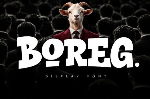
#1 · Best OverallBoreg is a stout urban display face in which the letters are short and wide, the strokes are fat and the counters tilt, so a short word reads as a painted hoarding rather than as a sign.
The B closes two heavy lobes of uneven size, the O holds an oval counter set slightly off centre, the R keeps a fat bowl and a short leg and the E carries three thick arms, all at a maximal weight with rounded corners and a low contrast. The tilt in the counters is deliberate: nothing sits perfectly level, which is what keeps the face from reading as a mechanical grotesque at 80 pt and gives it the look of lettering painted quickly on a wall. The fit is tight, so a five-letter word fills a wide format on its own. Counters are small, so the face needs 30 pt minimum and belongs on posters rather than on labels. The dark crowd photograph, the white ink, the small caption are presentation; the display face is the word.
Heavyweight streetwear tee logo or album cover — Set a single uppercase word with a period or underlined vowel alternate.
Zero fragile details — cuts and weeds effortlessly on thick puff or flock HTV.
#2 · Runner-Up PickStreet Blaze is a heavy graffiti capital alphabet in which the letters swell into bubbles, the contours chip and the stems carry a rough inner edge, so a two-word title reads as something sprayed on a wall.
The S curls a fat spine, the t crosses a thick bar, the r turns a rounded arm, the e fills a heavy eye, the b closes a wide bowl and the l stands on a fat stem, all at a graffiti weight with rounded outer contours and a ragged inner edge. The combination of soft outline and rough fill is the character: it reads as spray paint rather than as vinyl, which is why the sample sets two words over a torn paper ground with splatter around them. Because the shapes are solid, the face holds from 30 pt and prints in one dark colour. The torn paper, the orange splatter, the crown and the marker line are presentation; the black bubble words are the face.
Streetwear chest print, gaming thumbnail or sneaker sticker — Add a white sticker outline over gritty concrete or halftone textures.
Solid thick shapes cut cleanly on HTV and sticker vinyl (surrounding spray splashes on cover are backdrop art).
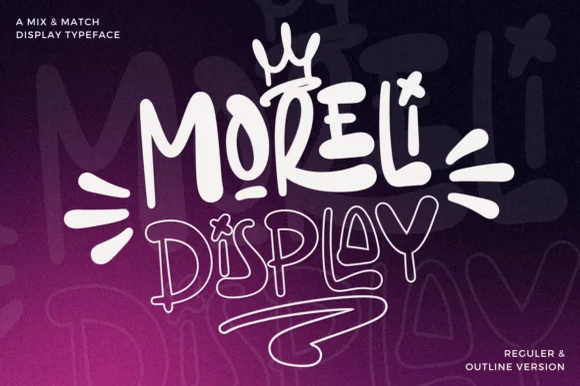
#3 · Editor's ChoiceMoreli is a playful mix-and-match street-bubble display typeface shipped in both solid Regular and matching hollow Outline versions.
Moreli is a street-art bubble and outline graffiti display duo: the fill cut is a fat rounded bubble with a wide flare and a slight lean, while the outline cut traces the same shapes as a hollow keyline for a second colour behind or in front. The pair is designed to be layered, so the outline only makes sense when it is registered against the fill. The keyline is the finest element and it closes first when the face is reduced. The fill needs roughly 36 mm and the outline 44 mm for their detail to read.
Streetwear drop tee, skate sticker & podcast cover — Stack the solid Regular style on line one at 110% scale above the Outline style on line two, tilting the whole lockup 5 degrees.
Use the solid Regular cut for vinyl decals; reserve the fine double-wall Outline version for screen printing, DTF, or large posters.
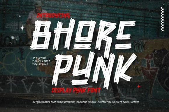 #4 · Top Maker Utility
Bhore Punk is a fierce, slanted punk-rock display typeface sliced through with diagonal razor-cut stencil splits and jagged dry-brush spurs.
Bhore Punk is a slashed stencil-cut punk and streetwear display: squared letters cut through by three or four parallel slashes, with hard corners, a slightly uneven baseline and small torn bridges left holding the pieces together. The slashes are the design and they merge into solid notches as soon as the face is reduced. It needs roughly 30 mm for the slash and the bridge to read, and it is best as a one-colour vinyl cut or a flat two-colour print on uncoated stock.
Punk gig flyer, skate zine masthead & album cover — Stack 2 short all-caps words tight in stark white and red over high-contrast monochrome photography.
For DIY spray-paint stencils or large HTV back prints, scale letters to 2 inches+ so all separated slash fragments stay easy to align.
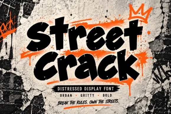 #5 · Standout Silhouette
Street Crack is a muscular, forward-driving urban display font with chunky graffiti-marker strokes and rugged concrete-textured edges.
Street Crack is a gritty urban brush-tag and distressed street display: a ragged loaded stroke with spatter along the edges, broken joins where the brush skipped and a hard outline that reads as a sprayed tag on a rough wall. The spatter and the skips are the design and they silt into a solid mass when the face is reversed or printed small. It needs roughly 30 mm for the skip and the spatter to read, and it is best in one spray colour on a wall, or a flat two-colour print on uncoated stock.
Skatewear hoodie, streetwear drop poster & gaming banner — Stack 2 short punchy words at a 6-degree upward slant over bright neon-orange or acid-yellow brush accents.
Because outer contours carry micro-distressed grit, prefer DTF, screen printing, sublimation, or 2 in+ sign vinyl over tiny weeding.
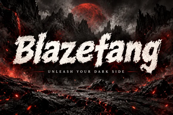 #6
Blazefang is a forward-leaning, heavy dry-brush display typeface torn with raw bristle streaks and jagged diagonal momentum.
Blazefang is a slanted dry-brush display drawn for action and dark-fantasy covers: a steep forward lean, ragged bristle edges, tapered stroke ends and dry gaps where the brush skipped across the surface. The slant and the taper push the word right, so a centred block needs uneven side margins to look straight. It needs roughly 34 mm for the bristle edge and the dry gaps to read, and it is best in one ink on a dark ground with a scratched texture, or black on a pale bone tone.
Action-RPG thumbnail, metal single cover & esports banner — Set single-word titles at 68–110 pt centered over dark atmospheric art above wide-spaced sans taglines.
Dry-brush bristle voids inside every stroke mean you should output via digital graphics, print, or DTF—avoid blade-cut vinyl.
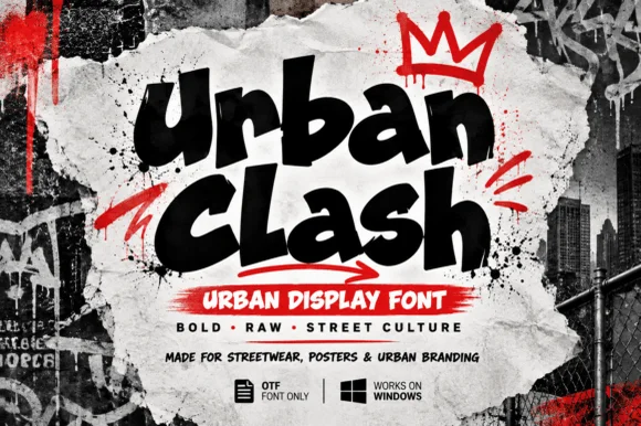 #7
Urban Clash is a heavy, tight-set street-marker display typeface with flared chisel terminals, energetic bounce, and raw urban presence.
Urban Clash is a chunky street-marker graffiti display: fat interlocking letters with a squared marker edge, a hard keyline, small drips running off the baseline and a few counters cut through as if sprayed over a layer. The drips and the cut counters are the finest elements and both close when the face is reduced. It needs roughly 30 mm for the drip and the keyline to read, and it is best as a flat two-colour print on coated stock, or one vinyl colour where the drips become cut paths.
Streetwear drop tee, hip-hop flyer & YouTube thumbnail — Stack 2 words tight at a slight upward tilt and accent with a single contrasting red underline arrow or crown.
Broad solid fills and open counters make Urban Clash straightforward to cut on thick HTV, puff vinyl, and sticker stock.
 #8
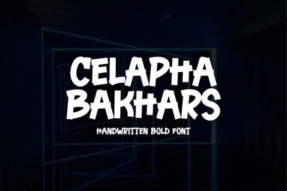
Celapha Bakhars is a punchy street-marker display font slashing thick, slightly overlapping chisel-tip capitals with urban poster energy.
Celapha Bakhars is a street-marker display in flat caps with chisel tips, slightly overlapping strokes and angled legs, so a word reads as a poster painted fast with a wide marker. The overlap is deliberate and gives the face its energy, while the flat chisel ends keep it readable at 24 mm. It needs roughly 28 mm for the chisel edges to read, and it is best in white on a dark ground or in one bright ink on a pale one.
Skate-shop slap sticker, streetwear tee, gym & podcast — Stack 2 tight uppercase lines centered at 68–135 pt in stark white or neon yellow on matte black.
Thick, smooth solid strokes cut and weed in seconds on Cricut HTV and Oracal 651 (click Weld if tight letter edges kiss!).
 #9
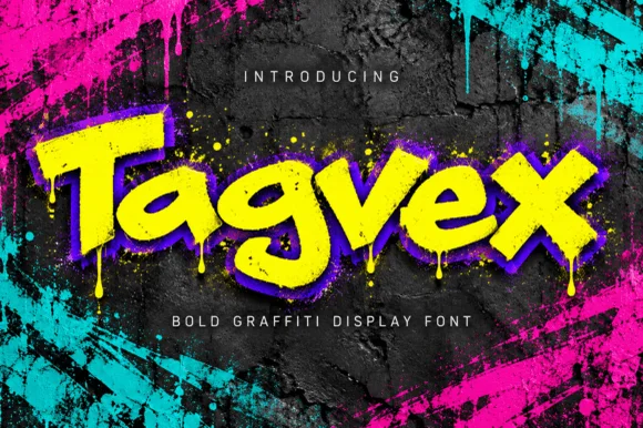
Tagvex is a chunky mixed-case graffiti display font combining wide chisel-marker strokes with hanging wet-paint drips.
Tagvex is a chunky graffiti display in mixed case with wide chisel-marker strokes, flared terminals and long wet-paint drips hanging from the baseline. The core letters stay solid and readable while the drips add movement, and a built-in offset shadow in the specimen style gives depth without a second ink. Drips extend below the baseline, so the layout needs foot room, and the face needs roughly 25 mm for the drips to read as paint. It is a street face for posters, cups and apparel.
Gaming stream overlay, hip-hop single & skate-shop flyer — Fill letters with acid yellow, add a tight purple drop shadow, and place over dark concrete.
Great for DTF hoodies, Print-Then-Cut stickers, and digital graphics; scale above 1.75 in if blade-cutting vinyl drips.
 #10
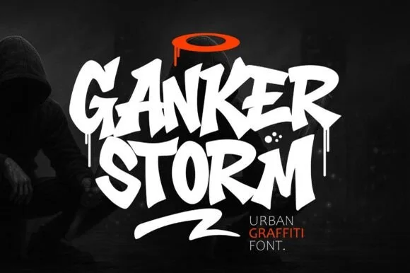
Ganker Storm is a bold urban graffiti display font combining sharp chisel-tag capitals, wet paint drips, and underline swooshes.
Ganker Storm is a street-tag display drawn with a chisel marker and then dripped: flat-cut tag letters, a slight lean, blunt blade ends and long paint runs that fall from the terminal of the last letter. The drips add height below the baseline, so a centred block needs clearance underneath. It needs roughly 28 mm for the chisel cut and the drip to read, and it is best in one wet black on a pale wall or white card, or a single saturated colour where the runs stay sharp.
Rap single cover, street-dance battle poster & skate video — Stack 2 all-caps words tight (0.85 leading), top with a contrasting orange/red halo, and underline with a slash swash.
Heavy solid letter cores cut well on 1.5 in+ hoodie HTV (weld overlapping letters!); fine drip tips shine in DTF and print.
 #11
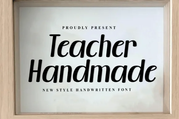
Teacher Handmade is an upright handwritten face in black on white: thick monoline-brush strokes with rounded ends, tall ascenders, an open e and a lower-case g with a straight tail, so the two words read as marker lettering written quickly and confidently.
The two words are stacked and the drawing is handwriting rather than a script: nothing is connected, the stroke weight is nearly constant, and the ends are rounded, which is what a round-tip marker produces. The x-height is large and the ascenders are tall, so the pair fills its lines without needing a heavy weight, and the letters lean very slightly to the right, which keeps the writing from looking mechanical. The counters are generous and the spacing is even, so the face stays readable at paragraph sizes, which is unusual for a handwritten display. The specimen sets the phrase inside a pale wooden frame with tracked caps above and below, and the light grey ground keeps the black strokes crisp, so the page reads as a framed print rather than a type sheet.
Framed classroom welcome sign, teacher tote & tumbler — Stack 2 mixed-case lines centered at 68–135 pt inside a natural wood frame above wide-tracked serif micro-caps.
100% smooth, disconnected solid strokes cut and weed in seconds on Cricut Oracal 651 and HTV down to 0.6 inches!
 #12
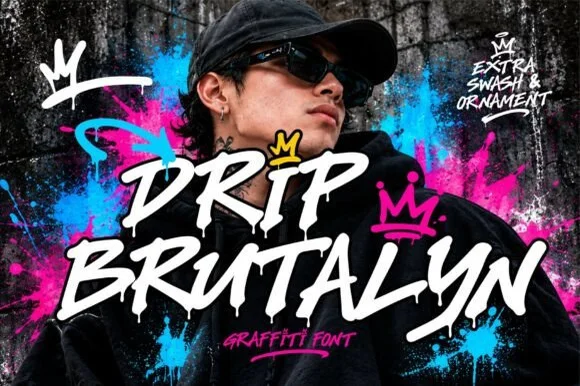
Drip Brutalyn is a street brush alphabet in which the strokes are cut with slashes, the edges are rough and the tails run down as drips, so a word reads as lettering sprayed on a wall that has not dried.
The D opens with a hard slash and a squared bowl, the r keeps a short arm, the i stands as a narrow bar with a rough top and the p drops a stem that ends in a drip, all at a heavy weight with torn edges and sharp angles. The drips are the character: several letters carry a run of paint below the baseline, which is what gives the face its aggressive street register and also what makes it unsuitable for anything that must align. Because the strokes are wide, the face holds at 40 pt on a print and at 80 mm on a garment, and it fails below 20 pt where the tears turn to noise. The graffiti wall, the pink and blue splashes, the crown marks and the small caption are presentation; the brush face is the two words.
Mixtape cover, streetwear back graphic or festival tee — Layer white lettering with a hard black shadow over vibrant colour splashes.
Best for DTF, screen printing and digital graphics due to fine drip tips.
 #13
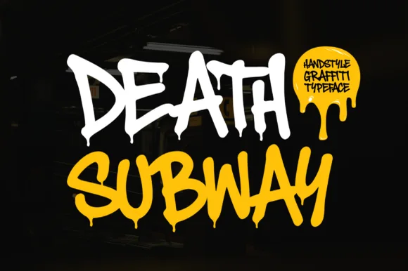
Death Subway Graffiti captures a raw underground marker-and-spray handstyle, where angular street slashes meet organic drip terminals that hang below the letters for skate decks, streetwear and flyers.
The strokes stay uneven and fast, the slashes cut at angles, the drips hang from the ends and no two letters repeat the same width. That drip is the character: the word looks tagged rather than designed, which is why the sample keeps one short phrase on a plain ground. The drips form part of the silhouette, so keep 20 mm of clearance beneath from 40 pt and check whether the drip terminals ship as characters or exist only in the sample.
Skateboard graphic, streetwear hoodie or hip-hop flyer — Set in high-contrast white, acid yellow or neon green over matte black.
Fine paint-drip tips suit DTF, screen printing and posters rather than small vinyl cuts.
 #14
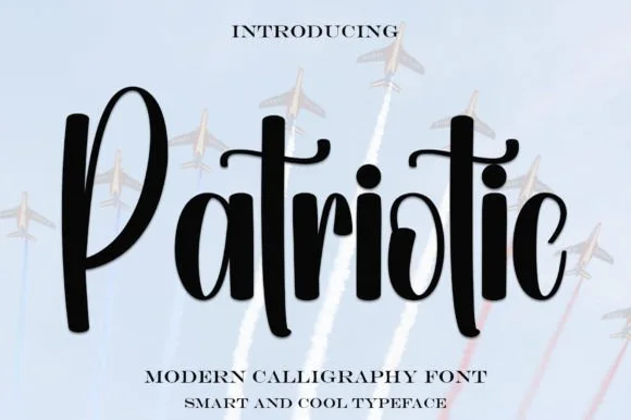
Patriotic is a sturdy, upright modern calligraphy brush script with bold downstrokes, rounded loops, and a sweeping t-crossbar.
Patriotic is a bold upright brush-calligraphy script with a connected crossbar: thick flat-edged strokes drawn nearly vertical, joins that stay open under the letter bodies and a crossbar that runs across the whole word in one sweep as a banner line. It reads as a hand-painted sign rather than a formal script, and the crossbar is what holds the row together. The crossbar is the finest element and it breaks into separate tittles as soon as the face is reduced. It needs roughly 32 mm for the stroke and the crossbar to read, and it is best as one flat ink on white or red board.
4th of July family picnic shirt & insulated tumbler — Set a single focal script word at 3.5–5 inches wide at a slight 5-degree tilt, paired with bold block-sans dates or town names below.
Always weld overlapping brush connectors in Cricut or Silhouette before sending to the mat so letters cut as one solid piece.
 #15
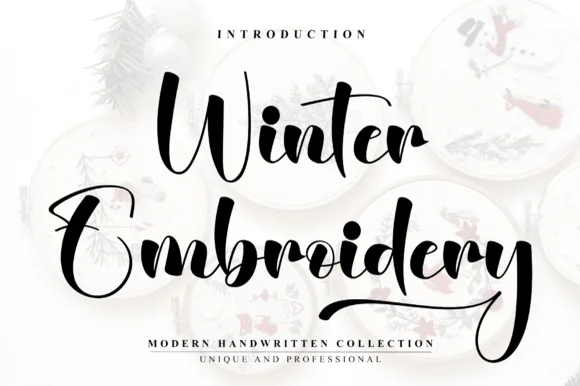
Winter Embroidery is a bouncy modern calligraphy brush script—despite its name, it features smooth solid ink strokes rather than stitch textures.
Winter Embroidery is a thick-thin bouncy modern brush script: a high-contrast stroke with a swollen thick and a hairline-thin, letters that rise and fall along the baseline and joins that loop back into the word. It is the look of a machine-embroidered name, so it suits a patch or a knit more than a leaflet. The hairlines are the finest element and they break first, on thread and in print. It needs roughly 34 mm for the thick-thin contrast to read, and it is best one colour on a soft ground where the hairline holds.
Holiday mug decal, gift sack & ornament lettering — Stack a two-word winter phrase with tight leading so the upper capital sits neatly above the wider lowercase second word.
Weld all cursive joins before vinyl cutting and keep x-height above 0.65 in so the thin upward connectors do not lift during weeding.
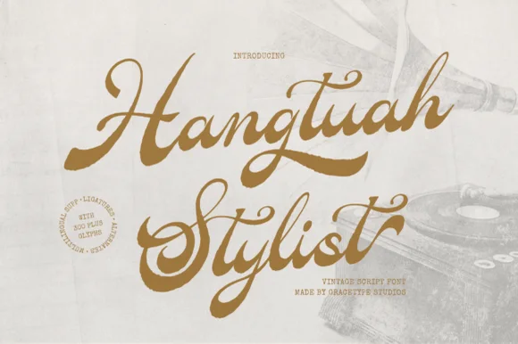 #16
Hangtuah is a thick, slanted vintage sign-painter script featuring bold brush strokes, dynamic swash capitals, and retro underline tails.
Hangtuah is a bold retro sign-painter brush script with underline swashes: a heavy loaded stroke, a firm slant, connected letters and thick underline swashes that run beneath the word and turn up at the end. The underlines are the design and they fix the block's width, and the brush edge is the finest element. It needs roughly 30 mm for the underline and the brush edge to read, and it is best in one dense ink on a sanded board, or a flat two-colour print on uncoated stock.
Barbershop window decal, Moto apparel & coffee tin — Angle a 1-to-2-word brand name upward 7 degrees and anchor the empty lower-right space with a tapered underline tail alternate.
Weld all overlapping brush joins before cutting HTV or gold metallic sign vinyl; thick strokes weed smoothly at 1.2 in+.
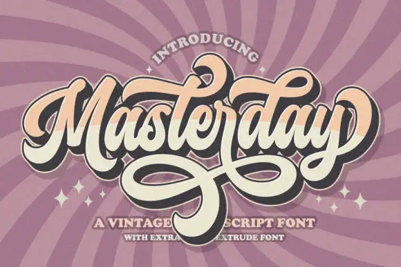 #17
Masterday builds a dense connected title above large intertwined lower loops, where upper curls and crossing strokes demand more space than the small internal letters alone suggest and a black offset extrusion deepens the silhouette.
The body stays compact, the loops grow large, the lower strokes cross one another and the offset shadow repeats the whole word behind it. That interlacing is the character: the phrase reads as a finished badge rather than a line of type, which is why the sample keeps one title with heavy loops beneath. The extrusion belongs to the artwork, so test the plain face first, keep 26 mm between baselines and check that the crossing strokes actually exist as characters.
A retro birthday dance poster — Place the name in a generous central band. Keep a broad clear area under the loops before the date, venue and RSVP.
Verify available swashes and any extruded style in the current listing; do not copy the artwork effect as a promised feature.
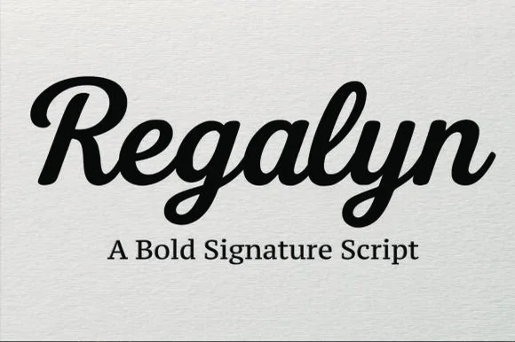 #18
Regalyn is a bold, heavy-bodied signature script with velvety rounded brush downstrokes and sturdy, cutter-friendly lowercase loops.
Regalyn is a heavy retro brush-pen signature script: a thick loaded stroke that ends in tapered flicks, connected letters, a firm rightward slant and a low bounce that keeps the word close to the baseline. The weight closes the loops early, and the tapered flicks are the finest element. It needs roughly 26 mm for the tapered flick and the loaded stroke to read, and it is best in one deep ink on cream and kraft, or a single dark colour on a pale board where the stroke prints as a ridge.
Apparel chest logo, baseball-cap embroidery & tumbler decal — Set single-word brand names at 4–9 inches wide across hoodies, hats, or tumblers above a clean serif subline.
Weld all overlapping cursive connectors before cutting HTV or permanent vinyl; weeds cleanly down to 0.7 inches.
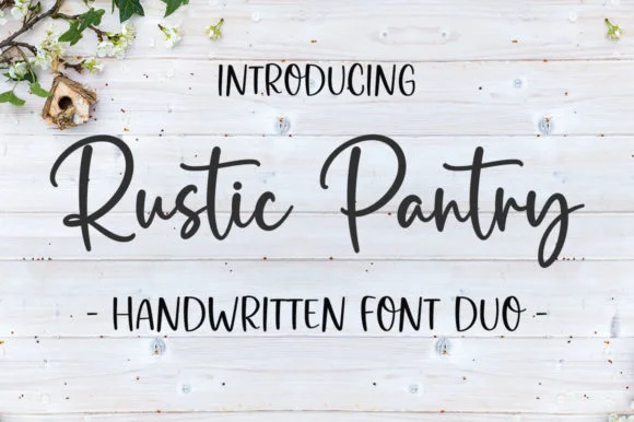 #19
Rustic Pantry is a coordinated farmhouse font duo pairing a lively bouncy cursive script with a tall, narrow hand-drawn uppercase sans.
Rustic Pantry is a duo of a bouncy farmhouse brush script and a tall skinny marker sans: the script runs a loaded stroke with small flicks, a rising baseline and joined letters, while the sans is narrow with blunt marker ends for prices and lists. The two voices share one palette, so a jar label can carry a name and a list in the same hand. The script's bounce grows the word vertically and the marker sans stacks a long line in a narrow label. The script needs roughly 22 mm and the sans 18 mm for their detail to read.
Glass pantry canister decal, spice-jar set & kitchen sign — Center the script word at 2–3.5 inches wide above a 0.5-inch tracked skinny sans descriptor line.
Weld all touching cursive connectors before cutting Oracal 651 permanent jar vinyl; medium stroke weight weeds cleanly.
 #20
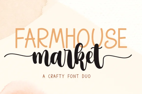
Farmhouse Market teams a tall, organic uppercase sans with a bold, bouncy brush script finished by sweeping side tails.
Farmhouse Market pairs a condensed hand-drawn sans with a thick brush-pen script: the sans is a narrow uneven block with a wobbling stem for signs and price cards, while the script is a heavy brush stroke with dry ends and a visible pen turn at each join. The pair is built for a market stall, so it wants kraft paper and one dark ink rather than a coated ground. The dry brush ends are the finest element and they silt first. The sans needs roughly 22 mm and the script 30 mm for their detail to read.
Farmers-market canvas tote & produce crate stencil — Span the uppercase sans across the top width of the script's core letters, letting the script's left and right tails extend 1 inch wider on each side.
Weld all brush script letters into a single compound path before cutting HTV, and double-check the small upper loop inside 'e' and 'k'.
 #21
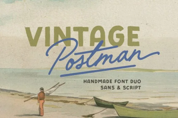
Vintage Postman pairs a sturdy retro sans with the look of a soft rubber stamp and a brisk monoline brush script: the olive sans holds a solid horizontal line while the angled script cuts across the baseline with a hand-signed slant.
The sans cut keeps even stems, softly rounded corners and a slightly uneven impression, and the script cut draws a monoline stroke at a steady width with a sharp slant and quick connectors. The pairing of a grounded row and an angled line is the character: one gives structure and the other gives motion, which is why the sample sets the olive words above the blue signature. Because the script slants, keep 18 mm between the rows and 20 mm at the right for the exit; the sans stays readable from 0.35 inches of pen height.
Coffee bag label, travel poster or surf-shop tee — Set the geographical or brand noun in all-caps sans and overlap the descriptor in angled script.
Check light organic edge texture on the sans if cutting decals under 1.5 inches.
 #22
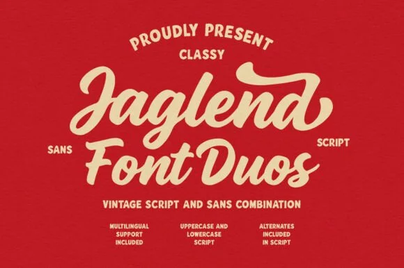
Jaglend Font Duo pairs a thick, creamy vintage sign-painter brush script with a sturdy, hand-drawn condensed uppercase sans companion.
Jaglend Font Duo pairs a retro sign-painter brush script with a rugged condensed sans: the script carries a loaded stroke with small flicks and connected letters on a firm slant and a shallow bounce, while the sans is narrow with uneven edges that read as a sanded board for lists and prices. The two voices share one palette, so a window, a price list and a card can be built from one family without a third face. The script's flicks are the finest element and they close first at small sizes, while the condensed sans stacks a long service list in a narrow panel without wrapping. The script needs roughly 24 mm and the condensed sans 18 mm for their detail to read.
BBQ rub tin, craft soda label & barbershop window sign — Arch the sans uppercase header over a large slanted Jaglend Script centerpiece and anchor with tracked sans footers.
Broad solid brush strokes cut cleanly on HTV, sticker vinyl, and wood-sign stencils—weld script connections before cutting.
 #23
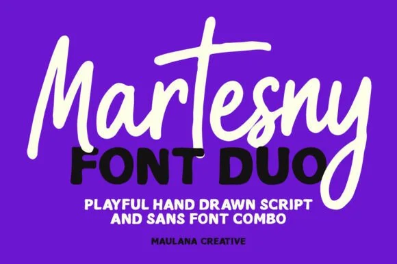
Martesny combines a lively, tall-crossed hand-drawn marker script with a solid, rounded geometric uppercase sans partner.
Martesny is a duo of an energetic marker brush script and a chunky rounded sans: the script runs a wet loaded stroke with small flicks and joined letters, while the sans is a fat rounded block with tight counters for badges and prices. The pair carries a loud card in one ink, and the marker edge is the finest element. The script needs roughly 24 mm and the chunky sans 26 mm for their detail to read, and both work in one bright ink on white.
Podcast cover, YouTube thumbnail & custom party hoodie — Let the script's descending 'y' or 'g' overlap slightly across the corner of the bold uppercase sans line beneath it.
Both the chunky sans and medium-thick marker script weed reliably on HTV and decal vinyl at 1 inch+ scale.
 #24
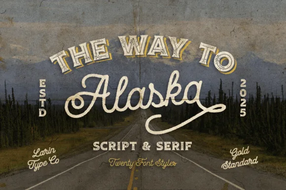
Way to Alaska is a monumental 20-font vintage signboard superfamily by Pasha Larin pairing heritage brush scripts with arched Western/signboard serifs!
Way to Alaska is a twenty-font vintage signboard superfamily built around a heritage script and a companion serif, with layered shadows, inlines, outlines and small ornaments that all share one skeleton. The size of the family means a whole shopfront can be built from one voice, but the layers must be picked deliberately or a panel turns into a stack of outlines. The script needs roughly 24 mm and the serif 20 mm for their detail to read, and two inks cover most of the family.
Craft distillery / brewery badge, coffee roaster & apparel line — Arch the vintage Serif ('THE WAY TO', 54 pt) above sweeping 'Alaska' Script (110 pt) flanked by vertical 'ESTD / 2026' stamps!
Use the clean solid styles for crisp Cricut HTV, Oracal 651 & laser engraving; use textured/inline styles for DTF, print & labels!
 #25
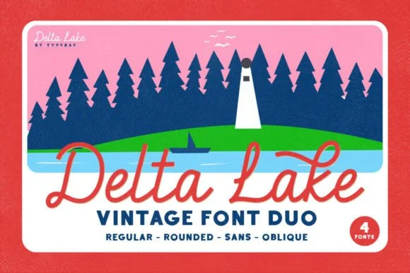
Delta Lake Font is a 4-font vintage outdoor duo bundling matched Script (Regular & Rounded tails) and bold camp Sans (Regular & Oblique).
Delta Lake Font is a four-cut vintage national-park and lake-camp duo: a regular, a rounded, a sans and an oblique, all drawn on the same slightly inked skeleton with a small badge-friendly weight. The cuts share metrics so a line can mix a regular name with a sans caption, and the rounded cut is the softest of the four. It needs roughly 22 mm for the inked edge and the rounded terminal to read, and it is best in one deep green or brown on cream and buff stock, where the ink edge prints as a slightly worn rule.
Lake-house boat towel, camp enamel mug & cabin sign — Set 'Lake [Name]' in coral or cream Delta Lake Script with side tails over tracked navy Delta Lake Sans below.
Both the sturdy monoline script and bold camp sans cut and weed super cleanly on HTV, boat vinyl, and wood stencils (weld script!).
 #26
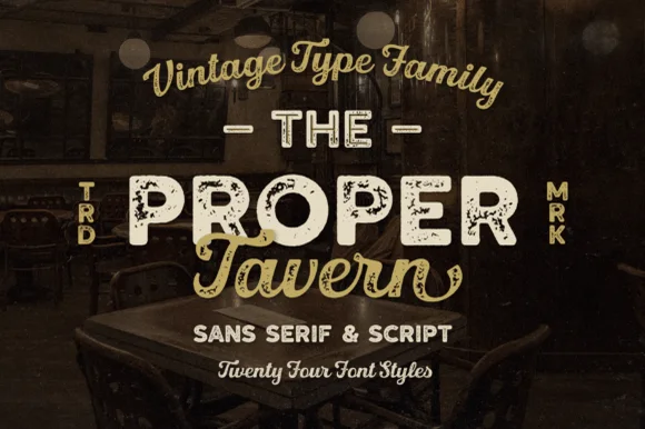
Proper Tavern is a massive 24-style vintage signboard collection pairing ornate inline/textured slabs & sans cuts with a classic brush script.
Proper Tavern is a vintage pub signboard family with twenty-four styles built from a sans, a slab and a script: each style shares one skeleton, so a fascia, a chalkboard and a card can be set from one voice with different weights, inlines and shadow layers. The size of the family means the layers must be chosen deliberately or a panel turns into a stack of outlines. The script needs roughly 24 mm and the slab 20 mm for their detail to read, and two inks cover most of the family.
Craft-brewery tap list, gastropub sign & whiskey box — Arch the vintage script at top, set the hero pub name in wide Proper Tavern inline caps flanked by vertical 'TRD/MRK', and tuck script below.
Pick the clean solid styles from the 24-pack for Cricut vinyl/HTV, and use the inline/textured cuts for printed bottles and laser wood plaques!
 #27
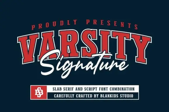
Varsity Signature pairs an outlined varsity slab alphabet, arched in the sample, with a brush script that runs across the middle of the letters and drops below them.
The slab half is a collegiate capital face with an outline and a dark fill, set on an arc so the tops of the letters follow a curve, and each letter carries a square slab and a straight leg rather than a curved terminal. The script half is a brush hand with a heavy first stroke and a light exit, and in the sample it crosses the middle of the arc so the two words interlock rather than stack. That interlock is the useful part of the pairing: it lets a design carry a team name and a subtitle in the same visual block at a size where a plain stack would look separated. Weight is heavy in the slabs and medium in the script, so the contrast stays readable at 70 pt on a garment. The navy ground, the red and white inks, the small crest and the boxed caption are presentation; the duo is the two words.
A school-club identity heading — Give the club name its own upper arch and reserve a plain bottom strip for the meeting schedule.
Check all required letters and do not let script obscure the block-name counters.
Practical buyer checklist
Key cutting, printing and pairing answers before choosing a brush & streetwear typeface.
The heavier dry-brush faces hold up because the strokes are wide enough for the film to grip. Fine brush textures with lots of isolated specks fail first, since those pieces lift at the corners after a few cycles.
Yes, and it often looks better than DTF because plastisol sits slightly proud of the fabric and reads like paint. Use a higher mesh count so the ragged edges survive without filling in.
Adult tees typically run the design between 10 and 12 inches wide across the chest. On a hoodie, stay at or above 8 inches so the brush texture does not shrink into noise.
Many sets are capitals-only by design, since the genre uses block lockups. Check the glyph table before planning a mixed-case slogan, and set any small line in a separate sans when lowercase is missing.
Keep exploring
Explore adjacent maker roundups or check our practical pre-production checklists.
18 curated fonts · Previews & pairings
33 curated fonts · Previews & pairings
26 curated fonts · Previews & pairings
20 curated fonts · Previews & pairings
Guides: Invitation font checklist · Vinyl & cutting checklist · How to pair script & sans fonts
Allow optional Google Analytics to measure visits and catalogue actions. Your search words and notes are not included. Privacy & storage