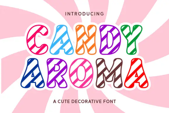
Neutral Sans Workhorse

Merry Chunky + Hermano
Lets Merry Chunky own the focal silhouette while handling secondary copy, sizing and subheads cleanly.
Inspect Hermano specimenDisclosure: MakerFileHub may earn a commission from qualifying purchases via paid links on this page. How our links work.
Bold slightly-angled cut-paper poster sans (All-year ready!)
Merry Chunky is a punchy, clean-cut geometric poster sans with lively cut-paper angles—and zero holiday clipart attached so it works all 365 days!
Paid link
Get this fontProject & layout blueprintsAt-a-glance maker compatibility
Sturdy stroke walls and open counters weed cleanly on adhesive vinyl, HTV apparel film, and cut cardstock.
Visual anatomy & craft review
Merry Chunky is a clean-cut geometric poster sans in caps with lively cut-paper angles on the stems and squared terminals, so a word reads as letters cut from card rather than as a modern grotesk. The angled cuts are few and deliberate, which keeps it clean at 20 mm and gives it character at 200 mm, and the heavy even weight holds in one ink. It needs roughly 26 mm for the cuts to read, and it is best in raspberry red on white or in one dark ink on kraft.
Cut-paper-bold · Clean-sans · Zero-clutter
Two-font hierarchy recipes
Tested contrast partners — pairing Merry Chunky with grounded secondary typography.
Merry Chunky + Hermano
Lets Merry Chunky own the focal silhouette while handling secondary copy, sizing and subheads cleanly.
Inspect Hermano specimen
Merry Chunky + Amor Hadena
Grounds bold display lettering with classic typographic authority on posters, badges and apparel.
Inspect Amor Hadena specimenPractical applications
Concrete hierarchy, scale and production guidance tailored to Merry Chunky’s stroke geometry.
Cut-paper caps read as a hand-assembled poster, which is what a small brand uses instead of a corporate identity. The heavy weight holds at 44 mm on a box lid in one ink, and the angled cuts give a short name personality without an illustration.
Hierarchy & layout recipe
Box 200 x 150 x 80 mm, word 44 mm on the lid, 25 mm margins. Sign 900 x 400 mm, word 160 mm, 60 mm margins and 25 mm frame clearance. Merch print 280 x 160 mm, word 60 mm, 40 mm margins.
Pre-production check
A screen print at 60 mm on a dark garment fills the 1 mm angled cut and the letter becomes a plain block. Keep the cut at 1.5 mm or add an underbase, and approve a strike-off before the run.
Geometric cut caps read as an editor's cover rather than a fashion masthead, which is what a culture title wants. The heavy fill holds a long title at 84 pt in one ink, and the angles give the cover edge without a photograph.
Hierarchy & layout recipe
Cover 210 x 297 mm, title 84 pt, cover lines 10/14 pt, 18 mm margins and 10 mm trim. Opener 420 x 297 mm, headline 120 mm, body 9/13 pt. Poster A2, word 280 mm, details 22/28 pt, 30 mm margins.
Pre-production check
An 84 pt title with 1 mm angles on uncoated stock gains ink and closes the cuts, so the word reads as a slab. Set the title at 76 pt or print on coated stock, and check one cover before the run.
Cut-paper caps read as a club identity made by members, which is what a summer league prints on a banner. The heavy weight holds at 380 mm in vinyl, and the angles give the name movement that a plain sans lacks.
Hierarchy & layout recipe
Banner 2400 x 800 mm, word 380 mm, 150 mm margins with eyelets every 500 mm and 50 mm clear. Poster A2, word 280 mm, details 22/28 pt, 30 mm margins. Kit print 280 x 120 mm, word 60 mm, 40 mm margins.
Pre-production check
A vinyl-cut banner at 380 mm leaves 20 mm between letters that closes as the vinyl stretches in wind, so the word bows. Cut the word in segments with 25 mm overlaps, and check one tensioned banner before the season.
Technical & licence verification
Confirm included OTF/TTF/WOFF formats, full glyph tables and licence coverage on the live store page before batch production.
Closest visual alternatives
Matched across letterform anatomy, stroke behaviour and craft applications.
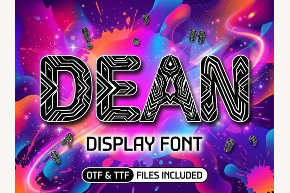
Cybernetic circuit-maze & tribal-line block display
Dean is a bold geometric block display typeface filled inside every thick stem with intricate parallel maze and circuit-board pathways.
Ideas for this font
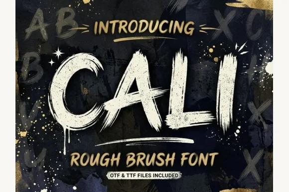
Heavy streaky hog-bristle wall-paint brush font (OTF & TTF)
Cali is a bold, wide-bristle rough brush display font streaked with authentic paint-roller and dry-brush fibers (OTF & TTF).
Ideas for this font
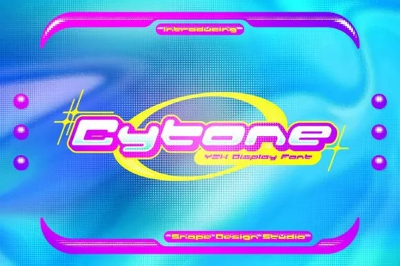
Extended geometric Y2K techno-pop capsule display
Cytone is a wide, upbeat Y2K display font sculpting low-slung geometric capsule letters built for orbital rings and glossy pop graphics.
Ideas for this font
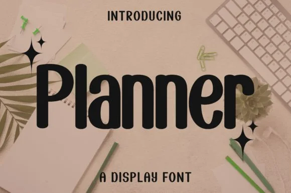
Bold condensed rounded-terminal display sans
Planner is a clean, bold condensed display sans (not a messy script) featuring smooth rounded terminals and tall, space-saving lowercase.
Ideas for this font
Same independent foundry
Allow optional Google Analytics to measure visits and catalogue actions. Your search words and notes are not included. Privacy & storage