
Very heavy rounded sport slab capitals
Chicago Titans
Chicago Titans pushes slab weight to its limit: thick stems, counters narrowed to slots, wide flat feet and almost no space left between the letters of a word.
Ideas for this font
Foundry portfolio · Decorative · Serif · Slab Serif
T.D. House is the studio behind Chicago Titans and Blade Gothic, and it works the athletic and gothic end of display type. Thirty-two releases that read as stadium signage, jersey numbering and tattoo-adjacent blackletter rather than as greeting card lettering.
Before you buy from this studio
Team faces in this library are usually layered. Check whether the fill, outline and shadow ship as separate files, since cutting a single flattened layer removes the two-colour look that sells the style.
Very heavy rounded sport slab capitals
Chicago Titans pushes slab weight to its limit: thick stems, counters narrowed to slots, wide flat feet and almost no space left between the letters of a word.
Ideas for this font

Sharp angular blackletter with fractured serifs and kept lowercase counters
Blade Gothic is a blackletter display in which the strokes break into sharp angles, the serifs fracture and the vertical rhythm stays clean, so a title reads as medieval lettering that still resolves at headline scale.
Ideas for this font

Tall ornamental serif with inward curls and heavy vertical stress
Billvane is a tall ornamental serif in which the stems carry heavy vertical stress, the terminals curl inward and the bowls close on small counters, so a single word reads as a Victorian playbill.
Ideas for this font

Narrow pointed blackletter with a long straight p descender
Darkspire is a gothic blackletter display face with sharp calligraphic strokes, splattered edges and a rough texture, built for dark posters and tattoo-inspired lettering.
Ideas for this font
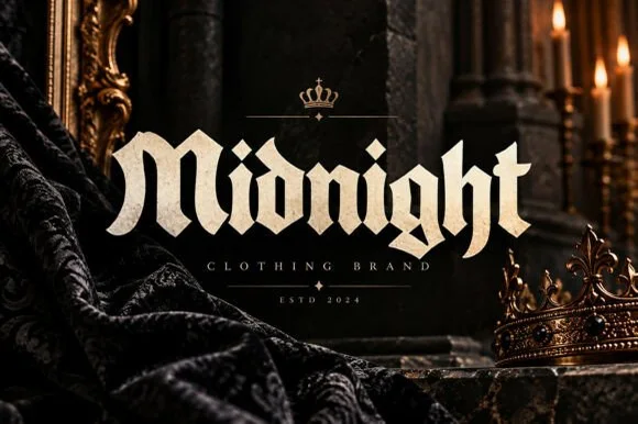
Bold street-gothic blackletter with compact forms and heavy verticals
Midnight is a bold blackletter in which the letters stay compact, the verticals run heavy and the breaks bend at sharp angles, so a word reads as a clothing label rather than as a manuscript.
Ideas for this font
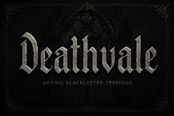
Slender blackletter with an arched D and curled a terminals
Deathvale is a narrow gothic blackletter with tall ascenders, needle-sharp spurs and a silver fill, drawn to sit inside a dark arch like a name carved over a door.
Ideas for this font
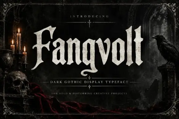
Broad angular blackletter with hooked F and curled g descender
Fangvolt is a gothic display face drawn in the old style: tall ascenders, deep pockets of white between the strokes, sharp diamond feet and a grain that looks pressed into dark paper.
Ideas for this font
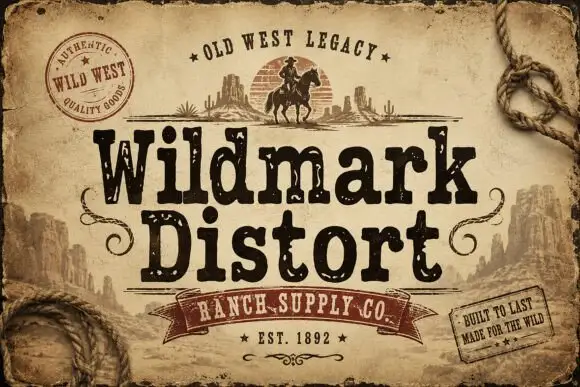
Distressed western display
Wildmark Distort is a distressed western display in black and cream on aged paper: a rounded slab with an uneven, worn outline, a swollen waist and a slight tilt, framed by a rope, a round seal, a ribbon and two small cards with period copy.
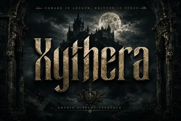
Textured gothic display
Xythera is a textured gothic display in gold on a dark scene: tall capitals with sharp spurs, a carved surface, and a stone-like speckle inside the strokes, framed by an arched stone border with a moonlit castle behind, so the plate reads as a fantasy title rather than a blackletter.
Ideas for this font
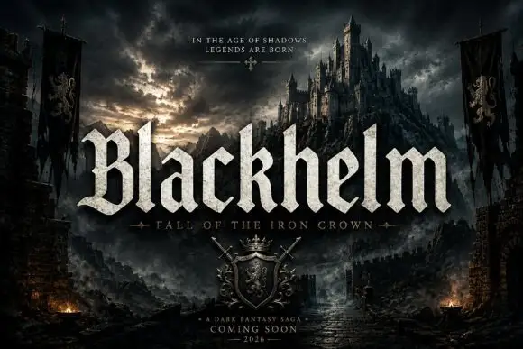
Broad blackletter with sharply peaked shoulders and forked B
Blackhelm is a bold blackletter display face with wide letters, a heavy stem weight and a surface that looks chiselled from weathered stone rather than drawn with a broad nib.
Ideas for this font
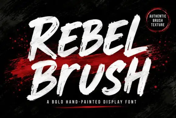
Heavy condensed display sans
Rebel is a heavy condensed display sans in bright blue on black: tall narrow caps with flat terminals, cut corners on the diagonals, a high waist and closed counters, set as one stacked block with a second word in outline and small tracked notes at the sides.
Ideas for this font
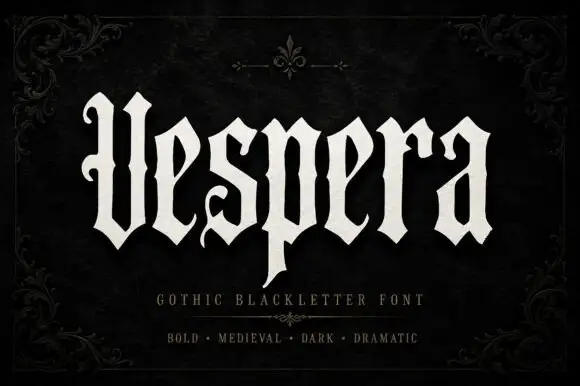
Tall open blackletter
Vespera is a tall open blackletter in bone on a black damask ground: a hooked V, a descending p, fine hairlines between the heavy strokes and open counters, set as one word with a plain descriptor and three style words beneath, framed by a fine corner ornament.
Ideas for this font
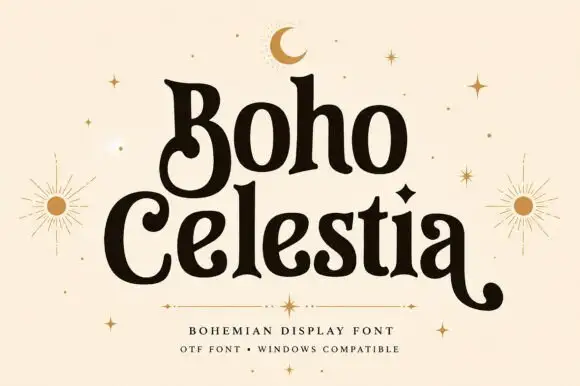
Rounded bohemian serif with curled lower extensions and soft flared ends
Boho Celestia is a warm rounded serif in which the stems flare at their ends, the bowls stay heavy and the B curls inward below its stem while the final a sends a long low tail, so a word reads as hand-drawn bohemian lettering.
Ideas for this font
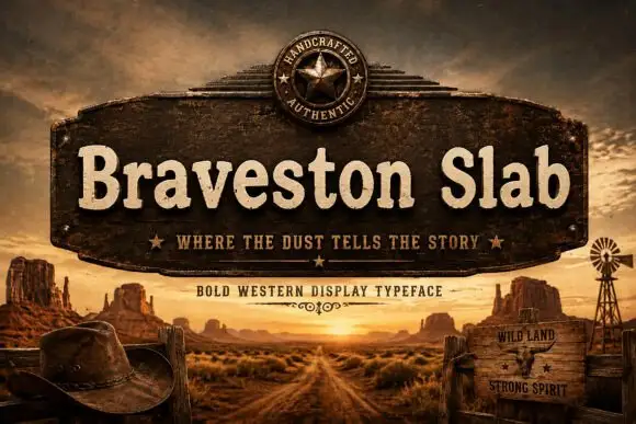
Rounded mixed-case slabs with blunt feet and irregular rustic edges
Braveston Slab is a rounded mixed-case slab in which the bowls stay heavy, the feet blunt off, the edges carry a slight unevenness and the lowercase keeps a warm width, so a title reads as a ranch sign rather than a hard Western face.
Ideas for this font
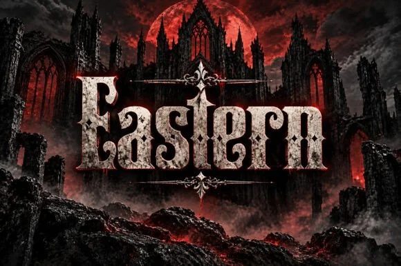
Weathered cathedral Fraktur blackletter display (OTF)
Eastern is a dramatic medieval Fraktur blackletter display font featuring bifurcated crown spurs and classic gothic lowercase (OTF).
Ideas for this font
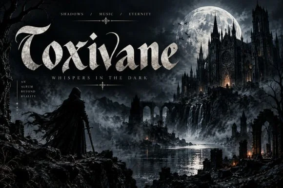
Cinematic gothic display with stone texture
Toxivane is a cinematic gothic display in stone white on a dark castle artwork: tall letters with pointed terminals and hairline joins, filled with a mineral texture, with a tracked capital line beneath and small credits in the corners.
Ideas for this font
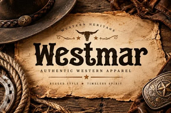
Western heritage slab with spurred serifs and a worn contour
Westmar is a western heritage slab in which the serifs grow spurs, the stems bulge and the contour breaks into a worn edge, so a name reads as a brand burned onto a wooden sign.
Ideas for this font
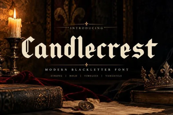
Clean high-legibility modern gothic blackletter
Candlecrest is a clean, high-clarity modern blackletter combining crisp calligraphic serifs with open, approachable lowercase bowls.
Ideas for this font
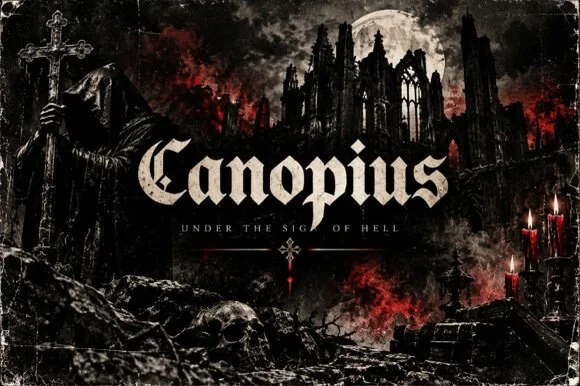
Classic broad-nib medieval Textura blackletter
Canopius is a bold, disciplined modern Textura blackletter featuring stout vertical pillars, diamond feet, and scrolled capital interiors.
Ideas for this font
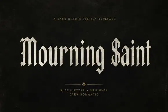
Slender blackletter display
Mourning Saint is a slender blackletter in bone on black: mixed case with a split M, a parallel-lined S, narrow bodies, sharp spurs and a tall x-height, set in two words across the sheet with a small tracked line above and two tracked lines beneath a drawn divider.
Ideas for this font
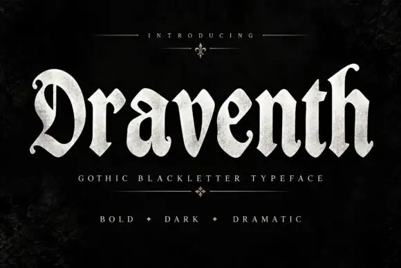
Broad rounded blackletter with curled D and pointed lower joins
Draventh is a wide gothic blackletter display face with heavy stems, sharp hooked shoulders and a weathered silver fill that reads as rubbed metal.
Ideas for this font
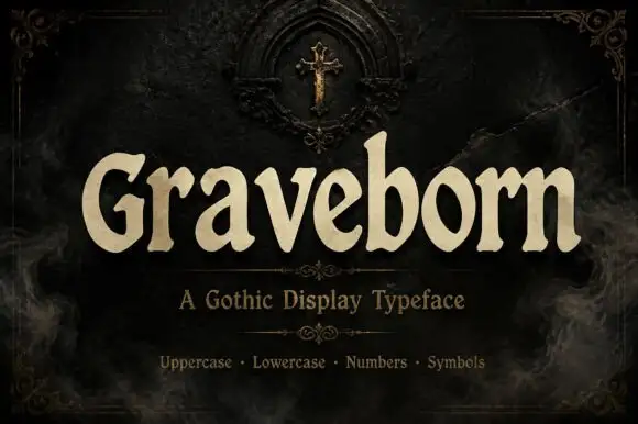
Softly flared Gothic display with broad rounded lowercase
Graveborn is a gothic display face that mixes a blackletter skeleton with a sturdy serif, giving spiky terminals, a tall x-height and a weight heavy enough to sit on a dark ground.
Ideas for this font
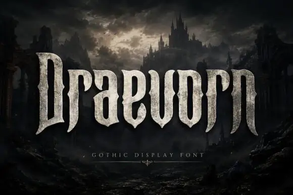
Tall heavy display with pinched waists and long tapering feet
Draevorn is a wide bold blackletter with broad stems, short spurs and a weathered stone fill that makes the letters look quarried rather than drawn.
Ideas for this font
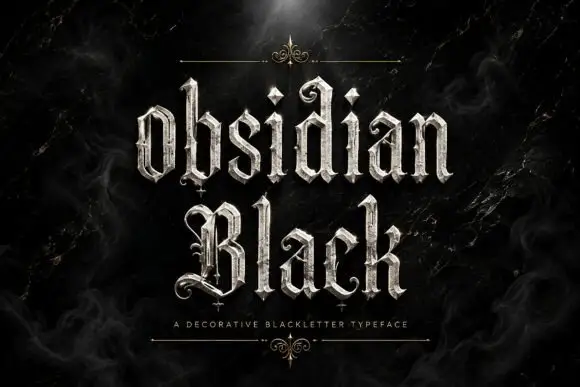
Slender outlined blackletter
Obsidian Black is a slender outlined blackletter in silver on a black marble ground: mixed case with small spirals at the terminals, long fine tips, doubled edges and a scaled texture on the fill, set in two lines with a small tracked line beneath between two hairline rules and drawn fleurons.
Ideas for this font
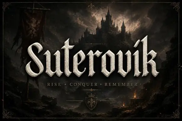
Narrow gothic display with sweep
Suterovik is a narrow gothic display in silver on a dark landscape: mixed case with a sweeping S, a hooked tall k, angular shoulders and a scaled texture, set as one word with a tracked line beneath and a small crest at the foot, framed against a castle and a banner.
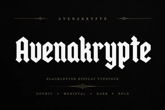
Solid angular blackletter with diamond joins and a long y
Avenakrypte is a blackletter display face drawn with flat angled strokes, diamond-cut feet and much wider counters than the historical model, so the letters look sharpened rather than densely woven.
Ideas for this font
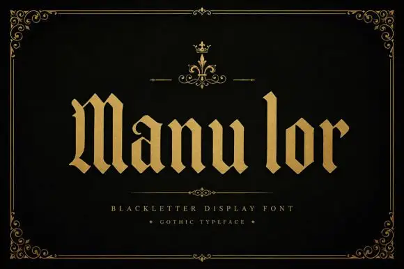
Broad blackletter with diamond shoulders
Manulor is a broad blackletter in gold on a black ground: diamond-shaped shoulders, a tall narrow l, even stroke widths and heavy bowls, set as one word between a small crown ornament above and two tracked credit lines beneath, all inside a fine ornamental frame.
Ideas for this font
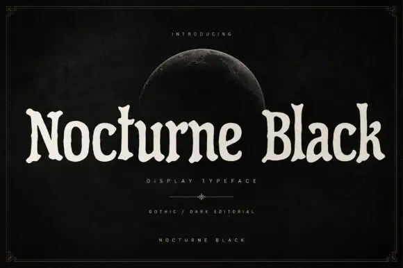
Soft uneven serif display
Nocturne Black is a soft uneven serif in cream on a black ground: rounded bowls, flared ends, slightly irregular widths and a wide fitting, set as one long line beneath a small introducing line and a half moon, with a descriptor and two credit lines at the foot inside a fine frame.
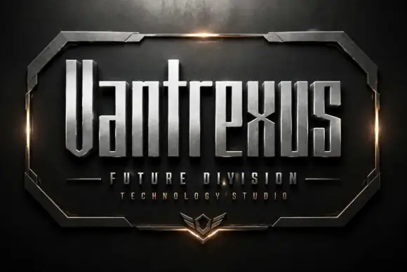
Narrow angular sci-fi display
Vantrexus is a narrow angular display in brushed silver on a dark etched plate: tall squared letters with pinched joins, chamfered corners and narrow counters, cut into a bevelled metal frame with a glow at either side and two tracked lines beneath in the same family.
Ideas for this font
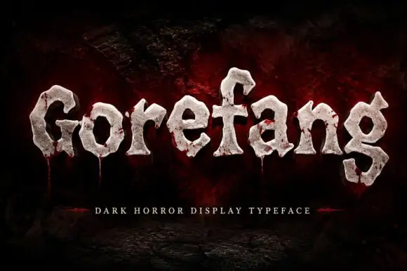
Chunky uneven letters with rough pale faces and low red trails
Gorefang is a dark horror display face in which each letter looks carved from a cracked white stone, with chipped edges, a textured surface and thin trails of red running down from the baseline.
Ideas for this font

Slanted brush script
Lover is a slanted brush script in black on nude packaging: thick downstrokes with rough white breaks, blunt tapered ends and a fast rightward lean, shown on a bottle, a bag, a tag, a card and a jar across a single mockup sheet.
Ideas for this font
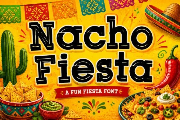
Inline-dotted Western & Mexican cantina Tuscan slab-serif
Nacho Fiesta is a bold, single-color cantina slab-serif accented with Western median spurs and crisp inline dots/dashes inside every stroke.
Ideas for this font
Allow optional Google Analytics to measure visits and catalogue actions. Your search words and notes are not included. Privacy & storage