 #1 · Best Overall
Disclosure: MakerFileHub may earn a commission from qualifying purchases via paid links on this page. How our links work.
Cut-paper letters, mismatched cases & collage
19 Best Ransom Note & Punk Zine Fonts
A ransom note works because every letter looks like it came from a different page, and the font has to fake that convincingly. Ransom Note Magazine and Nocht Star build the clipping look, Alphabet Riot and Chaos Reality push it toward street-poster aggression, and Ransom Alphabet and Ransom Note supply pastel and outline variants for party and scrapbook work.
Quick verdict
Ransom Note Magazine is the most convincing collage face, Alphabet Riot handles a punk poster, and Ransom Note gives an outline version for colouring and layered prints. Chaos Reality is the pick for a brutalist editorial.
Quick answer
Top 3 ransom note, cutout & punk zine picks right now.
Short on time? Start with our three highest-rated ransom note, cutout & punk zine standouts before scrolling the full breakdown.
#1 · Best Overall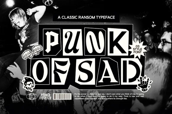 #2 · Runner-Up Pick
 #3 · Editor's Choice
How we tested & selected these 19 fonts
We kept 19 of 152 candidates that vary letterforms across the alphabet instead of applying one tilt to a normal font. Judged on whether the variation repeats visibly, how the tiles sit in a tight line, and legibility at 14 pt for invitation details.
Side-by-side summary
Top 5 ransom note, cutout & punk zine picks at a glance.
Compare specimens, OpenType/PUA traits and primary project roles side by side.
| Rank & Font | Style & File Specs | Best Project Fit | Store Listing |
|---|---|---|---|
| DecorativeCollage | 90s pop-punk album cover, teen zine & mystery podcast | Get fontPaid link | |
| DecorativeAnarcho-punk | Punk gig flyer, photocopy zine masthead & cassette J-card | Get fontPaid link | |
| DecorativeFile formats | Youth snack pouch, street-brand tee & sticker pack | Get fontPaid link | |
| DecorativePunchy | Comedy/commentary YouTube thumbnail, zine & poster | Get fontPaid link | |
| DisplayZany | Art-class zine cover, music-camp tee & bulletin board | Get fontPaid link |
Display & Decorative Headlines
19 fonts#1 · Best OverallRansom Note Magazine
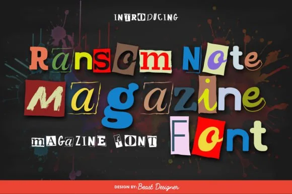
Ransom Note Magazine is a colorful cut-out collage font placing mismatched serif, sans, and slab letters onto colorful torn magazine paper scraps.
A colour font shown on charcoal with red paint splatter: every character sits on its own tilted cut-paper rectangle in red, blue, yellow, green or cream, and the letters inside the tiles mix different typographic styles, so a word reads as a ransom note assembled from magazine scraps rather than as a typeface with a texture. Because the tiles vary in colour and angle, the sheet is a contact print rather than a specimen. The construction sets a low size floor, since each tile is solid, but the mixture of letter styles means the smallest practical size is where all of them still read as letters. Uses shown are editorial and party work.
Recommended project & layout
90s pop-punk album cover, teen zine & mystery podcast — Set 2-to-4-word headlines at 54–96 pt over dark grunge or halftone paper backgrounds.
Before you cut or print
Multi-color paper-scrap artwork requires color printing, Print-Then-Cut stickers, DTF, or digital graphics—not single-color cut vinyl.
Best paired with
Get fontPaid link
#2 · Runner-Up PickPunk of Sad
Punk of Sad is a classic black-and-white punk-zine ransom typeface (3 styles) setting gritty serif/sans letters inside uneven cut-newspaper tiles.
Punk of Sad is a monochrome punk-zine ransom face in three styles, setting serif and sans letters inside uneven cut-newspaper tiles with alternating black-on-white and white-on-black blocks, so a word reads as a ransom note assembled on a photocopier. The three styles let a designer alternate tiles for rhythm, and the tiles are large, which means the face needs size before the clipping edges read. It needs roughly 24 mm for the tile edges to hold, and it is best in pure black and white with no grey, on newsprint or matte paper.
Recommended project & layout
Punk gig flyer, photocopy zine masthead & cassette J-card — Stack 2 or 3 words big across high-contrast grainy B&W photography alongside barcode and safety-pin graphics.
Before you cut or print
Single-color black/white vector tiles print razor-sharp on thermal sticker printers (Munbyn/Rollo), DTF, and screen prints!
Best paired with
Get fontPaid link
#3 · Editor's ChoiceChardus Ransom
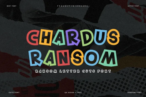
Chardus Ransom is a crisp, graphic ransom-cut display font alternating solid and outlined letters with tilted geometric rectangle tiles.
Chardus Ransom is a clean geometric ransom display built from cut tiles: every letter sits on its own rectangular or circular plate, the plates butt against each other with visible gaps, and the strokes are the same weight as a modern geometric sans. The plate edges are straight and sharp, so a word reads as assembled paper rather than drawn type. It needs roughly 30 mm for the plate gaps to read, and it is best in black on newsprint and bright paper stocks, with one accent plate in red.
Recommended project & layout
Youth snack pouch, street-brand tee & sticker pack — Color each glyph in alternating pop hues over dark charcoal or crisp white.
Before you cut or print
Clean geometric outlines mean you can even cut larger 1.75 in+ HTV or Print-Then-Cut stickers smoothly!
Best paired with
Get fontPaid link
 #4 · Top Maker Utility
Crazy Punky
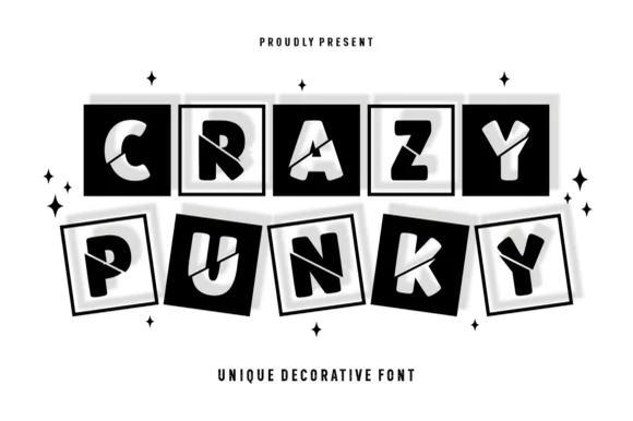
Crazy Punky is a high-contrast monochrome ransom-tile display font placing bold mismatched capitals inside tilted black squares with 3D offset borders.
Crazy Punky is a tilted three-dimensional shadow-box ransom-tile display: each letter sits on its own dark tile, tilted a few degrees in alternating directions, with a hard offset shadow under the tile and a white chalky edge around the shape. The tilt grows the word's box and the tiles read as cut paper letters. It needs roughly 30 mm for the tile edge and the shadow to read, and it is best as a flat two-colour print on white, or a one-colour cut file where the tiles are separate pieces.
Recommended project & layout
Comedy/commentary YouTube thumbnail, zine & poster — Stack 2 five-letter words centered on stark white and scatter tiny four-point stars around.
Before you cut or print
Shines on black-and-white thermal stickers, print posters, and DTF shirts; avoid small cut vinyl due to thin 3D frame lines.
Best paired with
Get fontPaid link
 #5 · Standout Silhouette
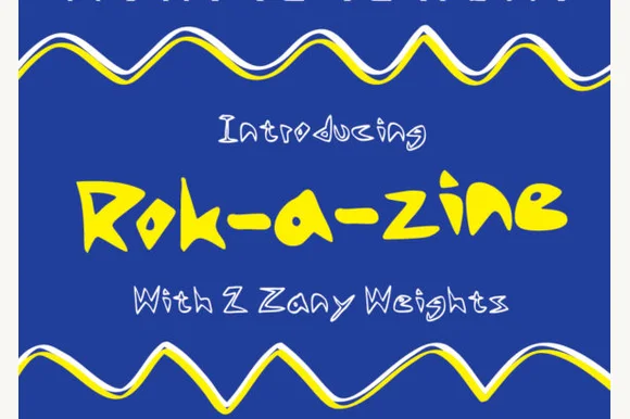
Rok-a-zine
Rok-a-Zine is a zany hand-drawn display in yellow with a black outline on blue: irregular caps with zigzag arms and slanted strokes, letters that tilt at different angles, and a wavy ribbon border that frames the page top and bottom.
The word is set across the middle and the drawing is deliberately unstable: the R leans right, the k drops below the baseline, the a is a round blob with a tail, and the strokes vary in width from letter to letter, so the line looks like a marker tag rather than a typeface. A heavy black outline wraps each letter and the outline is as thick as the strokes in places, which is what keeps the yellow readable on the blue field. The characters are wide and closely spaced, so the word reads as a single wobbling shape, and the counters stay open enough to keep it legible. The frame is a wavy ribbon in white and yellow that repeats the same hand, and the two caption lines are set in a scrawled caps cut, so the whole page is one visual voice.
Recommended project & layout
Art-class zine cover, music-camp tee & bulletin board — Set main titles in the chunky Solid weight (48–84 pt) and subheaders in the open Inline weight below.
Before you cut or print
Solid weight has zero fussy grunge—super fast and clean to cut on Cricut cardstock, vinyl, and HTV down to 0.7 in!
Best paired with
Get fontPaid link
 #6
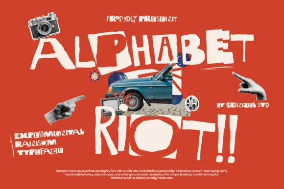
Alphabet Riot
Alphabet Riot is a bold, gritty street-collage ransom font mixing solid hand-cut block letters with tilted cutout boxes and exclamation energy.
Alphabet Riot is a mixed-case collage display that blends solid hand-cut block letters with tilted cutout boxes, giving the ransom-note instability of a pasted street poster. Tilt and size vary deliberately between glyphs, so a word looks assembled, and the solid blocks keep it legible despite the chaos. It needs roughly 20 mm for the tilt to read as style rather than error, and it is a flyer, sticker and zine face. Setting a long sentence is futile: the face works on two or three words with a graphic payoff.
Recommended project & layout
Indie rock gig poster, skate video title & zine cover — Set 2 bold lines in off-white over vermilion red, cobalt, or charcoal mixed-media photo collages.
Before you cut or print
Chunky solid/cutout shapes print and screen-print boldly, and even cut on large 1.75 in+ hoodie HTV!
Best paired with
Get fontPaid link
 #7
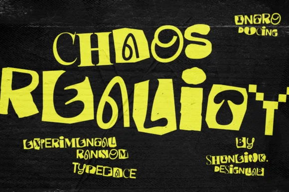
Chaos Reality
Chaos Reality is an experimental brutalist ransom display font mixing chunky blocks, coiled spirals, and warped mixed-weight letterforms.
Chaos Reality is an experimental ransom display in which each glyph is warped on a different axis, cases are mismatched within a single word, weights jump between characters and baselines tilt independently. The deliberate inconsistency means a word cannot be tracked or aligned normally, and the tallest and shortest glyphs set the line box. It needs roughly 26 mm for the warp to read as intent rather than error, and it is best in flat black on cheap white and newsprint, where the mixed weights stay legible.
Recommended project & layout
Underground rave poster, experimental zine & album sleeve — Set 2 bold lines in acid lime or stark white on black concrete textures with +5 tracking.
Before you cut or print
Solid vector edges (no grunge dust) cut cleanly on 1.25 in+ streetwear HTV and laptop slaps—watch the thinner 'C/H' stems.
Best paired with
Get fontPaid link
 #8
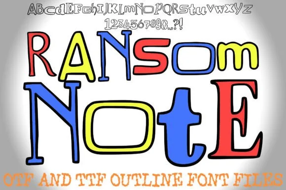
Ransom Note
Ransom Note (by squeebcreative) is an installable hand-drawn outline ransom font mixing mismatched serif, slab, and block letters ready to color.
Ransom Note is a hand-drawn ransom alphabet in which every letter is cut from a different source: mixed serif and sans shapes, uneven plate sizes, torn edges, taped corners and outline-only variants. The outlines are open, so the face can be coloured, and the mixing is deliberate, which means a word cannot be aligned or tracked normally. It needs roughly 28 mm for the torn edge and the plate joins to read, and it is best in flat black on newsprint, or coloured in with two crayon-bright inks on cheap white stock.
Recommended project & layout
Detective-mystery classroom game, worksheet & bulletin board — Print the pure outline glyphs at 64–110 pt on white paper, or drop bright solid colors inside each letter in Canva/Procreate.
Before you cut or print
Designed for print, worksheets, and Print-Then-Cut stickers—thin outline walls are too narrow for small vinyl weeding.
Best paired with
Get fontPaid link
 #9
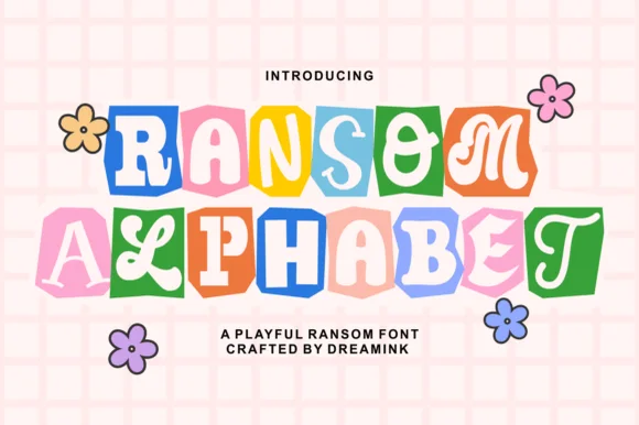
Ransom Alphabet
Ransom Alphabet is a cheerful, kid-friendly ransom-cutout font pairing groovy 70s, serif, and bubble letters inside colorful rounded paper tiles.
A pale pink colour font on grid paper with retro daisy doodles: stacked words alternate colourful tilted paper squares in blue, orange, pink, lavender and green with unboxed groovy characters, so the same face can read as a scrapbook ransom or as a friendly sticker sheet. The softened palette is what separates it from the punk end of the ransom idea, and the mixed tiles keep a short word lively without an extra graphic. Because the tiles are solid, the size floor comes from the smallest interior letter. The grid and daisies behind are staging that names the register rather than glyphs.
Recommended project & layout
Teacher binder cover, scrapbook album & classroom door — Stack 2 centered words over grid-paper backgrounds accented with hand-drawn flower doodles.
Before you cut or print
Designed for color Print-Then-Cut stickers, digital GoodNotes covers, sublimation, and DTF shirts.
Best paired with
Get fontPaid link
 #10
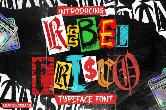
Rebel Frisco Graffiti Urban Y2k
Rebel Frisco Graffiti Urban Y2k is a wild cut-out ransom-note decorative font mixing brick-wall blocks, dollar signs, blackletter, and newspaper clippings!
Rebel Frisco is a cut-and-paste punk zine alphabet built from brick-wall fragments and stolen type: every letter sits on a torn paper scrap, the scraps overlap at different angles, some letters are photographs of brick and others are photocopied sans, and the edges are ragged with tape marks. The inconsistency is deliberate, so a word cannot be aligned or tracked normally, and the photocopy grain is part of the render. It needs roughly 26 mm for the torn edge and the brick texture to read, and it is best in flat black on cheap white and newsprint, where the mixed greys stay legible.
Recommended project & layout
Punk-rock gig poster, skate-zine cover & true-crime thumbnail — Stack 2 short 4-to-6-letter words big (72–140 pt) and color individual paper tiles in red, yellow, cyan, and white.
Before you cut or print
Intricate brick lines and torn-paper textures inside each tile require print, DTF transfers, or Print-Then-Cut stickers—never weed vinyl!
Best paired with
Get fontPaid link
 #11
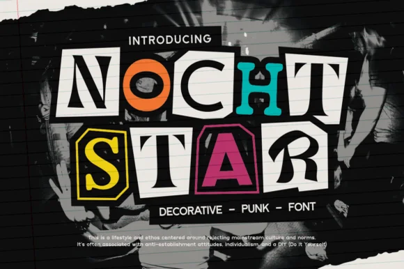
Nocht Star
Nocht Star is an authentic cut-magazine-clipping punk ransom font placing mismatched serif, sans, and stencil letters inside scissor-cut collage boxes!
Nocht Star is a DIY punk zine ransom face built from cut magazine clippings: each letter is a different torn paper tile with a visible cut edge, mismatched type styles inside the tiles and a hard photocopy contrast. The mismatched tiles are the design, so the face already looks assembled and any added texture pushes it into mud. It needs roughly 26 mm for the cut edge to read, and it is best as a one-colour photocopy or a flat black print on uncoated stock.
Recommended project & layout
90s/Y2K pop-punk band merch tee, burn-book cover & sticker — Stack 2 short words huge (80–160 pt), coloring individual clipping tiles in black, white, hot magenta, cyan, and yellow.
Before you cut or print
Clean, crisp scissor-cut polygons (zero tiny grunge specks!) actually cut on 1.3 in+ Cricut HTV & Print-Then-Cut stickers—and rock on DTF hoodies!
Best paired with
Get fontPaid link
 #12
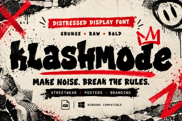
Klashmode
Klashmode is a raw, rebellious street-grunge display font mixing chunky tilted uppercase and lowercase blocks with rough ink-stamp edges.
Klashmode is a chaotic punk display that mixes chunky tilted uppercase and lowercase blocks with rough ink-stamp edges, so a word looks assembled from cut-outs rather than set on a baseline. Tilt is baked into each glyph, which means the face already carries the ransom-note instability and only needs a short phrase to work. Ink-stamp roughness sits on the edges, so it survives a low-resolution print, and it needs roughly 18 mm for the tilt to read as intentional rather than as a mistake. It is a sticker, flyer and zine face.
Recommended project & layout
Skatewear chest graphic, punk sticker & zine header — Set 1 mixed-case word across a 10-inch chest underscored by a bold red brush bar and graffiti crown.
Before you cut or print
Solid heavy cores cut on 1.25 in+ hoodie HTV and slap stickers—and print razor-sharp via DTF and screen print.
Best paired with
Get fontPaid link
 #13
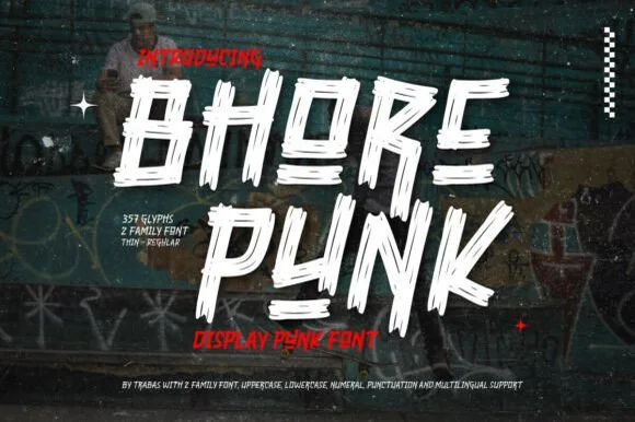
Bhore Punk
Bhore Punk is a fierce, slanted punk-rock display typeface sliced through with diagonal razor-cut stencil splits and jagged dry-brush spurs.
Bhore Punk is a slashed stencil-cut punk and streetwear display: squared letters cut through by three or four parallel slashes, with hard corners, a slightly uneven baseline and small torn bridges left holding the pieces together. The slashes are the design and they merge into solid notches as soon as the face is reduced. It needs roughly 30 mm for the slash and the bridge to read, and it is best as a one-colour vinyl cut or a flat two-colour print on uncoated stock.
Recommended project & layout
Punk gig flyer, skate zine masthead & album cover — Stack 2 short all-caps words tight in stark white and red over high-contrast monochrome photography.
Before you cut or print
For DIY spray-paint stencils or large HTV back prints, scale letters to 2 inches+ so all separated slash fragments stay easy to align.
Best paired with
Get fontPaid link
 #14
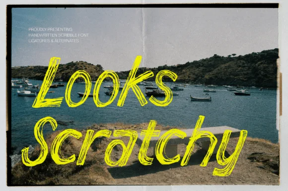
Looks Scratchy
Looks Scratchy mimics urgent, multi-pass sketchbook handwriting where traced double and triple pen lines overlap each letterform.
Looks Scratchy is a scribble script drawn with a ballpoint and an oil pastel in several passes: each letter is a loose looping stroke, the passes overlap so the line doubles back on itself, and the pastel adds a soft wider halo under the pen. The scribble reads as energy rather than as typography, so the word shape matters more than the letter shapes. It needs roughly 30 mm for the double pass and the pastel halo to read, and it is best in one ballpoint blue or black on white, with the halo left as a soft second colour that must not turn muddy.
Recommended project & layout
Indie album cover, polaroid zine caption & poster scrawl — Angle 2-word captions across dark photographic corners in high-visibility acid yellow, chalk white, or crimson.
Before you cut or print
Overlapping hairline scribble loops create dozens of micro-slivers—produce via print, DTF, or digital graphics rather than blade-cut vinyl.
Best paired with
Get fontPaid link
 #15
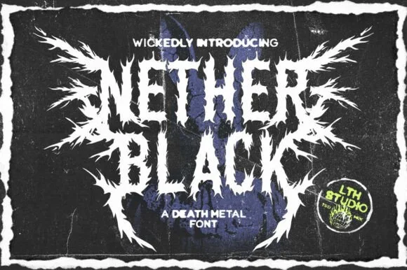
Nether Black
Nether Black is a ferocious death-metal display typeface erupting with symmetrical thorn spikes and splintered outer wings.
Nether Black is a jagged symmetrical death-metal thorn display: dense blackletter-derived stems with spikes thrown from every arm, mirrored ornaments along the vertical axis and a solid inner field that makes each word read as a barbed plate. It is a scene face, so it belongs on a record sleeve and a club flyer rather than on a product label. The spikes are the finest element and they fill into a solid edge when the face is reduced or screened. It needs roughly 40 mm for the spikes and the stems to read, and it is best one white ink on a black ground or the reverse.
Recommended project & layout
Haunted-attraction merch hoodie & horror gig poster — Stack two short 4-to-6-letter words centered on a black garment back, using the winged outer alternates only on the first and last letters.
Before you cut or print
Skip cut-and-weed vinyl on the razor-fine thorn tips—use DTF transfers, screen printing, or high-resolution poster print instead.
Best paired with
Get fontPaid link
 #16
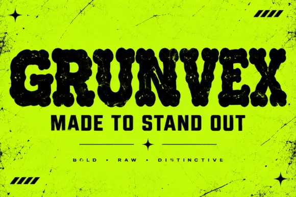
Grunvex
Grunvex is an ultra-heavy, puffy street-block display font combining rounded graffiti-slab silhouettes with subtle worn-ink texture.
Grunvex is an ultra-heavy puffy street-block display with rounded graffiti-slab silhouettes, tightly touching capitals, tiny slit counters and a subtle worn-ink bite on the edges, so a word reads as a painted block panel rather than a tag. The slit counters are very small, which means the face needs size to stay legible, and the touching letters make the word behave as one mass. It needs roughly 34 mm for the slits to read, and it is best in jet black on acid yellow or in one flat ink on a dark ground.
Recommended project & layout
Rave/punk flyer, streetwear chest bar & YouTube thumbnail — Set 1 uppercase hero word at 72–130 pt with tight -5 tracking above solid condensed subheaders ('MADE TO STAND OUT').
Before you cut or print
Best for screen print, DTF hoodies, and posters; if cutting large 2 in+ vinyl, Contour out the sparse internal specks.
Best paired with
Get fontPaid link
 #17
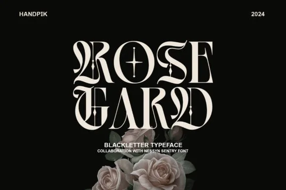
Rose Gard
Rose Gard is a sleek, high-contrast modern blackletter featuring calligraphic hairline loops, razor-sliced stems, and a star-crossed O.
Rose Gard is a sharp high-contrast blackletter drawn for editorial use: fine hairlines against dense black stems, pointed diamond terminals, tight vertical rhythm and a clean baseline that lets it sit inside a column. The hairlines are the weakest element in print and the terminals are what survive at display size. It needs roughly 30 mm for the diamond terminal and the hairline to read, and it is best in one dense black on a smooth text stock, or a single dark red on cream, and it should never be reversed at small sizes.
Recommended project & layout
Gothic romance cover, dark-academia zine & album sleeve — Stack two short 4-to-5-letter words flush-center at 64–96 pt with generous black negative space around them.
Before you cut or print
Needle-thin hairline loops and interior star crosshairs require print, foil, or digital output—do not weed small vinyl.
Best paired with
Get fontPaid link
 #18
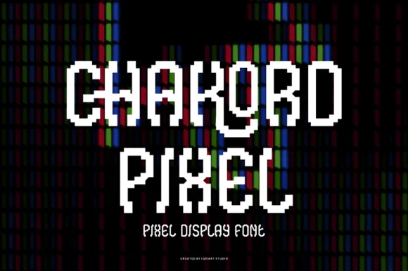
Chakord Pixel
Chakord Pixel builds chunky 8-bit arcade capitals from crisp square pixel blocks with playful notched corners and ligature-like joins.
Chakord Pixel is a stair-stepped eight-bit arcade pixel display: every stroke is built from square cells on a fixed grid, with hard diagonal steps, chunky caps and no anti-aliased curves at all. The grid is the design, so the face must be set on an even multiple of the cell size or the steps break into uneven runs. The corners are the finest element and they crumble when the face is scaled off-grid. It needs roughly 32 mm for the cell to read as a pixel, and it is best one bright ink on a dark ground.
Recommended project & layout
'Level Up' gamer birthday topper & party shirt — Stack 'LEVEL 10' or the birthday kid's gamer tag in two centered lines, backing white letters with a black offset pixel shadow.
Before you cut or print
Because stepped corners create many tiny 90-degree turns, use a fresh 45-degree blade at medium speed so vinyl corners lift sharply.
Best paired with
Get fontPaid link
 #19
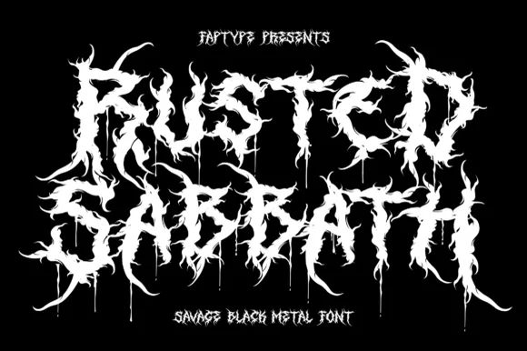
Rusted Sabbath
Rusted Sabbath is a black metal display alphabet in which the stems split into spikes, the counters disappear and the tops of the letters run into flame-like hooks, so a band name reads as a sigil before it reads as words.
The R breaks its bowl into three clawed points, the U turns into a fork, the S carries two rows of spikes, the T raises a crown of thorns and the D ends in a dripping tail, all at a skeletal weight with sharp, irregular terminations and no optical spacing at all. The deliberate illegibility is the character: the face is built to be read as an emblem on a patch or a cassette cover, not as text. Because the points are thin, the face needs 60 pt before the spikes print, and it belongs on one colour over black. The framed black field, the small typewriter caps above and the subtitle below are presentation; the spiked band name is the face.
Recommended project & layout
Horror movie title card, metal tee or punk zine — Pair with tiny clean grotesque credits at the bottom margin.
Before you cut or print
For screen print, DTF and digital graphics.
Best paired with
Get fontPaid link
Practical buyer checklist
Frequently asked questions.
Key cutting, printing and pairing answers before choosing a ransom note, cutout & punk zine typeface.
How do I keep a ransom-note design readable?
Use it for a short word, keep a straight baseline and add tracking between letters. The contrast between chaotic letterforms and a rigid grid is what makes it legible; letting the baseline wander loses the reader in three words.
Can ransom note fonts be cut from vinyl?
The blocky ones can, at 1.5 inches or more. Tiles with torn paper texture carry fine edges that tear away during weeding, so print those instead and keep cutting for the clean geometric variants.
Do ransom fonts include lowercase letters?
Most mix cases deliberately, so the lowercase glyphs are often differently styled capitals. That is the point of the effect, but it means you cannot control case the way you would in a normal font.
What kind of project suits a ransom note font?
Punk and grunge posters, album art, escape-room props, Halloween invitations and zine layouts. It is a poor fit for anything that must feel calm, corporate or trustworthy.
Keep exploring
Related collections & guides.
Explore adjacent maker roundups or check our practical pre-production checklists.
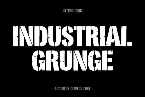
01 / Type Styles
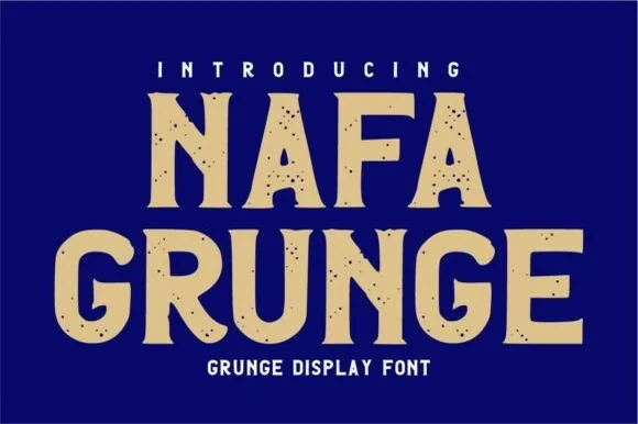
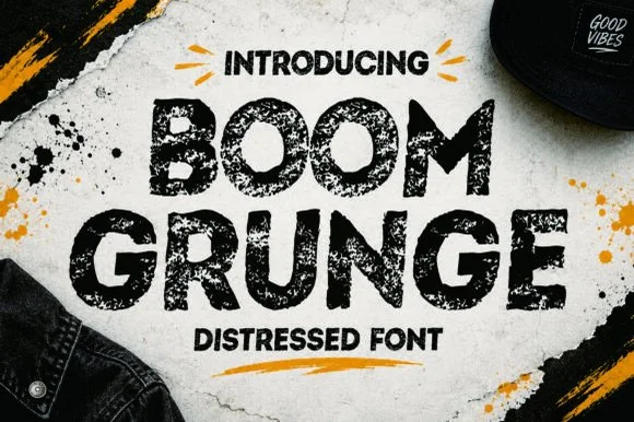
90s grunge, distressed & rock
27 curated fonts · Previews & pairings

02 / Type Styles
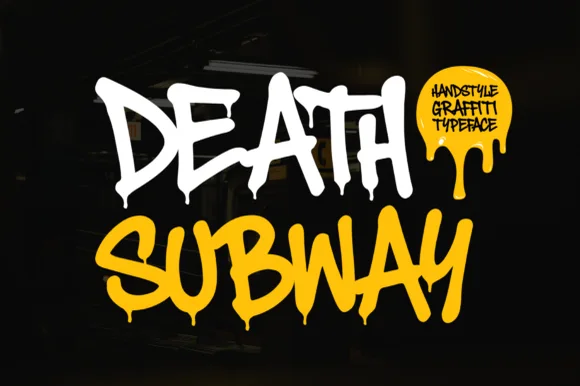
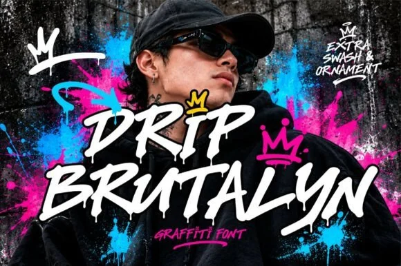
Graffiti, throw-up & street tag
18 curated fonts · Previews & pairings
03 / Type Styles
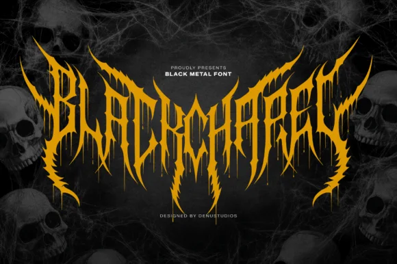
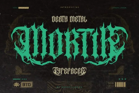
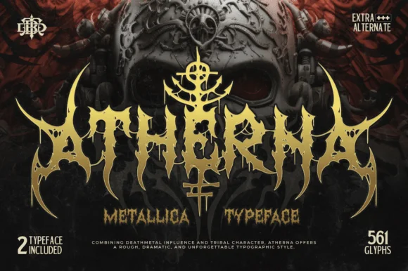
Heavy metal, spiked & horror display
17 curated fonts · Previews & pairings



04 / Cricut & Craft
T-shirts, hoodies & HTV apparel
33 curated fonts · Previews & pairings
Guides: Invitation font checklist · Vinyl & cutting checklist · How to pair script & sans fonts