 #1 · Best Overall
Disclosure: MakerFileHub may earn a commission from qualifying purchases via paid links on this page. How our links work.
Heavy slabs, wood type & Tuscan spurs
26 Best Bold Slab Serif & Woodblock Fonts
A bold slab is the most dependable display device in print: squared feet, even stroke weight and enough presence to stop a reader. Bronco Slab and Bold Chicago carry the ultra-heavy end, Deckle and Match Jersey cover the rounded and collegiate variants, and Western Vintage, Kiron and Blovanta bring the woodblock and Tuscan spurs that turn a slab into a heritage sign.
Quick verdict
Bronco Slab is the heaviest and most useful for signage, Deckle suits a warmer rounded label, and Kiron is the pick for Tuscan detail. Bold Chicago covers the vintage signage look.
Quick answer
Top 3 bold slab serif & woodblock picks right now.
Short on time? Start with our three highest-rated bold slab serif & woodblock standouts before scrolling the full breakdown.
#1 · Best Overall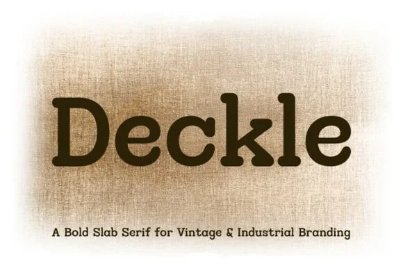 #2 · Runner-Up Pick
 #3 · Editor's Choice
How we tested & selected these 26 fonts
We kept 26 of 446 candidates with genuine slab construction: uniform stems, squared or bracketed feet and a consistent width. Judged on how the slabs hold at 8 ft sign scale, numeral design, and whether the face was drawn as a slab rather than a serif with thick feet.
Side-by-side summary
Top 5 bold slab serif & woodblock picks at a glance.
Compare specimens, OpenType/PUA traits and primary project roles side by side.
| Rank & Font | Style & File Specs | Best Project Fit | Store Listing |
|---|---|---|---|
| Slab SerifRodeo | Rodeo team hoodie, truck-door decal & smokehouse sign | Get fontPaid link | |
| Slab SerifSturdy | Workwear canvas tag, craft brewery coaster & tool roll | Get fontPaid link | |
| Slab SerifChunky | Deep-dish pizza box, diner sweatshirt & craft-beer can | Get fontPaid link | |
| Slab SerifChampionship | Clean Cricut HTV team shirt, senior banner & megaphone decal | Get fontPaid link | |
| Slab SerifLanguage support · File formats | Small-batch hot sauce, BBQ rub & smokehouse label | Get fontPaid link |
Serifs & Slab Serifs
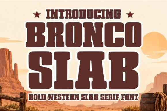
26 fonts#1 · Best OverallBronco Slab Font
Bronco Slab Font is a massive, ultra-heavy Western athletic slab serif built with thick rectangular block feet and rock-solid single-layer mass.
Bronco Slab Font is an ultra-heavy Western rodeo block slab: very thick square stems, slabs as thick as the stems, closed counters and a small notch cut into some letters that reads as a brand mark. The near-solid weight closes the counters first, and the square slabs give a word a foundry weight. It needs roughly 32 mm for the counter and the notch to read, and it is best in one dense ink on sand and cream, or a two-colour build where the slab edge carries a highlight.
Recommended project & layout
Rodeo team hoodie, truck-door decal & smokehouse sign — Stack 2 centered uppercase words tight (0.90 leading) beneath a smaller starred eyebrow header.
Before you cut or print
One of the toughest, most durable fonts for car decals, wood stencils, puff HTV, and leather branding irons.
Best paired with
Get fontPaid link
#2 · Runner-Up PickDeckle
Deckle is a bold, ink-softened slab serif blending classic typewriter mechanics with warm, rounded letterpress corners.
Deckle is a rounded typewriter and letterpress industrial slab serif: even slabbed stems with a softly rounded corner, a slightly irregular baseline that mimics pressed metal type and open counters that stay clean at small sizes. The pressed irregularity is subtle and disappears when the face is reversed or set very small. It needs roughly 20 mm for the rounded slab and the irregularity to read, and it is best in one dense black on uncoated stock, or a single ink with a deboss impression where the slab edge catches light.
Recommended project & layout
Workwear canvas tag, craft brewery coaster & tool roll — Set brand names in title case at 36–60 pt with +10 tracking over raw linen, kraft, or oatmeal stock.
Before you cut or print
Clean outer edges with zero tiny distress holes make Deckle super dependable for vinyl decals, HTV, and rubber stamps.
Best paired with
Get fontPaid link
#3 · Editor's ChoiceBold Chicago
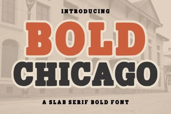
Bold Chicago is a massive, ultra-heavy slab serif with pillowy rounded serifs, tiny circular counters, and vintage street-sign clout.
Bold Chicago is an ultra-heavy rounded slab serif drawn from vintage signage: thick square stems with rounded corners, heavy unbracketed slabs, closed counters and a weight that fills the letter shape almost completely. The near-solid construction means counters vanish first at small sizes, and the rounded corners are what keep it from reading as a plain block. It needs roughly 30 mm for the counters to stay open, and it is best in one dense ink on cream and kraft, or a two-colour build where a shadow carries the depth.
Recommended project & layout
Deep-dish pizza box, diner sweatshirt & craft-beer can — Stack 2 all-caps words in two-tone rust and charcoal wrapped in a unified cream sticker contour.
Before you cut or print
Super fast outer weeding on HTV, puff vinyl, and sign vinyl—just lift the small keyhole counters inside 'B', 'O', 'D', and 'A'.
Best paired with
Get fontPaid link
 #4 · Top Maker Utility
Match Jersey
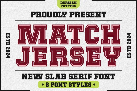
Match Jersey is a clean, non-distressed 6-style varsity slab serif system built for crisp collegiate apparel, cutter vinyl, and team crests.
Match Jersey is a six-style clean collegiate varsity slab family with solid, inline and outline cuts: extended block letters with thick unbracketed slabs and a small terminal notch, repeated across six layer combinations so a shirt, a pennant and a certificate can all be built from one voice. The family needs the right layer chosen per item, and the outline cuts are the weakest element. The solid cut needs roughly 30 mm and the outline 34 mm for their detail to read.
Recommended project & layout
Clean Cricut HTV team shirt, senior banner & megaphone decal — Stack two 10-inch chest lines in maroon and navy, flanking with vertical 'ESTD 2026' side bars.
Before you cut or print
Use the solid cut for fast weeding at small sizes (0.6 in+) and the inline/outline cuts for large 2 in+ chest crests.
Best paired with
Get fontPaid link
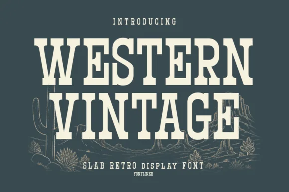 #5 · Standout Silhouette
Western Vintage
Western Vintage is a bold, condensed slab serif with crisp bracketed block feet and tall frontier poster proportions.
Western Vintage is a tall condensed Western saloon slab serif: heavy squared slabs on a narrow body, a very tall ascender, a spurred stem and a set of inline and shadow companions in the same proportions. It is the lettering of a saloon sign and a rodeo poster, so it wants height and one flat ink rather than a soft palette. The slab spurs are the finest element and they fill first at small sizes. It needs roughly 38 mm for the slab and the spur to read, and it is best on a painted board or a kraft ground.
Recommended project & layout
Small-batch hot sauce, BBQ rub & smokehouse label — Arch 'WESTERN' or the brand title slightly at +15 tracking above a horizontal divider rule and a bold heat-level badge.
Before you cut or print
Straight block slabs and open counters weed cleanly on adhesive vinyl, stencil film, and leather laser-engraving down to 0.6 in.
Best paired with
Get fontPaid link
 #6
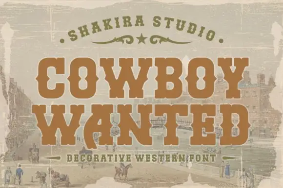
Cowboy Wanted
Cowboy Wanted sets a heavy western slab in warm brown on a sepia landscape, its serifs bracketed, its corners spurred and its strokes slightly worn at the edges.
COWBOY over WANTED fills the frame, the O and the C keeping wide bowls and the W carrying a central spur that splits the letter into two V shapes. Serifs are thick and squared, and the whole line sits on a faded frontier scene, with an arc of small caps above and a tracked caption below. The wear is even rather than dramatic, so the letters keep their edges at poster size and soften at small size. It is a period display face, and its use is narrow on purpose: wanted posters, event bills and packaging that has to look printed in the previous century.
Recommended project & layout
A western-party invitation title — Stack COWBOY above WANTED on a plain cream invitation with the venue on a separate white reverse.
Before you cut or print
Confirm counters and source any town scene independently.
Best paired with
Get fontPaid link
 #7
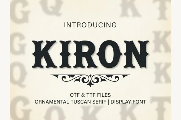
Kiron
Kiron is a clean, heavy Western Tuscan display serif with crisp diamond median spurs, flared bracketed serifs, and solid single-layer geometry.
Kiron is a Tuscan slab serif with a median spur: heavy unbracketed slabs that split into a fork at the foot, a spur that rises from the middle of some stems and a decorative notch where the stem meets the slab. The forked slabs are the design and they close first when the face shrinks. It needs roughly 30 mm for the fork and the spur to read, and it is best in one dense ink on cream, or a single dark red on buff where the forks print as crisp cuts.
Recommended project & layout
Smokehouse BBQ sign, hot-sauce bottle & Western hat patch — Center all-caps brand names at 48–80 pt with +12 tracking above a symmetrical Victorian scroll divider.
Before you cut or print
Clean vector outlines with zero inline gaps make Kiron one of the easiest Western fonts to weed on HTV and sign vinyl down to 0.8 in.
Best paired with
Get fontPaid link
 #8
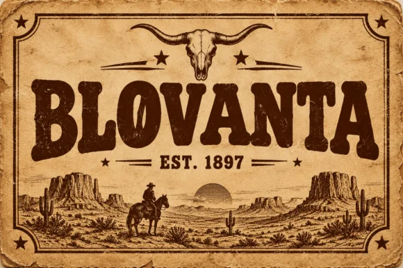
Blovanta
Blovanta is a heavy, weathered Western display serif featuring chunky flared stems, a notched 'O' crossbar accent, and vintage ranch grit.
Blovanta is a weathered woodblock Western saloon display serif: heavy unbracketed slabs with chipped edges, a slightly uneven baseline that mimics hand-set timber type and a surface where the ink coverage breaks into patches as if the block had worn. The chips are the design and they silt when the face is reversed or printed small. It needs roughly 30 mm for the chip and the slab to read, and it is best in one dense ink on uncoated stock, or a single ink with a slight deboss where the block edge catches light.
Recommended project & layout
Smokehouse sign, rodeo tee & rustic cabin wood plaque — Center an all-caps ranch or town name at 60 pt above flanked 'EST. 1897' horizontal rules on kraft or cedar backgrounds.
Before you cut or print
Interior woodblock speckles print and laser-engrave superbly; if cutting adhesive vinyl, weld/flatten tiny interior specks first.
Best paired with
Get fontPaid link
 #9
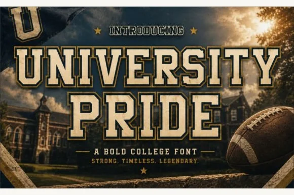
University Pride
University Pride is a commanding collegiate varsity slab serif featuring chamfered block stems framed by a crisp outer contour line.
University Pride is a double-outlined collegiate stadium varsity slab: extended block letters with a hard keyline inside a second keyline, thick unbracketed slabs and a small inward notch on the terminals that reads as a stadium banner. The double outline doubles the footprint and the inner line closes first. It needs roughly 32 mm for the second keyline and the notch to read, and it is best in two flat inks on jersey and banner mesh, or three inks where paper forms the second line.
Recommended project & layout
Alumni sweatshirt, homecoming banner & varsity jacket — Set school or department names across a 10-inch chest arch above flanked star dividers and graduation years.
Before you cut or print
Because every letter carries a thin outer border gap, cut HTV at 1.4 inches tall or larger, or use DTF/screen print for smaller crest text.
Best paired with
Get fontPaid link
 #10
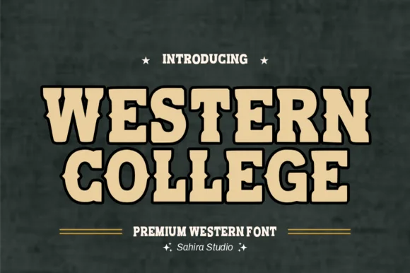
Western College
Western College fuses stout collegiate varsity block slabs with pointed frontier waist spurs for Texas/Montana campus and rodeo gear.
Western College is a hybrid display that fuses stout collegiate varsity slabs with pointed frontier waist spurs and a heavy drop outline, so a word reads as a college team wearing a rodeo badge. The double structure is dense, which means the face needs size to keep the outline and the spur separate, and the wide stance fills a panel with a short name. It needs roughly 30 mm for the spur and outline to read, and it is best in sand tan inside black on slate or two athletic colours on white.
Recommended project & layout
College rodeo-team hoodie, FFA jacket & tailgate banner — Stack 2 centered uppercase lines at 60–115 pt in sand/gold inside a 0.08 in black outline on forest green or maroon.
Before you cut or print
100% smooth, solid single-layer shapes cut and layer fast on Cricut HTV, twill patches, and Oracal 651 down to 0.7 in!
Best paired with
Get fontPaid link
 #11
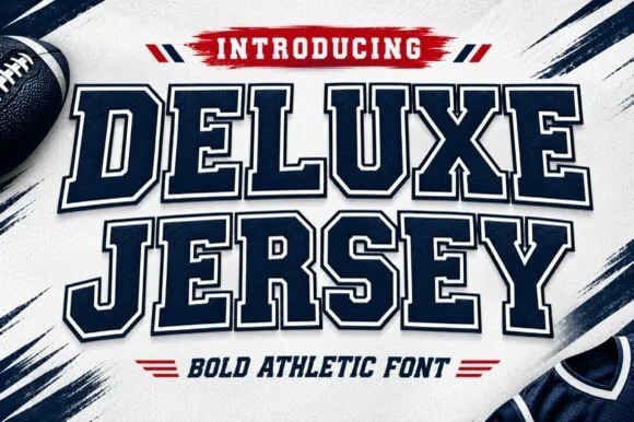
Deluxe Jersey
Deluxe Jersey is a classic double-outlined collegiate varsity slab serif built for athletic chests, senior jerseys, and team banners.
Deluxe Jersey is a collegiate varsity block slab with an inline border: extended block letters with thick unbracketed slabs, a thin keyline running just inside the outer edge and a small notch on the terminals that reads as a stitched jersey patch. The inline border doubles the footprint and closes first when the face is reduced. It needs roughly 32 mm for the border and the notch to read, and it is best in two flat inks on jersey, or one thread colour on a patch where the border becomes an inner stitch line.
Recommended project & layout
Senior-night jersey chest, spirit hoodie & megaphone decal — Arch the school or team name slightly across a 10.5-inch chest width above large centered player numerals.
Before you cut or print
Because the built-in outer outline creates a thin channel around every letter, scale HTV cuts to at least 1.5 inches tall or use DTF/sublimation for tiny badges.
Best paired with
Get fontPaid link
 #12
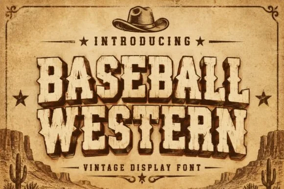
Baseball Western
Baseball Western blends classic American ballpark slabs with Wild-West Tuscan median spurs and rustic parchment distressing.
Baseball Western is a woodblock serif built from spurred saloon lettering: bracketed slab slabs, a heavy vertical stress, sharp spur points on the E, G and J, and a small internal shadow line that mimics a carved block. The spurs break the silhouette outward, so the artwork box grows at every word. It needs roughly 34 mm for the spur and the shadow line to read, and it is best in warm black or oxblood on sand and raw board.
Recommended project & layout
Texas-rodeo baseball tournament tee, BBQ smokehouse & cap — Arch or stack 2 uppercase words in sand-tan with dark-brown drop shadow under a cowboy-hat or star crest.
Before you cut or print
Subtle rustic wear prints and laser-engraves great on leatherette patches; solid cores also cut on 1.25 in+ HTV.
Best paired with
Get fontPaid link
 #13
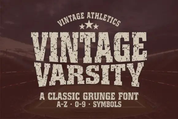
Vintage Varsity
Vintage Varsity is a condensed athletic capital alphabet with heavy flat slabs and a cracked wear texture, so a short word reads as a printed team jersey from decades ago.
The letters are narrow and tall: the V closes to a sharp point, the A keeps a low bar, the R carries a straight leg and the S reverses through flat terminals, with slabs at every stem and no bracketing. The wear is drawn into the letterforms rather than applied as an effect: cracks run through the slabs and a few counters show chipped edges, which is what gives the face its printed-jersey look. Weight is heavy and uniform, the fit is tight enough that a long team name holds a single line, and because the texture is coarse the face needs a decent size to stay legible. The dark ground, the cream ink, the star rule and the two small caption lines are presentation; the typeface is the two words.
Recommended project & layout
A reunion match poster — Keep dates and scores in a clean companion face.
Before you cut or print
Inspect cracks in the narrowest strokes.
Best paired with
Get fontPaid link
 #14
Varsity Spirit
Varsity Spirit is a layered varsity capital alphabet in which each letter carries an inline stroke, a keyline and a set of matching numerals, so a team name reads as the appliqué on a college jacket.
The V cuts two thick diagonals with an inline running between them, the S holds a stepped spine, the A pinches a flat apex, the R turns a notched leg and the numerals carry the same inline and keyline, all at a heavy slab weight with square serifs. The inline is the character: it divides each stroke into two bands, which is why the sample sets a stacked word above a full numeral line. Because the inline is narrow, the face needs 40 pt before it stays open, and each layer has to be a clean vector for a vinyl or embroidery cut. The white timber ground, the format strip and the small badge are presentation; the black and white layered words are the face.
Recommended project & layout
A school-spirit event poster — Put a broad title over a separate plain schedule and keep the inner lines away from background patterns.
Before you cut or print
Check every required numeral and letter rather than assuming the sample alphabet is complete.
Best paired with
Get fontPaid link
 #15
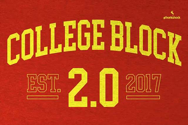
College Block 2.0
College Block 2.0 displays yellow block lettering on textured red, where the main title curves upward across a shallow arc and EST. and 2017 appear as thin hollow outlines beside a much larger solid 2.0 with clipped corners.
The blocks stay square and heavy, the counters narrow to rectangles, the secondary words thin into outlines and the main row follows an arc. That three-level treatment is the character: the sample builds a date lockup from one face by changing scale and outline, which is why the texture sits in the ground rather than the letters. The arch is a composition choice, not a font feature. Keep 44 pt, build the arc in your layout tool and check the thin outlines at the size you plan.
Recommended project & layout
An alumni programme cover — Arc COLLEGE gently over a straight REUNION line on a red programme cover; put the class year below with generous space.
Before you cut or print
Check the exact year and whether hollow styles are supplied or must be drawn separately.
Best paired with
Get fontPaid link
 #16
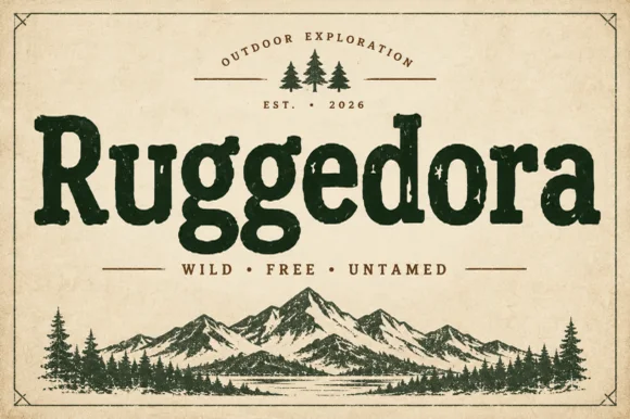
Ruggedora
Ruggedora is a heavy, softly distressed vintage slab serif with plump rounded bowls, bracketed feet, and weathered trail-sign warmth.
Ruggedora is a worn Cooper-style vintage slab serif: heavy bracketed slabs, a rounded stem, and a surface that is chipped along the contour with small voids inside the stroke so the letter reads as letterpress kept in a drawer. The wear is drawn, so a one-colour print keeps it, and the bracket is what closes first at small sizes. It needs roughly 30 mm for the bracket and the chips to read, and it is best in one dense ink on kraft and newsprint, or white on a dark board where the chips print as lights.
Recommended project & layout
Campfire enamel mug, national-park patch & overland decal — Center the main title in forest green, rust, or charcoal above wide-tracked sans mottoes ('WILD · FREE · UNTAMED') and pine icons.
Before you cut or print
Solid interior letter bodies allow clean HTV and outdoor car-decal weeding down to 0.85 inches.
Best paired with
Get fontPaid link
 #17
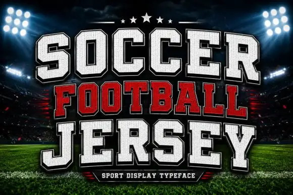
Soccer Football Jersey
Soccer Football Jersey is a layered athletic capital alphabet in which each letter carries a stitched fill, a heavy keyline and an offset shadow, so a team name reads as the appliqué on a match jersey.
The S steps a heavy spine, the O closes a tall block, the C cuts a square crescent, the F sets a wide arm and the R turns a blunt leg, all at a jersey weight with square corners, a fill drawn as fabric and a contour that runs around the whole word. The layers are the character: the sample builds each line from fill, keyline and shadow, which lets one word carry three colours without extra artwork. Because each layer is a separate vector, every edge has to be clean, and the offset must repeat exactly or the word looks broken. The floodlit stadium, the stars, the ball and the small bottom banner are presentation; the white and red jersey words are the face.
Recommended project & layout
A school football-day programme — Use a straight title above a plain fixture list.
Before you cut or print
Verify numerals and school permissions.
Best paired with
Get fontPaid link
 #18
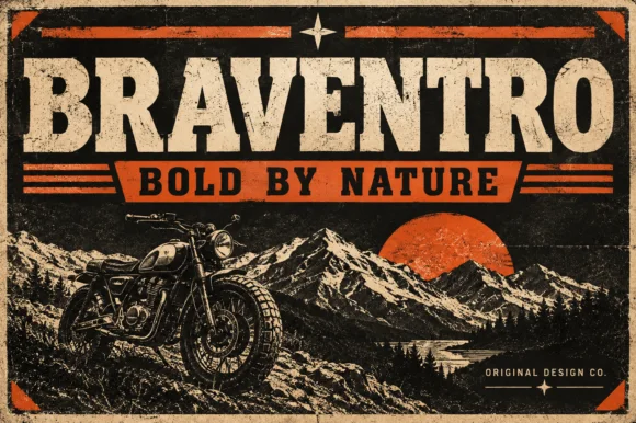
Braventro
Braventro is a heavy heritage slab in which the brackets run broad, the counters stay compact and the stems carry sign-letter weight, so a two-word heading reads as a stencilled tin sign for an outdoor brand.
The B stacks two dense bowls, the R keeps a compact bowl over a heavy leg, the A carries a wide apex with a low crossbar and the V drops two thick diagonals into a narrow point, all at a sign weight with bracketed serifs and small counters. The density is the character: the letters sit close and the ink covers most of the box, which is why the sample sets a short phrase on a plain tin ground. Because the counters are small, the face wants 30 pt before they stay open, and it holds from three quarters of an inch of cap height on wood, acrylic or vinyl. The rivets, the rust texture and the small subline are presentation; the heavy slab words are the face.
Recommended project & layout
Garage metal sign, craft beer label or leather hat patch — Pair with a ribbon banner subline in bold sans capitals.
Before you cut or print
OTF display font; solid bold edges cut cleanly on stencils and vinyl.
Best paired with
Get fontPaid link
 #19
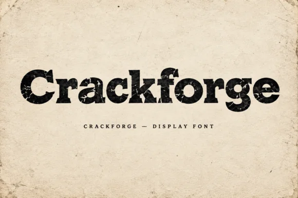
Crackforge
Crackforge is a heavy slab display alphabet in which the stems stay thick, the serifs turn square and the surface breaks into fine cracks, so a word reads as a cast metal plate that has been outdoors for years.
The C cuts a square crescent, the r turns a blunt arm, the a closes a small bowl on a heavy stem, the c repeats the square cut, the k splays two thick diagonals and the f carries a wide bar, all at a bold slab weight with square serifs and a cracked texture drawn into the fill. The crack pattern is the character: it sits inside the strokes rather than on the outline, which is why the sample sets mixed case on a plain ground and lets the surface do the work. Because the strokes are solid, the face reads from 30 pt and prints in one ink; the cracks disappear below that size. The aged paper ground, the torn edges and the small caps line beneath are presentation; the black display word is the face.
Recommended project & layout
Hot-sauce bottle label, distressed band tee or pub poster — Print large in dark ink on kraft/cream paper or off-white ink on black shirts.
Before you cut or print
Internal crack fissures are built for DTF, screen printing and print — not blade vinyl cutting.
Best paired with
Get fontPaid link
 #20
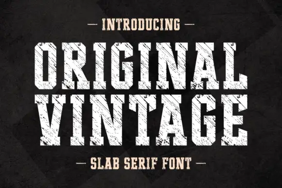
Original Vintage
Original Vintage uses tall white slab capitals with clipped corners and dense diagonal cuts. The scratch direction crosses both rows with a consistent angle, producing a striated surface rather than scattered chip damage, while the black charcoal background stays separate from the letter texture.
The stems stay tall, the corners clip, the feet stay square and the wear runs in one direction. That consistent scratch angle is the character: the letters look planed rather than chipped, which is why the two rows share the same grain. Fine diagonal gaps need a large plain setting, so keep 40 pt as the floor, avoid placing them over texture and check the numerals and punctuation your layout actually uses before promising a full retro system. The diagonal gaps are the fragile cut: below 30 pt they read as dirt on the plate, so keep 40 pt and set the word on a plain ground rather than over texture.
Recommended project & layout
A restoration story opener — Put BACK TO WORK across a black chapter panel, with a restored-tool image on the facing page and plain captions beneath.
Before you cut or print
Check the diagonal gaps in the actual size and keep long text in another face.
Best paired with
Get fontPaid link
 #21
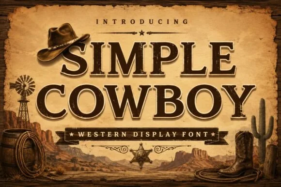
Simple Cowboy
Simple Cowboy is a wide, authoritative Western slab serif featuring crisp bracketed block feet and fine interior inline bevel lines.
Simple Cowboy is an inline-chiselled Western frontier slab serif: heavy unbracketed slabs, a carved inline running down each stem, exaggerated spur serifs on the diagonal strokes and a high cap height that reads as a routed ranch sign. The inline is the design and it fills when the face is reversed or printed small. It needs roughly 30 mm for the inline and the spur to read, and it is best in one dense ink on timber-grey stock, or a routed cut where the inline becomes a groove.
Recommended project & layout
Country music merch, leather-goods stamp & steakhouse menu — Stack 2 centered uppercase lines above a starred ribbon banner, using +15 tracking for crisp frontier balance.
Before you cut or print
In print, sublimation, and laser wood signs, the fine inline bevel pops sharply; if cutting small vinyl, fill/weld the thin inner line first.
Best paired with
Get fontPaid link
 #22
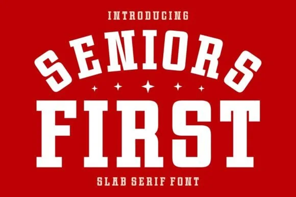
Seniors First
Seniors First is a solid, single-layer collegiate block slab serif with stout rectangular feet, chamfered bowls, and punchy athletic balance.
Seniors First is a chunky varsity block athletic slab serif: extended block letters with thick unbracketed slabs, a small notch cut into the terminals and an even weight that reads as a stadium jersey number. The wide blocks fill a banner and the notch closes when the face is reduced. It needs roughly 30 mm for the notch and the slab to read, and it is best in two flat inks on jersey and felt, or one ink on banner mesh at gate distance.
Recommended project & layout
Class-of-2027 hoodie, senior yard banner & car-window decal — Arch the top word at a 20% curve over small four-point stars and anchor the second word straight underneath.
Before you cut or print
Cuts cleanly at almost any craft scale from 0.5-inch cap badges up to 11-inch jersey backs.
Best paired with
Get fontPaid link
 #23
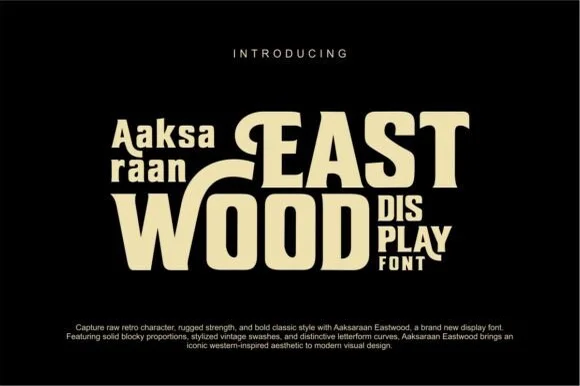
Eastwood
Eastwood is a bold retro-Western display font pairing chunky block proportions with sweeping horizontal swash bars and notched spurs.
Eastwood is a retro Western slab display with swash caps: heavy bracketed slabs, a flared stem that widens at the foot, and capital letters that open into long curled swashes above the line. The swashes grow the word box upward, and the flared feet are the first thing to close at small sizes. It needs roughly 32 mm for the flare and the swash curl to read, and it is best in one warm ink on sand and cream, or a single deep colour on a pale board where the flare prints as a clean wedge.
Recommended project & layout
Roastery coffee bag, craft-jerky pouch & retro saloon tee — Lock smaller two-line descriptors ('DIS / PLAY' or 'EST / 2026') neatly underneath extended 'T' or 'E' top bars.
Before you cut or print
Solid cream-on-black vector shapes with zero distress pits cut cleanly on HTV, mug vinyl, and wood stencils down to 0.9 in.
Best paired with
Get fontPaid link
 #24
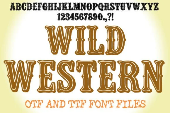
Wild Western
Wild Western is a playful cowboy Tuscan slab font featuring open color-in inline centers alongside crisp Western spurs (OTF & TTF).
Wild Western is a colorable inline-outlined Western cowboy Tuscan slab: heavy unbracketed slabs that split into a forked foot, a wide inline running down each stem and a small spur at the shoulder, delivered so the inline can be filled with any colour. The forked feet are the design and they close first when the face is reduced, and the inline invites a second colour. It needs roughly 32 mm for the fork and the inline to read, and it is best as a two-colour flat print on uncoated stock, or a one-colour cut where the inline becomes a knock-out path.
Recommended project & layout
Western reading-week banner, color-in worksheet & party hat — Set large 72–120 pt headers on white cardstock for classroom coloring, or fill centers with warm saddle tan in Canva.
Before you cut or print
Great for print, Print-Then-Cut, and wood laser scoring; if cutting small vinyl, use solid fills or scale above 2 inches.
Best paired with
Get fontPaid link
 #25
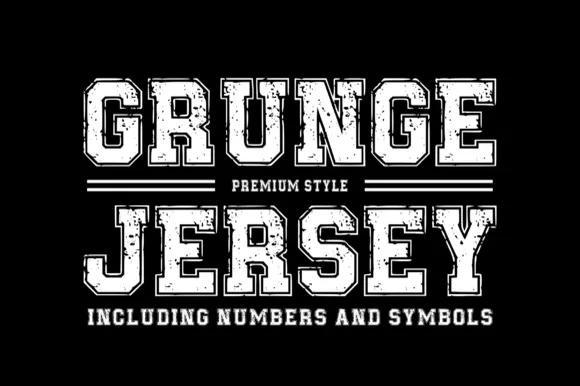
Grungejersey Regular
Grungejersey Regular is a classic collegiate athletic slab serif combining double-inline jersey borders with subtle weathered gym-shirt distress.
Grungejersey Regular is an athletic varsity slab with an inline border and a distressed surface: thick block letters, a fine rule drawn inside the contour, and a worn edge that chips the outer line at irregular intervals. The inline is the structure, so the distressed chips must not cross it or the letter breaks. It needs roughly 32 mm for the inline rule to read as a separate line, and it is best in one dark ink on heather grey or cream, and it should never be reversed at small sizes.
Recommended project & layout
Vintage intramural tee, alumni tailgate hoodie & gym poster — Set 2 centered uppercase lines framed by horizontal double-rule bars above jersey numbers.
Before you cut or print
Subtle grunge specks + thin inline borders make Grungejersey ideal for DTF transfers, screen printing, and sublimation rather than blade-weeded HTV.
Best paired with
Get fontPaid link
 #26
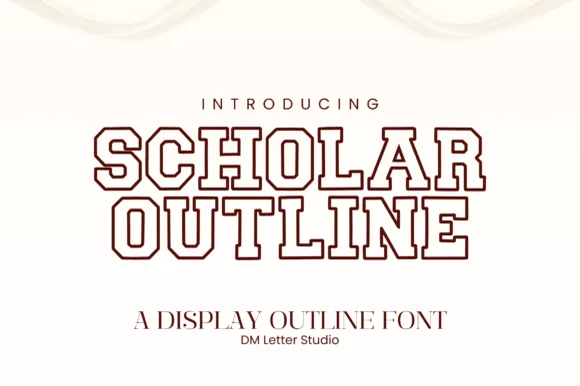
Scholar Block Outline
Scholar Block Outline is a clean, double-contoured collegiate varsity slab serif with octagonal corners and multilingual support.
Scholar Block Outline is a collegiate varsity slab drawn as a double line: the letter is an outline with a second outline running inside it, so every stem reads as two parallel tracks with a narrow channel between them. The channel is the whole design and it closes first at small sizes, and the double line makes a heavy face look light on a light ground. It needs roughly 32 mm for both lines and the channel to read, and it is best in one dark ink on white or heather grey, or a two-colour build where the outer line takes the second colour.
Recommended project & layout
Senior hoodie chest arch, grad banner & notebook cover — Stack 2 centered uppercase lines at 60–110 pt in varsity maroon, navy, or forest green on heather-gray or cream garments.
Before you cut or print
Because it cuts two thin parallel outline rings, scale HTV/vinyl above 1.75 inches tall, or use DTF/sublimation for smaller badges.
Best paired with
Get fontPaid link
Practical buyer checklist
Frequently asked questions.
Key cutting, printing and pairing answers before choosing a bold slab serif & woodblock typeface.
What is the difference between a slab serif and a bold serif?
A slab has serifs as thick as its stems with unbracketed joins, while a bold serif keeps bracketed transitions between stem and serif. The slab reads mechanical and the bold serif reads classical.
Which slab serifs work best for signage?
Ultra-heavy faces with squared feet and open counters, cut or printed at 8 inches or more. At that scale a slab reads from across a car park, which is why it dominates hardware, ranch and brewery signage.
Can bold slabs be used for body text?
Only in short measures. The heavy feet and tight counters slow reading in paragraphs, so use them for heads, labels and captions, and set any long text in a light or regular serif.
Do slab fonts include a proper set of numerals?
Most include 0 to 9, and the heavy ones usually make excellent price figures. Check that numerals share a width with the letters if you plan a table or an address block.
Keep exploring
Related collections & guides.
Explore adjacent maker roundups or check our practical pre-production checklists.
01 / Type Styles
Western & vintage label
23 curated fonts · Previews & pairings
02 / Branding & Print
Varsity & athletic
25 curated fonts · Previews & pairings
03 / Branding & Print
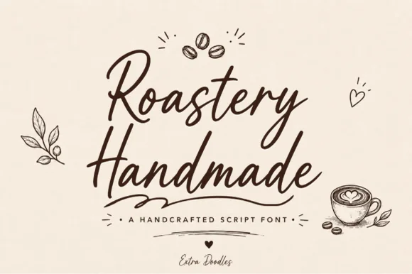
Coffee shop, roastery & café branding
22 curated fonts · Previews & pairings
04 / Branding & Print
Whiskey, craft beer & spirits labels
21 curated fonts · Previews & pairings
Guides: Invitation font checklist · Vinyl & cutting checklist · How to pair script & sans fonts