Modern Grotesque Body

Chicago Titans + Memoir Slang
Creates crisp high-hierarchy contrast beneath Chicago Titans headlines across menus, websites and labels.
Inspect Memoir Slang specimenDisclosure: MakerFileHub may earn a commission from qualifying purchases via paid links on this page. How our links work.
Very heavy rounded sport slab capitals
Chicago Titans pushes slab weight to its limit: thick stems, counters narrowed to slots, wide flat feet and almost no space left between the letters of a word.
Paid link
Get this fontProject & layout blueprintsAt-a-glance maker compatibility
Sturdy stroke walls and open counters weed cleanly on adhesive vinyl, HTV apparel film, and cut cardstock.
Visual anatomy & craft review
Stems are extremely wide relative to the height, so the counters in a, e and g narrow to slots, while the wide T feet and flat slab terminals give the line a hard rectangular silhouette. Spacing is deliberately tight, with letters nearly touching, which is what produces the varsity-patch density rather than any added outline or stroke. Mixed case is used: the first word sits shorter and heavier, the second stretches wider across the rule beneath it. The two hairline rules and the tracked subtitle in the preview are layout elements rather than part of the alphabet. At small sizes the tightness becomes the limiting factor long before the weight does.
Heavy · Athletic · Tight
Two-font hierarchy recipes
Tested contrast partners — pairing Chicago Titans with grounded secondary typography.
Chicago Titans + Memoir Slang
Creates crisp high-hierarchy contrast beneath Chicago Titans headlines across menus, websites and labels.
Inspect Memoir Slang specimen
Chicago Titans + Honey and Lemon
Adds a warm human signature touch for 1-to-3-word callouts without competing against structured serif capitals.
Inspect Honey and Lemon specimenPractical applications
Concrete hierarchy, scale and production guidance tailored to Chicago Titans’s stroke geometry.
The compressed silhouette gives a school publication a strong front cover without needing a photograph behind it, which keeps the print cheap.
Hierarchy & layout recipe
Run the two words at 20 mm cap height on A4, then set the roster in a lighter grotesque at 9 pt, keeping at least 6 mm between the title and the first name.
Pre-production check
Check the a and g counters on your printer, because they fill in quickly on uncoated stock and the fix is a lighter stock rather than a thinner weight.
Heavy slabs hold at distance on apparel and signage, which is what a small club identity needs on a tight printing budget.
Hierarchy & layout recipe
Measure the full word width before you size the artwork, since this face is wider than it looks and a chest print runs out of shirt before it runs out of height.
Pre-production check
Test a single-colour screen print first: the tight spacing leaves very little room for ink spread between neighbouring letters.
Blocky slabs read from the far side of a pitch, where a script or a thin sans disappears against grass and crowd movement.
Hierarchy & layout recipe
Keep four words maximum at 30 cm width, print in one solid colour on white banner stock, and put the event schedule below in a plain sans at 3 cm cap height.
Pre-production check
Avoid outlines on this face, because the counters are already narrow and a keyline closes them entirely.
Technical & licence verification
Confirm included OTF/TTF/WOFF formats, full glyph tables and licence coverage on the live store page before batch production.
Closest visual alternatives
Matched across letterform anatomy, stroke behaviour and craft applications.
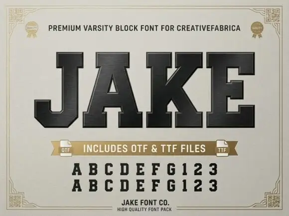
Very heavy collegiate slab capitals with tight spacing and flat slabs
Jake is a very heavy collegiate slab in capitals only, with flat rectangular slabs, tight spacing and almost no internal space left in the counters.
Ideas for this font
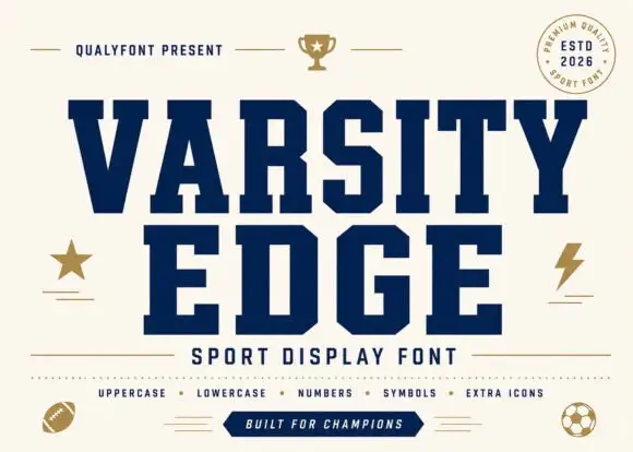
Solid angular varsity blocks
Varsity Edge is a heavyweight collegiate display: wide slab-serifed capitals with flat tops and feet, tight spacing and squared counters, set navy on cream with a set of sport icons around it.
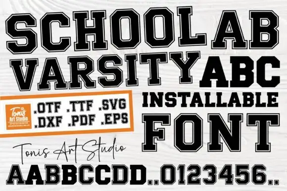
Solid and inset-bordered college blocks
School Varsity is a college block face built as two layers, an outer black letter and a white inset, supplied as font and cut files: OTF, TTF, SVG, DXF, PDF and EPS.
Ideas for this font
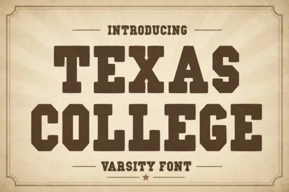
Solid angular college capitals
Texas College is a heavy collegiate block in dark brown on aged tan paper: wide slab-serifed capitals with squared counters, set on a sunburst within a thin double frame.
Ideas for this font
Same independent foundry
Allow optional Google Analytics to measure visits and catalogue actions. Your search words and notes are not included. Privacy & storage