Neutral Sans Workhorse

Midnight + Cultivo
Lets Midnight own the focal silhouette while handling secondary copy, sizing and subheads cleanly.
Inspect Cultivo specimenDisclosure: MakerFileHub may earn a commission from qualifying purchases via paid links on this page. How our links work.
Bold street-gothic blackletter with compact forms and heavy verticals
Midnight is a bold blackletter in which the letters stay compact, the verticals run heavy and the breaks bend at sharp angles, so a word reads as a clothing label rather than as a manuscript.
Paid link
Get this fontProject & layout blueprintsAt-a-glance maker compatibility
Sturdy stroke walls and open counters weed cleanly on adhesive vinyl, HTV apparel film, and cut cardstock.
Visual anatomy & craft review
The capital M draws as three heavy verticals joined by angular breaks, the i keeps a diamond dot and the g closes a narrow tail, all at a heavy even weight with flat tops and sharp junctions. The construction is compact rather than calligraphic: the diamonds are small, the hairlines are thin but few, and the overall mass reads at 60 pt on a garment while staying tight enough for a single word. That compactness is what separates the face from historical blackletter and makes it usable as a streetwear mark. Counters are narrow, so the face wants 24 pt minimum and generous leading when stacked. The dark stone, the gold frame, the crown, the candlelight and the small caption lines are presentation; the typeface is the word.
Gothic · Bold · Street
Two-font hierarchy recipes
Tested contrast partners — pairing Midnight with grounded secondary typography.
Midnight + Cultivo
Lets Midnight own the focal silhouette while handling secondary copy, sizing and subheads cleanly.
Inspect Cultivo specimen
Midnight + Amor Hadena
Grounds bold display lettering with classic typographic authority on posters, badges and apparel.
Inspect Amor Hadena specimenPractical applications
Concrete hierarchy, scale and production guidance tailored to Midnight’s stroke geometry.
The compact gothic mass reads at 70 mm on a shirt front and gives a young label the archive weight it wants without a crest.
Hierarchy & layout recipe
Screen a 250 mm chest print: set the brand at 70 mm through a 140-thread mesh, keep any second line in a 20 mm caps sans beneath, and stay 60 mm below the collar so the print sits on the flat of the chest.
Pre-production check
Thin junctions in a gothic face break on a coarse mesh; check a pull on the actual fabric and thicken the junctions rather than the verticals.
The gothic weight gives a release cover a mark that reads as a stamp at 40 mm, and the compact fit keeps it inside a square crop.
Hierarchy & layout recipe
Print a 120 mm square cover: set the title at 40 mm across the centre, keep the artist in a 10 mm caps sans at the foot, and leave 12 mm of margin so the sharp breaks are not cut by the sleeve trim.
Pre-production check
A square sleeve trimmed after printing can clip a sharp break; check the trim against the artwork and pull the title in by 3 mm.
The bold gothic holds at 10 pt on a leather patch, and the compact construction keeps a long brand name on one line instead of two.
Hierarchy & layout recipe
Emboss a 55 by 35 mm leather patch: set the brand at 10 pt, keep the city in a 4.5 pt caps sans beneath, and leave 5 mm of margin so the sharp junctions are not lost in the pressed edge.
Pre-production check
A gothic junction under 0.5 mm fills in on a leather die; check a pressed sample and simplify the two tightest breaks before cutting.
Technical & licence verification
Confirm included OTF/TTF/WOFF formats, full glyph tables and licence coverage on the live store page before batch production.
Closest visual alternatives
Matched across letterform anatomy, stroke behaviour and craft applications.
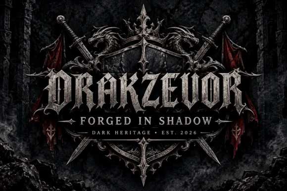
Armoured dark-fantasy gothic with pointed spurs and heavy blackletter structure
Drakzevor is an armoured dark-fantasy gothic alphabet in which each letter grows pointed spurs and the blackletter skeleton is thickened into metal plates.
Ideas for this font
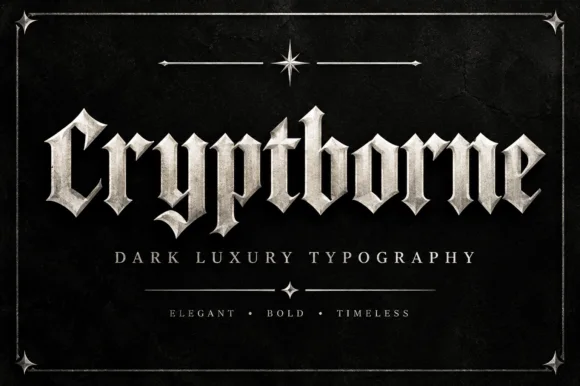
Crisp cathedral blackletter with flat tops and fine diamond spurs
Cryptborne is a crisp cathedral blackletter in which the letters are built from flat-topped stems, fine diamond spurs and thin hairlines against heavy mass, so a short word reads as carved stonework.
Ideas for this font
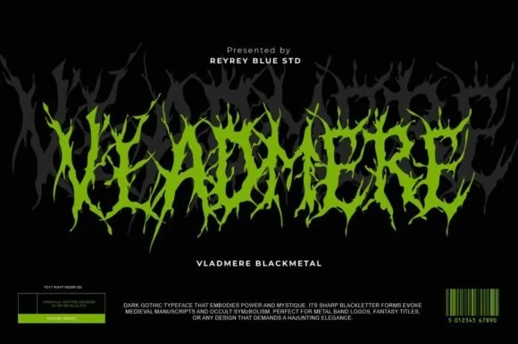
Black-metal jagged logo display
Vladmere is a black-metal logo face in lime green on black: letters built from thin jagged blades that lean and intersect, a mirrored grey copy behind the word, and a barcode-style badge at the foot that gives the specimen the look of a record sleeve.
Ideas for this font
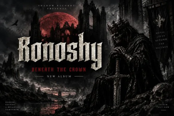
Sharp blackletter with stone texture
Ronoshy is a blackletter display in bone white on a dark gothic scene: tall spiked capitals with hairline joins and sharp terminals, textured like carved stone, set above a red subtitle in a small rounded capital face.
Ideas for this font
Same independent foundry
Allow optional Google Analytics to measure visits and catalogue actions. Your search words and notes are not included. Privacy & storage



