Neutral Sans Workhorse

Canopius + Borsen
Lets Canopius own the focal silhouette while handling secondary copy, sizing and subheads cleanly.
Inspect Borsen specimenDisclosure: MakerFileHub may earn a commission from qualifying purchases via paid links on this page. How our links work.
Classic broad-nib medieval Textura blackletter
Canopius is a bold, disciplined modern Textura blackletter featuring stout vertical pillars, diamond feet, and scrolled capital interiors.
Paid link
Get this fontProject & layout blueprintsAt-a-glance maker compatibility
Sturdy stroke walls and open counters weed cleanly on adhesive vinyl, HTV apparel film, and cut cardstock.
Visual anatomy & craft review
Canopius is a tall spiked gothic display with knife-point serifs, a heavy black body and hooked finials that extend past the cap line, so a word reads as a horror poster rather than a blackletter text face. The points are sharp and there are many of them, which means the face needs size and a print process that does not fill the tips, and its density makes it read as a silhouette at distance. It needs roughly 35 mm for the points to hold, and it is best in bone white on black, or blood red on charcoal.
Textura-classic · Heavy · Cathedral
Two-font hierarchy recipes
Tested contrast partners — pairing Canopius with grounded secondary typography.
Canopius + Borsen
Lets Canopius own the focal silhouette while handling secondary copy, sizing and subheads cleanly.
Inspect Borsen specimen
Canopius + Augler
Grounds bold display lettering with classic typographic authority on posters, badges and apparel.
Inspect Augler specimenPractical applications
Concrete hierarchy, scale and production guidance tailored to Canopius’s stroke geometry.
Spiked gothic lettering reads as a horror attraction, which is what a haunted house sells at the gate. The dense silhouette holds at 260 mm on a poster in one ink, and the many points give the word the aggression that a clean serif cannot.
Hierarchy & layout recipe
Poster A2, word 260 mm with 15 mm point clearance, times 22/28 pt, 30 mm margins and 20 mm trim. Sign 600 x 900 mm, word 120 mm, 50 mm margins and 30 mm frame clearance. Card 105 x 148 mm, word 26 mm, details 8/11 pt.
Pre-production check
Points under 0.5 mm at 26 mm on an event card fill in a laser printer and the word reads as a black slab. Keep the card word at 34 mm or print offset, and check one card at final size.
Knife-point gothic reads as a metal or horror brand, which is what a small venue prints on a tee and a coaster. The dense black body prints one colour on a dark garment, and the finials give the mark an edge at 60 mm without a second design.
Hierarchy & layout recipe
Tee print 260 x 140 mm, word 55 mm, 40 mm margins. Coaster 90 mm round, word 12 mm, 4 mm die margin and 4 mm clear of the cut edge. Label 80 x 60 mm, name 16 mm, 4 mm die margin.
Pre-production check
A plastisol print at 55 mm bridges the 1 mm gap between two points and they fuse into a single thick spike. Keep the gaps at 1.5 mm or raise the print to 70 mm, and approve a strike-off before the run.
Gothic points read as a cold-season fright bill, which is what a December screening wants against a Christmas calendar. The bone-on-black palette matches winter promotion, and the dense word holds on a backlit marquee card.
Hierarchy & layout recipe
Poster A2, word 250 mm, details 22/28 pt, 30 mm margins and 20 mm trim. Ticket 70 x 180 mm, title 20 mm, seat 7 pt, 8 mm margins. Marquee card 300 x 200 mm, word 70 mm with 20 mm point clearance, 30 mm margins.
Pre-production check
A backlit marquee blooms the white points into a glow and the letters merge into a white block. Reduce the card word to 60 mm or print dark on light, and check one card lit in its frame.
Technical & licence verification
Confirm included OTF/TTF/WOFF formats, full glyph tables and licence coverage on the live store page before batch production.
Closest visual alternatives
Matched across letterform anatomy, stroke behaviour and craft applications.
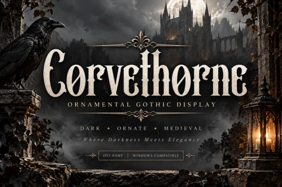
Raven-gothic ornamental blackletter with diamond counter flourishes
Corvethorne is a tall, condensed ornamental gothic display font accented with interior diamond crosshairs and curled medieval spurs.
Ideas for this font
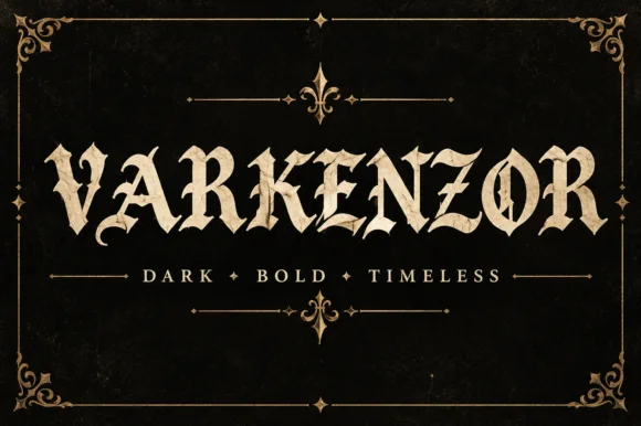
Condensed blackletter with sharp spurs
Varkenzor is a condensed blackletter in ochre on black inside an ornamental frame: tall narrow strokes, sharp spurs on the capitals, tight spacing that fuses the word into a band, and small diamond ornaments separating the motto words.
Ideas for this font
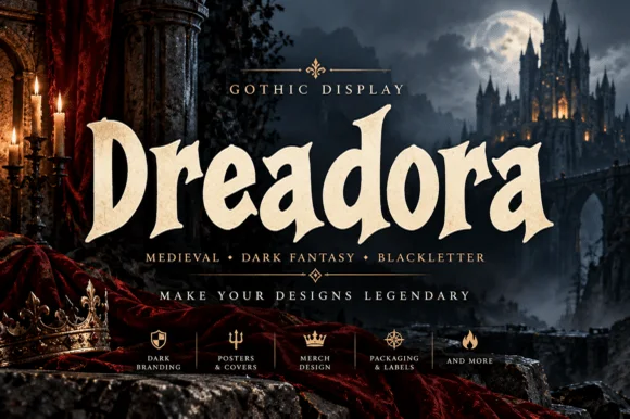
Stately broad-nib medieval manuscript blackletter
Dreadora is a stately medieval blackletter pairing classic broad-nib manuscript rhythm with smooth, highly legible lowercase bowls.
Ideas for this font
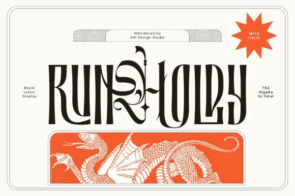
Condensed blackletter display with swashes
Runholdy is a condensed blackletter in black on bone: heavy narrow letters with long hairline swashes that leave the word entirely, sharp spurs on the capitals, and a red dragon illustration printed as a band beneath.
Ideas for this font
Same independent foundry
Allow optional Google Analytics to measure visits and catalogue actions. Your search words and notes are not included. Privacy & storage



