Neutral Sans Workhorse

Westmar + Cenura
Lets Westmar own the focal silhouette while handling secondary copy, sizing and subheads cleanly.
Inspect Cenura specimenDisclosure: MakerFileHub may earn a commission from qualifying purchases via paid links on this page. How our links work.
Western heritage slab with spurred serifs and a worn contour
Westmar is a western heritage slab in which the serifs grow spurs, the stems bulge and the contour breaks into a worn edge, so a name reads as a brand burned onto a wooden sign.
Paid link
Get this fontProject & layout blueprintsAt-a-glance maker compatibility
Sturdy stroke walls and open counters weed cleanly on adhesive vinyl, HTV apparel film, and cut cardstock.
Visual anatomy & craft review
The W splays four heavy strokes with spurred feet, the e closes a wide eye, the s holds a thick spine with terminal spurs, the t sets a wide bar, the m keeps three even stems and the r turns a spurred arm, all at a slab weight with exaggerated serifs and a rough, broken outline. The spurs are the character: they sit on the serifs and the terminals and give the word its frontier look, which is why the sample sets one name on a torn paper label. Because the shapes are solid, the face holds from 24 pt and prints in one ink, and the worn edge reads as age rather than as damage. The leather hat, the rope, the buckle and the torn paper are presentation; the dark display name is the face.
Western · Slab · Worn
Two-font hierarchy recipes
Tested contrast partners — pairing Westmar with grounded secondary typography.
Westmar + Cenura
Lets Westmar own the focal silhouette while handling secondary copy, sizing and subheads cleanly.
Inspect Cenura specimen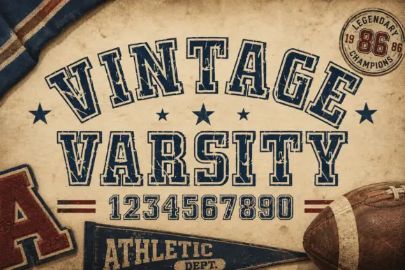
Westmar + Vintage Varsity
Grounds bold display lettering with classic typographic authority on posters, badges and apparel.
Inspect Vintage Varsity specimenPractical applications
Concrete hierarchy, scale and production guidance tailored to Westmar’s stroke geometry.
The spurred slabs suit a leather goods brand, and the worn contour prints as an embossed look at 22 pt on a paper label.
Hierarchy & layout recipe
Print a 70 by 45 mm label: set the brand name at 22 pt, set the maker line in a 7 pt slab beneath, and keep 5 mm of border so the spur feet are not clipped by the die.
Pre-production check
Spur feet cut by a small die look broken; check the imposed label and keep 4 mm of ground around the word.
The western register reads from the road, and the heavy spurs hold a two-word ranch sign at 110 mm on a painted timber board.
Hierarchy & layout recipe
Paint a 900 by 300 mm board: set the words at 110 mm, keep 35 mm of border, and paint in one deep colour so the spurred serifs stay crisp in daylight.
Pre-production check
A worn contour painted by hand can read as a bad edge; check the board at three metres and keep the spurs deliberate rather than ragged.
The spurs give a clothing hang tag a period voice, and the slab weight keeps a short brand name solid at 18 pt on kraft card.
Hierarchy & layout recipe
Print a 45 by 90 mm tag: set the brand name at 18 pt, punch a 4 mm hole 10 mm from the top, and keep the spurred first letter clear of the punched hole so the string does not tear it.
Pre-production check
A spur printed next to a punched hole tears under load; check the assembled tag and turn the word so the spur faces the lower edge.
Technical & licence verification
Confirm included OTF/TTF/WOFF formats, full glyph tables and licence coverage on the live store page before batch production.
Closest visual alternatives
Matched across letterform anatomy, stroke behaviour and craft applications.
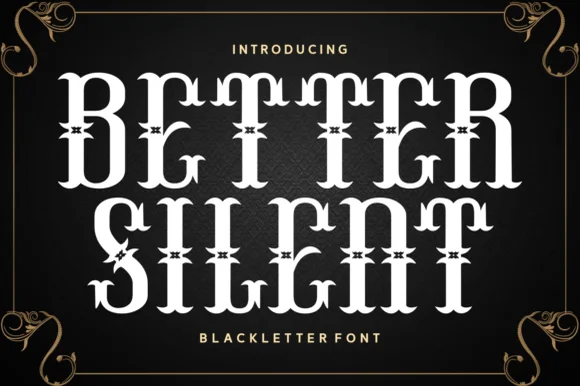
Spurred Victorian Tuscan & Western saloon display
Better Silent is a bold Victorian-Tuscan display font (more saloon-Victorian than medieval blackletter) armed with bifurcated spurs and curls.
Ideas for this font
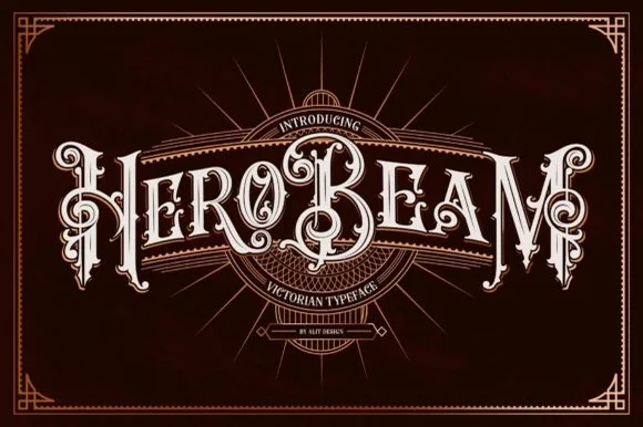
3D-shaded Victorian saloon & tattoo blackletter
Hero Beam is an elaborate Victorian poster typeface dressed with interior inline filigree, curled spurs, and crisp drop-contour framing.
Ideas for this font
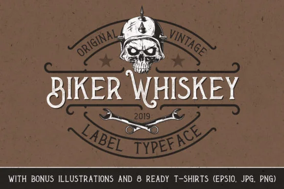
Spurred Victorian whiskey-label serif with bonus illustrations
Biker Whiskey is a clean, condensed Victorian label serif featuring hooked swash capitals, median thorns, and bonus skull/wrench shirt graphics.
Ideas for this font
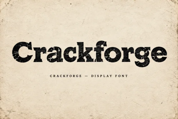
Heavy slab display with a cracked, weathered texture
Crackforge is a heavy slab display alphabet in which the stems stay thick, the serifs turn square and the surface breaks into fine cracks, so a word reads as a cast metal plate that has been outdoors for years.
Ideas for this font
Same independent foundry
Allow optional Google Analytics to measure visits and catalogue actions. Your search words and notes are not included. Privacy & storage



