Editorial Serif Anchor

Rebel + Augler
Anchors Rebel's fluid strokes with crisp Roman proportions on wedding suites, headers and packaging.
Inspect Augler specimenDisclosure: MakerFileHub may earn a commission from qualifying purchases via paid links on this page. How our links work.
Heavy condensed display sans
Rebel is a heavy condensed display sans in bright blue on black: tall narrow caps with flat terminals, cut corners on the diagonals, a high waist and closed counters, set as one stacked block with a second word in outline and small tracked notes at the sides.
Paid link
Get this fontProject & layout blueprintsAt-a-glance maker compatibility
Sturdy stroke walls and open counters weed cleanly on adhesive vinyl, HTV apparel film, and cut cardstock.
Visual anatomy & craft review
The two words are stacked and the second is set as a contour, which shows the solid construction and the outline version from one skeleton. The drawing is a condensed sans at heavy weight: the terminals are flat, the diagonals are cut, and the width is tight, which keeps a long word inside a narrow column. Because the counters are closed, the face reads as a mass at a distance, and the specimen keeps the palette to two colours so the block stands out. The small tracked notes at the sides belong to the product sheet, and the plate sets the block large enough that the cut corners are visible as a decision rather than as damage.
Bold, condensed, display, urban
Two-font hierarchy recipes
Tested contrast partners — pairing Rebel with grounded secondary typography.
Rebel + Augler
Anchors Rebel's fluid strokes with crisp Roman proportions on wedding suites, headers and packaging.
Inspect Augler specimen
Rebel + Furion
Keeps small-scale dates, URLs, nutrition facts and care instructions crisp and legible below script titles.
Inspect Furion specimenPractical applications
Concrete hierarchy, scale and production guidance tailored to Rebel’s stroke geometry.
A heavy condensed sans reads as a shopfront mark, and the tight width fits a long street name on a narrow fascia without shrinking the height.
Hierarchy & layout recipe
Fabricate a 1,000 by 300 mm sign: the name at 120 mm cap height, the street in a 24 mm condensed sans, and a 5 mm rule. Keep 25 mm margins and specify a matte finish so the closed counters do not glare.
Pre-production check
Check the sign at 120 mm, where the closed counters can read as blots; keep the aperture open enough to identify the letter. Confirm the 24 mm street reads at four metres and that the rule clears the fixings.
A heavy condensed face holds a long title in a narrow column, and the outline version gives the cover a second level without a second typeface.
Hierarchy & layout recipe
Set the title at 100 mm cap height across a narrow 160 mm column, the subtitle in the outline at 20 mm, and the author at 8 pt. Print two colours on a dark stock and keep the block to the upper half.
Pre-production check
Check the title at thumbnail size, where closed counters can merge into a block; open the spacing. Confirm the 8 pt author survives lamination and that the subtitle outline stays open at 20 mm.
A condensed athletic face prints as one screen, and the closed counters make the word read as a sturdy mark on a dark shirt.
Hierarchy & layout recipe
Print a 250 mm chest graphic: the gym at 60 mm cap height, the year at 16 mm, and one ink on a dark shirt. Keep the thinnest stroke at 4 mm so the screen holds and place the graphic 80 mm below the collar.
Pre-production check
Check the screen at actual mesh, where a 4 mm stroke fills; thicken it. Wash-test one shirt and confirm the year stays legible after five cycles.
Technical & licence verification
Confirm included OTF/TTF/WOFF formats, full glyph tables and licence coverage on the live store page before batch production.
Closest visual alternatives
Matched across letterform anatomy, stroke behaviour and craft applications.

Slanted brush capitals with torn ends
Temur Amorak Urban Bold Brush Font sets two rows of heavy white capitals that lean hard to the right, with torn ragged stroke ends, long diagonal cuts through the thick stems and a small green brush subtitle underneath on a dark grainy field.
Ideas for this font
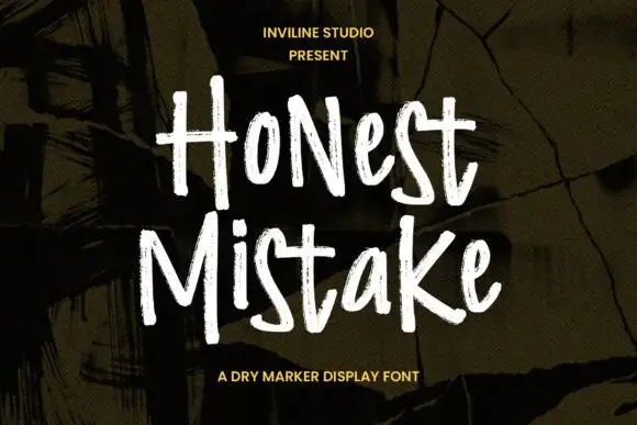
Rough narrow mixed-case marker forms with dry edges and uneven height
Honest Mistake is a narrow mixed-case marker face in which the strokes carry a dry edge, the heights shift and the crossbars sit unevenly, so a word reads as something written quickly on a wall of plywood.
Ideas for this font
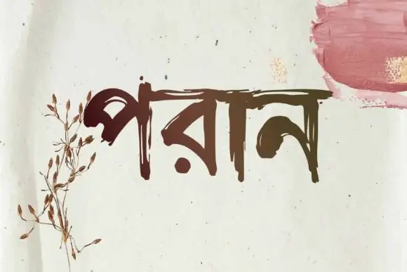
Bengali brush lettering
Poran is Bengali brush lettering in dark brown on a speckled off-white sheet: a single word with a rough horizontal head line and tapered, uneven strokes, with a dried botanical drawing at the left and a rose brush swatch at the upper right.
Ideas for this font
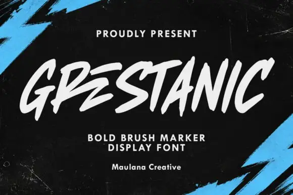
Sharp slanted marker capitals
Grestanic sets narrow marker capitals at a hard slant, with terminals that taper to sharp points, uneven tops and edges that break rather than curve.
Ideas for this font
Same independent foundry
Allow optional Google Analytics to measure visits and catalogue actions. Your search words and notes are not included. Privacy & storage



