 #1 · Best Overall
Disclosure: MakerFileHub may earn a commission from qualifying purchases via paid links on this page. How our links work.
Cracked slabs, worn wood type & ink-ribbon texture
20 Best Distressed, Stamp & Letterpress Fonts
Distress is a reproduction problem: the texture should look like ink pressed into paper, not like noise layered over a letter. Crackforge and Creative Vintage draw the wear into the glyph outline, Distressed Sport and Vintage Varsity carry it into athletic slabs, and Retro Grunge adds a vertical scrape that reads as wood type. Nafa Grunge and Industrial Grunge push further into worn signage territory.
Quick verdict
Crackforge is the most convincing letterpress slab for labels, Creative Vintage suits vintage packaging, and Nafa Grunge works for worn signage. Distressed Sport covers the athletic case.
Quick answer
Top 3 distressed stamp & vintage press picks right now.
Short on time? Start with our three highest-rated distressed stamp & vintage press standouts before scrolling the full breakdown.
#1 · Best Overall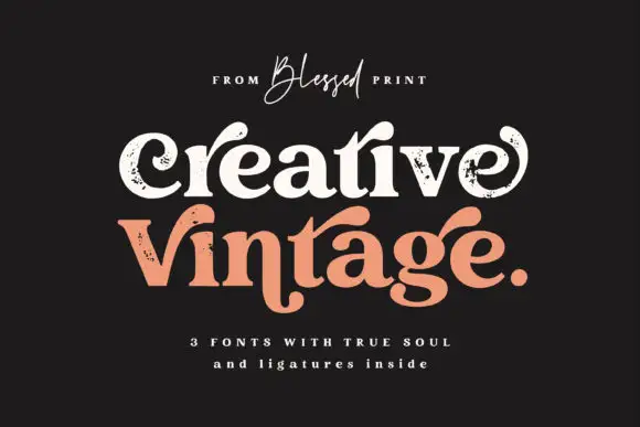 #2 · Runner-Up Pick
 #3 · Editor's Choice
Distressed Sport
Chalk-weathered athletic slab with hatched wear and square feet
Get fontPaid link
Read review ↓How we tested & selected these 20 fonts
We kept 20 of 470 candidates after removing clean faces and untextured scripts that shared keywords but not construction. Judged on where the texture sits inside the glyph, whether the wear repeats visibly, and how much survives at 100 percent print scale.
Side-by-side summary
Top 5 distressed stamp & vintage press picks at a glance.
Compare specimens, OpenType/PUA traits and primary project roles side by side.
| Rank & Font | Style & File Specs | Best Project Fit | Store Listing |
|---|---|---|---|
| DisplayFile formats | Hot-sauce bottle label, distressed band tee or pub poster | Get fontPaid link | |
| SerifPUA encoded | A vintage-print collection band | Get fontPaid link | |
| Slab SerifWeathered | Vintage gym hoodie, crossfit poster or sublimation mug | Get fontPaid link | |
| Slab SerifLanguage support · File formats | A local music-poster heading | Get fontPaid link | |
| Slab SerifLanguage support · File formats | A reunion match poster | Get fontPaid link |
Serifs & Slab Serifs
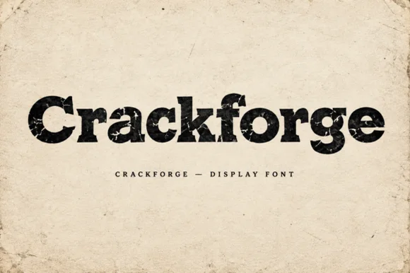
9 fonts#1 · Best OverallCrackforge
Crackforge is a heavy slab display alphabet in which the stems stay thick, the serifs turn square and the surface breaks into fine cracks, so a word reads as a cast metal plate that has been outdoors for years.
The C cuts a square crescent, the r turns a blunt arm, the a closes a small bowl on a heavy stem, the c repeats the square cut, the k splays two thick diagonals and the f carries a wide bar, all at a bold slab weight with square serifs and a cracked texture drawn into the fill. The crack pattern is the character: it sits inside the strokes rather than on the outline, which is why the sample sets mixed case on a plain ground and lets the surface do the work. Because the strokes are solid, the face reads from 30 pt and prints in one ink; the cracks disappear below that size. The aged paper ground, the torn edges and the small caps line beneath are presentation; the black display word is the face.
Recommended project & layout
Hot-sauce bottle label, distressed band tee or pub poster — Print large in dark ink on kraft/cream paper or off-white ink on black shirts.
Before you cut or print
Internal crack fissures are built for DTF, screen printing and print — not blade vinyl cutting.
Best paired with
Get fontPaid link
#2 · Runner-Up PickCreative Vintage
Creative Vintage is a high-contrast serif in which the terminals curl into swash shapes, the C turns inward, the t finishes in a broad low hook and scattered distressed marks break the fill, so a title reads as a worn printed label.
The C curls its terminal inward, the t ends in a broad low hook, the V and g stretch long curved extensions and the fill carries scattered marks that thin the strokes. The distressed curl is the character: the wear sits in the outline rather than over it, which is why the sample suits a printed label. Because the marks are small, the face wants 30 pt before they read as texture rather than dirt, and the thin curls need coated stock. The extra characters are PUA-encoded, so decorative access is a separate step.
Recommended project & layout
A vintage-print collection band — Give the title two spacious lines and put item details in a clean separate strip.
Before you cut or print
Inspect the selected style and ligature access rather than assuming all three fonts match.
Best paired with
Get fontPaid link
#3 · Editor's ChoiceDistressed Sport
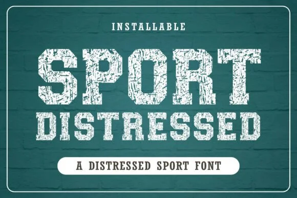
Distressed Sport is an athletic slab alphabet in which the stems are heavy and square, the wear runs as chalk hatching across the fill and the feet stay flat, so a word reads as a print pulled off a worn gym wall.
The S reverses through flat curves, the P holds a squared bowl, the O closes a rectangular counter and the R carries a straight leg, all at a heavy even weight with unbracketed slabs and a mask that scratches diagonally through the strokes. That hatching is the character: the wear runs in one direction, which reads as chalk or screen texture rather than as random noise. Because the scratches are fine, the face needs 30 pt minimum and works best on a garment where the texture is expected. The teal chalkboard ground, the white ink, the small arc and the two captions are presentation; the slab face is the two words.
Recommended project & layout
Vintage gym hoodie, crossfit poster or sublimation mug — Print in off-white or faded gold ink over dark heather or navy garments.
Before you cut or print
Use for DTF, screen printing or sublimation — never blade vinyl cutting due to heavy distress.
Best paired with
Get fontPaid link
 #4 · Top Maker Utility
Retro Grunge
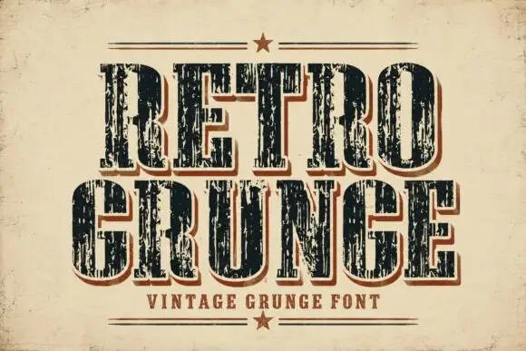
Retro Grunge shows tall closely spaced slab capitals with rounded bowls and deep vertical scratches, where the E and R keep heavy stems even as the surface breaks and a red-brown offset edge sits behind the black letters on aged paper.
The stems stay tall, the fit runs close, the scratches cut vertically and the offset edge repeats the whole row behind it. That scrape is the character: the word looks printed on a worn press rather than deliberately shredded, which is why the cover keeps the letters pale on aged stock. The letter texture already supplies most of the visual activity, so skip extra distressed art in the layout, keep 34 pt and check the offset edge against the trim.
Recommended project & layout
A local music-poster heading — Use two large rows above a clean information band; keep the background relatively quiet.
Before you cut or print
Inspect the scratches and counters at the intended print size.
Best paired with
Get fontPaid link
 #5 · Standout Silhouette
Vintage Varsity
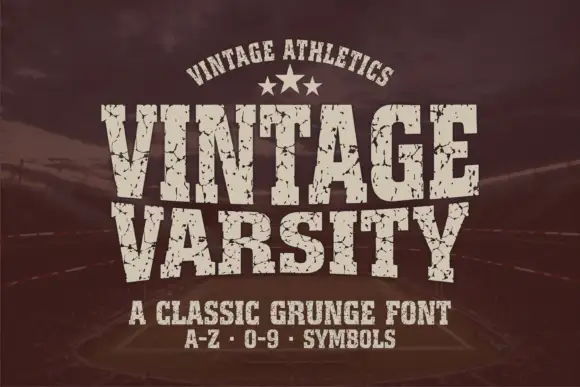
Vintage Varsity is a condensed athletic capital alphabet with heavy flat slabs and a cracked wear texture, so a short word reads as a printed team jersey from decades ago.
The letters are narrow and tall: the V closes to a sharp point, the A keeps a low bar, the R carries a straight leg and the S reverses through flat terminals, with slabs at every stem and no bracketing. The wear is drawn into the letterforms rather than applied as an effect: cracks run through the slabs and a few counters show chipped edges, which is what gives the face its printed-jersey look. Weight is heavy and uniform, the fit is tight enough that a long team name holds a single line, and because the texture is coarse the face needs a decent size to stay legible. The dark ground, the cream ink, the star rule and the two small caption lines are presentation; the typeface is the two words.
Recommended project & layout
A reunion match poster — Keep dates and scores in a clean companion face.
Before you cut or print
Inspect cracks in the narrowest strokes.
Best paired with
Get fontPaid link
 #6
Vintage Strong
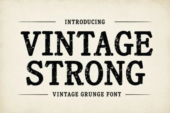
Vintage Strong is a bold, classic Western-style display serif textured with authentic iron-stamp speckles and worn press contours.
Vintage Strong is a weathered woodcut and iron-press Western serif: heavy bracketed slabs, a slightly irregular stem width and a surface of chipped edges, grain lines and small voids where the wood block wore. The wear is drawn, so a one-colour print keeps it, and the bracket is what closes first at small sizes. It needs roughly 32 mm for the bracket and the grain to read, and it is best in one dense ink on kraft and newsprint, or white on a dark board where the grain prints as light lines.
Recommended project & layout
Dry-rub spice tin, craft ale label & heritage denim tag — Stack 2 uppercase words centered between horizontal rule bars with a small tracked footer below.
Before you cut or print
Because internal grunge pits create tiny weeding specks, prefer label printing, DTF, screen print, or laser engraving over cut vinyl.
Best paired with
Get fontPaid link
 #7
Dirty Western
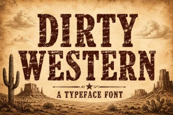
Dirty Western is a rugged frontier slab serif stamped with coarse woodblock grain, pitted distress, and classic 1880s wanted-poster authority.
Dirty Western is a heavy frontier slab stamped with coarse woodblock grain and pitted wear, in the register of an 1880s wanted poster rather than a modern retro face. Capitals are tall with bracketed slabs, the counters are large enough to stay legible under the distress, and the wear is on the surface rather than the outline, so the word keeps a solid silhouette at a distance. It needs roughly 18 mm before the pitting reads as age instead of dirt, and it is all-caps in practice, pairing with a plain grotesque for detail lines.
Recommended project & layout
Small-batch bourbon bottle, beef-jerky bag & smokehouse menu — Stack 2 centered uppercase rows at 60–110 pt in dark espresso or saddle brown over aged kraft/parchment.
Before you cut or print
Heavy internal woodgrain distress requires label printing, DTF transfers, sublimation, or laser wood engraving—never blade-cut vinyl!
Best paired with
Get fontPaid link
 #8
Vintage Cowboy
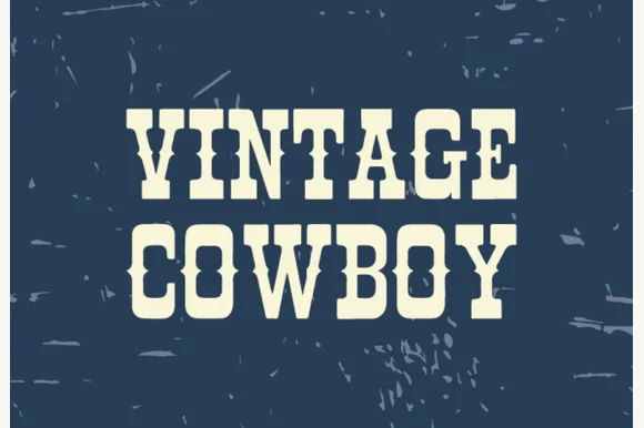
Vintage Cowboy is a stout, lightly weathered ranch slab serif combining thick bracketed serifs with subtle worn-wood edge character.
Vintage Cowboy is a lettered Western display with blocky spurred serifs, a heavy even stroke and a rope-and-sheriff flavour across the specimen, so a word reads as a rodeo bill rather than a saloon sign. The spurs are short and the fill is solid, which makes it easy to cut and to print in one colour, and the even weight keeps it legible at 20 mm on a ticket. It needs roughly 26 mm for the spur to read as a point, and it is best in a warm brown or oxblood on cream or kraft.
Recommended project & layout
Raw-denim leather waist patch, workwear tee & boot box — Stack 2 centered uppercase words at 64–120 pt with tight 0.92 line spacing on navy, denim, or saddle tan.
Before you cut or print
Solid cores with only mild outer-edge distressing—prints great via DTF/screen print and laser-engraves cleanly on leather!
Best paired with
Get fontPaid link
 #9
Blovanta
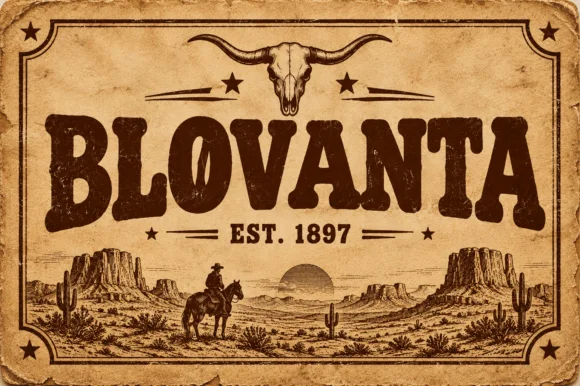
Blovanta is a heavy, weathered Western display serif featuring chunky flared stems, a notched 'O' crossbar accent, and vintage ranch grit.
Blovanta is a weathered woodblock Western saloon display serif: heavy unbracketed slabs with chipped edges, a slightly uneven baseline that mimics hand-set timber type and a surface where the ink coverage breaks into patches as if the block had worn. The chips are the design and they silt when the face is reversed or printed small. It needs roughly 30 mm for the chip and the slab to read, and it is best in one dense ink on uncoated stock, or a single ink with a slight deboss where the block edge catches light.
Recommended project & layout
Smokehouse sign, rodeo tee & rustic cabin wood plaque — Center an all-caps ranch or town name at 60 pt above flanked 'EST. 1897' horizontal rules on kraft or cedar backgrounds.
Before you cut or print
Interior woodblock speckles print and laser-engrave superbly; if cutting adhesive vinyl, weld/flatten tiny interior specks first.
Best paired with
Get fontPaid link
Display & Decorative Headlines
4 fonts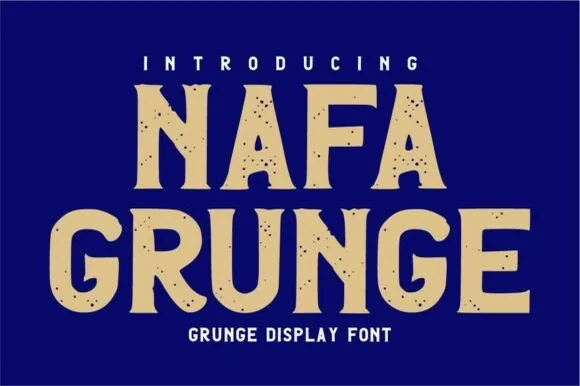 #10
Nafa Grunge
Nafa Grunge is a bold vintage sans-display font pairing subtly notched outer contours with clean, solid interiors.
Nafa Grunge is a bold vintage sans display with subtly notched outer contours, hand-chipped edges and clean solid interiors, so a word reads as sign-painter lettering with a chipped edge rather than as a distressed texture. The notches sit only on the contour, which keeps the counters clean at 20 mm, and the heavy weight holds in one ink. It needs roughly 26 mm for the chipping to read, and it is best in sand tan on cobalt or in one dark ink on board.
Recommended project & layout
Workwear hoodie HTV, brewery coaster & hardware sign — Stack 2 centered uppercase words at 56–100 pt in warm tan or cream over cobalt navy or barn red.
Before you cut or print
Solid interiors make this one of the most cutter-friendly vintage grunge fonts—weeds cleanly down to 1 inch!
Best paired with
Get fontPaid link
 #11
Industrial Grunge
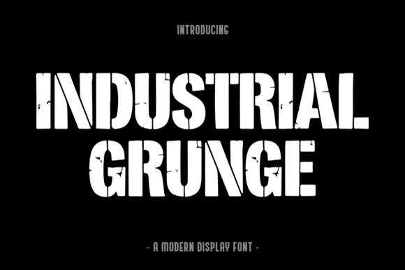
Industrial Grunge is a heavy, blocky industrial display font combining vertical stencil cuts with chipped concrete/steel edge wear.
Industrial Grunge is a heavy stencil-slashed block with a weathered steel surface: fat square stems, cut-through stencil bridges across the closed letters, chipped edges and patches where the plate appears to have rusted through. The bridges are structural for cutting and the chips are the finest element, so both disappear when the face is reversed. It needs roughly 28 mm for the bridge and the chip to read, and it is best in one dense ink on uncoated stock, or a single white on a dark ground where the bridges print as cut-throughs.
Recommended project & layout
Garage gym banner, welding/fabrication shirt & tool crate — Stack 2 centered all-caps lines at 60–110 pt in stark white, hazard yellow, or rust orange over matte black.
Before you cut or print
Because wear is mostly along outer edges and stencil slits (not hundreds of tiny pinholes), it even cuts on 1.5 in+ stencil/HTV vinyl!
Best paired with
Get fontPaid link
 #12
Jack Skull
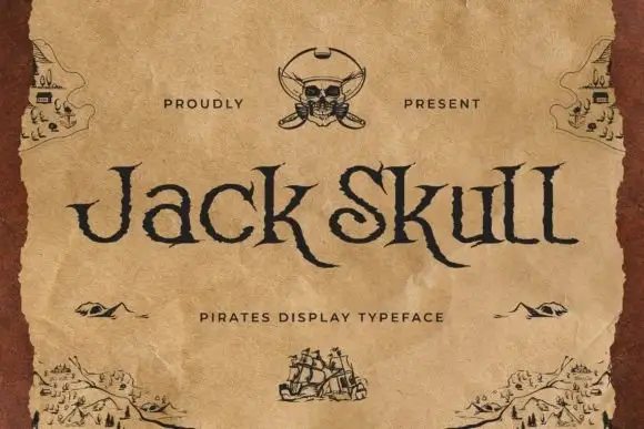
Jack Skull is a pirate display face: irregular letterforms with jagged edges, spiked serifs and uneven stroke weights, drawn to look cut into a parchment map.
Jack Skull sits across the middle of an aged parchment card in a dark brown, and the letters look hand-cut: the strokes thicken and thin without a pattern, the serifs break into spikes, and the K and the S carry small notches that read as knife marks. A skull and crossed swords sit at the top centre, small drawn islands and ships decorate the corners, and a spaced caption under the word names the style. The captions and the ornaments are drawn at the same brown as the type, so the card reads as one printed sheet rather than a word on a background. The face is a display cut for pirate parties, rum labels and treasure-hunt invitations, and it holds at a large size where the rough edges are visible; set small, the notches close and the word turns into a plain condensed serif.
Recommended project & layout
A pirate-party invitation heading — Place Jack Skull in the upper half of a plain sand-coloured card with a separate small location block near the bottom.
Before you cut or print
Check the descender clearance and source pirate illustrations separately.
Best paired with
Get fontPaid link
 #13
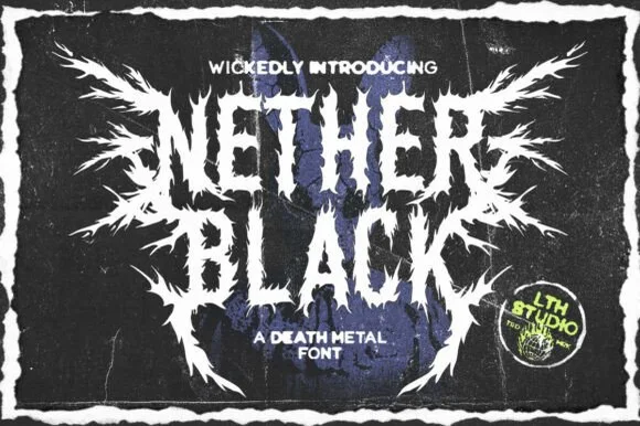
Nether Black
Nether Black is a ferocious death-metal display typeface erupting with symmetrical thorn spikes and splintered outer wings.
Nether Black is a jagged symmetrical death-metal thorn display: dense blackletter-derived stems with spikes thrown from every arm, mirrored ornaments along the vertical axis and a solid inner field that makes each word read as a barbed plate. It is a scene face, so it belongs on a record sleeve and a club flyer rather than on a product label. The spikes are the finest element and they fill into a solid edge when the face is reduced or screened. It needs roughly 40 mm for the spikes and the stems to read, and it is best one white ink on a black ground or the reverse.
Recommended project & layout
Haunted-attraction merch hoodie & horror gig poster — Stack two short 4-to-6-letter words centered on a black garment back, using the winged outer alternates only on the first and last letters.
Before you cut or print
Skip cut-and-weed vinyl on the razor-fine thorn tips—use DTF transfers, screen printing, or high-resolution poster print instead.
Best paired with
Get fontPaid link
Matched Font Duos & Packs
7 fonts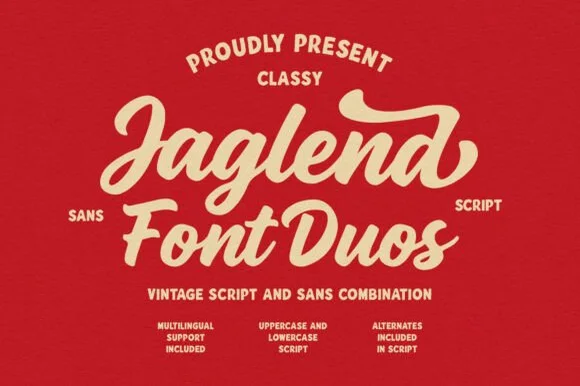 #14
Jaglend Font Duo
Jaglend Font Duo pairs a thick, creamy vintage sign-painter brush script with a sturdy, hand-drawn condensed uppercase sans companion.
Jaglend Font Duo pairs a retro sign-painter brush script with a rugged condensed sans: the script carries a loaded stroke with small flicks and connected letters on a firm slant and a shallow bounce, while the sans is narrow with uneven edges that read as a sanded board for lists and prices. The two voices share one palette, so a window, a price list and a card can be built from one family without a third face. The script's flicks are the finest element and they close first at small sizes, while the condensed sans stacks a long service list in a narrow panel without wrapping. The script needs roughly 24 mm and the condensed sans 18 mm for their detail to read.
Recommended project & layout
BBQ rub tin, craft soda label & barbershop window sign — Arch the sans uppercase header over a large slanted Jaglend Script centerpiece and anchor with tracked sans footers.
Before you cut or print
Broad solid brush strokes cut cleanly on HTV, sticker vinyl, and wood-sign stencils—weld script connections before cutting.
Best paired with
Get fontPaid link
 #15
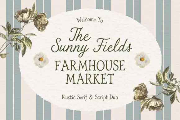
The Sunny Field
The Sunny Field pairs a rustic serif in spaced capitals with a light script above it, so a market sign can carry a soft welcome line and a firm name beneath.
The serif half is a modest text roman with slightly uneven serifs and a moderate contrast, set in spaced capitals so four words fill a wide plate without crowding. The script half is a light connected hand with tall loops and a gentle slant, and in the sample it carries the welcome line and the upper label while the serif carries the market name. Because both halves are light, the pair reads as printed stationery rather than as a signboard, which is the register a farm shop or a market stall wants. The serif holds at small sizes, and the script supplies the personal note. The striped ground, the botanical line drawings, the soft oval panel and the small caption are presentation; the duo is the lettering.
Recommended project & layout
A farmers-market welcome sign — Place the script name above the larger serif MARKET line, then keep opening hours in plain type below; move flowers to the corners.
Before you cut or print
Confirm the exact supplied pair and proof from viewing distance.
Best paired with
Get fontPaid link
 #16
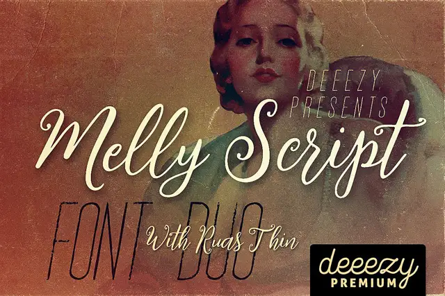
Melly Script Font Duo
Melly Script Font Duo pairs a slanted rounded script with an extremely narrow capital display face, so a design can carry a soft headline and a tall thin second line from one purchase.
The script half is a rounded hand with a steady lean and open counters: the capital M opens with a broad first arch, the e and the l stay light, the double l rises into two plain loops and the y finishes with a curved tail. Weight is medium and even, joins are open rather than tight, and the ends taper slightly. The second half is the opposite extreme: a condensed capital face with hairline-thin stems, very narrow counters and tall proportions, which reads as a drawn rule rather than as text at body size. Together they let one poster carry a warm headline and a skeletal subhead, which is the pairing the sample demonstrates. The washed vintage photograph, the cream inks and the small premium badge are presentation; the two faces are the words.
Recommended project & layout
A vintage-film programme — Place script above a narrow-capital section label, then keep listings plain.
Before you cut or print
Check distressed strokes on the final programme size.
Best paired with
Get fontPaid link
 #17
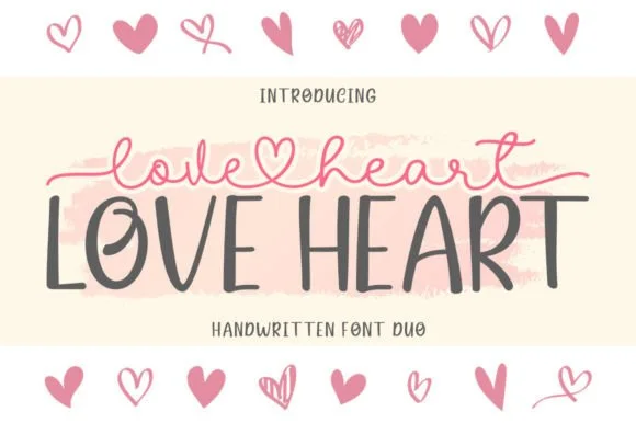
Love Heart Duo
Love Heart Duo matches a tall, slightly textured uppercase brush-sans with a fine monoline cursive featuring a built-in center heart swash.
Love Heart Duo pairs a hand-brushed tall sans with a heart-connected monoline script: the sans is narrow with a dry brush edge and open counters for headlines and lists, while the script runs an even thin stroke where the joins between two words swell into a small drawn heart. The pair gives one card a hand-linked line and a legible second voice from a single family and a single palette, so an invitation, a tag and a seal can be built together. The hearts are the finest element and they close into dots as soon as the face shrinks, and the dry brush edge fills when the sans is reversed or printed small. The sans needs roughly 24 mm and the script 26 mm for their detail to read.
Recommended project & layout
Couple anniversary mug, pillow sham & Valentine card — Match the outer tip-to-tip width of the tailed script to the full width of the uppercase sans row underneath.
Before you cut or print
The fine monoline script cuts best above 1.75 in tall on vinyl; for smaller mugs, use sublimation or Print-Then-Cut.
Best paired with
Get fontPaid link
 #18
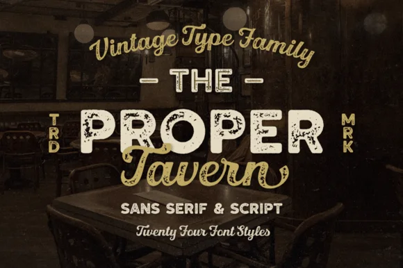
Proper Tavern
Proper Tavern is a massive 24-style vintage signboard collection pairing ornate inline/textured slabs & sans cuts with a classic brush script.
Proper Tavern is a vintage pub signboard family with twenty-four styles built from a sans, a slab and a script: each style shares one skeleton, so a fascia, a chalkboard and a card can be set from one voice with different weights, inlines and shadow layers. The size of the family means the layers must be chosen deliberately or a panel turns into a stack of outlines. The script needs roughly 24 mm and the slab 20 mm for their detail to read, and two inks cover most of the family.
Recommended project & layout
Craft-brewery tap list, gastropub sign & whiskey box — Arch the vintage script at top, set the hero pub name in wide Proper Tavern inline caps flanked by vertical 'TRD/MRK', and tuck script below.
Before you cut or print
Pick the clean solid styles from the 24-pack for Cricut vinyl/HTV, and use the inline/textured cuts for printed bottles and laser wood plaques!
Best paired with
Get fontPaid link
 #19
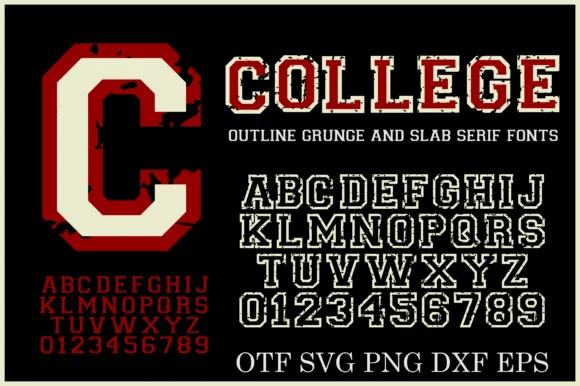
College Grunge
College Grunge is a powerhouse 2-font + cut-file varsity pack pairing a rough distressed slab WITH a crisp double-outline collegiate slab in OTF, SVG, PNG, DXF & EPS!
College Grunge is a two-font collegiate pack of a distressed varsity slab and a clean double-outline cut, with vector and raster files for cutting: the distressed cut carries chipped edges and uneven ink, while the clean cut has a second keyline inside the first. The pair lets one shirt show a worn name and a crisp second line, and the clean cut is the weaker element at small sizes. The distressed slab needs roughly 30 mm and the double outline 34 mm for their detail to read.
Recommended project & layout
Cricut varsity hoodie, senior banner & letterman decal — Layer the clean Outline font in white HTV around solid athletic crimson or navy—or print the Grunge fill on vintage tees!
Before you cut or print
Use the CLEAN Outline style + included SVG/DXF files for fast Cricut/Silhouette vinyl cutting; use the Grunge style for DTF & print!
Best paired with
Get fontPaid link
 #20
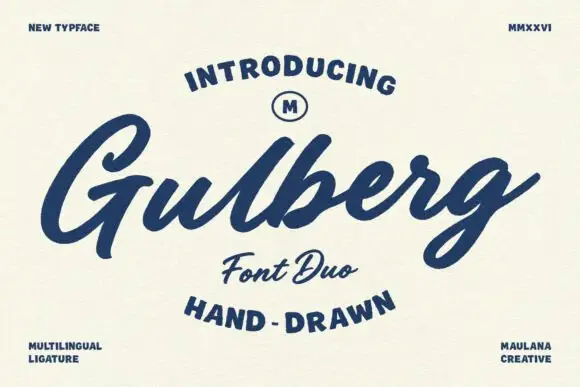
Gulberg
Gulberg is a slanted brush script with strong pressure changes and short angular shoulders, laid over broad, lightly roughened capital lettering.
The script leans hard right and carries real velocity: the G opens with a wide aperture and a short spur, the r has a sharp angular shoulder, and the g loops below with a narrow tail. Contrast between the thick downstroke and the thin upstroke is strong enough that the joins pinch, which is why the sample reads as brushed lettering rather than a drawn cursive. The capital line above and below is wide, heavy and slightly irregular at the edges, so it frames the script without competing with it. A small multilingual note on the card is a specification claim from the listing rather than something visible in the preview, so treat language coverage as a question for the live product page.
Recommended project & layout
A repair-workshop badge concept — Place script in a wide top band and caps service wording beneath, with no copied motorcycle marks.
Before you cut or print
Check g-tail clearance and one-colour counter openness.
Best paired with
Get fontPaid link
Practical buyer checklist
Frequently asked questions.
Key cutting, printing and pairing answers before choosing a distressed stamp & vintage press typeface.
Can a distressed font be printed cleanly at small sizes?
Below about 14 pt the wear fills in and the letter reads as a smudge. Keep distressed faces on display sizes, and switch to a solid companion for ingredient lists, addresses and other small print.
Why do letterpress fonts look different on textured paper?
Uncoated stock absorbs ink unevenly and adds its own grain, which doubles the texture. That can be beautiful, but it also makes fine distress disappear, so proof on the exact paper before a full run.
Do I need a specific letterpress font?
No: a strong slab or grotesque with open counters presses well. What matters is plate depth and paper choice. The distressed faces simply save you from creating the wear yourself.
Can distressed fonts be used for embroidery?
Not usefully. Digitising smooths the wear away and adds stitch texture instead, so the result looks nothing like the file. Choose a solid face and let the thread supply the texture.
Keep exploring
Related collections & guides.
Explore adjacent maker roundups or check our practical pre-production checklists.
01 / Type Styles
Western & vintage label
23 curated fonts · Previews & pairings


02 / Branding & Print
Brand & packaging
39 curated fonts · Previews & pairings
03 / Branding & Print
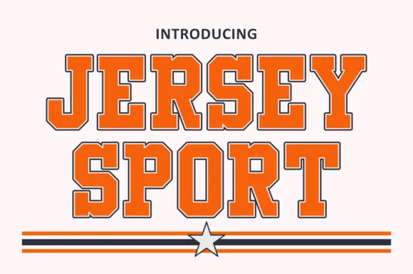
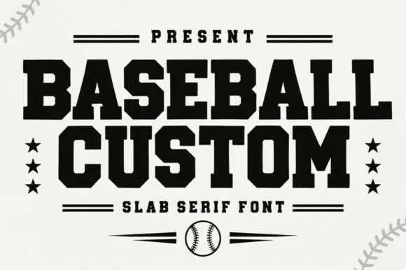
Varsity & athletic
25 curated fonts · Previews & pairings

04 / Type Styles
Brush & streetwear
27 curated fonts · Previews & pairings
Guides: Invitation font checklist · Vinyl & cutting checklist · How to pair script & sans fonts