Modern Grotesque Body

Graveborn + Cultivo
Creates crisp high-hierarchy contrast beneath Graveborn headlines across menus, websites and labels.
Inspect Cultivo specimenDisclosure: MakerFileHub may earn a commission from qualifying purchases via paid links on this page. How our links work.
Softly flared Gothic display with broad rounded lowercase
Graveborn is a gothic display face that mixes a blackletter skeleton with a sturdy serif, giving spiky terminals, a tall x-height and a weight heavy enough to sit on a dark ground.
Paid link
Get this fontProject & layout blueprintsAt-a-glance maker compatibility
Sturdy stroke walls and open counters weed cleanly on adhesive vinyl, HTV apparel film, and cut cardstock.
Visual anatomy & craft review
GRAVEBORN runs across the frame in cream on a nearly black ground, the letters tall and narrow with pointed feet on the stems and a few diagonal spurs where a blackletter pen would turn. The G and the R carry small hooked terminals, the B has a doubled bowl, and the O is a flat-sided circle, so the word reads as gothic without becoming unreadable to anyone who does not know the style. Behind the type a stone arch with a cross hangs in the dark, smoke drifts across the lower half, and a thin ornamented rule frames the whole card. Two small lines under the word name the style and the character set in a serif that is quieter than the display face, and that contrast is doing a lot of work: the display line is ornament, the supporting lines are information. It is a metal, tattoo and horror poster face, and it needs size; at 18 pt the stems close up and the spurs read as smudges.
Softly flared Gothic display with broad rounded lowercase
Two-font hierarchy recipes
Tested contrast partners — pairing Graveborn with grounded secondary typography.
Graveborn + Cultivo
Creates crisp high-hierarchy contrast beneath Graveborn headlines across menus, websites and labels.
Inspect Cultivo specimen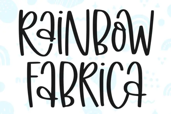
Graveborn + Rainbow Fabrica
Adds a warm human signature touch for 1-to-3-word callouts without competing against structured serif capitals.
Inspect Rainbow Fabrica specimenPractical applications
Concrete hierarchy, scale and production guidance tailored to Graveborn’s stroke geometry.
The lettering sets the genre before anyone reads the title, and the heavy cream strokes stay readable across a dim room without a printed illustration behind them.
Hierarchy & layout recipe
Print an A2 poster: set the film title at 120 pt across two rows, keep 30 mm of clear ground beneath before the time and venue at 12 pt, and hold 24 mm of margin so the spiked feet are not cut.
Pre-production check
Spurs on the R and G fill in below 30 pt; print one copy at the final size and check the word from three metres before the run.
The face gives a bottle a shelf presence that a plain serif cannot, and the narrow stems keep a long brewery name inside a wrap label.
Hierarchy & layout recipe
Print a 70 by 110 mm label: set the brewery name at 22 pt on one row, keep 8 mm of clear ground beneath before the style line at 5 pt, and hold 6 mm at each end where the label curves away.
Pre-production check
Cream ink on dark stock looks grey until it dries; print a label on the real paper and compare the tone before the batch.
The gothic forms signal the contents without a picture, and the depth of the strokes holds a cover line over a photograph of smoke or stone.
Hierarchy & layout recipe
Print a 135 by 216 mm book cover: set the anthology title at 60 pt across two rows, keep 22 mm of clear ground beneath before the editor credit at 8 pt, and hold 15 mm from the lowest spur to the trim.
Pre-production check
Dark covers scuff at the corners; print one cover and rub the edge before the print run is signed off.
Technical & licence verification
Confirm included OTF/TTF/WOFF formats, full glyph tables and licence coverage on the live store page before batch production.
Closest visual alternatives
Matched across letterform anatomy, stroke behaviour and craft applications.
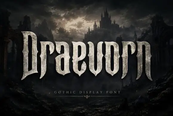
Tall heavy display with pinched waists and long tapering feet
Draevorn is a wide bold blackletter with broad stems, short spurs and a weathered stone fill that makes the letters look quarried rather than drawn.
Ideas for this font
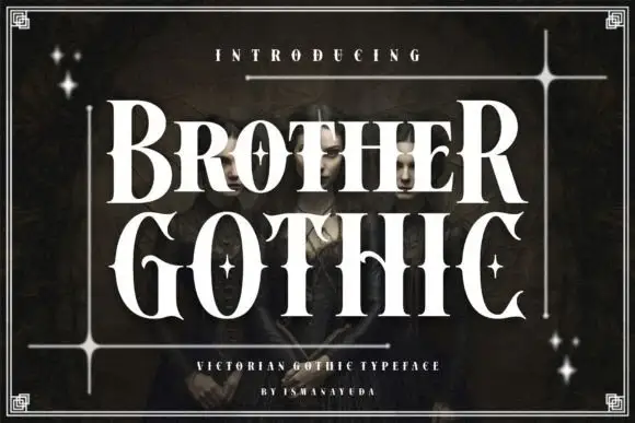
Tall high-contrast capitals with pinched waists and flared tips
Brother Gothic shows white capitals in two rows over a dark portrait. Broad vertical strokes narrow sharply into fine joins, the O has an elongated oval counter, the C ends in pointed flares, and several letters squeeze at the waist to give the serif structure a theatrical edge without a broken-stroke texture.
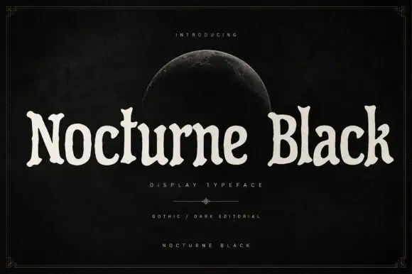
Soft uneven serif display
Nocturne Black is a soft uneven serif in cream on a black ground: rounded bowls, flared ends, slightly irregular widths and a wide fitting, set as one long line beneath a small introducing line and a half moon, with a descriptor and two credit lines at the foot inside a fine frame.
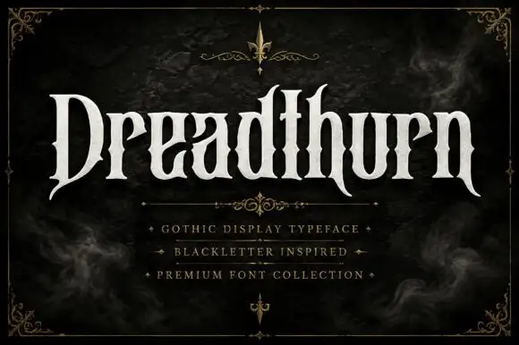
Gothic-influenced mixed case with long hooked D and narrowed waists
Dreadthorn is a gothic display blackletter with wide letters, flared stems, sharp spurs and a clean flat contour, drawn to print white on a dark ground without any texture.
Ideas for this font
Same independent foundry
Allow optional Google Analytics to measure visits and catalogue actions. Your search words and notes are not included. Privacy & storage



