Neutral Sans Workhorse

Draventh + Corven
Lets Draventh own the focal silhouette while handling secondary copy, sizing and subheads cleanly.
Inspect Corven specimenDisclosure: MakerFileHub may earn a commission from qualifying purchases via paid links on this page. How our links work.
Broad rounded blackletter with curled D and pointed lower joins
Draventh is a wide gothic blackletter display face with heavy stems, sharp hooked shoulders and a weathered silver fill that reads as rubbed metal.
Paid link
Get this fontProject & layout blueprintsAt-a-glance maker compatibility
Sturdy stroke walls and open counters weed cleanly on adhesive vinyl, HTV apparel film, and cut cardstock.
Visual anatomy & craft review
Draventh spans the frame in a pale weathered silver on a dark ground, and the letters are broad with short ascenders: the D and the h carry hooks at the top, the v and the n break into sharp diagonals, and every foot ends in a diamond. The fill is textured rather than flat, so the shapes look cast and then worn, and the counters stay open enough that the word reads at a distance. Below the title a spaced caption sits between fine rules with a small fleuron, and a second line lists three qualities divided by diamonds. A fleuron also sits above the word, so the composition is symmetrical on a vertical axis. It is a cover and poster blackletter for horror, metal and dark fantasy, and it needs a large size, because the weathering that gives it character turns into dirt at small sizes.
Broad rounded blackletter with curled D and pointed lower joins
Two-font hierarchy recipes
Tested contrast partners — pairing Draventh with grounded secondary typography.
Draventh + Corven
Lets Draventh own the focal silhouette while handling secondary copy, sizing and subheads cleanly.
Inspect Corven specimen
Draventh + Lumera Editorial
Grounds bold display lettering with classic typographic authority on posters, badges and apparel.
Inspect Lumera Editorial specimenPractical applications
Concrete hierarchy, scale and production guidance tailored to Draventh’s stroke geometry.
The weathered weight sets the mood at a glance, and the pale fill holds against a dark ground where a black gothic face would disappear.
Hierarchy & layout recipe
Print an A2 poster: set the event name at 120 pt across one row, keep 32 mm of clear ground beneath before the times at 13 pt, and hold 26 mm of margin so the diamond feet stay inside.
Pre-production check
Weathered fills print as noise on cheap stock; print one poster at the final size and check the letter edges first.
The wide letters hold a long title at thumbnail size, and the weathered surface gives a painted cover a printed-plate feel.
Hierarchy & layout recipe
Print a 140 by 216 mm cover: set the title at 58 pt across two rows, keep 24 mm of clear ground beneath before the author at 12 pt, and hold 17 mm from the widest letter to the spine edge.
Pre-production check
Textured fills dot out under matte lamination; print one cover with the finish and check the surface before the run.
The face gives a bottle a period character that a modern gothic cannot imitate, and the wide stems stay legible on a label seen from the far end of a bar.
Hierarchy & layout recipe
Print a 65 by 100 mm label: set the ale name at 22 pt on one row, keep 8 mm of clear ground beneath before the strength at 5 pt, and hold 6 mm from the diamond feet to the die line.
Pre-production check
The weathered fill turns the counters to grit on a small label; print one at the real size on the intended stock and look at the e and the o before the run.
Technical & licence verification
Confirm included OTF/TTF/WOFF formats, full glyph tables and licence coverage on the live store page before batch production.
Closest visual alternatives
Matched across letterform anatomy, stroke behaviour and craft applications.
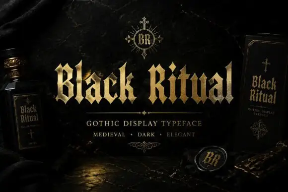
Faceted blackletter with split B and sharp diamond dots
Black Ritual sets heavy gothic capitals with diamond finials in a gold finish on a black ground, and shows the same face printed on a bottle label and a book cover so the range is visible.
Ideas for this font
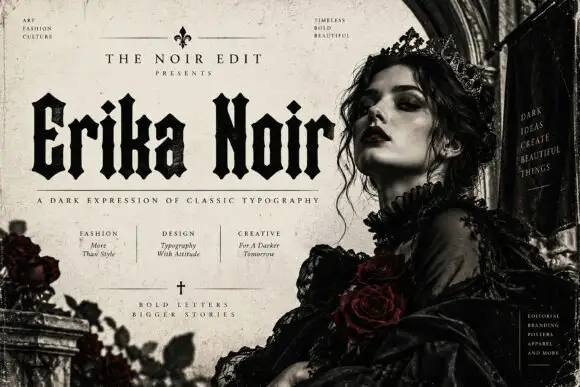
Heavy upright blackletter with blunt notches and diamond dots
Erika Noir is a wide blackletter display face with heavy stems, flat feet and a dense texture, set here in a fashion editorial where the lettering takes half the page.
Ideas for this font
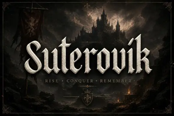
Narrow gothic display with sweep
Suterovik is a narrow gothic display in silver on a dark landscape: mixed case with a sweeping S, a hooked tall k, angular shoulders and a scaled texture, set as one word with a tracked line beneath and a small crest at the foot, framed against a castle and a banner.
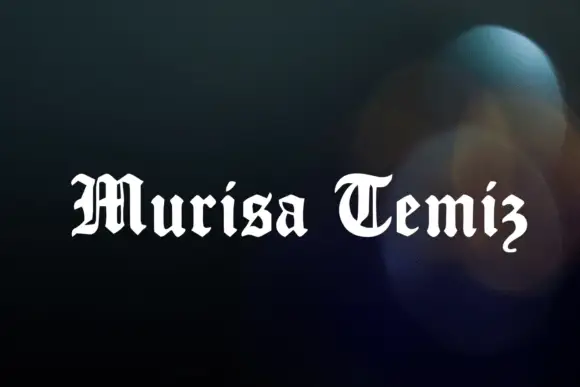
Compact blackletter
Murisa Temiz is a compact blackletter shown in white over a soft dark blur: a curled M and T, a hooked final z, tightly fitted letters and short ascenders, set as two words on one line with no other copy on the sheet.
Ideas for this font
Same independent foundry
Allow optional Google Analytics to measure visits and catalogue actions. Your search words and notes are not included. Privacy & storage



