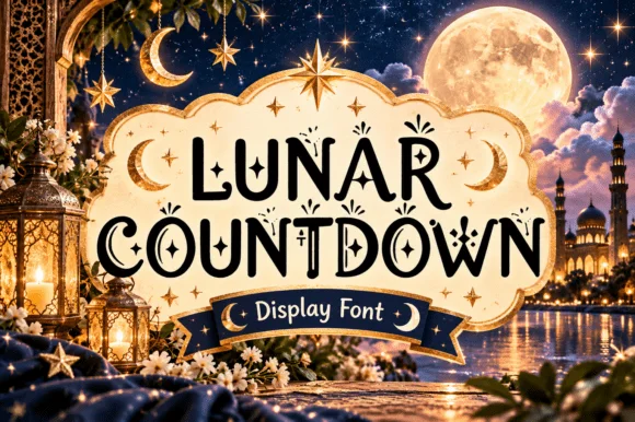
 #1 · Best Overall
Lunar Countdown
Celestial crescent-moon & star ornamental display serif
Get fontPaid link
Read review ↓Disclosure: MakerFileHub may earn a commission from qualifying purchases via paid links on this page. How our links work.
Crescent moons, star-inlaid serifs & night-sky detail
Night-sky lettering depends on one decision: whether the moon or star is part of the letter or sits beside it. Lunar Countdown and Starveil build crescents and stars into the stroke, Silveria Magic and Celestial Tattoo inlay fine celestial marks, and Sun and Moon and Boho Moon treat the moon phase as a counter. Starry Stroller and Starlight keep the softer nursery register.
Quick verdict
Lunar Countdown is the strongest celestial serif for a print or invitation, Starveil handles the dark celestial look, and Starry Stroller covers the nursery side. Sun and Moon is the pick when the letter itself has to contain the moon.
Quick answer
Short on time? Start with our three highest-rated celestial, moon & star standouts before scrolling the full breakdown.
#1 · Best OverallCelestial crescent-moon & star ornamental display serif
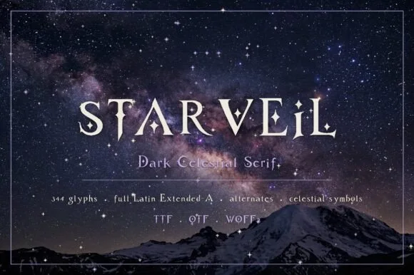 #2 · Runner-Up Pick
Dark celestial serif with crescent moons & stars (344 glyphs, OTF/TTF/WOFF2)
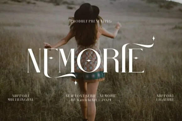 #3 · Editor's Choice
We kept 16 of 24 candidates after checking whether crescents and stars are fused to the glyph. Judged on detail survival at 1 inch, how the ornament reads in a single colour, and whether the face holds on a dark ground for wall art.
Side-by-side summary
Compare specimens, OpenType/PUA traits and primary project roles side by side.
| Rank & Font | Style & File Specs | Best Project Fit | Store Listing |
|---|---|---|---|
| SerifAlternates & swashes | New Year's Eve invite, Ramadan lantern box & Eid card | Get fontPaid link | |
| SerifAlternates & swashes | Romantasy book cover, astrology app/site & tarot deck | Get fontPaid link | |
| SerifLigatures · Alternates & swashes · Language support | Fantasy novel cover, tarot guidebook & poetry anthology | Get fontPaid link | |
| SerifFine contrasting capitals with overlapping circular bowls | An interiors feature-cover title | Get fontPaid link | |
| SerifLigatures · Alternates & swashes · Language support | A botanical feature-cover title | Get fontPaid link |
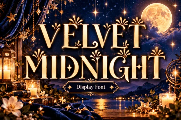
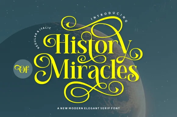
#1 · Best OverallLunar Countdown is a storybook ornamental display serif embellished with tucked crescent moons, dangling stars, and curled spiral terminals.
Lunar Countdown is a celestial display serif with crescent moons and stars worked into the caps: bracketed heavy stems, a crescent cut into the bowl of the round letters and a small star cluster replacing the dot and some terminals. The ornaments are integral to the letter, so they vanish rather than thin out at small sizes. It needs roughly 32 mm for the crescent and the star to read, and it is best in one midnight ink on cream, or a fine gold on a deep navy where the crescents print in reverse.
New Year's Eve invite, Ramadan lantern box & Eid card — Stack 2 centered uppercase words inside an arched frame in midnight navy or gold foil over cream cardstock.
Main serif bodies are substantial, while tiny hanging star accents reproduce cleanest in print, foil, or 2 in+ decals.
#2 · Runner-Up PickStarveil is a dark celestial display serif (344 glyphs, Latin Extended-A, TTF/OTF/WOFF2) embedding crescent moons and star sparkles into flared stems.
Starveil is a dark celestial serif with crescent moons and stars built into the glyph set: fine-bracketed serifs, a firm stem, crescents that replace the dots and tittles and small four-point stars on the diagonals, across a large multilingual glyph set supplied as OTF, TTF and WOFF2. The crescents are the finest element and the stars are what closes first. It needs roughly 30 mm for the crescent and the star to read, and it is best in one silver on black or a deep ink on cream, and it holds up on screen at 14 px where the crescents become plain dots.
Romantasy book cover, astrology app/site & tarot deck — Center all-caps titles at 54–96 pt with +20 tracking in silver foil or white over midnight nebula/mountain photography.
Fine crescent-moon notches and star dots belong in print, foil stamping, and web headers—not small blade-cut vinyl.
#3 · Editor's ChoiceNemorie is a refined high-contrast display serif featuring sweeping scythe-like swash bars, sculpted ligatures, and four-point star accents.
Nemorie is a high-contrast art-nouveau serif with celestial ligatures: a thin-thick stroke with hairline hairlines, tall whipped ascenders that rise into a small star or comet tail and ligature pairs that knit two letters into one drawn shape. The hairlines are the design and the first thing to break on textured stock, and the ligatures change the word's width as they engage. It needs roughly 28 mm for the hairline and the comet tail to read, and it is best in one fine ink on smooth or coated stock, or a foil impression above 40 pt where the hairlines still carry.
Fantasy novel cover, tarot guidebook & poetry anthology — Center 1-word titles at 56–90 pt with +15 tracking over moody photography, keeping author names clean below.
Ultra-fine hairlines require book printing, foil stamping, or high-res digital covers rather than small cut vinyl.
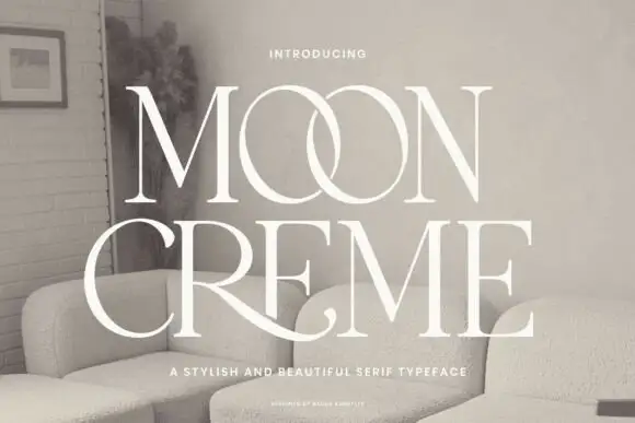 #4 · Top Maker Utility
Moon Creme shows tall white serif capitals with fine hairlines and broad round O forms on a muted interior photograph, where the two O letters overlap into a single linked shape and the R leg of the lower row sweeps beneath the following letters before curling away.
The uprights stay heavy, the hairlines thin sharply, the bowls stay circular and two letters deliberately cross. That overlap is the character: the word reads as a bespoke lockup rather than a plain setting, which is why the sample uses all capitals and a single weight. The interlock and the extended leg may be separate alternates, and that cannot be inferred from the image. Keep 44 pt before the hairlines break, check the alternate mapping in your file and reserve 20 mm for the R leg.
An interiors feature-cover title — Use a quiet photograph panel or a solid title field.
Proof hairlines and avoid assuming automatic overlaps.
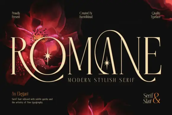 #5 · Standout Silhouette
Romane is a very tall modern serif in which the capitals stretch, the hairlines stay slender, the R leg sweeps below the line and a large loop rises around the central A, so a name reads as a couture title with movement at both ends.
The R curves its leg far under the baseline, the A carries a rising loop around its apex, the O closes a tall narrow bowl and every stem holds a fine contrast that thins at the joins, with ligatures available for awkward pairs. The sweeping extensions are the character: ornament arrives from the letters themselves, which is why the sample sets one name on black with floral artwork behind. Because the hairlines are fine, the face wants coated stock from 18 pt and the loop needs 18 mm of clear space above the cap line. The red flowers and stars behind the title are artwork; the cream capitals are the face.
A botanical feature-cover title — Use a clear title panel with authorised botanical imagery elsewhere.
Proof swashes and hairlines at intended size.
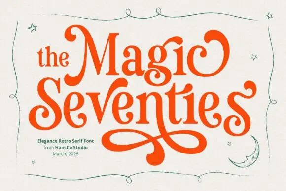 #6
Magic Seventie shows orange serif lettering with heavy curved sides and pointed joins, where large curled initials frame the two-row title and a long figure-eight extension drops below the words, while thin green stars, a moon and a wavy border surround the name.
The sides stay heavy, the joins point, the initials curl and one tail draws a figure eight under the row. That extension is the character: a period serif gains a poster flourish, which is why the sample stacks two rows above it. The stars, moon and border are separate drawings, so plan 26 mm beneath the tail, keep 36 pt and check that the curl is a supplied character rather than cover art. The figure-eight tail is the detail that fails: it needs 26 mm of clear ground beneath the row, and the curl has to be a supplied character rather than cover art before a poster can rely on it.
A retro-party invitation title — Reserve a broad lower margin for one verified figure-eight swash.
Proof the phrase and clear separate stars.
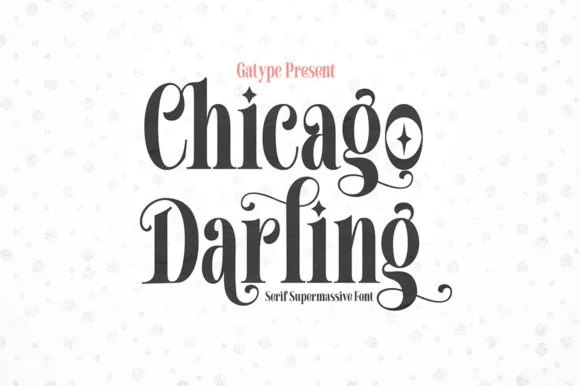 #7
Chicago Darling is a bold, condensed modern-vintage serif distinguished by curled spiral terminals, sparkling counters, and deep descender loops.
Chicago Darling is a high-contrast vintage display serif with curled ball terminals: hairline thins against swollen stems, a small x-height, a high waist and terminals that roll into small balls on the a, c and r. It is the lettering of a nineteen-twenties poster and a department-store sign, so it wants size and air. The hairline thins are the finest element and they break first in print and in vinyl. It needs roughly 34 mm for the contrast and the ball terminal to read, and it is best one dark ink on a cream ground.
Soy candle vessel label & apothecary box front — Stack a two-word scent or brand name tightly at 32–42 pt with tighter line-height, anchored by minimalist uppercase sans notes below.
Hairline crossbars and spiral tips shine in 300 DPI print and hot foil; avoid weeding small adhesive vinyl below 2 inches cap height.
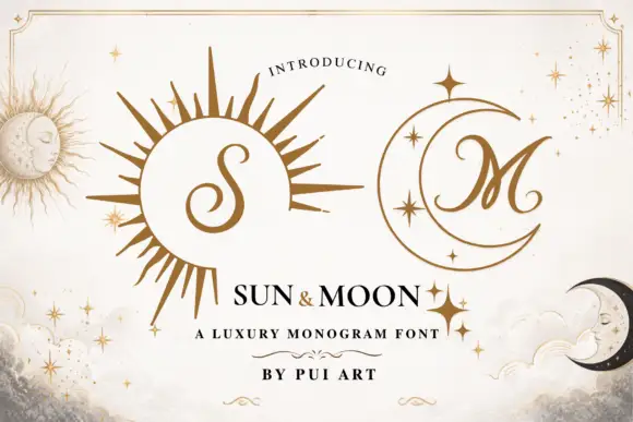 #8
Sun and Moon pairs a rayed sun with a crescent moon, sets one script initial inside each, and draws both in a single fine gold line with a scatter of four-point stars around them.
Two marks share the page: a sun whose rays alternate long and short and radiate from a plain disc that holds a curly script initial; and a moon turned on its back with three stars inside it and a second script initial nested in the curve. Around them a border of thin double rules with corner flourishes frames the composition, and small four-point stars and dots drift through the ground behind the marks. The palette is one warm gold on an off-white paper with a soft grey wash at the edges, so the whole card looks letterpressed rather than printed in colour. The initials are the same playful script, and each sits at a size where one letter reads clearly and two would collide with the rays. The lettering line is fine but never thinner than the smallest star, which is what keeps the set consistent. It is a monogram system for personal stationery, and it holds together because every part is drawn at the same weight.
A day-and-night collection label pair — Place a verified sun S on one white square label and moon M on a matching navy label with product details on their reverses.
Confirm both mappings and colour handling.
 #9
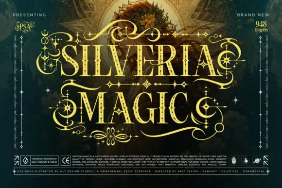
Silveria Magic shows narrow serif capitals in pale gold with fine internal details and sharp contrasting strokes, where long sweeping extensions, crescent curls and star-shaped ornaments frame two rows over a detailed teal fantasy scene and a corner note advertises a glyph count.
The stems stay narrow, the contrast stays sharp, the extensions sweep horizontally and the ornaments sit on the joins as crescents and stars. That ornament frame is the character: the word is designed to be surrounded rather than set in a line, which is why the sample sits on a dense illustration. The advertised glyph count is not verifiable from the image, and the busy ground makes it hard to separate encoded marks from added art. Keep 48 pt, test the ornaments against your own file and avoid this face for any text that must read quickly.
A fantasy story-cover title — Begin with plain verified capitals, then add only confirmed ornaments in open margins.
Proof fine details and independently clear background art.
 #10
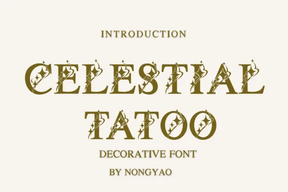
Celestial Tattoo adorns classic roman capitals with four-point star sparkles and crescent curls, built for tarot decks, astrology brands and apothecary labels, where each uppercase character carries tiny celestial cutouts and curled finials while the underlying letter stays a clean roman capital.
The base forms stay classical, the cutouts sit inside the strokes, the finials curl out and the accents repeat at a small scale. That inlaid star is the character: a roman cap becomes a celestial mark without losing its legibility, which is why the sample works at monogram size. The preview cover misspells its own title while the glyphs stay clean, so check the character set yourself, keep 40 pt so the cutouts survive, and treat the crescent curls as part of the outline.
Candle label, tarot box or crystal shop header — Keep headlines to 1–3 words at 36pt+ and pair with a plain humanist serif for body copy.
Tiny interior star cutouts are made for print, foil and digital graphics rather than small vinyl cuts.
 #11
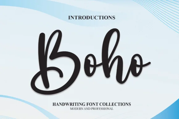
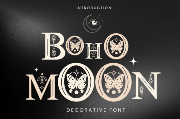
Boho Moon is an enchanting decorative display serif nesting illustrated luna moths/butterflies inside every 'O' and celestial runes across stems!
Boho Moon is a celestial decorative display in which the counters of the letters hide drawn moths, butterflies and moon phases, and the stems carry fine star dots and a thin crescent rule. The illustration sits inside the letter, so the counters must stay open, and the star dots are the first thing to vanish. It needs roughly 36 mm for the moth and the moon phase to read, and it is best in one metallic or deep ink on a dark ground, or a single ink on ivory where the fine dots stay visible.
Apothecary herb jar, moth/crystal tote & astrology journal — Stack 1 or 2 uppercase words at 64–120 pt in warm sand-blush or gold over matte black, accented with four-point stars.
Detailed moth wings and tiny dot cutouts inside stems require print, DTF, sublimation, or laser wood engraving—never weed vinyl!
 #12
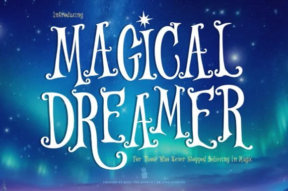
Magical Dreamer is a tall, dreamy fairytale display serif curling spiral hooks and twinkling aurora magic into storybook capitals (with alternates & swashes)!
Magical Dreamer is a celestial fairytale serif in which the swashes curl into starlight: caps open into long curls tipped with small stars, the serifs finish in fine points and the alternate set adds trails that run off the last letter. The star tips are the finest element and the trails extend the word, so the box needs side clearance. It needs roughly 34 mm for the star tip and the curl to read, and it is best in one deep ink on cream, or a fine gold foil above 46 pt where the star edges stay sharp.
Celestial 'Twinkle Little Star' invite, nursery print & tee — Stack 2 tall uppercase lines centered at 76–155 pt crowned by a four-point North Star above matching lowercase subtext.
Solid, smooth hand-drawn stems cut cleanly on Cricut glitter HTV and Oracal 651 above 1.1 inches!
 #13
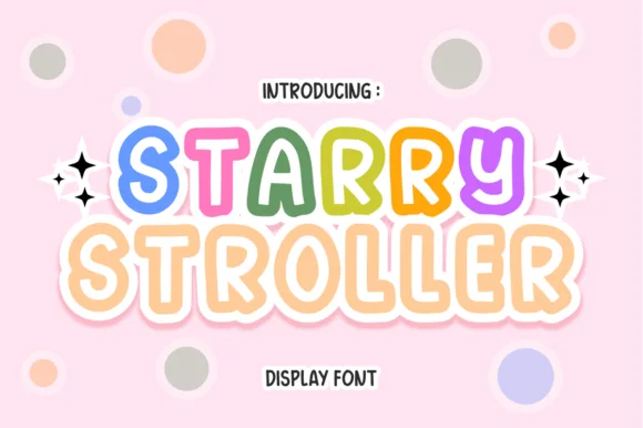
Starry Stroller is a cute, bubbly nursery display font tracing plump rounded capitals with a cheerful parallel inner/outer outline.
Starry Stroller is a bubbly nursery display whose plump rounded capitals carry a parallel inner and outer outline with a solid pastel core between them, so a word reads as a soft vinyl sticker rather than as a printed letter. The two outlines are concentric, which means the face needs size for both to register, and the pastel core can be printed or left to the paper. It needs roughly 30 mm for the double outline to read, and it is best in pastel cores on blush or white with a crisp inner gap.
Baby-shower banner, nursery name print & stroller tag — Color each letter of the baby's name in rotating rainbow pastels at 64–120 pt flanked by sparkle stars.
Shines in Print-Then-Cut stickers, nursery art prints, sublimation, and DTF onesies; scale above 1.8 in if weeding thin vinyl rings.
 #14
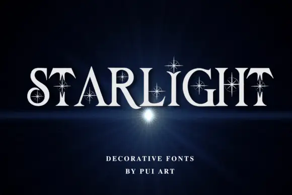
Starlight is a high-contrast serif display face in which a four-point star is cut out of the counters and set across the stems, so a word appears to have light shining through the letters.
STARLIGHT spans the card in white over a dark blue ground with a soft horizon glow, and the letterforms are a tall display roman with fine hairlines and sharp serifs. Each letter carries at least one star: a four-point sparkle in the counter of the A, a small one on the stem of the R, a pair on the H. The stars are cut rather than added, so they read as holes in the letter, and the spacing is generous enough that the star shapes do not crowd the word. A caption at the foot names the set in small spaced caps. The face is a title cut for covers, invitations and signage, and the practical limit is size: the star cut-outs are the smallest feature, so they fill in first on cheap stock or at a small reproduction, and a proof at the final size is essential.
A sparkling evening invitation — Place STARLIGHT in pale ink across a plain navy card with time and venue in a separate white footer.
Verify actual case and sparkle contours without promising animation or glow.
 #15
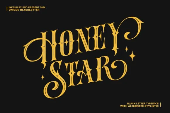
Honey Star is a whimsical, medium-bold ornamental blackletter blending diamond gothic stems with sweeping celestial spiral curls.
Honey Star is a Victorian ornamental blackletter crossed with psychedelic swashes: dense broken strokes with a heavy vertical rhythm, split serifs that curl into long spiral tails, small stars set into the counters and a warm wobble across the baseline. The spirals and the stars are the finest elements and both close first. It needs roughly 34 mm for the spiral and the star to read, and it is best in two warm inks on cream, or one dense ink on white where the spirals print as drawn lines.
Celestial tarot box, apothecary candle & spooky-season mug — Center a 2-word title in metallic gold over midnight black or deep plum, flanking outer curls with minimal star marks.
Main stems have decent body, while outer spiral tips taper fine—favor gold foil, sublimation, or 1.8 in+ vinyl decals.
 #16
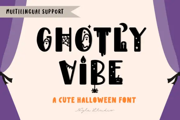
Ghostly Vibe is a cute Halloween display face in which the caps carry little scenes inside them: a ghost in the counter of the O, a spider web in the G, a dripping stroke under the T, and a candelabra between two words.
GHOSTLY over VIBE fills the card in solid black on a cream panel, and the letters are drawn by hand with thick uneven strokes, so the word looks written rather than constructed. Several letters hold a drawn figure: the O contains a ghost with a surprised face, the G has a web across its aperture, the T drips at the foot, the B holds a small candle and the E carries a tiny pumpkin. Between the two rows a candelabra with a lit flame stands on its own, and a row of small stars and dots runs through the composition. A banner at the upper left advertises language support, and two lines at the foot name the style. It is a cute seasonal face rather than a horror one, and it works at moderate sizes, though the figures inside the letters need about 28 pt before they read.
A ghost-theatre ticket heading — Set the confirmed name on a cream ticket face with seat, time and venue in a separate plain purple band.
Verify ghost and candle forms and keep ticket data undecorated.
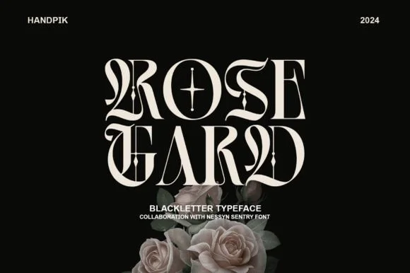 #17
Rose Gard is a sleek, high-contrast modern blackletter featuring calligraphic hairline loops, razor-sliced stems, and a star-crossed O.
Rose Gard is a sharp high-contrast blackletter drawn for editorial use: fine hairlines against dense black stems, pointed diamond terminals, tight vertical rhythm and a clean baseline that lets it sit inside a column. The hairlines are the weakest element in print and the terminals are what survive at display size. It needs roughly 30 mm for the diamond terminal and the hairline to read, and it is best in one dense black on a smooth text stock, or a single dark red on cream, and it should never be reversed at small sizes.
Gothic romance cover, dark-academia zine & album sleeve — Stack two short 4-to-5-letter words flush-center at 64–96 pt with generous black negative space around them.
Needle-thin hairline loops and interior star crosshairs require print, foil, or digital output—do not weed small vinyl.
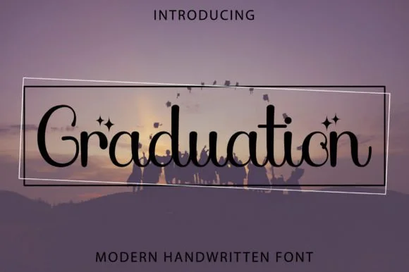 #18
Graduation (by Kido Studio) is a whimsical PUA-encoded decorative serif (NOT a blocky slab!) curling fairytale loops and four-point stars around mixed-case letters!
Graduation is a whimsical decorative serif in mixed case, with curled ball terminals, fairytale loops on the ascenders and four-point star accents supplied as PUA glyphs so the sparkle can be placed deliberately rather than applied as a graphic overlay. The contrast is moderate and the counters stay open, which lets the face hold at 14 pt, and the ball terminals give a word a soft, celebratory edge without the bounce of a script. Because the stars are glyphs, they inherit the text colour and reflow with the line, which is useful on a card set in one ink.
'Reach for the Stars' grad cap topper, frame & invite — Center 1 mixed-case word at 68–140 pt inside tilted geometric hairline frames.
PUA-encoded alternates copy easily via Character Map; cut solid letters at 1.2 in+ on vinyl or print at any size!
Practical buyer checklist
Key cutting, printing and pairing answers before choosing a celestial, moon & star typeface.
Only above roughly 1 inch where the sparkle clears 0.5 mm. Below that the fine rays detach during weeding. For small labels and tags, print the design instead of cutting it.
The softer rounded serifs and the monoline scripts, in a light palette. Sharp spiked stars and dripping gothic detail read as mystical or horror-adjacent, which is the wrong register for a child's room.
Use white, cream or gold vinyl, and keep the lettering at 3 inches or more so the counters stay open at a distance. On a dark wall the contrast is high but fine detail still disappears, so favour heavier weights.
Some include a symbol set on private-use keys and others do not. Check the glyph count and the charmap before planning a zodiac print, since the symbols are usually the first thing a seller omits.
Keep exploring
Explore adjacent maker roundups or check our practical pre-production checklists.
24 curated fonts · Previews & pairings
18 curated fonts · Previews & pairings
34 curated fonts · Previews & pairings
26 curated fonts · Previews & pairings
Guides: Invitation font checklist · Vinyl & cutting checklist · How to pair script & sans fonts
Allow optional Google Analytics to measure visits and catalogue actions. Your search words and notes are not included. Privacy & storage