Modern Grotesque Body

Wildmark Distort + Mango Dream
Creates crisp high-hierarchy contrast beneath Wildmark Distort headlines across menus, websites and labels.
Inspect Mango Dream specimenDisclosure: MakerFileHub may earn a commission from qualifying purchases via paid links on this page. How our links work.
Distressed western display
Wildmark Distort is a distressed western display in black and cream on aged paper: a rounded slab with an uneven, worn outline, a swollen waist and a slight tilt, framed by a rope, a round seal, a ribbon and two small cards with period copy.
Paid link
Get this fontProject & layout blueprintsAt-a-glance maker compatibility
Fine grain and micro-texture excel in 300 DPI print, sublimation, and screen print rather than small vinyl weeding.
Visual anatomy & craft review
The plate is a full western composition: the display sits centre, a seal with a star and a ribbon with a supply name sit at the sides, and two small cards with ruled copy fill the corners. The lettering is a rounded western slab with a deliberately uneven outline and a heavy wear, which reads as a stamped or painted mark rather than a digital face. Because the wear is coarse, the face works at display sizes, and the specimen keeps the palette to three tones so the period feel comes from the composition rather than from colour. The supporting elements are set in condensed caps and a small script, which is exactly how a period tin or a ranch sign would be laid out.
Western, distressed, vintage, rustic
Two-font hierarchy recipes
Tested contrast partners — pairing Wildmark Distort with grounded secondary typography.
Wildmark Distort + Mango Dream
Creates crisp high-hierarchy contrast beneath Wildmark Distort headlines across menus, websites and labels.
Inspect Mango Dream specimen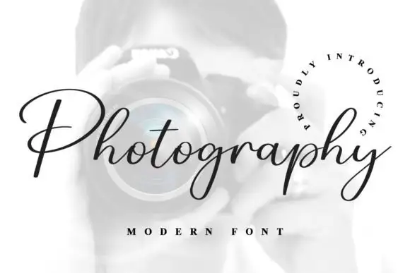
Wildmark Distort + Photography Font
Adds a warm human signature touch for 1-to-3-word callouts without competing against structured serif capitals.
Inspect Photography Font specimenPractical applications
Concrete hierarchy, scale and production guidance tailored to Wildmark Distort’s stroke geometry.
A distressed western display gives a small brand a period identity, and the coarse wear reproduces on an uncoated stock without a texture overlay.
Hierarchy & layout recipe
Print a 70 by 100 mm label: the product at 16 pt, the descriptor in a 7 pt condensed face, and the weight at 6 pt. Keep 5 mm inside the die and print two colours on a kraft stock.
Pre-production check
Check the 16 pt product on kraft, where the wear can close a counter; keep the size above 13 pt. Confirm the 6 pt weight reads on the shelf and that the ribbon clears the die.
A period display sets a themed event in one word, and the composition elements from the family let a poster read as a notice rather than a flyer.
Hierarchy & layout recipe
A2 portrait: the event at 110 mm cap height, the date in a 26 mm condensed face, and a seal at the upper left. Keep 30 mm margins and print three colours on a warm ground.
Pre-production check
Check the poster at five metres, where the wear can read as damage; keep it consistent. Confirm the 26 mm date reads at three metres and that the seal clears the type block.
A rustic display reads across a field, and the heavy letters hold in paint on a board where a fine face would soften in daylight.
Hierarchy & layout recipe
Paint a 1,400 by 500 mm board: the fair at 150 mm cap height, the days in a 30 mm condensed face, and a 6 mm rule. Keep 30 mm margins and paint two colours on a primed board.
Pre-production check
Check the board at ten metres, where the small counters can fill; keep them above 6 mm. Confirm the 30 mm days read at four metres and that the rule clears the frame.
Technical & licence verification
Confirm included OTF/TTF/WOFF formats, full glyph tables and licence coverage on the live store page before batch production.
Closest visual alternatives
Matched across letterform anatomy, stroke behaviour and craft applications.
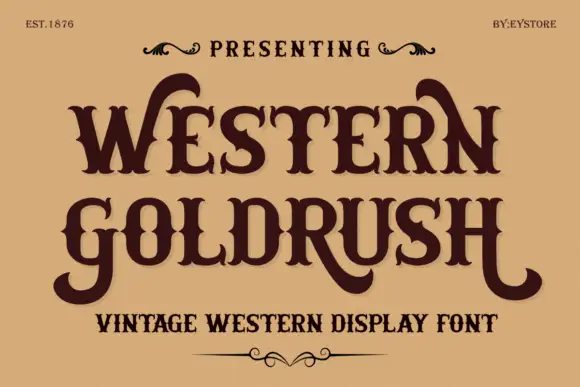
Ornamental western capitals with long curved spurs and heavy slab feet
Western Goldrush is an ornamental western serif in which the capitals carry long curved spurs, the feet flare into heavy slabs and the middle letters stay narrow, so a word reads as a saloon sign.
Ideas for this font
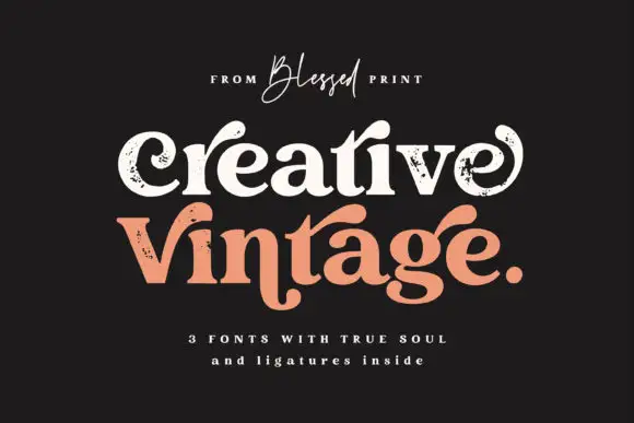
Distressed curled vintage serif
Creative Vintage is a high-contrast serif in which the terminals curl into swash shapes, the C turns inward, the t finishes in a broad low hook and scattered distressed marks break the fill, so a title reads as a worn printed label.
Ideas for this font
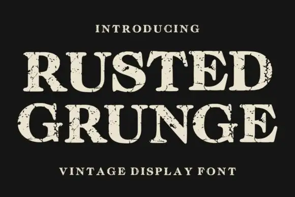
Distressed contrasting serif
Rusted Grunge is a broad contrasting serif in cream on a near-black ground: heavy stems with sharp serifs and irregular cracked gaps that run through the strokes and along the serifs, set on two lines with a tracked line above and a caption beneath.
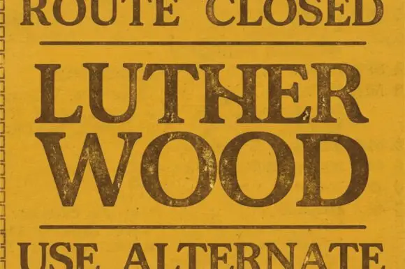
Broad traditional serif with worn fill
Lutherwood is a broad traditional serif in dark brown on a mottled mustard ground: wide capitals with flared serifs, a large bowl on the O and a worn, spotted fill, set in two lines between two rules, with a small line above and below that read as sign copy.
Ideas for this font
Same independent foundry
Allow optional Google Analytics to measure visits and catalogue actions. Your search words and notes are not included. Privacy & storage



