Neutral Sans Workhorse

Deathvale + Saltriver Grotesk
Lets Deathvale own the focal silhouette while handling secondary copy, sizing and subheads cleanly.
Inspect Saltriver Grotesk specimenDisclosure: MakerFileHub may earn a commission from qualifying purchases via paid links on this page. How our links work.
Slender blackletter with an arched D and curled a terminals
Deathvale is a narrow gothic blackletter with tall ascenders, needle-sharp spurs and a silver fill, drawn to sit inside a dark arch like a name carved over a door.
Paid link
Get this fontProject & layout blueprintsAt-a-glance maker compatibility
Sturdy stroke walls and open counters weed cleanly on adhesive vinyl, HTV apparel film, and cut cardstock.
Visual anatomy & craft review
Deathvale spans the frame in a pale silver-grey against a dark stone arch, and the letters are tall and slim with long ascenders that rise well above the x-height and spurs that taper to points. The fill carries a metallic grain, so the word looks cast rather than printed, and a fine ornamental frame of corner curls holds the composition at the edges. A single spaced caption sits beneath the word on a hairline rule. The drawing is disciplined: the stems are all the same weight, the shoulders curl the same way, and the only variation is in the ascenders, which is why the word reads as one line of lettering rather than as a collection of decorated shapes. It is a cover and poster blackletter for horror, fantasy and metal, and its thin points mean it needs a large size and a clean print.
Slender blackletter with an arched D and curled a terminals
Two-font hierarchy recipes
Tested contrast partners — pairing Deathvale with grounded secondary typography.
Deathvale + Saltriver Grotesk
Lets Deathvale own the focal silhouette while handling secondary copy, sizing and subheads cleanly.
Inspect Saltriver Grotesk specimen
Deathvale + Aureline
Grounds bold display lettering with classic typographic authority on posters, badges and apparel.
Inspect Aureline specimenPractical applications
Concrete hierarchy, scale and production guidance tailored to Deathvale’s stroke geometry.
The narrow gothic line sets the hour's mood, and the pale fill holds against a dark arch where a heavy white face would glare and flatten the stone.
Hierarchy & layout recipe
Print an A2 poster: set the film title at 110 pt across one row, keep 32 mm of clear ground beneath before the door time at 13 pt, and hold 26 mm of margin so the needle points stay clear of the trim.
Pre-production check
Points and hairlines break on textured stock; print one poster on the intended paper and check the sharpest point.
The lettering tells a reader what the book is before the subtitle, and the narrow forms fit a long collection title into a paperback trim.
Hierarchy & layout recipe
Print a 135 by 216 mm cover: set the title at 54 pt across two rows, keep 22 mm of clear ground beneath before the editor at 10 pt, and hold 16 mm from the lowest spur to the bottom trim.
Pre-production check
Metallic fills band on uncoated covers; print one cover on the real stock and check the grain before the run.
The carved tone gives a bottle a gothic identity, and the narrow letters fit a long house name on a wrap label without shrinking.
Hierarchy & layout recipe
Print a 60 by 110 mm label: set the house name at 20 pt on one row, keep 8 mm of clear ground beneath before the strength at 4.5 pt, and hold 6 mm from the points to the die line.
Pre-production check
Pale ink on dark labels needs an opaque underprint; print one label in the real process and check the contrast first.
Technical & licence verification
Confirm included OTF/TTF/WOFF formats, full glyph tables and licence coverage on the live store page before batch production.
Closest visual alternatives
Matched across letterform anatomy, stroke behaviour and craft applications.
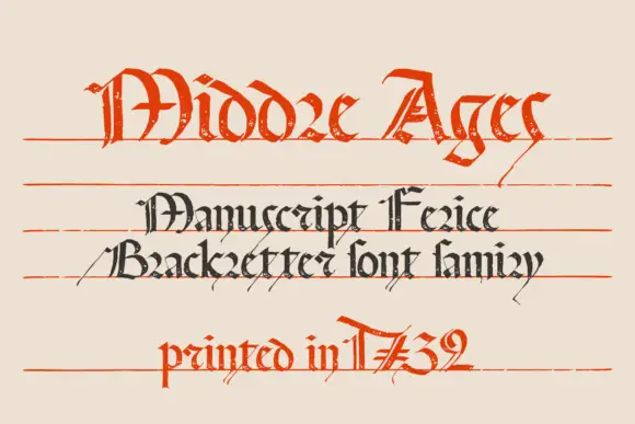
Rough manuscript blackletter
Manuscript Felice is a rough manuscript blackletter shown on cream against faint ruled lines: a large red line of capitals with a ragged finish, a smaller dark line in a tighter cut beneath it, a tracked line that names the family, and a red date line at the foot.
Ideas for this font
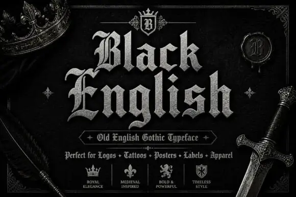
Angular blackletter with diamond-ended strokes and ornate initials
Black English shows pale Gothic mixed case on black, where angular broken bowls, pointed joins and diamond stroke endings give the lowercase a dense rhythm, the large B and E carry extra entry flourishes and a grey hatched treatment adds surface detail to the shown title.
Ideas for this font
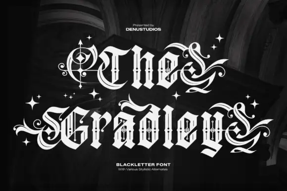
Ornate blackletter with hairline inner strokes and long curling swashes
The Gradley is an ornate blackletter display face: heavy letters with a fine inline running through the stems, long swashes on several capitals, and stars scattered between the words.
Ideas for this font
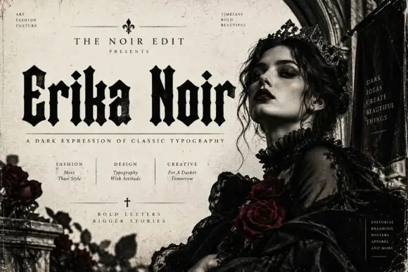
Heavy upright blackletter with blunt notches and diamond dots
Erika Noir is a wide blackletter display face with heavy stems, flat feet and a dense texture, set here in a fashion editorial where the lettering takes half the page.
Ideas for this font
Same independent foundry
Allow optional Google Analytics to measure visits and catalogue actions. Your search words and notes are not included. Privacy & storage



