 #1 · Best Overall
Disclosure: MakerFileHub may earn a commission from qualifying purchases via paid links on this page. How our links work.
Spurred slabs, Tuscan flares & woodblock
23 Best Western & Vintage Label Fonts
Western type is a set of ornaments applied to a slab base: spurs at the terminals, a Tuscan flare in the middle of the stem, and a condensed footprint that came from wood type. Braventro and Western Vintage work the heavy saloon end, Cowboy Wanted and Union Rodeo bring the geo-polygonal bowls, and Baseball Western and Kiron add the spurred Tuscan detail that reads instantly as frontier.
Quick verdict
Braventro is the strongest heavy Western for signage, Western Vintage suits tall saloon panels, and Kiron is the pick for Tuscan detail on labels. Union Rodeo works for a rodeo poster where the forms need to be bold and simple.
Quick answer
Top 3 western & vintage label picks right now.
Short on time? Start with our three highest-rated western & vintage label standouts before scrolling the full breakdown.
#1 · Best Overall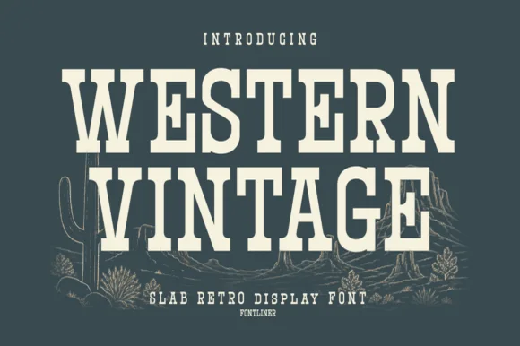 #2 · Runner-Up Pick
 #3 · Editor's Choice
Cowboy Wanted
Heavy western-style capitals with squared feet and pinched ornamental sides
Get fontPaid link
Read review ↓How we tested & selected these 23 fonts
We kept 23 of 161 candidates with genuine frontier construction: spurred terminals, median Tuscan flares, squared feet and woodblock proportions. Faces that are merely vintage-looking or slab-seriffed were removed rather than demoted.
Side-by-side summary
Top 5 western & vintage label picks at a glance.
Compare specimens, OpenType/PUA traits and primary project roles side by side.
| Rank & Font | Style & File Specs | Best Project Fit | Store Listing |
|---|---|---|---|
| Slab SerifFile formats | Garage metal sign, craft beer label or leather hat patch | Get fontPaid link | |
| Slab SerifLanguage support · File formats | Small-batch hot sauce, BBQ rub & smokehouse label | Get fontPaid link | |
| Slab SerifPUA encoded | A western-party invitation title | Get fontPaid link | |
| Slab SerifPUA encoded | A frontier documentary cover | Get fontPaid link | |
| Slab SerifLanguage support | Country music merch, leather-goods stamp & steakhouse menu | Get fontPaid link |
Serifs & Slab Serifs
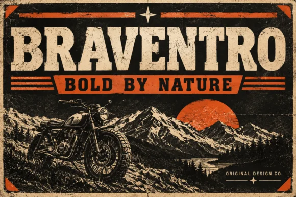
16 fonts#1 · Best OverallBraventro
Braventro is a heavy heritage slab in which the brackets run broad, the counters stay compact and the stems carry sign-letter weight, so a two-word heading reads as a stencilled tin sign for an outdoor brand.
The B stacks two dense bowls, the R keeps a compact bowl over a heavy leg, the A carries a wide apex with a low crossbar and the V drops two thick diagonals into a narrow point, all at a sign weight with bracketed serifs and small counters. The density is the character: the letters sit close and the ink covers most of the box, which is why the sample sets a short phrase on a plain tin ground. Because the counters are small, the face wants 30 pt before they stay open, and it holds from three quarters of an inch of cap height on wood, acrylic or vinyl. The rivets, the rust texture and the small subline are presentation; the heavy slab words are the face.
Recommended project & layout
Garage metal sign, craft beer label or leather hat patch — Pair with a ribbon banner subline in bold sans capitals.
Before you cut or print
OTF display font; solid bold edges cut cleanly on stencils and vinyl.
Best paired with
Get fontPaid link
#2 · Runner-Up PickWestern Vintage
Western Vintage is a bold, condensed slab serif with crisp bracketed block feet and tall frontier poster proportions.
Western Vintage is a tall condensed Western saloon slab serif: heavy squared slabs on a narrow body, a very tall ascender, a spurred stem and a set of inline and shadow companions in the same proportions. It is the lettering of a saloon sign and a rodeo poster, so it wants height and one flat ink rather than a soft palette. The slab spurs are the finest element and they fill first at small sizes. It needs roughly 38 mm for the slab and the spur to read, and it is best on a painted board or a kraft ground.
Recommended project & layout
Small-batch hot sauce, BBQ rub & smokehouse label — Arch 'WESTERN' or the brand title slightly at +15 tracking above a horizontal divider rule and a bold heat-level badge.
Before you cut or print
Straight block slabs and open counters weed cleanly on adhesive vinyl, stencil film, and leather laser-engraving down to 0.6 in.
Best paired with
Get fontPaid link
#3 · Editor's ChoiceCowboy Wanted
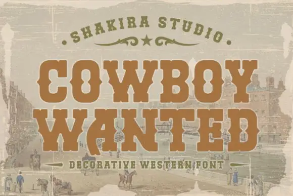
Cowboy Wanted sets a heavy western slab in warm brown on a sepia landscape, its serifs bracketed, its corners spurred and its strokes slightly worn at the edges.
COWBOY over WANTED fills the frame, the O and the C keeping wide bowls and the W carrying a central spur that splits the letter into two V shapes. Serifs are thick and squared, and the whole line sits on a faded frontier scene, with an arc of small caps above and a tracked caption below. The wear is even rather than dramatic, so the letters keep their edges at poster size and soften at small size. It is a period display face, and its use is narrow on purpose: wanted posters, event bills and packaging that has to look printed in the previous century.
Recommended project & layout
A western-party invitation title — Stack COWBOY above WANTED on a plain cream invitation with the venue on a separate white reverse.
Before you cut or print
Confirm counters and source any town scene independently.
Best paired with
Get fontPaid link
 #4 · Top Maker Utility
Union Rodeo
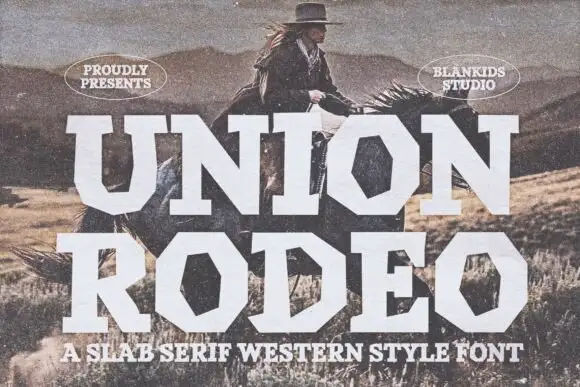
Union Rodeo sets a western slab in huge white capitals, its corners chamfered and its stems notched, so the word looks stencilled on a barn door rather than set in a modern face.
UNION over RODEO fills the frame over a sepia photograph of a rider in dry hills, the letters heavy with square serifs and cut corners that break the block into angular facets. The N and the U keep wide counters, and the diagonal cuts on the R and the D make the word feel cut with a chisel. Two oval badges sit above and a tracked caption below names the style. The face is a display slab, so it wants space: stacked in two rows it fills a poster, and set small it turns into a dark band where the notches read as damage.
Recommended project & layout
A frontier documentary cover — Stack RIDERS AND ROADS in dark brown on a cream title panel above one separately cleared rider photograph.
Before you cut or print
Verify the phrase and establish documentary facts independently.
Best paired with
Get fontPaid link
 #5 · Standout Silhouette
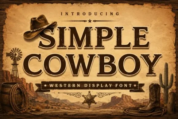
Simple Cowboy
Simple Cowboy is a wide, authoritative Western slab serif featuring crisp bracketed block feet and fine interior inline bevel lines.
Simple Cowboy is an inline-chiselled Western frontier slab serif: heavy unbracketed slabs, a carved inline running down each stem, exaggerated spur serifs on the diagonal strokes and a high cap height that reads as a routed ranch sign. The inline is the design and it fills when the face is reversed or printed small. It needs roughly 30 mm for the inline and the spur to read, and it is best in one dense ink on timber-grey stock, or a routed cut where the inline becomes a groove.
Recommended project & layout
Country music merch, leather-goods stamp & steakhouse menu — Stack 2 centered uppercase lines above a starred ribbon banner, using +15 tracking for crisp frontier balance.
Before you cut or print
In print, sublimation, and laser wood signs, the fine inline bevel pops sharply; if cutting small vinyl, fill/weld the thin inner line first.
Best paired with
Get fontPaid link
 #6
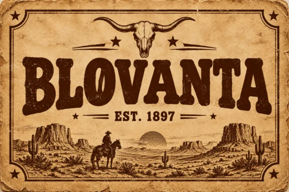
Blovanta
Blovanta is a heavy, weathered Western display serif featuring chunky flared stems, a notched 'O' crossbar accent, and vintage ranch grit.
Blovanta is a weathered woodblock Western saloon display serif: heavy unbracketed slabs with chipped edges, a slightly uneven baseline that mimics hand-set timber type and a surface where the ink coverage breaks into patches as if the block had worn. The chips are the design and they silt when the face is reversed or printed small. It needs roughly 30 mm for the chip and the slab to read, and it is best in one dense ink on uncoated stock, or a single ink with a slight deboss where the block edge catches light.
Recommended project & layout
Smokehouse sign, rodeo tee & rustic cabin wood plaque — Center an all-caps ranch or town name at 60 pt above flanked 'EST. 1897' horizontal rules on kraft or cedar backgrounds.
Before you cut or print
Interior woodblock speckles print and laser-engrave superbly; if cutting adhesive vinyl, weld/flatten tiny interior specks first.
Best paired with
Get fontPaid link
 #7
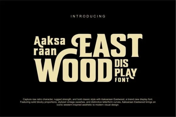
Eastwood
Eastwood is a bold retro-Western display font pairing chunky block proportions with sweeping horizontal swash bars and notched spurs.
Eastwood is a retro Western slab display with swash caps: heavy bracketed slabs, a flared stem that widens at the foot, and capital letters that open into long curled swashes above the line. The swashes grow the word box upward, and the flared feet are the first thing to close at small sizes. It needs roughly 32 mm for the flare and the swash curl to read, and it is best in one warm ink on sand and cream, or a single deep colour on a pale board where the flare prints as a clean wedge.
Recommended project & layout
Roastery coffee bag, craft-jerky pouch & retro saloon tee — Lock smaller two-line descriptors ('DIS / PLAY' or 'EST / 2026') neatly underneath extended 'T' or 'E' top bars.
Before you cut or print
Solid cream-on-black vector shapes with zero distress pits cut cleanly on HTV, mug vinyl, and wood stencils down to 0.9 in.
Best paired with
Get fontPaid link
 #8
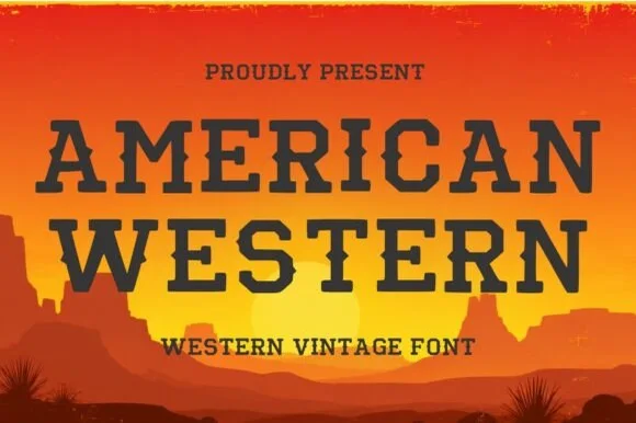
American Western
American Western is a clean, wide-stance frontier slab serif pairing generous open counters with crisp diamond waist spurs.
American Western is a clean Wide-West saloon slab serif: extended unbracketed slabs, a heavy even stem, a small medial spur on some letters and a wide stance that reads as a painted board rather than a display face. The width makes a word long, and the clean slabs mean it survives one-colour print without losing detail. It needs roughly 28 mm for the slab and the spur to read, and it is best in one warm black or oxblood on sand and cream, or a single white on a dark board where the slabs print as clean bars.
Recommended project & layout
Country music-festival tee, RV desert decal & cooler — Stack 2 uppercase rows at 56–105 pt with +8 tracking over warm sunset gradients.
Before you cut or print
100% smooth, non-distressed paths cut and weed in seconds on Oracal 651, HTV, and Mylar wood-sign stencils down to 0.65 in!
Best paired with
Get fontPaid link
 #9
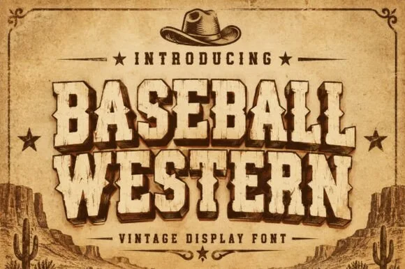
Baseball Western
Baseball Western blends classic American ballpark slabs with Wild-West Tuscan median spurs and rustic parchment distressing.
Baseball Western is a woodblock serif built from spurred saloon lettering: bracketed slab slabs, a heavy vertical stress, sharp spur points on the E, G and J, and a small internal shadow line that mimics a carved block. The spurs break the silhouette outward, so the artwork box grows at every word. It needs roughly 34 mm for the spur and the shadow line to read, and it is best in warm black or oxblood on sand and raw board.
Recommended project & layout
Texas-rodeo baseball tournament tee, BBQ smokehouse & cap — Arch or stack 2 uppercase words in sand-tan with dark-brown drop shadow under a cowboy-hat or star crest.
Before you cut or print
Subtle rustic wear prints and laser-engraves great on leatherette patches; solid cores also cut on 1.25 in+ HTV.
Best paired with
Get fontPaid link
 #10
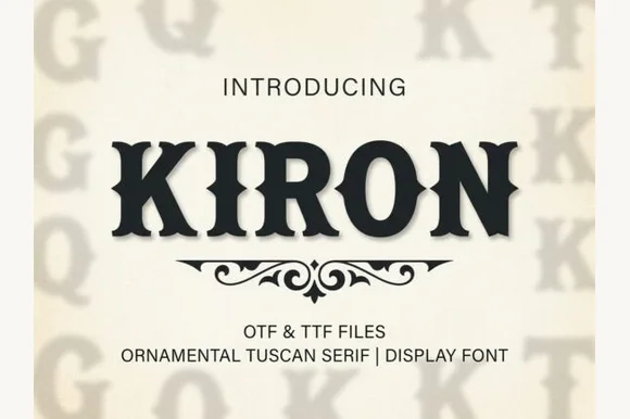
Kiron
Kiron is a clean, heavy Western Tuscan display serif with crisp diamond median spurs, flared bracketed serifs, and solid single-layer geometry.
Kiron is a Tuscan slab serif with a median spur: heavy unbracketed slabs that split into a fork at the foot, a spur that rises from the middle of some stems and a decorative notch where the stem meets the slab. The forked slabs are the design and they close first when the face shrinks. It needs roughly 30 mm for the fork and the spur to read, and it is best in one dense ink on cream, or a single dark red on buff where the forks print as crisp cuts.
Recommended project & layout
Smokehouse BBQ sign, hot-sauce bottle & Western hat patch — Center all-caps brand names at 48–80 pt with +12 tracking above a symmetrical Victorian scroll divider.
Before you cut or print
Clean vector outlines with zero inline gaps make Kiron one of the easiest Western fonts to weed on HTV and sign vinyl down to 0.8 in.
Best paired with
Get fontPaid link
 #11
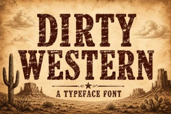
Dirty Western
Dirty Western is a rugged frontier slab serif stamped with coarse woodblock grain, pitted distress, and classic 1880s wanted-poster authority.
Dirty Western is a heavy frontier slab stamped with coarse woodblock grain and pitted wear, in the register of an 1880s wanted poster rather than a modern retro face. Capitals are tall with bracketed slabs, the counters are large enough to stay legible under the distress, and the wear is on the surface rather than the outline, so the word keeps a solid silhouette at a distance. It needs roughly 18 mm before the pitting reads as age instead of dirt, and it is all-caps in practice, pairing with a plain grotesque for detail lines.
Recommended project & layout
Small-batch bourbon bottle, beef-jerky bag & smokehouse menu — Stack 2 centered uppercase rows at 60–110 pt in dark espresso or saddle brown over aged kraft/parchment.
Before you cut or print
Heavy internal woodgrain distress requires label printing, DTF transfers, sublimation, or laser wood engraving—never blade-cut vinyl!
Best paired with
Get fontPaid link
 #12
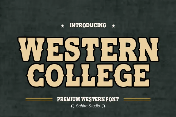
Western College
Western College fuses stout collegiate varsity block slabs with pointed frontier waist spurs for Texas/Montana campus and rodeo gear.
Western College is a hybrid display that fuses stout collegiate varsity slabs with pointed frontier waist spurs and a heavy drop outline, so a word reads as a college team wearing a rodeo badge. The double structure is dense, which means the face needs size to keep the outline and the spur separate, and the wide stance fills a panel with a short name. It needs roughly 30 mm for the spur and outline to read, and it is best in sand tan inside black on slate or two athletic colours on white.
Recommended project & layout
College rodeo-team hoodie, FFA jacket & tailgate banner — Stack 2 centered uppercase lines at 60–115 pt in sand/gold inside a 0.08 in black outline on forest green or maroon.
Before you cut or print
100% smooth, solid single-layer shapes cut and layer fast on Cricut HTV, twill patches, and Oracal 651 down to 0.7 in!
Best paired with
Get fontPaid link
 #13
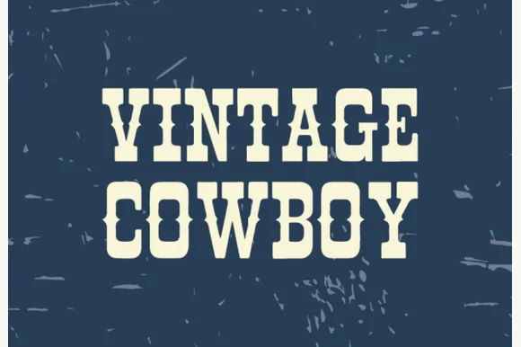
Vintage Cowboy
Vintage Cowboy is a stout, lightly weathered ranch slab serif combining thick bracketed serifs with subtle worn-wood edge character.
Vintage Cowboy is a lettered Western display with blocky spurred serifs, a heavy even stroke and a rope-and-sheriff flavour across the specimen, so a word reads as a rodeo bill rather than a saloon sign. The spurs are short and the fill is solid, which makes it easy to cut and to print in one colour, and the even weight keeps it legible at 20 mm on a ticket. It needs roughly 26 mm for the spur to read as a point, and it is best in a warm brown or oxblood on cream or kraft.
Recommended project & layout
Raw-denim leather waist patch, workwear tee & boot box — Stack 2 centered uppercase words at 64–120 pt with tight 0.92 line spacing on navy, denim, or saddle tan.
Before you cut or print
Solid cores with only mild outer-edge distressing—prints great via DTF/screen print and laser-engraves cleanly on leather!
Best paired with
Get fontPaid link
 #14
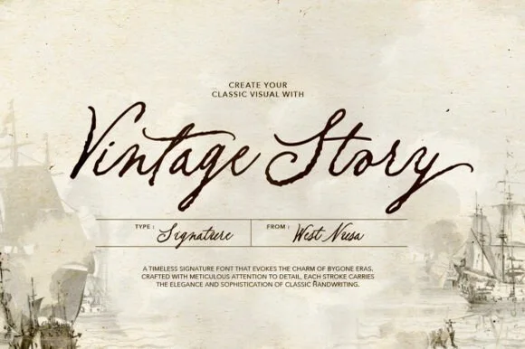
Vintage Story
Vintage Story is an expressive, slanted dip-pen signature script evoking 19th-century ship logs, heirloom postcards, and handwritten letters.
Vintage Story is a slanted archival dip-pen signature script: a steep slant, a high-contrast stroke with a swollen downstroke and a hairline exit, and capitals that loop back over the word. The dip pen leaves occasional thick entries, and the hairline exits are the weakest part in print. It needs roughly 24 mm for the entry swell and the hairline to read, and it is best in one brown-black on buff stock, or a single faded blue on cream to mimic an old letter.
Recommended project & layout
Historical romance cover, travel journal & museum postcard — Set 2-word titles at 48–72 pt over aged parchment, paired with a neat boxed spec grid underneath.
Before you cut or print
Fine tapered pen strokes are built for print, book jackets, and Foil Quill—keep vinyl decals above 2 inches if cutting.
Best paired with
Get fontPaid link
 #15
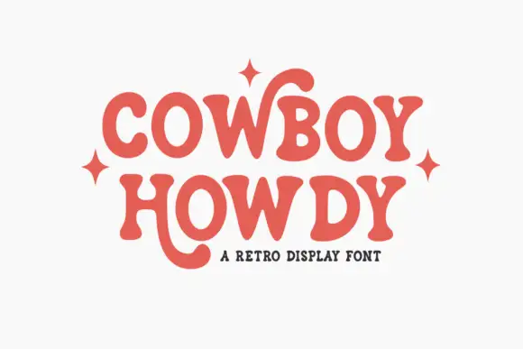
Cowboy Howdy
Cowboy Howdy uses rounded heavy serif forms and open circular bowls in a warm coral red, where the Y of the upper word throws a tall curl high above the cap line and the H of the lower word drops a long rounded tail beneath the baseline.
The strokes stay heavy, the serifs round into soft brackets, the bowls stay nearly circular and two letters carry oversized curls. Those two curls are the character: the sample is built around a shape that only works in a short word, which is why the four sparkle marks sit close to the letters. The curls need clearance on all sides, so plan 20 mm of air above the top word and 24 mm below the lower one, keep 40 pt and check whether the curl is a default letter or an alternate in your file.
Recommended project & layout
A friendly market label — Leave the lower tail clear of the descriptor.
Before you cut or print
Verify the actual name and available alternates.
Best paired with
Get fontPaid link
 #16
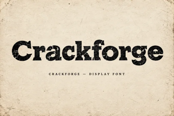
Crackforge
Crackforge is a heavy slab display alphabet in which the stems stay thick, the serifs turn square and the surface breaks into fine cracks, so a word reads as a cast metal plate that has been outdoors for years.
The C cuts a square crescent, the r turns a blunt arm, the a closes a small bowl on a heavy stem, the c repeats the square cut, the k splays two thick diagonals and the f carries a wide bar, all at a bold slab weight with square serifs and a cracked texture drawn into the fill. The crack pattern is the character: it sits inside the strokes rather than on the outline, which is why the sample sets mixed case on a plain ground and lets the surface do the work. Because the strokes are solid, the face reads from 30 pt and prints in one ink; the cracks disappear below that size. The aged paper ground, the torn edges and the small caps line beneath are presentation; the black display word is the face.
Recommended project & layout
Hot-sauce bottle label, distressed band tee or pub poster — Print large in dark ink on kraft/cream paper or off-white ink on black shirts.
Before you cut or print
Internal crack fissures are built for DTF, screen printing and print — not blade vinyl cutting.
Best paired with
Get fontPaid link
Display & Decorative Headlines
7 fonts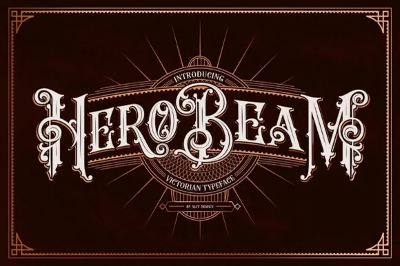 #17
Hero Beam
Hero Beam is an elaborate Victorian poster typeface dressed with interior inline filigree, curled spurs, and crisp drop-contour framing.
Hero Beam is a three-dimensional Victorian saloon and tattoo blackletter: a dense gothic body with a bevel that shades the left edge, a bright highlight ridge along the stem and a drop shadow that sits under the letter. The shading is the whole character, so it needs size to read as a solid beam rather than a smudge, and the highlight is the finest element. It needs roughly 36 mm for the bevel and the highlight to read, and it is best as a paper-colour build on dark stock, or one metallic ink with the highlight left as unprinted paper at 50 mm and above.
Recommended project & layout
Craft root-beer bottle, barber-parlor mirror & cigar box — Arc or center a single bold brand title at large scale (56–84 pt) over dark mahogany, navy, or black label panels.
Before you cut or print
Contains intricate interior filigree lines—produce via high-res label printing, DTF, or laser engraving rather than blade-cut vinyl.
Best paired with
Get fontPaid link
 #18
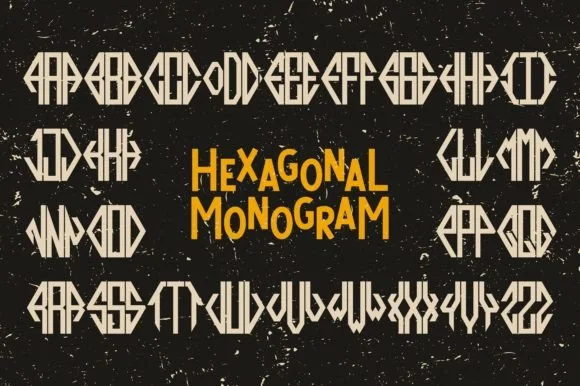
Hexagonal Monogram
Hexagonal Monogram is a modular three-letter monogram font system that shapes any Left-Center-Right initial trio into a crisp six-sided geometric emblem.
Hexagonal Monogram is a geometric cipher monogram system built on a hexagon: three initials sit at the three positions of a hexagon, joined by thin rules that form a continuous cipher, with a small dot at each junction and an optional frame. The system lets one mark be rotated without breaking, and the junction dots are the finest element. It needs roughly 34 mm for the dot and the rule to read, and it is best in one fine ink on smooth card, or a foil impression above 40 mm.
Recommended project & layout
Menswear cufflink engraving, leather wallet & wax seal — Type the 3 initials using the designated left, center, and right positional glyphs at tight 0 tracking inside a clean negative-space circle.
Before you cut or print
Straight geometric bars with zero thin serifs cut and laser-engrave with pinpoint accuracy even at 0.75-inch badge scale.
Best paired with
Get fontPaid link
 #19
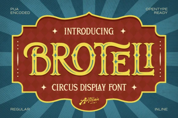
Broteli
Broteli is a theatrical vintage carnival display font featuring bifurcated Tuscan spurs, curled terminals, and both Regular and Inline cuts.
Broteli is a Tuscan-spurred circus and carnival poster display: heavy unbracketed slabs that split into a forked foot, a median spur rising from the middle of some stems, small ball terminals and a slight inward curve on the round letters that reads as a hand-painted carnival board. The forks are the design and they close first when the face shrinks. It needs roughly 32 mm for the fork and the spur to read, and it is best in two bright inks on cream, or one ink plus paper where the forks print as cuts.
Recommended project & layout
'Step Right Up' carnival birthday marquee & ticket invite — Set the child's name or 'CARNIVAL' in Broteli Inline at 56 pt inside a bordered plaque, flanked by four-point star dingbats.
Before you cut or print
Choose the solid Regular cut when cutting cardstock or vinyl banners; save the detailed Inline cut for printed invitations and posters.
Best paired with
Get fontPaid link
 #20
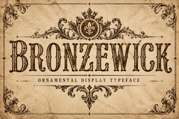
Bronzewick
Bronzewick pairs tall narrow Old West capitals with fine engraved linework inside every stem, so a single-colour print gains the depth of copperplate or woodblock engraving without a second ink.
The letters stay narrow and tall with heavy bracketed serifs, and the interior of each stem carries thin parallel hatch lines that read as shading. The internal hatching is the character: the depth lives inside the letter rather than in an outline, which is why the sample suits a whiskey label. Because the hatch lines are fine, keep 34 pt before they resolve, and check that the chosen surface does not fill them at press. The face suits short heritage headings and loses the engraving effect on longer lines.
Recommended project & layout
Craft whiskey label, beard-oil bottle or book cover — Use at 36pt+ on light kraft or cream stock so internal hatching lines stay crisp.
Before you cut or print
Fine internal engraving lines are made for print, laser engraving and sublimation — not blade vinyl cutting.
Best paired with
Get fontPaid link
 #21
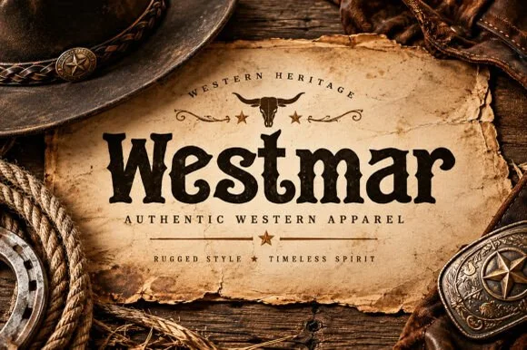
Westmar
Westmar is a western heritage slab in which the serifs grow spurs, the stems bulge and the contour breaks into a worn edge, so a name reads as a brand burned onto a wooden sign.
The W splays four heavy strokes with spurred feet, the e closes a wide eye, the s holds a thick spine with terminal spurs, the t sets a wide bar, the m keeps three even stems and the r turns a spurred arm, all at a slab weight with exaggerated serifs and a rough, broken outline. The spurs are the character: they sit on the serifs and the terminals and give the word its frontier look, which is why the sample sets one name on a torn paper label. Because the shapes are solid, the face holds from 24 pt and prints in one ink, and the worn edge reads as age rather than as damage. The leather hat, the rope, the buckle and the torn paper are presentation; the dark display name is the face.
Recommended project & layout
Western apparel label, boot-shop sign or whiskey bottle — Set in Title Case below an arched uppercase heritage subline.
Before you cut or print
Sturdy strokes laser-engrave sharply on leatherettes and cut cleanly at 1.5"+ height.
Best paired with
Get fontPaid link
 #22
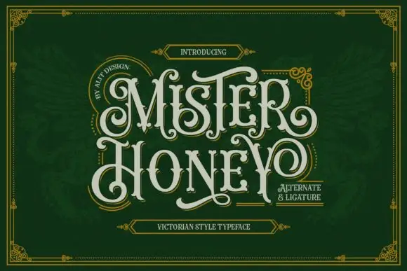
Mister Honey
Mister Honey revives a Victorian poster style: tall condensed capitals with bulbous serifs, curling tails and a thin inner keyline that opens a second colour inside every letter.
The two rows sit on a deep green ground inside a gold rule with corner flourishes, the letters cream with a dark inset edge, the M and the H throwing curled spurs and the Y finishing in a long sweep. Ornament is stacked deliberately: banner labels above and below, an arc of small caps to one side and a boxed note to the other. Because the keyline creates an inner shape, the face carries two tones without being a colour font, which is useful for labels. The setting is dense, and the sample works because the ornament stays outside the words; a busier layout would bury the letterforms.
Recommended project & layout
A honey gift-box lid — Set HONEY above HOUSE on a plain forest-green lid label, with the weight and producer details in a separate cream side strip.
Before you cut or print
Verify actual alternate selection and keep mandatory product information in simple type.
Best paired with
Get fontPaid link
 #23
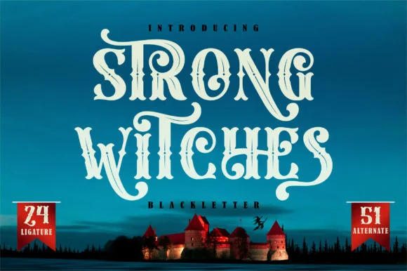
Strong Witches
Strong Witches is a lively, fairytale-gothic blackletter softened by bouncy curled swashes, 24 ligatures, and 51 stylistic alternates.
Strong Witches is a playful curly-swashed fantasy blackletter with twenty-four ligatures and fifty-one alternates: dense broken strokes with a light rhythm, curls that sprout off the shoulders and a swash set that turns a plain word into a drawn spell. The alternates only appear through specific keystrokes, and the curls are the finest element. It needs roughly 32 mm for the curl and the ligature to read, and it is best in two flat inks on cream, or one dense ink on white where the curls print as drawn lines.
Recommended project & layout
Hocus-Pocus party shirt, potion jar label & spellbook prop — Stack 2 centered words at 48–68 pt and swap in 2 or 3 of the 51 PUA alternates on outer capitals and descenders.
Before you cut or print
Sturdy main stems cut well on HTV and vinyl at 1.4 inches+ tall; take care around the narrower curled tail hooks when weeding.
Best paired with
Get fontPaid link
Practical buyer checklist
Frequently asked questions.
Key cutting, printing and pairing answers before choosing a western & vintage label typeface.
What is the difference between Western and Tuscan lettering?
Tuscan is the older term for a serif with a bifurcated or flared stem, common in nineteenth-century display type. Western borrows that flare and adds spurs, squared feet and heavier proportions drawn from American wood type.
Can Western fonts be used for a modern brand?
Yes, if you reduce the elements. One spurred slab headline with a clean sans for everything else reads as confident rather than costume, and keeping the palette restrained stops the frontier reference from taking over.
Why do Western fonts look so condensed?
They descend from wood type, where narrow letters meant fewer blocks to print and more characters per line. That compression survives in the style even in digital files, which is why they suit tall narrow panels.
Do distressed Western fonts work on vinyl?
Generally no. The weathering is made of small cuts and specks that cannot be weeded at typical sizes. Choose a clean weight of the same family or a solid slab for anything that has to be cut.
Keep exploring
Related collections & guides.
Explore adjacent maker roundups or check our practical pre-production checklists.
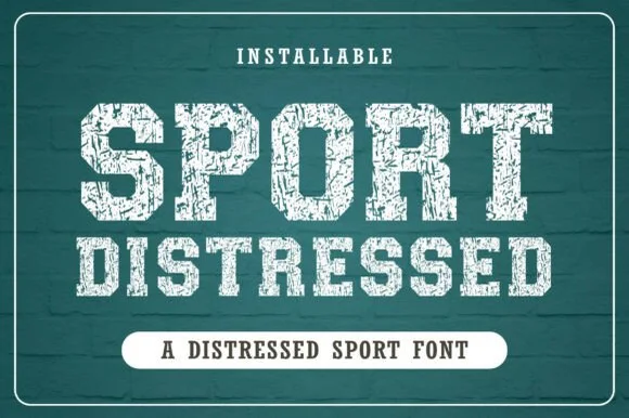
01 / Type Styles
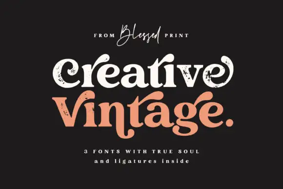
Distressed stamp & vintage press
20 curated fonts · Previews & pairings


02 / Branding & Print
Brand & packaging
39 curated fonts · Previews & pairings

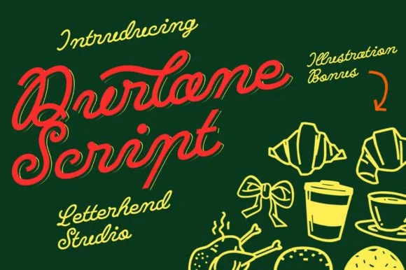

03 / Cricut & Craft
Coffee mugs, glass cans & barware
25 curated fonts · Previews & pairings
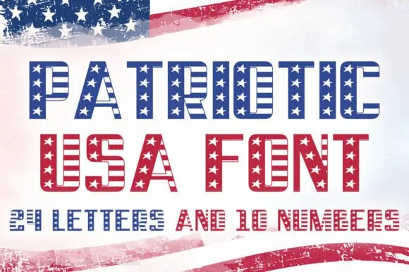
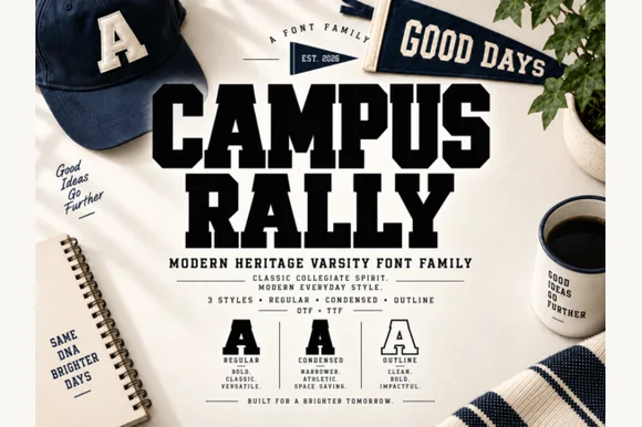
04 / Holidays & Seasons
4th of July & Americana
14 curated fonts · Previews & pairings
Guides: Invitation font checklist · Vinyl & cutting checklist · How to pair script & sans fonts