Neutral Sans Workhorse

Candlecrest + Cenura
Lets Candlecrest own the focal silhouette while handling secondary copy, sizing and subheads cleanly.
Inspect Cenura specimenDisclosure: MakerFileHub may earn a commission from qualifying purchases via paid links on this page. How our links work.
Clean high-legibility modern gothic blackletter
Candlecrest is a clean, high-clarity modern blackletter combining crisp calligraphic serifs with open, approachable lowercase bowls.
Paid link
Get this fontProject & layout blueprintsAt-a-glance maker compatibility
Sturdy stroke walls and open counters weed cleanly on adhesive vinyl, HTV apparel film, and cut cardstock.
Visual anatomy & craft review
Candlecrest is a modern blackletter with the calligraphic serifs kept crisp and the lowercase bowls opened up, so it reads as gothic without the cramped texture that makes traditional fraktur hard to parse. The C carries a scroll, the ascending d, l and t end in diamond tips, and the counters are wide enough that a mixed-case word can be read at 12 mm. It is a display face with unusual tolerance for small labels, and it works particularly well where the gothic reference should feel calm and antiquarian rather than aggressive.
Candlelit · Crisp-gothic · Readable
Two-font hierarchy recipes
Tested contrast partners — pairing Candlecrest with grounded secondary typography.
Candlecrest + Cenura
Lets Candlecrest own the focal silhouette while handling secondary copy, sizing and subheads cleanly.
Inspect Cenura specimen
Candlecrest + Mewah
Grounds bold display lettering with classic typographic authority on posters, badges and apparel.
Inspect Mewah specimenPractical applications
Concrete hierarchy, scale and production guidance tailored to Candlecrest’s stroke geometry.
An open modern blackletter reads as an old trade label rather than a metal band, which lets a candle or mead producer borrow heritage without shouting. The wide counters survive a small jar label where a tight fraktur turns to texture.
Hierarchy & layout recipe
Jar 70 mm diameter, label 60 x 50 mm, name 12 mm, weight 5 pt, 4 mm top arc clearance. Mead bottle 75 x 110 mm, name 16 mm, abv 4.5 pt. Shop sign 800 x 250 mm, name 120 mm, 60 mm margins.
Pre-production check
Blackletter at 12 mm on a curved jar label compresses at the wrap edges. Check the name against the label's arc, and shift it to the flattest area if the diamond tips distort in the proof.
Gothic letterforms suit a reading room and an autumn menu that leans into candlelight rather than costumes. Diamond-tipped ascenders give a menu header period detail while the open bowls keep dish names legible under low light.
Hierarchy & layout recipe
Bookmark 50 x 150 mm, title 14 mm, 6 mm margins, tassel hole 4 mm. Menu 148 x 210 mm, header 26 mm, dishes 8.5/12 pt in a plain serif, 15 mm margins. Mug wrap 210 x 85 mm, word 26 mm, 10 mm from the handle.
Pre-production check
Restaurant menus are read in dim light and a gothic at 8.5 pt is unusable. Keep dishes in the companion serif with a 12 pt leading, and confirm the header-to-body size contrast in a dimmed room test.
The face reads warm and antiquarian beside candlelight, which is the register a winter candle range wants instead of generic snowflake graphics. Open bowls mean a short product name stays readable on a matchbox where traditional fraktur would close up.
Hierarchy & layout recipe
Box 80 x 80 x 80 mm, name 16 mm, scent 6 pt. Journal A5, headings 18 mm, ruled area 7 mm pitch. Matchbox 110 x 50 x 15 mm, name 8 mm, strike panel 30 mm clear.
Pre-production check
Matchboxes are printed on thin board over a rough surface, and a fine diamond tip under 1 mm will break. Request a 1:1 proof on the actual matchbox board and simplify the smallest line if the tip reads as a smudge.
Technical & licence verification
Confirm included OTF/TTF/WOFF formats, full glyph tables and licence coverage on the live store page before batch production.
Closest visual alternatives
Matched across letterform anatomy, stroke behaviour and craft applications.
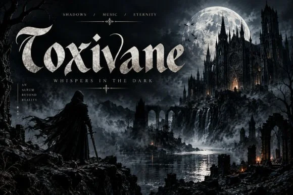
Cinematic gothic display with stone texture
Toxivane is a cinematic gothic display in stone white on a dark castle artwork: tall letters with pointed terminals and hairline joins, filled with a mineral texture, with a tracked capital line beneath and small credits in the corners.
Ideas for this font
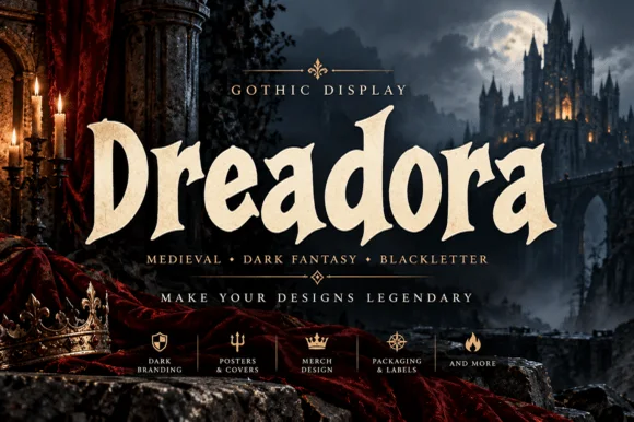
Stately broad-nib medieval manuscript blackletter
Dreadora is a stately medieval blackletter pairing classic broad-nib manuscript rhythm with smooth, highly legible lowercase bowls.
Ideas for this font
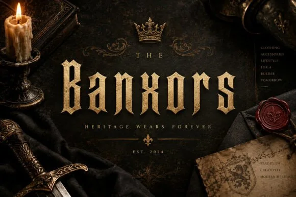
Thorned-spur heritage Gothic blackletter display (OTF)
Banxors is a sharp, authoritative Gothic blackletter typeface (OTF) armed with diamond median thorns for heritage apparel, spirits, and dark luxury!
Ideas for this font
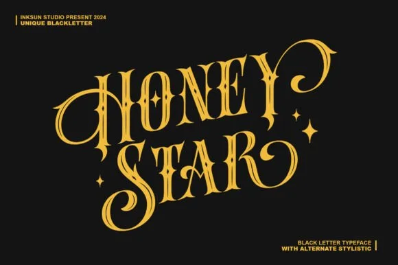
Swashed Victorian-psychedelic ornamental blackletter
Honey Star is a whimsical, medium-bold ornamental blackletter blending diamond gothic stems with sweeping celestial spiral curls.
Ideas for this font
Same independent foundry
Allow optional Google Analytics to measure visits and catalogue actions. Your search words and notes are not included. Privacy & storage



