Modern Grotesque Body

Nacho Fiesta + Noar
Creates crisp high-hierarchy contrast beneath Nacho Fiesta headlines across menus, websites and labels.
Inspect Noar specimenDisclosure: MakerFileHub may earn a commission from qualifying purchases via paid links on this page. How our links work.
Inline-dotted Western & Mexican cantina Tuscan slab-serif
Nacho Fiesta is a bold, single-color cantina slab-serif accented with Western median spurs and crisp inline dots/dashes inside every stroke.
Paid link
Get this fontProject & layout blueprintsAt-a-glance maker compatibility
Fine grain and micro-texture excel in 300 DPI print, sublimation, and screen print rather than small vinyl weeding.
Visual anatomy & craft review
Nacho Fiesta is an inline-dotted Western and Mexican cantina Tuscan slab serif: heavy unbracketed slabs that split into a fork, a line of round dots running down the middle of each stem instead of a solid inline and a small spur rising from some shoulders. The dotted inline is the design and it merges into a line as soon as the face is reduced. It needs roughly 32 mm for the dot pitch and the fork to read, and it is best in two warm inks on cream, or one ink plus paper where the dots print as round knockouts.
Cantina · Inline-dotted · Festive
Two-font hierarchy recipes
Tested contrast partners — pairing Nacho Fiesta with grounded secondary typography.
Nacho Fiesta + Noar
Creates crisp high-hierarchy contrast beneath Nacho Fiesta headlines across menus, websites and labels.
Inspect Noar specimen
Nacho Fiesta + Stylish
Adds a warm human signature touch for 1-to-3-word callouts without competing against structured serif capitals.
Inspect Stylish specimenPractical applications
Concrete hierarchy, scale and production guidance tailored to Nacho Fiesta’s stroke geometry.
A dotted Tuscan slab reads as a painted cantina board rather than a corporate logo. The dot pitch holds at 60 mm on a board, and two warm inks print the board and the cards in one order.
Hierarchy & layout recipe
Board 600 x 900 mm, word 100 mm with 12 mm dot clearance, items 26 mm, 30 mm margins. Card 85 x 55 mm, word 20 mm, 5 mm margins. Sign 900 x 400 mm, word 120 mm, 25 mm margins.
Pre-production check
On an 85 x 55 mm card the dots merge into a solid inline and the name reads as a plain bar. Raise the card word to 28 mm, and check one card before the run.
A dotted Tuscan reads across a field at gate distance where a thin face would vanish. The forks hold at 150 mm on a poster, and two warm inks print the poster and the tote from one separation.
Hierarchy & layout recipe
Poster A2, word 150 mm with 15 mm dot clearance, details 44 mm, 20 mm margins. Stage banner 3000 x 800 mm, word 260 mm, 60 mm safe edge. Tote print 300 x 300 mm, word 70 mm, 25 mm margins.
Pre-production check
Screen printed on a tote at 70 mm the dots bridge into a solid line after a wash. Use a 2 mm stencil bridge, and wash one sample before the order.
A Western slab reads as a printed frontier bill rather than a modern flyer. The forks hold at 100 mm on a poster, and two warm inks print the poster and the prize labels in one pass.
Hierarchy & layout recipe
Poster A2, word 100 mm with 12 mm dot clearance, details 34 mm, 20 mm margins. Tent sign 600 x 400 mm, word 90 mm, 25 mm margins. Prize label 90 x 60 mm, word 18 mm, 5 mm margins.
Pre-production check
A 90 x 60 mm prize label at 18 mm fills the dotted inline and the word reads as a stain. Raise the label word to 24 mm, and print one label before the batch.
Technical & licence verification
Confirm included OTF/TTF/WOFF formats, full glyph tables and licence coverage on the live store page before batch production.
Closest visual alternatives
Matched across letterform anatomy, stroke behaviour and craft applications.
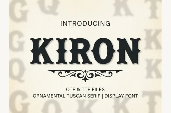
Classic median-spurred Western Tuscan slab-serif
Kiron is a clean, heavy Western Tuscan display serif with crisp diamond median spurs, flared bracketed serifs, and solid single-layer geometry.
Ideas for this font
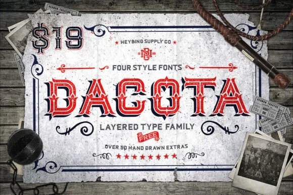
4-style layered Western saloon Tuscan family + 50+ extras
Dacota is a 4-style layered American West Tuscan serif family bundled with 50+ hand-drawn Western banners, ropes, and flourishes.
Ideas for this font
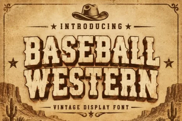
Spurred Wild-West saloon & vintage rodeo woodblock serif
Baseball Western blends classic American ballpark slabs with Wild-West Tuscan median spurs and rustic parchment distressing.
Ideas for this font
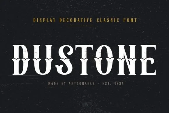
Weathered Victorian Tuscan saloon & gravestone serif
Dustone is a bold vintage Tuscan display serif combining split fishtail serifs, diamond median spurs, and subtle stone-worn texture.
Ideas for this font
Same independent foundry
Allow optional Google Analytics to measure visits and catalogue actions. Your search words and notes are not included. Privacy & storage



