Modern Grotesque Body

Boho Celestia + One More
Creates crisp high-hierarchy contrast beneath Boho Celestia headlines across menus, websites and labels.
Inspect One More specimenDisclosure: MakerFileHub may earn a commission from qualifying purchases via paid links on this page. How our links work.
Rounded bohemian serif with curled lower extensions and soft flared ends
Boho Celestia is a warm rounded serif in which the stems flare at their ends, the bowls stay heavy and the B curls inward below its stem while the final a sends a long low tail, so a word reads as hand-drawn bohemian lettering.
Paid link
Get this fontProject & layout blueprintsAt-a-glance maker compatibility
Sturdy stroke walls and open counters weed cleanly on adhesive vinyl, HTV apparel film, and cut cardstock.
Visual anatomy & craft review
The B closes two soft bowls and curls a stroke under its own stem, the C turns a wide round spine, the A flares both feet and the closing a extends into a tail that travels past the word. The lower curl is the character: it gives the line a base without a rule, which is why the sample sets one word on cream with ornaments around it. Because the tail extends, a title needs 14 mm of clear space at the right end and 16 mm beneath, and the face reads from 26 pt in print. The stars, moons and sun shapes around the title are separate artwork; the black serif lettering and its swashes are the face.
Bohemian · Rounded · Curled
Two-font hierarchy recipes
Tested contrast partners — pairing Boho Celestia with grounded secondary typography.
Boho Celestia + One More
Creates crisp high-hierarchy contrast beneath Boho Celestia headlines across menus, websites and labels.
Inspect One More specimen
Boho Celestia + Wishful Women
Adds a warm human signature touch for 1-to-3-word callouts without competing against structured serif capitals.
Inspect Wishful Women specimenPractical applications
Concrete hierarchy, scale and production guidance tailored to Boho Celestia’s stroke geometry.
The warm serif gives a candle label character, and the rounded stems stay solid at 22 pt on a 50 mm round label in one ink.
Hierarchy & layout recipe
Print a 50 mm round label: set the studio name at 22 pt, keep the low tail 8 mm clear of the die edge, and set the scent in a 6 pt caps along the lower curve.
Pre-production check
A tail printed across a round edge distorts on the sticker; check the wrap and keep the curl on the flat centre.
The bohemian weight reads at a walkway distance, and the flared feet hold a two-word title at 54 mm on a printed board in one ink.
Hierarchy & layout recipe
Print a 500 by 250 mm board: set the title at 54 mm, keep 18 mm of clear ground beneath the low tail, and keep 25 mm of border so the flare stays inside.
Pre-production check
A flared foot printed to the board edge looks clipped; check the mounted sign and keep 20 mm of margin.
The soft serif suits a relaxed ceremony, and the rounded forms keep a pair of names clear at 28 pt on a textured cream card.
Hierarchy & layout recipe
Print a 130 by 180 mm card: set the names at 28 pt, keep 16 mm of clear card beneath them for the curl, and set the date at 10 pt in a light serif below.
Pre-production check
A low tail printed into a date line collides with it; check the proof and keep 14 mm of clear ground under the baseline.
Technical & licence verification
Confirm included OTF/TTF/WOFF formats, full glyph tables and licence coverage on the live store page before batch production.
Closest visual alternatives
Matched across letterform anatomy, stroke behaviour and craft applications.
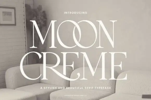
Fine contrasting capitals with overlapping circular bowls
Moon Creme shows tall white serif capitals with fine hairlines and broad round O forms on a muted interior photograph, where the two O letters overlap into a single linked shape and the R leg of the lower row sweeps beneath the following letters before curling away.
Ideas for this font
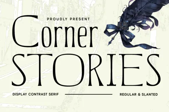
Narrow mixed case set above broad fine capitals in a contrast serif
Corner Stories is a contrast serif supplied in two proportions: a narrow mixed-case setting for running titles and a broad fine capital cut for display, so one page can carry both a subtitle and a wide masthead.
Ideas for this font
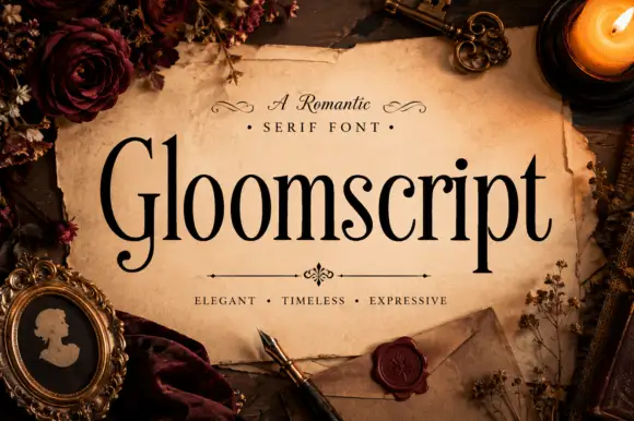
Tall narrow mixed case with a curled capital G foot
Gloomscript shows black contrasting serif letters with long upright stems and narrow rounded bowls, where the G extends into a low curled foot and the p descender drops well below an otherwise even line.
Ideas for this font
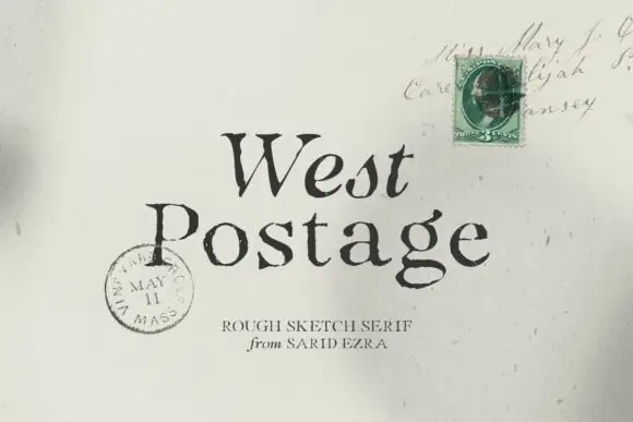
Rough sketch serif
West Postage is a rough sketch serif in near-black on aged cream: uneven stems, sketchy serifs, a drifting baseline and a seeded texture, set on two lines over a period envelope with a green stamp and a postmark, with a small tracked credit beneath.
Same independent foundry
Allow optional Google Analytics to measure visits and catalogue actions. Your search words and notes are not included. Privacy & storage



