Neutral Sans Workhorse

Gorefang + Mansory
Lets Gorefang own the focal silhouette while handling secondary copy, sizing and subheads cleanly.
Inspect Mansory specimenDisclosure: MakerFileHub may earn a commission from qualifying purchases via paid links on this page. How our links work.
Chunky uneven letters with rough pale faces and low red trails
Gorefang is a dark horror display face in which each letter looks carved from a cracked white stone, with chipped edges, a textured surface and thin trails of red running down from the baseline.
Paid link
Get this fontProject & layout blueprintsAt-a-glance maker compatibility
Fine grain and micro-texture excel in 300 DPI print, sublimation, and screen print rather than small vinyl weeding.
Visual anatomy & craft review
Gorefang spans the card in a pale grey stone texture against a dark red ground of blood mist, and the letters are wide with squared strokes, broken contours and small voids where the stone has chipped away. From the foot of several letters a thin red line runs down and pools, and the fill is mottled with darker specks, so the word reads as something carved and then stained rather than as printed type. A caption at the foot names the face in a light serif with wide spacing. The construction is a display texture: the letterform is a plain bold skeleton, and the character comes entirely from the surface, which means the face is for posters and covers at large sizes and would turn to noise on a small label or a shirt print at coarse mesh.
Chunky uneven letters with rough pale faces and low red trails
Two-font hierarchy recipes
Tested contrast partners — pairing Gorefang with grounded secondary typography.
Gorefang + Mansory
Lets Gorefang own the focal silhouette while handling secondary copy, sizing and subheads cleanly.
Inspect Mansory specimen
Gorefang + Augler
Grounds bold display lettering with classic typographic authority on posters, badges and apparel.
Inspect Augler specimenPractical applications
Concrete hierarchy, scale and production guidance tailored to Gorefang’s stroke geometry.
The texture and the drips set the genre before a single word of copy is read, and a promoter can print one sheet instead of commissioning an illustrated poster.
Hierarchy & layout recipe
Print an A2 poster: set the film title at 130 pt on one row, keep 34 mm of clear ground beneath the drips before the date at 13 pt, and hold 26 mm of margin so the chipped edges are not trimmed.
Pre-production check
Textured fills print as mush on cheap stock; print one poster at the final size and check a letter surface before the run.
The carved surface gives a paperback jacket a physical subject, and a series can hold the same treatment while the title changes volume to volume.
Hierarchy & layout recipe
Print a 129 by 198 mm cover: set the title at 48 pt across two rows, keep 20 mm of clear ground beneath before the editor credit at 10 pt, and hold 14 mm from the widest letter to the spine edge.
Pre-production check
The red drips disappear on a dark cover; print one cover on the intended stock and check the contrast before the print run.
The face reads from a distance in the dark, and the stone texture gives a plywood board the look of something found in a field rather than printed last week.
Hierarchy & layout recipe
Print a 900 by 600 mm board: set the attraction name at 160 pt across two rows, keep 40 mm of clear ground beneath before the times at 18 pt, and hold 30 mm of border on all four sides.
Pre-production check
Large textures look painted on vinyl; print one board on the intended material and check the surface before the set.
Technical & licence verification
Confirm included OTF/TTF/WOFF formats, full glyph tables and licence coverage on the live store page before batch production.
Closest visual alternatives
Matched across letterform anatomy, stroke behaviour and craft applications.
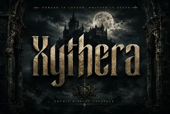
Textured gothic display
Xythera is a textured gothic display in gold on a dark scene: tall capitals with sharp spurs, a carved surface, and a stone-like speckle inside the strokes, framed by an arched stone border with a moonlit castle behind, so the plate reads as a fantasy title rather than a blackletter.
Ideas for this font
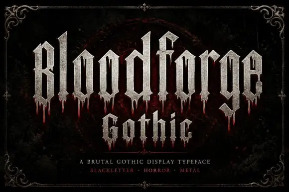
Narrow Gothic strokes with long drip-like lower extensions
Bloodforge Gothic is a brutal gothic display face: tall narrow letters with a stone texture, sharp spurs that end in points, and drip marks hanging from several of the stems.
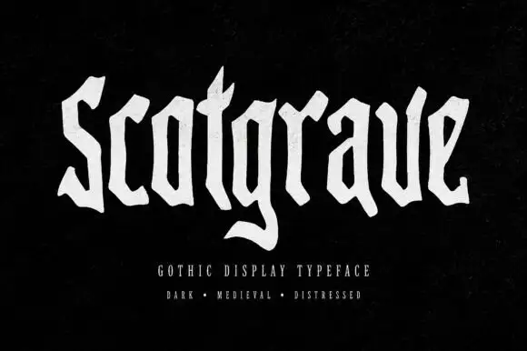
Uneven distressed blackletter
Scotgrave is an uneven blackletter in distressed white on a black ground: angular shoulders, a broad g tail, small gaps and rough edges in the strokes, set as one word with a plain descriptor and three style words beneath, tracked wide in small caps.
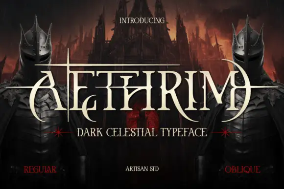
Fantasy capitals with needle-like extensions
Aethrim has high-contrast upright capitals with fine pointed cross-strokes and sweeping crescent-like curves, and long horizontal extensions cut across the title near cap height while armoured figures and a dark castle frame the word.
Ideas for this font
Same independent foundry
Allow optional Google Analytics to measure visits and catalogue actions. Your search words and notes are not included. Privacy & storage



