Editorial Serif Anchor

Lover + The Bilstein Editorial
Anchors Lover's fluid strokes with crisp Roman proportions on wedding suites, headers and packaging.
Inspect The Bilstein Editorial specimenDisclosure: MakerFileHub may earn a commission from qualifying purchases via paid links on this page. How our links work.
Slanted brush script
Lover is a slanted brush script in black on nude packaging: thick downstrokes with rough white breaks, blunt tapered ends and a fast rightward lean, shown on a bottle, a bag, a tag, a card and a jar across a single mockup sheet.
Paid link
Get this fontProject & layout blueprintsAt-a-glance maker compatibility
Sturdy stroke walls and open counters weed cleanly on adhesive vinyl, HTV apparel film, and cut cardstock.
Visual anatomy & craft review
The plate is a branding mockup rather than a specimen line, which is the honest way to show a brush script sold to cosmetics: the same word appears on five objects at five sizes, so a buyer can judge how the rough breaks behave on a label at twenty millimetres and on a bag at ninety. The drawing is a fast brush letter with thick downstrokes, thin joins and blunt ends, and the white breaks are cut into the strokes rather than sprayed over them, so the wear reproduces at any size. The nude palette and the dried rose keep the sheet quiet so the lettering carries it. Because the script is slanted and connected, it needs a clear run at the end of a line, and the mockups show it sitting alone rather than in a paragraph.
Brush, script, luxury, packaging
Two-font hierarchy recipes
Tested contrast partners — pairing Lover with grounded secondary typography.
Lover + The Bilstein Editorial
Anchors Lover's fluid strokes with crisp Roman proportions on wedding suites, headers and packaging.
Inspect The Bilstein Editorial specimen
Lover + Furion
Keeps small-scale dates, URLs, nutrition facts and care instructions crisp and legible below script titles.
Inspect Furion specimenPractical applications
Concrete hierarchy, scale and production guidance tailored to Lover’s stroke geometry.
A brush script reads as a beauty brand, and the blunt strokes hold on a small bottle label where a fine pointed script would break up.
Hierarchy & layout recipe
Print a 55 by 70 mm label: the brand at 18 pt, the product at 8 pt, and the volume at 6 pt. Keep 5 mm inside the die and hold 8 mm at the right for the end stroke.
Pre-production check
Check the 18 pt brand on a curved bottle, where the tail can run into the trim; pull it left. Confirm the 6 pt volume reads on the shelf and that the label holds in a warm room.
A brush script gives a carrier bag a signature, and the thick strokes survive on kraft where a hairline script would fill with fibre.
Hierarchy & layout recipe
Print a 300 by 250 mm bag panel: the brand at 90 mm, the line at 14 mm, and one ink on kraft. Keep 40 mm margins and centre the word so the tail has room at both ends.
Pre-production check
Check the 90 mm brand on kraft, where the rough breaks can clot; keep them above 1.5 mm. Confirm the 14 mm line reads at arm's length and that the print survives a folded gusset.
A brush script suits a hand-painted welcome board, and the thick downstrokes read across a room where a thin script would disappear.
Hierarchy & layout recipe
A1 board: the greeting at 100 mm cap height, the names at 55 mm, and the date at 22 mm. Keep 40 mm margins so the tails clear the border and paint one colour on a pale board.
Pre-production check
Check the board at five metres, where a thin join can vanish; keep the joins above 5 mm. Confirm the 22 mm date reads from the door and that the tails stay inside the frame.
Technical & licence verification
Confirm included OTF/TTF/WOFF formats, full glyph tables and licence coverage on the live store page before batch production.
Closest visual alternatives
Matched across letterform anatomy, stroke behaviour and craft applications.
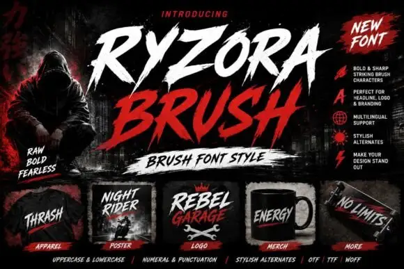
Torn brush display
Ryzora Brush is a brush display in bone and red on a dark street scene: forward-slanted capitals with torn edges, pointed tails and dry-brush gaps, set in two lines above a brush-stroke band, with a hooded figure at the left, a feature list at the right and a row of small mockups along the foot.
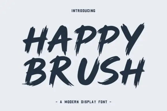
Heavy brush capitals with split pointed ends
Happy Brush is a heavy brush capital face in which the strokes slant, the ends taper into long points and some terminals split in two, so a short headline reads as a loaded brush dragged across the surface.
Ideas for this font
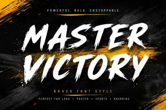
Frayed brush caps
Master Victory is a brush uppercase on a dark textured ground: slanted strokes with frayed tails, open counters and uneven edges, set in two stacked words in white over dry gold brush strokes, with a tracked line above and a plain list of uses beneath.
Ideas for this font

Heavy calligraphy with large curled terminals
Thick Black combines heavy rounded stems with large looping T, B and k forms, where two stacked words sit with tight middle counters and sweeping outer terminals, and a faint landscape runs behind the lettering as separate artwork.
Ideas for this font
Same independent foundry
Allow optional Google Analytics to measure visits and catalogue actions. Your search words and notes are not included. Privacy & storage



