Modern Grotesque Body

Nocturne Black + Hermano
Creates crisp high-hierarchy contrast beneath Nocturne Black headlines across menus, websites and labels.
Inspect Hermano specimenDisclosure: MakerFileHub may earn a commission from qualifying purchases via paid links on this page. How our links work.
Soft uneven serif display
Nocturne Black is a soft uneven serif in cream on a black ground: rounded bowls, flared ends, slightly irregular widths and a wide fitting, set as one long line beneath a small introducing line and a half moon, with a descriptor and two credit lines at the foot inside a fine frame.
Paid link
Get this fontProject & layout blueprintsAt-a-glance maker compatibility
Sturdy stroke walls and open counters weed cleanly on adhesive vinyl, HTV apparel film, and cut cardstock.
Visual anatomy & craft review
The plate is a dark specimen, and the half moon gives the word a ground without an illustration. The drawing is a soft uneven serif with rounded bowls and flared ends, so the face reads as a hand-cut display rather than a polished text serif, and the wide fitting keeps a long title legible across a portrait measure. That construction sets a moderate size floor, because the fine joins and the flares close first. The introducing line, the descriptor and the credits are product copy, and the frame and the moon are staging. It suits a cover, a poster and a label for a dark or an editorial subject, and it is warm enough to use on a literary title.
Serif, soft, editorial, dark
Two-font hierarchy recipes
Tested contrast partners — pairing Nocturne Black with grounded secondary typography.
Nocturne Black + Hermano
Creates crisp high-hierarchy contrast beneath Nocturne Black headlines across menus, websites and labels.
Inspect Hermano specimen
Nocturne Black + Abigail
Adds a warm human signature touch for 1-to-3-word callouts without competing against structured serif capitals.
Inspect Abigail specimenPractical applications
Concrete hierarchy, scale and production guidance tailored to Nocturne Black’s stroke geometry.
A soft serif carries a literary title, and the uneven widths give the cover warmth where a polished face would look cold.
Hierarchy & layout recipe
Set the title at 80 mm cap height across 180 mm, the author in a 11 pt serif, and the imprint at 8 pt. Print two colours on a textured stock, keeping 22 mm margins and 0.3 mm as the finest join.
Pre-production check
Check the title at 80 mm, where a join can clot; keep the counters open. Confirm the 8 pt imprint survives lamination and that the flares clear the trim.
A soft serif suits a dark reading, and the cream on black reads at distance where a delicate face would vanish. It holds at poster distance.
Hierarchy & layout recipe
A2 poster: the event at 100 mm cap height, the details in a 22 mm serif, and the venue at 11 mm. Keep 28 mm margins, print one colour on a dark stock and keep the joins above 2.5 mm.
Pre-production check
Check the A2 at five metres, where a join can vanish; keep it above 2.5 mm. Confirm the 11 mm venue reads at two metres and that the moon clears the type.
A soft serif label reads as a craft product, and the warm forms hold on a matte wrapper where a hard serif would look industrial.
Hierarchy & layout recipe
Print a 60 by 90 mm label: the maker at 12 pt, the bar at 8 pt, and the weight at 7 pt. Keep 5 mm inside the die, keep the joins above 0.4 mm and leave 10 mm at the foot for a batch note.
Pre-production check
Check the 12 pt maker on the wrap, where a join can fill; keep it above 0.4 mm. Confirm the 7 pt weight reads in hand and that the label takes a fold.
Technical & licence verification
Confirm included OTF/TTF/WOFF formats, full glyph tables and licence coverage on the live store page before batch production.
Closest visual alternatives
Matched across letterform anatomy, stroke behaviour and craft applications.
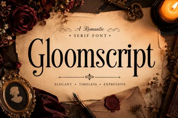
Tall narrow mixed case with a curled capital G foot
Gloomscript shows black contrasting serif letters with long upright stems and narrow rounded bowls, where the G extends into a low curled foot and the p descender drops well below an otherwise even line.
Ideas for this font
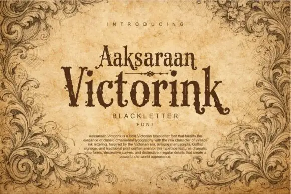
Distressed Victorian serif
Victorink is a narrow ornamental serif printed on aged parchment: uneven spurs, curled ends, chipped edges and a heavy printing texture, set in two stacked lines with a small descriptor beneath and a paragraph of description at the foot, framed by engraved acanthus leaves.
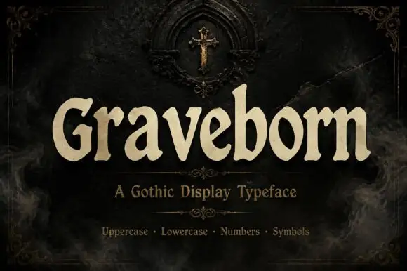
Softly flared Gothic display with broad rounded lowercase
Graveborn is a gothic display face that mixes a blackletter skeleton with a sturdy serif, giving spiky terminals, a tall x-height and a weight heavy enough to sit on a dark ground.
Ideas for this font
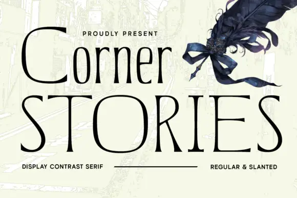
Narrow mixed case set above broad fine capitals in a contrast serif
Corner Stories is a contrast serif supplied in two proportions: a narrow mixed-case setting for running titles and a broad fine capital cut for display, so one page can carry both a subtitle and a wide masthead.
Ideas for this font
Same independent foundry
Allow optional Google Analytics to measure visits and catalogue actions. Your search words and notes are not included. Privacy & storage



