Modern Grotesque Body

Braveston Slab + Furion
Creates crisp high-hierarchy contrast beneath Braveston Slab headlines across menus, websites and labels.
Inspect Furion specimenDisclosure: MakerFileHub may earn a commission from qualifying purchases via paid links on this page. How our links work.
Rounded mixed-case slabs with blunt feet and irregular rustic edges
Braveston Slab is a rounded mixed-case slab in which the bowls stay heavy, the feet blunt off, the edges carry a slight unevenness and the lowercase keeps a warm width, so a title reads as a ranch sign rather than a hard Western face.
Paid link
Get this fontProject & layout blueprintsAt-a-glance maker compatibility
Fine grain and micro-texture excel in 300 DPI print, sublimation, and screen print rather than small vinyl weeding.
Visual anatomy & craft review
The B closes two round bowls on a straight stem, the r carries a short blunt arm, the a keeps a wide open counter and every foot ends in a small squared block with a softly irregular edge. The mixed-case setting is the character: most Western faces are capitals only, so a lowercase line softens the tone, which is why the sample sets one title on a wooden plaque. Because the weight is heavy, the face reads from 28 pt and holds fine at large sizes in print or vinyl, though punctuation and case coverage should be checked in the file before a long message is set. The medallion, windmill and sunset are artwork; the cream lettering is the face.
Rustic · Rounded slab · Mixed case
Two-font hierarchy recipes
Tested contrast partners — pairing Braveston Slab with grounded secondary typography.
Braveston Slab + Furion
Creates crisp high-hierarchy contrast beneath Braveston Slab headlines across menus, websites and labels.
Inspect Furion specimen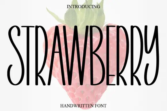
Braveston Slab + Strawberry
Adds a warm human signature touch for 1-to-3-word callouts without competing against structured serif capitals.
Inspect Strawberry specimenPractical applications
Concrete hierarchy, scale and production guidance tailored to Braveston Slab’s stroke geometry.
The rounded slabs read at a distance, and the mixed case keeps a two-word title warm at 80 mm on a painted board in one ink.
Hierarchy & layout recipe
Paint a 700 by 300 mm board: set the title at 80 mm, keep 30 mm between the two words, and keep 35 mm of border all round so the blunt feet are not trimmed.
Pre-production check
A heavy slab painted to the frame edge looks cut; check the mounted sign and keep 30 mm of margin.
The rustic weight suits a printed banner, and the lowercase keeps a long name readable at 60 mm across a vinyl sheet outdoors.
Hierarchy & layout recipe
Print a two-metre banner: set the name at 60 mm, keep 45 mm of border all round so the eyelets clear the letters, and set the dates in a 30 mm caps underneath.
Pre-production check
An eyelet punched through a letter tears the banner; check the layout and keep 40 mm of clear ground from the hem.
The rounded slab carries a can label, and the heavy forms stay solid at 20 pt on a 66 mm wrap panel printed in one flat ink.
Hierarchy & layout recipe
Print a 66 by 100 mm can panel: set the brand at 20 pt, set the style at 9 pt in a caps beneath, and keep 6 mm from the wrap edge so the letters stay on the flat wall.
Pre-production check
A slab wrapped over the can shoulder distorts; check the mock and keep every letter on the straight section.
Technical & licence verification
Confirm included OTF/TTF/WOFF formats, full glyph tables and licence coverage on the live store page before batch production.
Closest visual alternatives
Matched across letterform anatomy, stroke behaviour and craft applications.
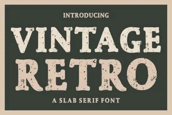
Heavy distressed slab serif
Vintage Retro is a heavy slab serif printed as a distressed cream on dark green: thick squared serifs, tight spacing, and a scatter of grit and small pinholes through the fills that reads as a worn letterpress block.
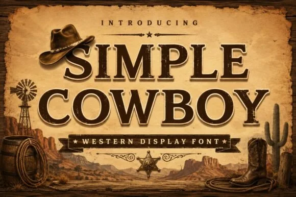
Inline-chiseled Western frontier slab serif
Simple Cowboy is a wide, authoritative Western slab serif featuring crisp bracketed block feet and fine interior inline bevel lines.
Ideas for this font
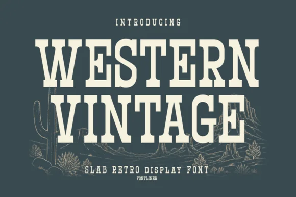
Tall condensed Western saloon slab serif
Western Vintage is a bold, condensed slab serif with crisp bracketed block feet and tall frontier poster proportions.
Ideas for this font
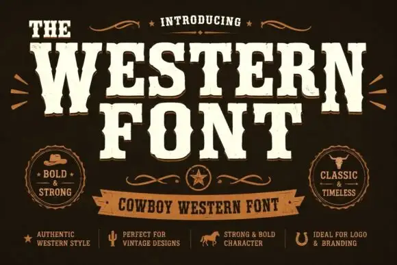
Heavy western capitals with pinched sides
The Western is a heavy western display in cream on dark brown: tall capitals with pinched waists, wedge serifs and a rough printed edge, laid out with a ribbon banner and two round badges.
Ideas for this font
Same independent foundry
Allow optional Google Analytics to measure visits and catalogue actions. Your search words and notes are not included. Privacy & storage



