Neutral Sans Workhorse

Manulor + Bargain Condensed
Lets Manulor own the focal silhouette while handling secondary copy, sizing and subheads cleanly.
Inspect Bargain Condensed specimenDisclosure: MakerFileHub may earn a commission from qualifying purchases via paid links on this page. How our links work.
Broad blackletter with diamond shoulders
Manulor is a broad blackletter in gold on a black ground: diamond-shaped shoulders, a tall narrow l, even stroke widths and heavy bowls, set as one word between a small crown ornament above and two tracked credit lines beneath, all inside a fine ornamental frame.
Paid link
Get this fontProject & layout blueprintsAt-a-glance maker compatibility
Sturdy stroke walls and open counters weed cleanly on adhesive vinyl, HTV apparel film, and cut cardstock.
Visual anatomy & craft review
The plate is a formal specimen, and the drawing is the whole subject: the shoulders are cut as diamonds, the l rises well above the other letters and the strokes stay even, so the word reads as a carved plate rather than as writing. That evenness means the face holds a moderate size without clogging, and the diamond shoulders are what close first when it shrinks. The crown, the frame and the two credit lines are staging and product copy. It suits a label, a certificate and a brand for a heritage or a spirits subject, and the wide fitting means a short word reads best at a large size.
Decorative, blackletter, broad, formal
Two-font hierarchy recipes
Tested contrast partners — pairing Manulor with grounded secondary typography.
Manulor + Bargain Condensed
Lets Manulor own the focal silhouette while handling secondary copy, sizing and subheads cleanly.
Inspect Bargain Condensed specimen
Manulor + The Bilstein Editorial
Grounds bold display lettering with classic typographic authority on posters, badges and apparel.
Inspect The Bilstein Editorial specimenPractical applications
Concrete hierarchy, scale and production guidance tailored to Manulor’s stroke geometry.
A broad blackletter reads as a house with age, and the gold holds in foil on a dark label where a hairline serif would fill in.
Hierarchy & layout recipe
Print a 55 by 85 mm label: the house at 12 pt, the expression at 8 pt, and the year at 7 pt. Keep 5 mm inside the die and keep the diamonds above 0.4 mm in foil.
Pre-production check
Check the 12 pt house in foil, where a diamond can fill; keep it above 0.4 mm. Confirm the 7 pt year reads on the shelf and that the label holds in a cellar.
A formal blackletter reads as a document, and the broad fitting holds a pair of long names on one line at a moderate size.
Hierarchy & layout recipe
A4 certificate: the title at 42 mm cap height, the names at 22 pt, the date at 12 pt, and a rule border 10 mm inside the trim. Letterpress one ink on a heavy card.
Pre-production check
Check the 22 pt names in letterpress, where a shoulder can sink; proof the plate first. Confirm the 12 pt date reads at arm's length and that the border stays even.
A broad blackletter frames a history cover, and the even strokes hold the title at display size without ornament. It holds the title alone.
Hierarchy & layout recipe
Set the title at 80 mm cap height across 180 mm, the author in a 12 pt serif, and the imprint at 8 pt. Print two colours on a textured stock and keep 22 mm margins.
Pre-production check
Check the title at 80 mm, where a shoulder can clot; keep the counters open. Confirm the 8 pt imprint survives lamination and that the l ascender clears the trim.
Technical & licence verification
Confirm included OTF/TTF/WOFF formats, full glyph tables and licence coverage on the live store page before batch production.
Closest visual alternatives
Matched across letterform anatomy, stroke behaviour and craft applications.
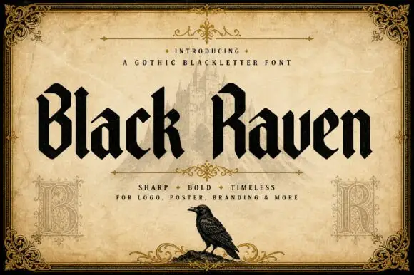
Solid blackletter with angular B and R bowls and pointed feet
Black Raven is a bold blackletter display face with wide stems, tight spacing and a flat black contour, drawn to print solid at large sizes on a light ground.
Ideas for this font
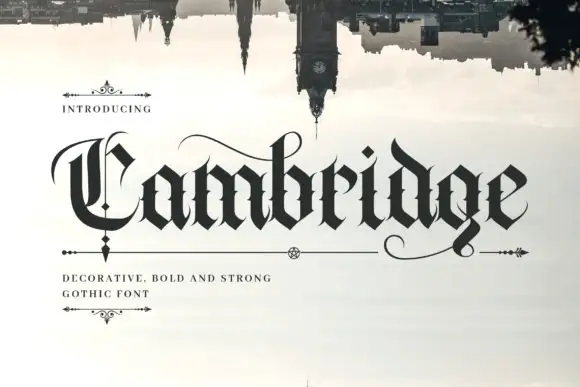
Dense blackletter with split C and long hairline swashes
Cambridge shows a black gothic word beneath an inverted skyline, where the C carries a thin parallel inner stroke and a wide upper arc, the heavy lowercase bodies meet in sharp diamond joins, fine curves extend above the middle and beneath the final g, and the i dot is a tilted diamond.
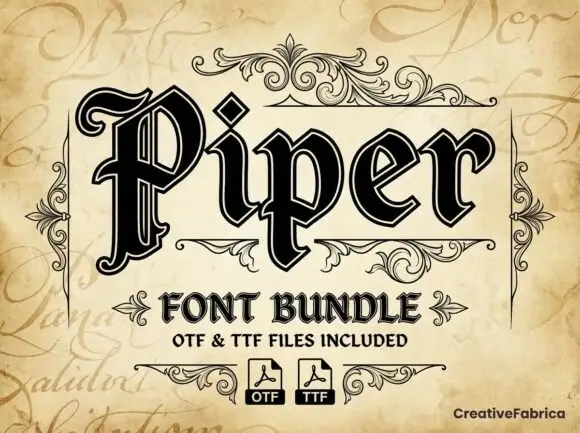
Outlined blackletter with doubled edges
Piper is an outlined blackletter in black on aged cream: a large curled P with doubled edges, narrow bodies, a diamond counter and fine inner lines, set as one large word above a scroll-flanked line that names the bundle and two format marks.
Ideas for this font
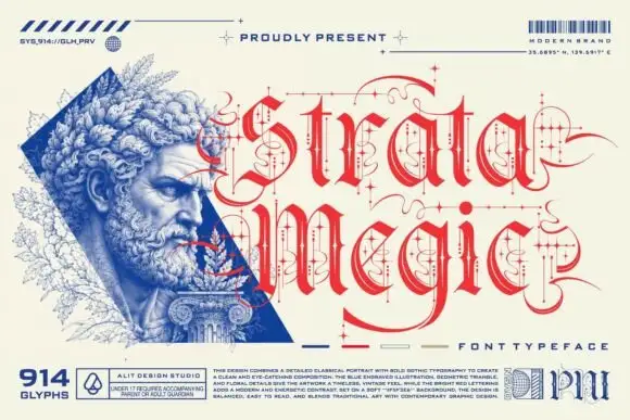
Fine calligraphic blackletter with looping line-and-dot ornaments
Strata Megic is a classical display serif with high contrast, sharp serifs and ornamental flourishes, shown in a technical drawing layout with glyph counts and swatch keys.
Ideas for this font
Same independent foundry
Allow optional Google Analytics to measure visits and catalogue actions. Your search words and notes are not included. Privacy & storage



