 #1 · Best Overall
Disclosure: MakerFileHub may earn a commission from qualifying purchases via paid links on this page. How our links work.
Spray tags, dripping markers & bubble throw-ups
18 Best Graffiti, Throw-Up & Street Tag Fonts
Graffiti type lives or dies on the edge quality of a stroke: a chisel-marker taper, a spray-can overspray halo, or a drip that hangs from a terminal. Death Subway Graffiti and Drip Brutalyn build the drip into the letterform, Temur Amorak and Grestanic keep a torn brush end, and Back Wild and Boy Graffiti handle the puffy throw-up side. Moreli adds an outline companion for two-colour work.
Quick verdict
Death Subway Graffiti is the strongest tag look for apparel, Back Wild covers throw-up bubbles, and Moreli is the pick when you need an outline layer. Temur Amorak handles a more restrained brush capital set for skate and streetwear.
Quick answer
Top 3 graffiti, throw-up & street tag picks right now.
Short on time? Start with our three highest-rated graffiti, throw-up & street tag standouts before scrolling the full breakdown.
#1 · Best Overall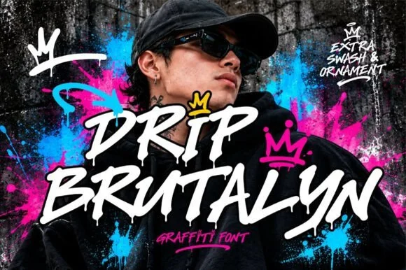 #2 · Runner-Up Pick
Drip Brutalyn
Dripping marker-slash street font with rough edges and ragged tails
Get fontPaid link
Read review ↓ #3 · Editor's Choice
Temur Amorak Urban Bold Brush Font
Slanted brush capitals with torn ends
Get fontPaid link
Read review ↓How we tested & selected these 18 fonts
We kept 18 of 394 candidates whose texture comes from the letter outline rather than a bitmap overlay. Scored on drip attachment, whether the spray edge resolves at 300 dpi, and how much of the word stays readable in a thumbnail on a phone screen.
Side-by-side summary
Top 5 graffiti, throw-up & street tag picks at a glance.
Compare specimens, OpenType/PUA traits and primary project roles side by side.
| Rank & Font | Style & File Specs | Best Project Fit | Store Listing |
|---|---|---|---|
| BrushRaw | Skateboard graphic, streetwear hoodie or hip-hop flyer | Get fontPaid link | |
| BrushAlternates & swashes | Mixtape cover, streetwear back graphic or festival tee | Get fontPaid link | |
| BrushLigatures · Language support · File formats | An action-event poster | Get fontPaid link | |
| BrushLanguage support | An independent gig poster | Get fontPaid link | |
| ScriptStreet-brush | Gym pump-cover hoodie, energy-drink can & streetwear tag | Get fontPaid link |
Scripts & Calligraphy
5 fonts#1 · Best OverallDeath Subway Graffiti
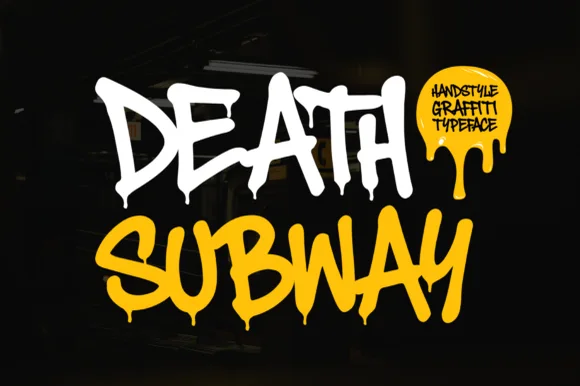
Death Subway Graffiti captures a raw underground marker-and-spray handstyle, where angular street slashes meet organic drip terminals that hang below the letters for skate decks, streetwear and flyers.
The strokes stay uneven and fast, the slashes cut at angles, the drips hang from the ends and no two letters repeat the same width. That drip is the character: the word looks tagged rather than designed, which is why the sample keeps one short phrase on a plain ground. The drips form part of the silhouette, so keep 20 mm of clearance beneath from 40 pt and check whether the drip terminals ship as characters or exist only in the sample.
Recommended project & layout
Skateboard graphic, streetwear hoodie or hip-hop flyer — Set in high-contrast white, acid yellow or neon green over matte black.
Before you cut or print
Fine paint-drip tips suit DTF, screen printing and posters rather than small vinyl cuts.
Best paired with
Get fontPaid link
#2 · Runner-Up PickDrip Brutalyn
Drip Brutalyn is a street brush alphabet in which the strokes are cut with slashes, the edges are rough and the tails run down as drips, so a word reads as lettering sprayed on a wall that has not dried.
The D opens with a hard slash and a squared bowl, the r keeps a short arm, the i stands as a narrow bar with a rough top and the p drops a stem that ends in a drip, all at a heavy weight with torn edges and sharp angles. The drips are the character: several letters carry a run of paint below the baseline, which is what gives the face its aggressive street register and also what makes it unsuitable for anything that must align. Because the strokes are wide, the face holds at 40 pt on a print and at 80 mm on a garment, and it fails below 20 pt where the tears turn to noise. The graffiti wall, the pink and blue splashes, the crown marks and the small caption are presentation; the brush face is the two words.
Recommended project & layout
Mixtape cover, streetwear back graphic or festival tee — Layer white lettering with a hard black shadow over vibrant colour splashes.
Before you cut or print
Best for DTF, screen printing and digital graphics due to fine drip tips.
Best paired with
Get fontPaid link
#3 · Editor's ChoiceTemur Amorak Urban Bold Brush Font
Temur Amorak Urban Bold Brush Font sets two rows of heavy white capitals that lean hard to the right, with torn ragged stroke ends, long diagonal cuts through the thick stems and a small green brush subtitle underneath on a dark grainy field.
The stems stay thick, the lean stays constant, the ends tear into spikes and the joins between strokes break rather than close. That torn edge is the character: the word reads as a fast tag painted with a wide flat brush, which is why the sample sits on a dark textured ground with nothing else in the frame. Uppercase only in the sample, with ligatures advertised in the small caps footer, so check whether your file carries lowercase and the alternates. Keep 34 pt or above so the tears stay separate, and print on matte stock where the ragged edges survive.
Recommended project & layout
An action-event poster — Keep the date and route horizontal below.
Before you cut or print
Check long strokes against the poster edge.
Best paired with
Get fontPaid link
 #4 · Top Maker Utility
Grestanic
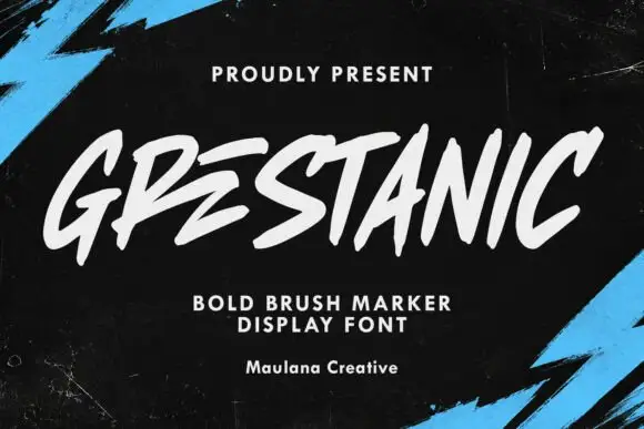
Grestanic sets narrow marker capitals at a hard slant, with terminals that taper to sharp points, uneven tops and edges that break rather than curve.
Every stem is cut fast: terminals taper to points, the arms of the E sit at steep angles, and the A opens into a narrow triangular counter that barely survives at small sizes. Spacing is tight and uneven, which produces the hand-scrawled rhythm, and the tops of the letters form a ragged edge instead of a clean line. There is no lower-case in the sample, so this is an uppercase-only display voice. The cyan brush strokes behind the word are artwork; the typeface is white and flat, and it depends on a dark ground for its contrast. The thin pointed ends are the first thing to fail in any reproduction, whether printed or cut.
Recommended project & layout
An independent gig poster — Set a short white heading on black with plain dates in a separate lower block.
Before you cut or print
Check A and N spacing at poster and thumbnail sizes.
Best paired with
Get fontPaid link
 #5 · Standout Silhouette
Graffiti Impact
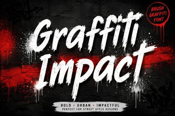
Graffiti Impact is a fast, forward-slanted urban brush script combining connected marker flow with gritty spray-splatter energy.
A slanted urban dry-brush script slashed in stark white across a spray-painted red and black wall: thick slanted strokes with dry bristle edges, so the word reads as a tag painted in a hurry rather than as a script with a grain overlay. The slant and the weight are the character, and the dry breaks sit where a brush lifts rather than randomly, which is what makes it repeatable. Because the strokes are bold, the face holds on posters and apparel but clogs at small sizes. The wall behind is staging. Uses are streetwear, gym and energy branding, fight posters and fitness content where speed is the message.
Recommended project & layout
Gym pump-cover hoodie, energy-drink can & streetwear tag — Stack 2 title-case words tilted -6° in stark white over crimson brush slashes on matte black.
Before you cut or print
Feathered brush edges reproduce sharpest via DTF, screen print, and sublimation rather than small blade-cut vinyl.
Best paired with
Get fontPaid link
Display & Decorative Headlines
13 fonts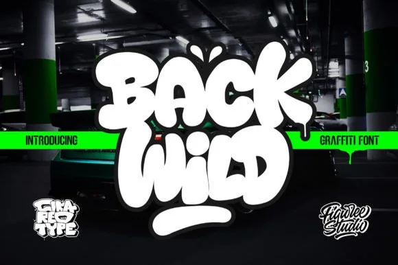 #6
Back Wild
Back Wild delivers puffy throw-up street bubble graffiti, where the white letters inflate into overlapping blobs with a dark outline and a soft glow, a drip runs from the final letter and a thick rounded underline bar sits below on a dark garage photograph.
The letters stay fat and rounded, they overlap rather than sit apart, the outline carries the shape and one drip pulls the eye down. That overlap is the character: the word reads as a painted throw-up rather than a font setting, which is why the sample shows a two-word stack on a dark ground. The green banner and the small studio marks belong to the cover. Check whether the outline and the glow are included styles, keep 44 pt so the outlines stay separate and print on a matte surface where the soft edge does not smear.
Recommended project & layout
Die-cut skate sticker, youth hoodie or party poster — Pair bright fill colours with a heavy black outer contour and underline swash.
Before you cut or print
Smooth bold contours cut great on layered vinyl and print-then-cut stickers.
Best paired with
Get fontPaid link
 #7
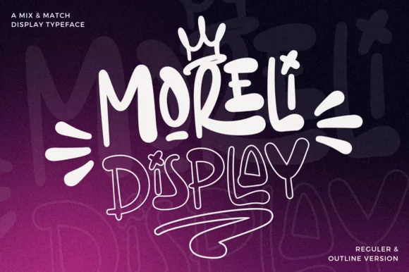
Moreli
Moreli is a playful mix-and-match street-bubble display typeface shipped in both solid Regular and matching hollow Outline versions.
Moreli is a street-art bubble and outline graffiti display duo: the fill cut is a fat rounded bubble with a wide flare and a slight lean, while the outline cut traces the same shapes as a hollow keyline for a second colour behind or in front. The pair is designed to be layered, so the outline only makes sense when it is registered against the fill. The keyline is the finest element and it closes first when the face is reduced. The fill needs roughly 36 mm and the outline 44 mm for their detail to read.
Recommended project & layout
Streetwear drop tee, skate sticker & podcast cover — Stack the solid Regular style on line one at 110% scale above the Outline style on line two, tilting the whole lockup 5 degrees.
Before you cut or print
Use the solid Regular cut for vinyl decals; reserve the fine double-wall Outline version for screen printing, DTF, or large posters.
Best paired with
Get fontPaid link
 #8
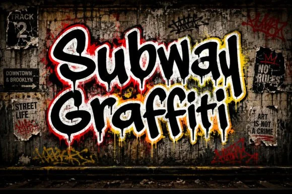
Subway Graffiti
Subway Graffiti is a lively mixed-case street-art display font featuring flared marker terminals and vertical wet-paint drips.
Subway Graffiti is a mixed-case marker display with flared terminals and long vertical wet-paint drips, drawn to sit on a brick wall or a subway panel. The core letters are chunky and readable, the flares give a tag rhythm, and the drips extend below the baseline so the layout needs foot room. It needs roughly 25 mm for the drips to read as paint rather than as a printing fault, and it works best in two inks on a mid-tone ground, with a second offset shadow in a light colour.
Recommended project & layout
Urban podcast cover, street-food truck wrap & concert poster — Wrap dark core letters inside a crisp white + yellow double glow border over brick or concrete.
Before you cut or print
Shines in DTF transfers, vinyl wraps, and posters; if blade-cutting HTV, scale above 1.5 in so thin paint drips weed intact.
Best paired with
Get fontPaid link
 #9
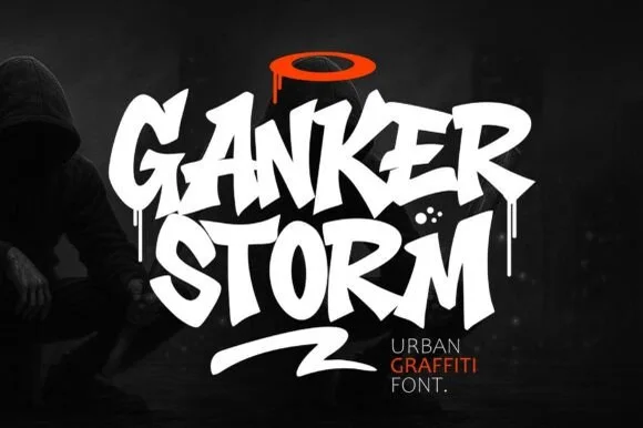
Ganker Storm
Ganker Storm is a bold urban graffiti display font combining sharp chisel-tag capitals, wet paint drips, and underline swooshes.
Ganker Storm is a street-tag display drawn with a chisel marker and then dripped: flat-cut tag letters, a slight lean, blunt blade ends and long paint runs that fall from the terminal of the last letter. The drips add height below the baseline, so a centred block needs clearance underneath. It needs roughly 28 mm for the chisel cut and the drip to read, and it is best in one wet black on a pale wall or white card, or a single saturated colour where the runs stay sharp.
Recommended project & layout
Rap single cover, street-dance battle poster & skate video — Stack 2 all-caps words tight (0.85 leading), top with a contrasting orange/red halo, and underline with a slash swash.
Before you cut or print
Heavy solid letter cores cut well on 1.5 in+ hoodie HTV (weld overlapping letters!); fine drip tips shine in DTF and print.
Best paired with
Get fontPaid link
 #10
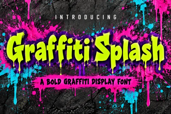
Graffiti Splash
Graffiti Splash is a bold, heavy mixed-case street display font dripping long vertical paint runs from chunky comic-slab letters.
Graffiti Splash is a heavy mixed-case street display with chunky comic-slab letters and long paint runs dripping from the baseline, plus a built-in extrusion shadow in some styles. The letters are wide and bouncy, the counters are large enough to stay readable with the drips attached, and the drips demand vertical room below the baseline — cropping close severs them. It needs roughly 30 mm for the drips to read as paint rather than as noise, and it is at its best in two flat colours on a wall or garment.
Recommended project & layout
Glow-party / splatter-paint room shirt, banner & invite — Run 1 or 2 mixed-case words across a 10-inch chest in neon lime or hot pink over black.
Before you cut or print
Shines in neon DTF transfers, Print-Then-Cut stickers, and glow HTV (scale above 1.6 in so drips weed cleanly!).
Best paired with
Get fontPaid link
 #11
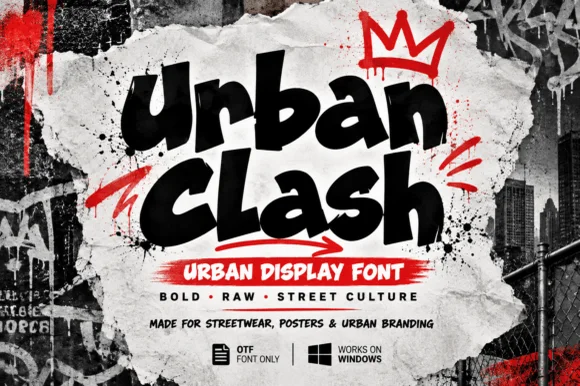
Urban Clash
Urban Clash is a heavy, tight-set street-marker display typeface with flared chisel terminals, energetic bounce, and raw urban presence.
Urban Clash is a chunky street-marker graffiti display: fat interlocking letters with a squared marker edge, a hard keyline, small drips running off the baseline and a few counters cut through as if sprayed over a layer. The drips and the cut counters are the finest elements and both close when the face is reduced. It needs roughly 30 mm for the drip and the keyline to read, and it is best as a flat two-colour print on coated stock, or one vinyl colour where the drips become cut paths.
Recommended project & layout
Streetwear drop tee, hip-hop flyer & YouTube thumbnail — Stack 2 words tight at a slight upward tilt and accent with a single contrasting red underline arrow or crown.
Before you cut or print
Broad solid fills and open counters make Urban Clash straightforward to cut on thick HTV, puff vinyl, and sticker stock.
Best paired with
Get fontPaid link
 #12
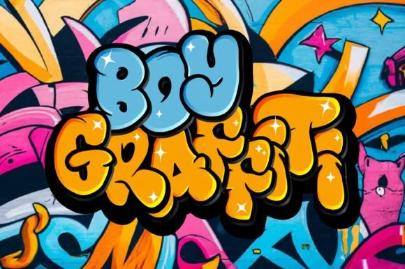
Boy Graffiti
Boy Graffiti is a plump, bubbly street-throwup display font with inflated comic-cushion letters and tiny slit counters.
Boy Graffiti is a puffy bubble throw-up face with inflated cushion-shaped letters, tiny slit counters and a heavy cartoon outline drawn as part of the glyph. The letters overlap slightly, which is what makes a word read as a painted throw-up rather than typed bubbles, and the outline gives it a sticker edge. Because the counters are slits, the face needs roughly 30 mm for legibility and is at its best as a two-letter or short word on a wall, garment or sticker. It is a street-culture display, not a text face.
Recommended project & layout
'Fresh Prince' 90s birthday shirt, kids' room decal & cup — Color word one sky blue and word two golden yellow wrapped in a unified thick black sticker shadow.
Before you cut or print
Smooth puffy curves cut and weed super cleanly on Cricut HTV, 3D puff vinyl, and Print-Then-Cut stickers!
Best paired with
Get fontPaid link
 #13
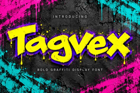
Tagvex
Tagvex is a chunky mixed-case graffiti display font combining wide chisel-marker strokes with hanging wet-paint drips.
Tagvex is a chunky graffiti display in mixed case with wide chisel-marker strokes, flared terminals and long wet-paint drips hanging from the baseline. The core letters stay solid and readable while the drips add movement, and a built-in offset shadow in the specimen style gives depth without a second ink. Drips extend below the baseline, so the layout needs foot room, and the face needs roughly 25 mm for the drips to read as paint. It is a street face for posters, cups and apparel.
Recommended project & layout
Gaming stream overlay, hip-hop single & skate-shop flyer — Fill letters with acid yellow, add a tight purple drop shadow, and place over dark concrete.
Before you cut or print
Great for DTF hoodies, Print-Then-Cut stickers, and digital graphics; scale above 1.75 in if blade-cutting vinyl drips.
Best paired with
Get fontPaid link
 #14
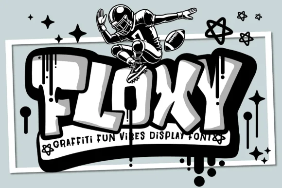
Floxy
Floxy is a chunky, rounded-rectangle street graffiti font accented with subtle paint drips and heavy cartoon 3D block depth.
A tubular rounded block display shown under a monochrome street character leaping over stars: the white letters carry a heavy black extruded side face and vertical drip highlights, so the word reads as painted street lettering with real depth rather than as an outline with a shadow. The counters are wide rectangles, which is what keeps a short name unmistakable at a distance, while the rounded corners stop the face from looking like a sports stencil. The extrusion is drawn rather than applied as an effect, so it repeats consistently on every glyph. The character and stars behind are staging. Uses are youth sport, skate and street-brand work.
Recommended project & layout
Youth flag-football hoodie, skate-camp tee & water bottle — Set 1 short 4-to-6-letter name big (72–130 pt) in white with heavy black extruded shadow.
Before you cut or print
Best for DTF shirts, Print-Then-Cut stickers, and posters; solid main blocks cut on 1.5 in+ HTV.
Best paired with
Get fontPaid link
 #15
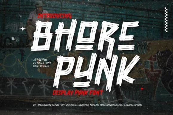
Bhore Punk
Bhore Punk is a fierce, slanted punk-rock display typeface sliced through with diagonal razor-cut stencil splits and jagged dry-brush spurs.
Bhore Punk is a slashed stencil-cut punk and streetwear display: squared letters cut through by three or four parallel slashes, with hard corners, a slightly uneven baseline and small torn bridges left holding the pieces together. The slashes are the design and they merge into solid notches as soon as the face is reduced. It needs roughly 30 mm for the slash and the bridge to read, and it is best as a one-colour vinyl cut or a flat two-colour print on uncoated stock.
Recommended project & layout
Punk gig flyer, skate zine masthead & album cover — Stack 2 short all-caps words tight in stark white and red over high-contrast monochrome photography.
Before you cut or print
For DIY spray-paint stencils or large HTV back prints, scale letters to 2 inches+ so all separated slash fragments stay easy to align.
Best paired with
Get fontPaid link
 #16
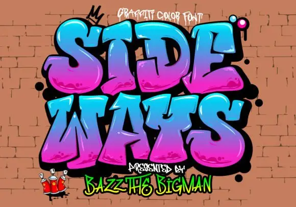
Sideways
Sideways is a graffiti colour face in which the letters are fat, tilted blocks with a heavy black outline, a magenta-to-cyan gradient and a soft highlight, presented on a brick wall with sprayed drips.
SIDE over WAYS fills the card at a strong tilt, and each letter is a thick graffiti shape with a gradient that runs from magenta at the bottom to cyan at the top, a black contour with a soft drop shadow and a highlight along one edge. The tilt increases across the word, so the whole piece looks sprayed rather than set, and small drips and dots sit around the letters. A caption at the top names the set, one at the foot credits the designer, and a small crown and a pair of characters sit in the corners. The construction is a colour font built for large format: at poster size the gradient and the highlight read as spray paint, and at label size they read as mush, which is the practical limit to keep in mind.
Recommended project & layout
A community mural exhibition poster — Use the title large on a white upper field and reserve the lower third for artist names in plain black type.
Before you cut or print
Check gradient rendering and commission or license any mural imagery separately.
Best paired with
Get fontPaid link
 #17
Street Blaze
Street Blaze is a heavy graffiti capital alphabet in which the letters swell into bubbles, the contours chip and the stems carry a rough inner edge, so a two-word title reads as something sprayed on a wall.
The S curls a fat spine, the t crosses a thick bar, the r turns a rounded arm, the e fills a heavy eye, the b closes a wide bowl and the l stands on a fat stem, all at a graffiti weight with rounded outer contours and a ragged inner edge. The combination of soft outline and rough fill is the character: it reads as spray paint rather than as vinyl, which is why the sample sets two words over a torn paper ground with splatter around them. Because the shapes are solid, the face holds from 30 pt and prints in one dark colour. The torn paper, the orange splatter, the crown and the marker line are presentation; the black bubble words are the face.
Recommended project & layout
Streetwear chest print, gaming thumbnail or sneaker sticker — Add a white sticker outline over gritty concrete or halftone textures.
Before you cut or print
Solid thick shapes cut cleanly on HTV and sticker vinyl (surrounding spray splashes on cover are backdrop art).
Best paired with
Get fontPaid link
 #18
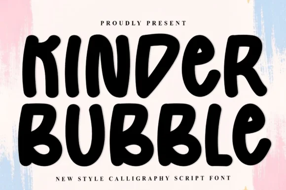
Kinder Bubble
Kinder Bubble is a bold, solid-black hand-drawn block display font with soft organic edges and playful mixed-case letterforms.
Kinder Bubble is a heavy hand-cut playroom block display: fat squared letters with visible scissor-cut edges, slightly mismatched heights and blunt corners, drawn to look as if cut from coloured card and pinned to a playroom wall. The cut edges are the design and they silt when the face is reduced. It needs roughly 26 mm for the cut edge and the height mismatch to read, and it is best as a one-colour vinyl or paper cut on a light ground, or one ink print where the cut edge reads as a shadow.
Recommended project & layout
Daycare cubby nameplates, teacher shirts & backpack tags — Center a child's name or grade level in 1.5–2.5 in solid letters, pairing classroom room numbers in the same bold face.
Before you cut or print
Weeds cleanly on both permanent vinyl and puff HTV; just watch the compact double counters inside 'B' below 0.8 inches.
Best paired with
Get fontPaid link
Practical buyer checklist
Frequently asked questions.
Key cutting, printing and pairing answers before choosing a graffiti, throw-up & street tag typeface.
Can graffiti fonts be cut from vinyl for a T-shirt?
Only the cleaner silhouettes. A dripping tag carries dozens of small detached islands that will not survive weeding, so use DTF or screen print for textured faces and keep cut vinyl for the block and throw-up styles.
What is a throw-up, in type terms?
A throw-up is a quick two-colour bubble lettering style with an outline and a fill, usually drawn fast. In font form it appears as a rounded, inflated alphabet, often shipped with a matching outline weight so you can build both layers.
How do I make graffiti lettering look hand-painted rather than typeset?
Vary the baseline, overlap two letters slightly, and add one drip or highlight by hand. Fonts repeat the same drip on every glyph, which is the giveaway, so edit or delete a few instances before final output.
Which graffiti styles read best at small sizes?
Chisel-marker capitals and thick bubble letters survive down to about 1 inch. Thin tags with long connectors turn into a scribble, so keep those for large format where the gesture is visible.
Keep exploring
Related collections & guides.
Explore adjacent maker roundups or check our practical pre-production checklists.
01 / Type Styles
Brush & streetwear
27 curated fonts · Previews & pairings



02 / Cricut & Craft
T-shirts, hoodies & HTV apparel
33 curated fonts · Previews & pairings
03 / Type Styles
Y2K & futuristic tech
16 curated fonts · Previews & pairings
04 / Type Styles
Chicano & fine-line tattoo scripts
11 curated fonts · Previews & pairings
Guides: Invitation font checklist · Vinyl & cutting checklist · How to pair script & sans fonts