Neutral Sans Workhorse

Blackhelm + Prime Nordic
Lets Blackhelm own the focal silhouette while handling secondary copy, sizing and subheads cleanly.
Inspect Prime Nordic specimenDisclosure: MakerFileHub may earn a commission from qualifying purchases via paid links on this page. How our links work.
Broad blackletter with sharply peaked shoulders and forked B
Blackhelm is a bold blackletter display face with wide letters, a heavy stem weight and a surface that looks chiselled from weathered stone rather than drawn with a broad nib.
Paid link
Get this fontProject & layout blueprintsAt-a-glance maker compatibility
Fine grain and micro-texture excel in 300 DPI print, sublimation, and screen print rather than small vinyl weeding.
Visual anatomy & craft review
Blackhelm fills the middle of the card in a pale grey against a dark scene of a castle on a rock, with two banners hanging at the edges and a small crest below the word. The letters are broader than a classic textura and the shoulders are rounded, so the word reads as monumental rather than dense: the B and the k have short spurs, the h and the l carry flat tops, and the counters stay open enough to see through at a distance. The fill is not flat grey but a fine grain, which gives the shapes the look of carved granite under a low sun. Above the word a small line sets a phrase about an age of shadows, and beneath it another names the saga and a year. It is a title face for fantasy, games and events, and it needs a large size and a dark ground to do what it is made for.
Broad blackletter with sharply peaked shoulders and forked B
Two-font hierarchy recipes
Tested contrast partners — pairing Blackhelm with grounded secondary typography.
Blackhelm + Prime Nordic
Lets Blackhelm own the focal silhouette while handling secondary copy, sizing and subheads cleanly.
Inspect Prime Nordic specimen
Blackhelm + Gorga
Grounds bold display lettering with classic typographic authority on posters, badges and apparel.
Inspect Gorga specimenPractical applications
Concrete hierarchy, scale and production guidance tailored to Blackhelm’s stroke geometry.
The carved weight gives a poster the look of a stone inscription, and the open counters keep the name readable on a wall in poor evening light.
Hierarchy & layout recipe
Print a 700 by 1000 mm poster: set the festival name at 150 pt across two rows, keep 40 mm of clear ground beneath before the dates at 18 pt, and hold 36 mm of margin so no spur is cut at the edge.
Pre-production check
The grain in the fill turns to noise at small sizes; print one poster on the intended paper and check the letter edges first.
The broad blackletter holds a long series title at thumbnail size, and the stone grain gives a photographic cover a drawn element without a second image.
Hierarchy & layout recipe
Print a 140 by 216 mm cover: set the title at 64 pt across two rows, keep 24 mm of clear ground beneath before the author at 12 pt, and hold 18 mm from the widest letter to the spine edge.
Pre-production check
Grain fills up in matte lamination; print one cover with the finish applied and compare it with the proof before the run.
The heavy letters survive snow and low light on an outdoor board, and the carved tone suits a season that sells mulled drinks and dark evenings.
Hierarchy & layout recipe
Print a 900 by 600 mm board: set the market name at 120 pt across two rows, keep 32 mm of clear ground beneath before the opening times at 20 pt, and hold 30 mm of border on all four sides.
Pre-production check
Outdoor boards fade in frost; print one board and leave it out for a week before the full set is produced.
Technical & licence verification
Confirm included OTF/TTF/WOFF formats, full glyph tables and licence coverage on the live store page before batch production.
Closest visual alternatives
Matched across letterform anatomy, stroke behaviour and craft applications.
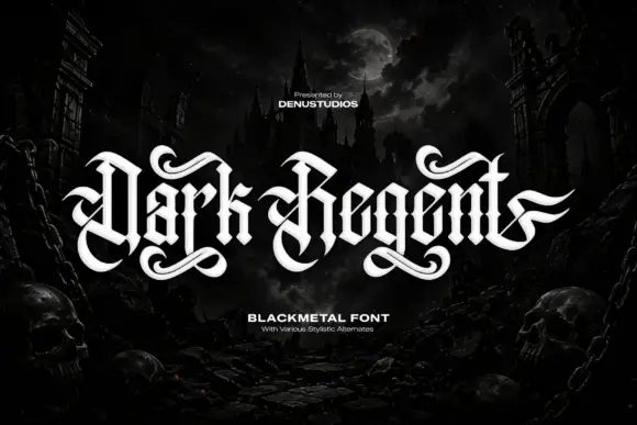
Ribbon-like blackletter with broad loops and curling lower tails
Dark Regent is a black-metal blackletter with broad hooked stems, swash tails that curl away from the baseline and a texture that reads as carved stone, framed here by a ruined castle and skulls.
Ideas for this font
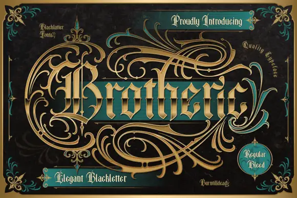
Outlined blackletter with an elaborate sweeping capital B
Brotheric sets a heavy blackletter on a dark panel and lets gold flourishes grow out of the word until they fill the frame, so the lettering reads as one engraved ornament rather than a line of text.
Ideas for this font
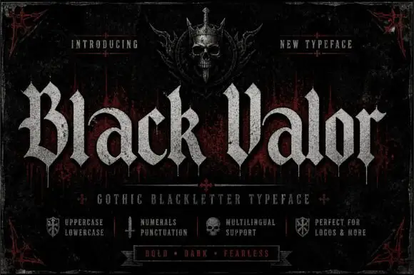
Broad blackletter with curved a shoulders and hooked capitals
Black Valor sets a gothic blackletter in distressed white on a black ground, with broad strokes, curled lowercase shoulders and hooked capitals whose ends finish in fine diamond points.
Ideas for this font
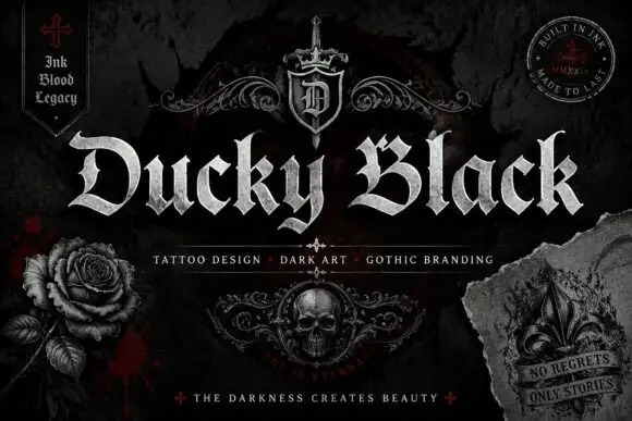
Wide blackletter with sweeping D and a densely split B
Ducky Black is a tattoo and dark-art blackletter with wide stems, sharp spurs and a distressed silver fill, framed by drawn roses, a skull and a fleur.
Ideas for this font
Same independent foundry
Allow optional Google Analytics to measure visits and catalogue actions. Your search words and notes are not included. Privacy & storage



