Neutral Sans Workhorse

Fangvolt + Lemon Milk Pro FTR
Lets Fangvolt own the focal silhouette while handling secondary copy, sizing and subheads cleanly.
Inspect Lemon Milk Pro FTR specimenDisclosure: MakerFileHub may earn a commission from qualifying purchases via paid links on this page. How our links work.
Broad angular blackletter with hooked F and curled g descender
Fangvolt is a gothic display face drawn in the old style: tall ascenders, deep pockets of white between the strokes, sharp diamond feet and a grain that looks pressed into dark paper.
Paid link
Get this fontProject & layout blueprintsAt-a-glance maker compatibility
Sturdy stroke walls and open counters weed cleanly on adhesive vinyl, HTV apparel film, and cut cardstock.
Visual anatomy & craft review
Fangvolt sits across the card in a pale weathered tone on a dark interior of stone arches, candles and a raven on a plinth. The letters are narrower than a modern blackletter and the ascenders are long, so the word has a vertical rhythm, while the shoulders curl back into small hooks and the feet end in clean diamonds. The fill carries a faint texture rather than a flat colour, which keeps the shapes from looking like a modern vector. Two short rules with small cross ornaments divide the word from the captions, and the captions themselves are set in a spaced serif at a fraction of the size, naming the style and the intended use. The composition is symmetrical and low-lit, and the type is the only pale element in it. It is a face for horror, metal and gothic fiction, and it belongs at poster and cover sizes.
Broad angular blackletter with hooked F and curled g descender
Two-font hierarchy recipes
Tested contrast partners — pairing Fangvolt with grounded secondary typography.
Fangvolt + Lemon Milk Pro FTR
Lets Fangvolt own the focal silhouette while handling secondary copy, sizing and subheads cleanly.
Inspect Lemon Milk Pro FTR specimen
Fangvolt + The Bilstein Editorial
Grounds bold display lettering with classic typographic authority on posters, badges and apparel.
Inspect The Bilstein Editorial specimenPractical applications
Concrete hierarchy, scale and production guidance tailored to Fangvolt’s stroke geometry.
The tall gothic letters set the evening's tone in one element, and the pale fill reads through the dim light of a room lit only by candles.
Hierarchy & layout recipe
Print a 500 by 700 mm poster: set the reading title at 110 pt across two rows, keep 30 mm of clear ground beneath before the time at 13 pt, and hold 26 mm of margin so the diamond feet stay whole.
Pre-production check
Pale type on dark stock needs an opaque white base; print one poster in the real process and check before the run.
The narrow letters fit a long collection title into a paperback trim, and the old-style spurs signal the period of the stories on a shelf of thumbnails.
Hierarchy & layout recipe
Print a 130 by 200 mm cover: set the title at 52 pt across two rows, keep 20 mm of clear ground beneath before the editor at 10 pt, and hold 15 mm from the outer letters to the trim.
Pre-production check
Fine hooks fill in at small trim; print one cover at the final size and inspect the shoulder curls before the print run.
The style gives a bottle a gothic character that a plain serif cannot, and the tall ascenders fit a long distillery name on a narrow label.
Hierarchy & layout recipe
Print a 60 by 110 mm label: set the distillery name at 22 pt on one row, keep 8 mm of clear ground beneath before the age at 5 pt, and hold 6 mm from the diamond feet to the die line.
Pre-production check
Dark glass swallows pale ink at the edges; print one label on the actual bottle and check the contrast before the order.
Technical & licence verification
Confirm included OTF/TTF/WOFF formats, full glyph tables and licence coverage on the live store page before batch production.
Closest visual alternatives
Matched across letterform anatomy, stroke behaviour and craft applications.
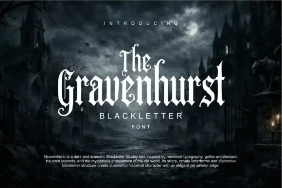
Slim blackletter with curled capital terminals and tall ascenders
Gravenhurst sets a condensed blackletter in white against a moonlit churchyard, its capitals hooked, its ascenders drawn to fine points and its counters kept narrow enough to feel carved.
Ideas for this font
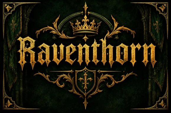
Spiked blackletter with diamond serifs
Raventhorn is a blackletter in gold on dark green: spiked capitals with diamond serifs and long hairline terminals, framed by a crown, a shield and a symmetric gold border drawn to the same weight.
Ideas for this font
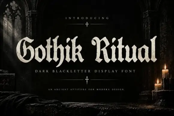
Rough-edged blackletter with broad bowls and hooked capitals
Gothik Ritual is a blackletter display face with tight spacing, needle-sharp spurs and a slightly rough contour, built to print light on a dark ground.
Ideas for this font
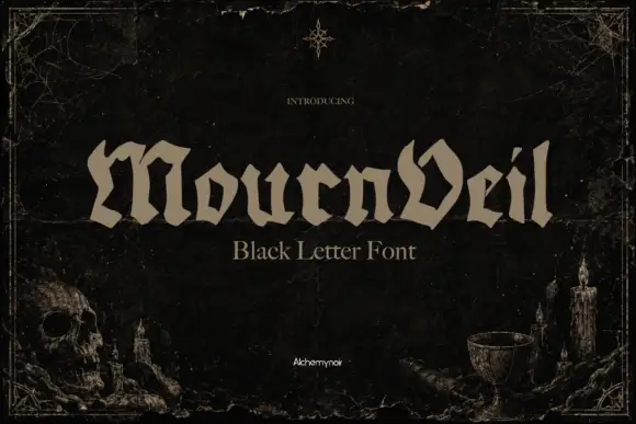
Low broad blackletter
Mournveil is a low broad blackletter in bone on a near-black textured ground: wide letters with irregular peaked tops, an angular V and short descenders, set as one word with a plain descriptor beneath, framed by a fine rule, a skull and candles at the lower corners.
Ideas for this font
Same independent foundry
Allow optional Google Analytics to measure visits and catalogue actions. Your search words and notes are not included. Privacy & storage



