Editorial Serif Anchor

Honey + Raffined
Anchors Honey's fluid strokes with crisp Roman proportions on wedding suites, headers and packaging.
Inspect Raffined specimenDisclosure: MakerFileHub may earn a commission from qualifying purchases via paid links on this page. How our links work.
Smooth thick monoline cursive with a long entry and a lifted exit
Honey is a smooth thick monoline cursive in which every stroke is the same weight, the entry comes in from the left and the exit lifts at the tip to the right.
Paid link
Get this fontProject & layout blueprintsAt-a-glance maker compatibility
Weld or Unite overlapping script joins into one continuous vector path before sending to the blade.
Visual anatomy & craft review
The word begins with a flat entry that runs in below the x-height, then the h rises into a tall plain stem without a looping ascender, and the letters after it keep an even roundness: the o closes a full circle, the n holds two even arches, the e loops back through its own bowl and the y drops a curved tail before the exit lifts. Weight is a true monoline: there is no contrast at all, joins are as thick as the stems and the ends are rounded rather than tapered, which is what makes the word hold together at small sizes on a jar or a card. The baseline stays level and the counters stay open. The pale photograph of a honey jar behind, the black ink and the two serif captions are presentation; the script is the word.
Smooth · Thick · Monoline
Two-font hierarchy recipes
Tested contrast partners — pairing Honey with grounded secondary typography.
Honey + Raffined
Anchors Honey's fluid strokes with crisp Roman proportions on wedding suites, headers and packaging.
Inspect Raffined specimen
Honey + Bargain Condensed
Keeps small-scale dates, URLs, nutrition facts and care instructions crisp and legible below script titles.
Inspect Bargain Condensed specimenPractical applications
Concrete hierarchy, scale and production guidance tailored to Honey’s stroke geometry.
The monoline weight survives printing on a small curved label where a contrasted script would disappear, and the round letters read against amber contents.
Hierarchy & layout recipe
Set the product at 13 pt on a 45 mm square jar label, keep the weight in a 6 pt sans, and leave 5 mm of margin so the round ends stay inside the label edge.
Pre-production check
Labels on filled jars lift at the edges; check one applied label after a week and move the type away from the lid side.
The even thick stroke reads at a distance and the lifted exit gives a one-word sign a finished edge, which is what a small ceremony needs outdoors.
Hierarchy & layout recipe
Set the greeting at 12 cm on a 600 by 400 mm board, set both names in the same face at 6 cm beneath, and leave 10 cm of margin so the exit clears the frame.
Pre-production check
Outdoor boards are read at an angle; check the sign from three metres and widen the counters of the o and e if they close at distance.
The smooth monoline prints cleanly at 16 pt and keeps a short thank-you warm without ornament, which suits a small mail-order business.
Hierarchy & layout recipe
Set the message at 16 pt on a 90 by 55 mm card, keep the order number in a 6 pt sans at the foot, and leave 8 mm at the base so the descender clears the edge.
Pre-production check
Cards in a parcel rub against the contents; print on a heavier stock and check that the thick strokes do not scuff in transit.
Technical & licence verification
Confirm included OTF/TTF/WOFF formats, full glyph tables and licence coverage on the live store page before batch production.
Closest visual alternatives
Matched across letterform anatomy, stroke behaviour and craft applications.

Wide-tailed monoline door-sign script
Welcome features relaxed lowercase cursive with long level beginning and ending swash tails, tailored for round wood signs and entryways, where the smooth monoline-leaning strokes and open letter spacing keep words calm while the extended w and e tails span a circular blank.
Ideas for this font
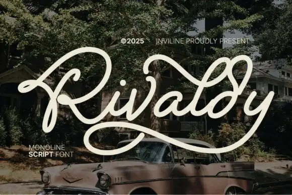
Wide looping monoline retro script
Rivaldy is a wide looping monoline retro script in cream over a vintage car photograph: a tall capital R drawn as a double loop, a light even stroke, and a descender that sweeps beneath the word and returns to the right margin.
Ideas for this font
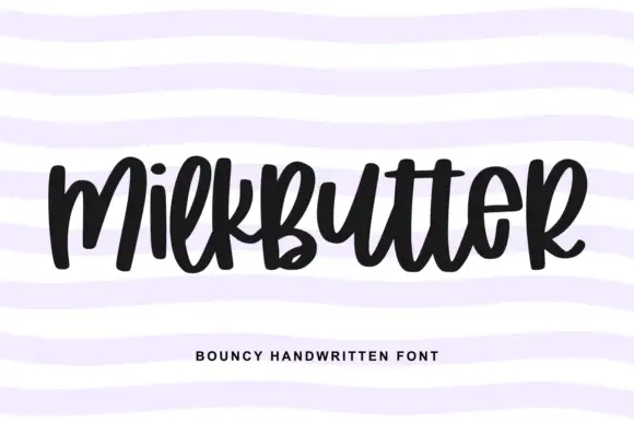
Bouncy fat handwriting with a tall waist
Milkbutter is a bouncy handwritten face in black on white: fat rounded letters with a tall waist, stems that lean and lift, and a baseline that rises and falls across the word, shown over soft lilac wavy bands.
Ideas for this font
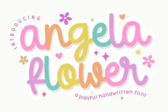
Rounded connected handwriting with small looped r
Angela Flower shows thick smooth strokes with softly rounded terminals, where the g drops low, the f makes a small loop and the r turns through a tight upper loop.
Ideas for this font
Same independent foundry
Allow optional Google Analytics to measure visits and catalogue actions. Your search words and notes are not included. Privacy & storage