 #1 · Best Overall
Disclosure: MakerFileHub may earn a commission from qualifying purchases via paid links on this page. How our links work.
Pen plotters, Foil Quill & laser scoring
15 Best Single-Line & Sketch Writing Fonts
A normal font hands your pen an outline, so a Cricut draws each letter twice and leaves a hollow bubble. Quietly Rose, Lutheria and Simplify Notation are built on centre paths, so the pen traces one line. Adellisa brings the same build to formal calligraphy, and Barleto proves a tall geometric sans can be single-line too.
Quick verdict
Pick Quietly Rose for script names and envelopes, Simplify Notation for labels and planner headings, and Barleto when the layout calls for tall geometric capitals. Adellisa is the formal option for invitations where a pen line should still feel like calligraphy.
Quick answer
Top 3 single-line writing & Foil Quill picks right now.
Short on time? Start with our three highest-rated single-line writing & Foil Quill standouts before scrolling the full breakdown.
#1 · Best Overall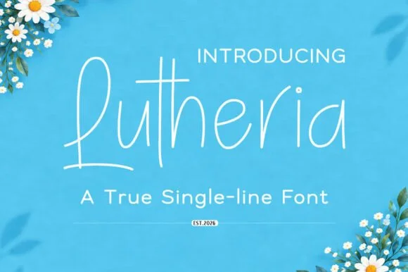 #2 · Runner-Up Pick
Lutheria
Upright single-line casual script with a very light even stroke
Get fontPaid link
Read review ↓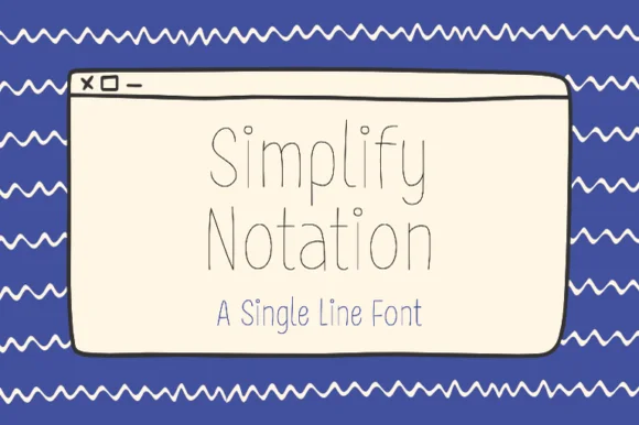 #3 · Editor's Choice
Simplify Notation
Single-line hairline sans drawn as a technical wireframe
Get fontPaid link
Read review ↓How we tested & selected these 15 fonts
Of 104 candidates we kept 15 that either ship a genuine single-line open path or hold an even hairline weight under 0.3 mm. Judged on path continuity, loop sizes that a 0.4 mm tip can enter without smudging, and how the baseline behaves when the design is scaled for a horizontal envelope.
Side-by-side summary
Top 5 single-line writing & Foil Quill picks at a glance.
Compare specimens, OpenType/PUA traits and primary project roles side by side.
| Rank & Font | Style & File Specs | Best Project Fit | Store Listing |
|---|---|---|---|
| ScriptHairline | Foil-quill wedding envelope addressing | Get fontPaid link | |
| HandwrittenAiry | Cricut Joy drawn thank-you insert card | Get fontPaid link | |
| DisplayNeat | Pen-drawn label set or greeting card body text | Get fontPaid link | |
| Sans serifGeometric | Laser-engraved metal jewelry tag or acrylic table sign | Get fontPaid link | |
| HandwrittenCute-pen | Cricut Pen greeting card, Foil Quill gift tag & sewing card | Get fontPaid link |
Clean Sans & Handwritten Print
9 fonts#1 · Best OverallQuietly Rose
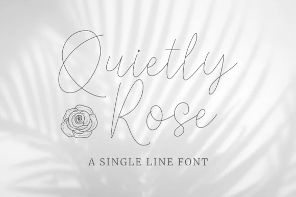
Quietly Rose is a single-line script in which the stroke never changes width, the loops open wide and the letters lean gently, so a phrase reads as a pencil line drawn quickly over a photograph.
The Q drops a wide curled tail, the u holds two even shoulders, the i carries a small dot, the e turns a light eye and the y finishes a long open loop, all at one hairline weight with a modest slant and generous spacing. The single line is the character: there is no thick and thin at all, so the face depends entirely on proportion and rhythm, which is why the sample sets it over a soft image rather than on a plain ground. Because the stroke is a hairline, it needs 30 pt on screen and a smooth stock in print; on a textured paper it breaks at 12 pt. The washed palm shadow, the line drawing of the rose, the letter-spaced caption and the small credit are presentation; the hairline script is the face.
Recommended project & layout
Foil-quill wedding envelope addressing — Switch Cricut/Silhouette operation from Basic Cut to Pen or Foil before sending to the machine.
Before you cut or print
Designed for Pen, Foil Quill and laser scoring — do not blade-cut in vinyl.
Best paired with
Get fontPaid link
#2 · Runner-Up PickLutheria
Lutheria is a true single-line script in which the stroke never thickens, the letters stay upright and the joins are open, so a word reads as something written with a fine pen at an even pace.
The capital L opens with a tall stem that loops back from the base, and the letters after it keep an easy rhythm: the u closes a small bowl, the t crosses with a single bar, the h rises into a plain stem, the e loops back high and the r keeps a short arm. Because the construction is one line of constant weight, the face behaves almost like a handwriting sans and holds at 12 pt on a small label. The upright angle means it stacks cleanly under a printed line without the slant fighting the baseline, and the open joins keep the letters distinct. It is light, so it needs good contrast rather than a heavy background. The blue ground, the white ink, the daisies in the corners and the two caption lines are presentation; the script is the word.
Recommended project & layout
Cricut Joy drawn thank-you insert card — Use fine-tip gel or technical pens (0.4 mm) on smooth cardstock.
Before you cut or print
Built for pen plotting, foil transfer and engraving — not vinyl cutting.
Best paired with
Get fontPaid link
#3 · Editor's ChoiceSimplify Notation
Simplify Notation is a single-line sans in which every letter is drawn as one even hairline with open joins, so a word reads as a wireframe sketch rather than as printed type.
The S keeps a shallow spine, the i carries a floating dot, the m turns two even shoulders, the p drops a hairline stem, the l rises as a plain line and the y splays two hairlines, all at one unchanging weight with joins left slightly open. The single line is the character: there is no thick stroke anywhere, which is why the sample sets a two-word title inside a drawn window frame with no other decoration. Because the line is very fine, the face needs 30 pt upward and a smooth ground, and it disappears at caption sizes. The blue ground, the drawn browser window, the wavy borders and the caption beneath are presentation; the hairline words are the face.
Recommended project & layout
Pen-drawn label set or greeting card body text — Pair beneath a flourished calligraphy headline to handle dates, addresses and body lines.
Before you cut or print
Use Draw/Pen toolpath rather than Cut.
Best paired with
Get fontPaid link
 #4 · Top Maker Utility
Barleto
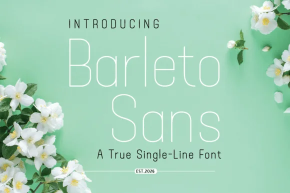
Barleto is a geometric sans built as a single line: the strokes never thicken, the letters run tall and open, and the whole alphabet stays at a hairline weight that reads as technical drawing.
The capital B closes two open bowls against a straight stem, the a is single storey with a light bowl, the r keeps a short arm and the t crosses with a thin bar, all at one constant weight. Because nothing is filled in, the face behaves like plotted lettering, which is why it suits captions, diagrams and architectural stationery. The x-height is tall and the spacing is generous, so a line of text stays legible at 9 pt even at this weight. The counters are wide rather than closed, which keeps the hairline from thinning visually at small sizes. At display sizes the face needs a coated stock to survive printing, and reverse-out printing is the safer route. The green ground, the white ink, the blossoms in the corners and the two caption lines are presentation; the typeface is the word.
Recommended project & layout
Laser-engraved metal jewelry tag or acrylic table sign — Track all-caps sublines +40 beneath a single-line calligraphy header.
Before you cut or print
Optimized for single-stroke engraving, Foil Quill and pen plotters.
Best paired with
Get fontPaid link
 #5 · Standout Silhouette
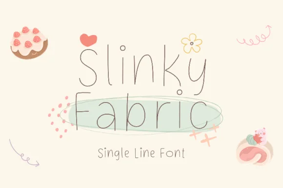
Slinky Fabric
Slinky Fabric is an airy, playful ultra-thin monoline print font accented with cute curled hooks on capitals and ascenders.
Slinky Fabric is an ultra-thin monoline print face with spiral-curled hooks on capitals and ascenders, tall disconnected rounded letters and airy spacing, so a name reads as written with a fine pen rather than a brush. The curls grow the artwork box upward, and the hairline weight means the face needs size and a smooth stock to survive print. It needs roughly 20 mm for the curls to read, and it is best in charcoal on cream or as a light foil on smooth board.
Recommended project & layout
Cricut Pen greeting card, Foil Quill gift tag & sewing card — Draw or print 2 stacked words at 38–64 pt on pastel cardstock accented by tiny floral/heart doodles.
Before you cut or print
Hairline pen strokes are strictly for pen plotting, Foil Quill, laser scoring, and flat print—never blade-weeded vinyl!
Best paired with
Get fontPaid link
 #6
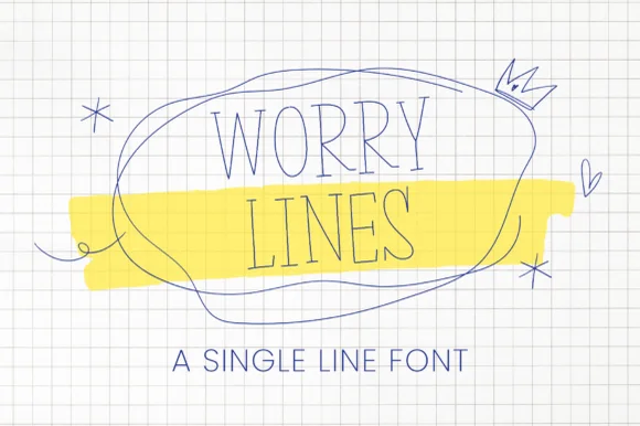
Worry Line
Worry Line is a neat, ultra-thin architectural pen font featuring tall narrow uppercase letters with tiny subtle serif ticks.
Worry Line is an ultra-thin architectural pen print in tall narrow capitals with tiny serif ticks, drawn as though ruled against a set square so the letters keep a draftsperson's discipline. The stroke is a single hairline, which means it needs about 14 mm before it survives print on textured stock, and it is at its best on smooth papers where the line stays continuous. It reads as a note in a sketchbook rather than a display face, so it suits headings, envelopes and captions, and it should never be set small on absorbent paper.
Recommended project & layout
Bullet-journal header, indie poetry zine & architectural note — Set all-caps headers at 32–56 pt with +12 tracking across yellow highlighter swatches on grid stock.
Before you cut or print
Designed for Cricut 0.4 Pen drawing, Foil Quill, digital journaling, and print—do not blade-cut vinyl.
Best paired with
Get fontPaid link
 #7
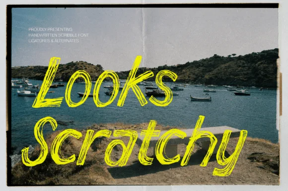
Looks Scratchy
Looks Scratchy mimics urgent, multi-pass sketchbook handwriting where traced double and triple pen lines overlap each letterform.
Looks Scratchy is a scribble script drawn with a ballpoint and an oil pastel in several passes: each letter is a loose looping stroke, the passes overlap so the line doubles back on itself, and the pastel adds a soft wider halo under the pen. The scribble reads as energy rather than as typography, so the word shape matters more than the letter shapes. It needs roughly 30 mm for the double pass and the pastel halo to read, and it is best in one ballpoint blue or black on white, with the halo left as a soft second colour that must not turn muddy.
Recommended project & layout
Indie album cover, polaroid zine caption & poster scrawl — Angle 2-word captions across dark photographic corners in high-visibility acid yellow, chalk white, or crimson.
Before you cut or print
Overlapping hairline scribble loops create dozens of micro-slivers—produce via print, DTF, or digital graphics rather than blade-cut vinyl.
Best paired with
Get fontPaid link
 #8
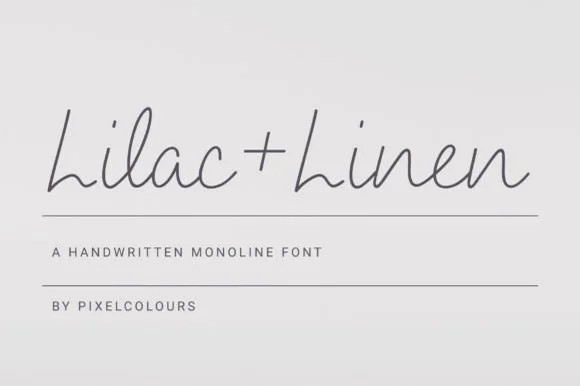
Lilac and Linen
Lilac and Linen is an ultra-clean, slender monoline handwritten font blending tall open capitals with airy semi-connected pen lowercase.
Lilac and Linen is an airy fine-pen architectural monoline handwritten face: a very light even stroke, wide open counters, tall ascenders and letters drawn as if by a fine technical pen with small lift gaps at the joins. The thin line is the whole character and it is the first thing to break on textured stock or at small sizes. It needs roughly 22 mm for the fine stroke and the lift gap to read, and it is best in one dark ink on smooth or coated paper, or a single ink on tracing-weight stock where the line stays continuous.
Recommended project & layout
Linen home-fragrance label, ceramic stamp & apothecary box — Center 'Brand + Scent' in charcoal ink on textured white cotton labels above 1 px hairline divider rules.
Before you cut or print
Fine hairline stroke weight is built for flat printing, Foil Quill, and Cricut Pen drawing—avoid tiny blade-cut vinyl.
Best paired with
Get fontPaid link
 #9
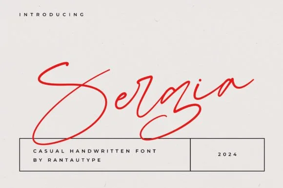
Sergia
Sergia is an expressive, fast-moving handwritten signature script with oversized sweeping initials and airy, minimalist pen curves.
Sergia is a fast ballpoint signature cursive with a steep slant, a light even line and joins that lift off the baseline so the word skims rather than sits. The speed shows in the abbreviated loops and the way the last letter trails into a quick tail, and the thin line needs white space to stay legible. It needs roughly 24 mm for the abbreviated loop and the tail to read, and it is best in one ballpoint blue or black on white, or a single dark ink on a smooth cream stock where the thin line does not bleed.
Recommended project & layout
Artist edition signature, gallery print & fashion label — Set the signature at a subtle upward angle in crimson, cobalt, or black above a crisp ruled grid box.
Before you cut or print
Hairline pen strokes are intended for print, digital watermarks, foil plates, or Foil Quill—not blade-cut vinyl weeding.
Best paired with
Get fontPaid link
Scripts & Calligraphy
6 fonts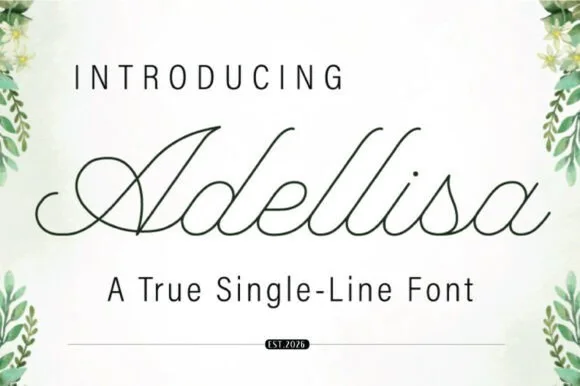 #10
Adellisa
Adellisa is a true single-line formal calligraphy in which every stroke is the same weight, the loops stay open and the joins cross cleanly on a level baseline.
The capital A opens with a loop that rises above the cap line and closes into a narrow bowl, and the letters after it hold a formal rhythm: the d and the l rise into tall open loops, the e loops back through its own bowl, the s reverses tightly and the i carries a small round dot. Because the line is a true single weight, there is no contrast at all: the joins, the stems and the loops are all drawn at one thickness, which is what makes the face suitable for engraving, monoline plotting and foil where a shaded script would fill in. The loops stay open enough to read at 18 pt, and the ends taper slightly. The botanical corners, the pale ground and the two caption lines are presentation; the calligraphy is the word.
Recommended project & layout
Plotter-drawn place cards or foil vow cover — Set Operation to Draw/Foil and test pen pressure on a spare envelope first.
Before you cut or print
True single-line font: may look open/unclosed in standard word processors until rendered as a stroke path.
Best paired with
Get fontPaid link
 #11
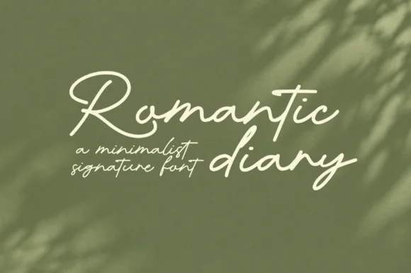
Romantic Diary
Romantic Diary is a minimalist signature script in which the capitals rise into slender loops, the body stays narrow and the stroke keeps one light weight, so a name reads as a quick signing gesture rather than as calligraphy.
The R opens a tall loop that swings left of its stem, the o stays an open ring, the m keeps three even arches, the a closes a narrow bowl, the n turns a light shoulder and the d rises into a second loop, all at one even light weight with tall proportions and a narrow slope. The restraint is the character: there is no heavy downstroke anywhere, which is why the sample sets two words loosely over a leafy ground with no other ornament. Because the stroke is light, the face needs 24 pt upward and a smooth ground to survive in print. The olive leaves, the soft shadows and the small caption lines are presentation; the cream script words are the face.
Recommended project & layout
Founder signature sign-off or minimalist candle label — Pair with clean geometric sans body text on textured cream stock.
Before you cut or print
Fine monoline stroke suits print, digital logos and larger (2.5"+) vinyl decals.
Best paired with
Get fontPaid link
 #12
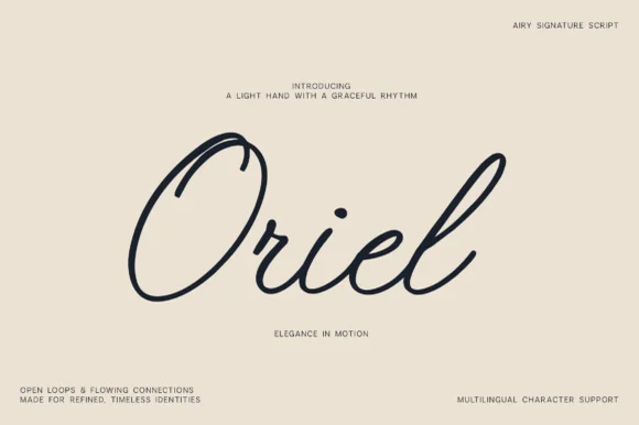
Oriel
Oriel is an airy, minimalist monoline signature script featuring wide open oval 'O' loops, unhurried rhythm, and full multilingual support.
Oriel is an airy monoline signature script with wide open oval O loops, an unhurried even rhythm and a very light optical weight, drawn to sit quietly on editorial stock rather than to shout. Because the stroke never thickens, it plots, foils and prints predictably, and because the loops stay open, the face reads at 14 mm even when printed in a pale ink. It carries multilingual character support, so a name in another script keeps the same airy construction. It suits quiet branding, place cards and watermarks, and it looks wrong at poster scale where its lightness becomes timid.
Recommended project & layout
Minimalist linen clothing tag, ceramic studio & watermark — Center 1 title-case word huge (76–155 pt) surrounded by generous warm-sand negative space and micro-sans corner notes.
Before you cut or print
Draws in crisp single-weight lines with Cricut Pens/Foil Quill and cuts cleanly on 1.25 in+ Oracal 651 (Weld joins!).
Best paired with
Get fontPaid link
 #13
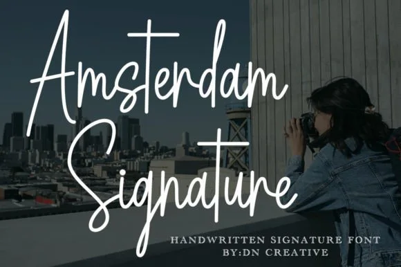
Amsterdam Signature
Amsterdam Signature is a slender, upright monoline cursive with dramatic peaked capitals and sweeping t-crossbars.
Amsterdam Signature is a tall monoline signature script: an even hairline stroke with long ascenders, letters joined low and fast, a slight forward slant and a single release stroke that carries the eye off the end of the word. It reads as a signed name rather than a set line, so it belongs on a card, a thank-you slip or a decal. The hairline is the finest element and it breaks first in print, on textured stock and in vinyl. It needs roughly 28 mm for the hairline and the ascender to read, and it is best one dark ink on a smooth coated stock.
Recommended project & layout
Photography watermark & studio business card — Place the two-word signature at 18–24 pt in high-contrast white or foil, pairing contact details below in a tracked-out 7 pt geometric sans.
Before you cut or print
Avoid adhesive blade cutting under 2 inches tall; use 300 DPI print, hot foil stamping, or Foil Quill drawing instead.
Best paired with
Get fontPaid link
 #14
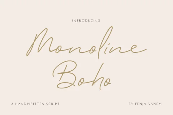
Monoline Boho
Monoline Boho is a fine, forward-slanted handwritten script featuring sweeping multi-peak capitals and airy looped ascenders.
Monoline Boho is a fine slanted monoline signature script with knotted loops: an even hairline stroke on a strong slant, letters joined low, and ascenders that tie themselves into small open knots before they release. It reads as a hand-signed name rather than a set line, which is why it belongs on a card, a tag or a decal. The knots are the finest element and they close into a smudge once the face is reduced or cut small. It needs roughly 30 mm for the knot and the hairline to read, and it is best one dark ink on a smooth stock.
Recommended project & layout
Botanical skincare bottle & ceramic studio logo — Give a two-word studio name generous whitespace at 24–30 pt, paired with widely tracked 7.5 pt uppercase sans ingredient lines.
Before you cut or print
Fine monoline strokes belong in print, foil stamping, or Foil Quill drawing rather than small cut-and-weed adhesive decals.
Best paired with
Get fontPaid link
 #15
I Heart You
I Heart You runs a fine connected phrase along one long baseline, where a heart replaces the dot on the opening i and two more hearts rise above the joins between words, with long entrance and exit strokes widening the phrase on both sides.
The stroke stays one even monoline weight, the letters stay connected, the hearts sit on the joins rather than beside them and the ends run long. Those heart joins are the character, because the phrase is drawn as a single ribbon with three interruptions. The small typeface label beneath is cover text. Check how the heart is reached in your file, keep 26 pt so the monoline stays unbroken and remember that a cutting machine will need the hearts joined to the letters.
Recommended project & layout
A single-line Valentine front — Centre the phrase on a wide card with generous end margins. Put the recipient name on the reverse rather than squeezing it between the heart loops.
Before you cut or print
Confirm the required heart alternates; single-line machine behaviour is not tested.
Best paired with
Get fontPaid link
Practical buyer checklist
Frequently asked questions.
Key cutting, printing and pairing answers before choosing a single-line writing & Foil Quill typeface.
Why do ordinary fonts draw hollow bubble letters with a Cricut pen?
Standard OTF and TTF files describe closed contours around each stroke, so the pen follows both the inside and outside edge. A true single-line font stores one centre path and the pen draws a single stroke like handwriting.
Can I use a single-line font with a laser instead of a pen?
Yes, and it is often the better use: a centre path becomes one clean score line rather than a hollow double score. Reduce power so the score marks the surface without cutting through, and test on the same material batch you plan to run.
Do single-line fonts support accented characters?
Coverage varies widely. Latin accents and currency symbols are usually present, but extended Cyrillic or Greek often fall back to a default face, which breaks the single-stroke look on that one glyph, so check the charmap before typesetting.
How do I keep a pen line from smudging on glossy card?
Use a pigment or archival pen rather than a water-based one, let each pass dry before the next, and slow the machine's drawing speed. On coated stock a light dusting of matte spray before drawing gives the ink something to bite into.
Keep exploring
Related collections & guides.
Explore adjacent maker roundups or check our practical pre-production checklists.

01 / Cricut & Craft
Vinyl & Cricut cutting
38 curated fonts · Previews & pairings

02 / Cricut & Craft
Monoline cursive & marker scripts
23 curated fonts · Previews & pairings
03 / Occasions & Milestones
Wedding
36 curated fonts · Previews & pairings
04 / Branding & Print
Digital planner & GoodNotes
19 curated fonts · Previews & pairings
Guides: Invitation font checklist · Vinyl & cutting checklist · How to pair script & sans fonts