Editorial Serif Anchor

Rainbow + Marquis - Elegant Modern Serif
Anchors Rainbow's fluid strokes with crisp Roman proportions on wedding suites, headers and packaging.
Inspect Marquis - Elegant Modern Serif specimenDisclosure: MakerFileHub may earn a commission from qualifying purchases via paid links on this page. How our links work.
Rounded connected script with tall loops
Rainbow is a rounded connected script in which a narrow looped capital opens the word, the lowercase joins broadly and the b and l rise well above the body, so a single line reads as cheerful handwriting with a lift at the start.
Paid link
Get this fontProject & layout blueprintsAt-a-glance maker compatibility
Weld or Unite overlapping script joins into one continuous vector path before sending to the blade.
Visual anatomy & craft review
The R closes a narrow loop, the b climbs above the ascender line, the joins stay round and open, and the lowercase bowls keep an even stroke through the connectors. The tall loop is the character: it gives one letter the vertical accent while the rest stays calm, which is why the sample sets one word alone. Because the joins are round, words need a clear gap between them, and the face cuts from about 1.1 inches of x-height before the connectors weld on vinyl. The rainbow fill and small illustrations are preview artwork; the lettering is the face.
Rounded · Connected · Loopy
Two-font hierarchy recipes
Tested contrast partners — pairing Rainbow with grounded secondary typography.
Rainbow + Marquis - Elegant Modern Serif
Anchors Rainbow's fluid strokes with crisp Roman proportions on wedding suites, headers and packaging.
Inspect Marquis - Elegant Modern Serif specimen
Rainbow + Bareum
Keeps small-scale dates, URLs, nutrition facts and care instructions crisp and legible below script titles.
Inspect Bareum specimenPractical applications
Concrete hierarchy, scale and production guidance tailored to Rainbow’s stroke geometry.
The rounded joins suit a party banner, and the tall loop keeps a short name readable at 40 pt printed across an A4 sheet. The tall loop keeps the name from looking like a plain script row.
Hierarchy & layout recipe
Print an A4 banner: set the name at 40 pt, keep 20 mm of clear sheet at each end so no loop runs off the edge, and set the age in a 14 pt rounded sans beneath with 12 mm of clear ground.
Pre-production check
A banner folded across a connector breaks the stroke visually; check the sheet and keep the fold 20 mm clear of the word.
The friendly script suits a tray label, and the even weight keeps a first name clear at 20 pt on a 60 mm printed sticker. The even weight keeps a first name clear at tray distance.
Hierarchy & layout recipe
Print a 60 by 25 mm tray label: set the name at 20 pt, keep 5 mm of clear vinyl at each end, and keep 3 mm inside the die so the loop is not trimmed. Round the corners so no loop is trimmed.
Pre-production check
A round join under 0.6 mm fills in on a laminated label; check the proof and keep the name at 18 pt or above. Matte laminate helps here.
The loopy script softens a valentine, and the open joins keep a short line clear at 28 pt on an A6 card in one ink. Rounding the joins keeps the line gentle rather than formal.
Hierarchy & layout recipe
Print an A6 card: set the line at 28 pt across the upper third, keep 18 mm of clear card on both sides, and leave the lower half blank for a written message. Keep the line on one row.
Pre-production check
Fine connectors printed at 20 pt on textured card close up; check the proof and keep the line at 26 pt on a smooth stock.
Technical & licence verification
Confirm included OTF/TTF/WOFF formats, full glyph tables and licence coverage on the live store page before batch production.
Closest visual alternatives
Matched across letterform anatomy, stroke behaviour and craft applications.
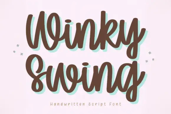
Bold handwriting with a coloured drop shadow
Winky Swing is a bold handwritten script in brown on cream: fat rounded letters with open loops, a tilted baseline and a mint shadow offset behind them, with two small sparkles either side and a tracked caption below.
Ideas for this font
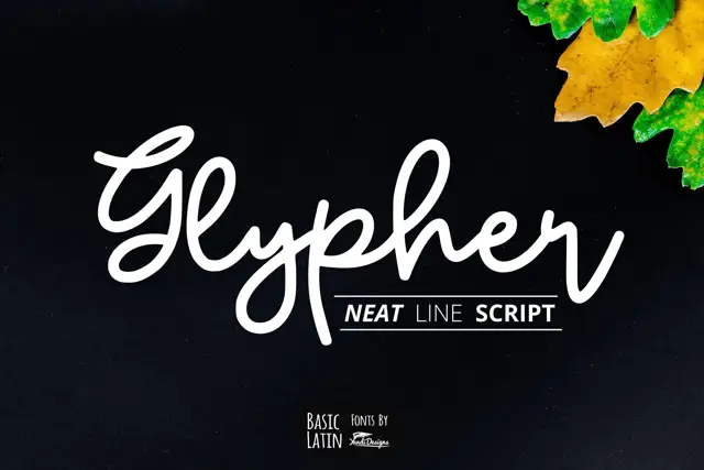
Rounded line-like joined script
Glypher is a rounded monoline joined script with a looping G, tall l and h ascenders that nearly double the x-height, and a high dot over the i.
Ideas for this font
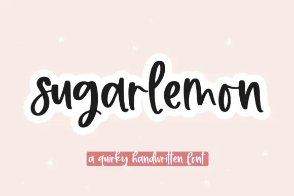
Thick bouncing rounded script
Sugarlemon is a thick bouncing script in black on blush: fat rounded strokes, a strong bounce between letters, tall narrow loops and a soft white sticker outline around the whole word.
Ideas for this font
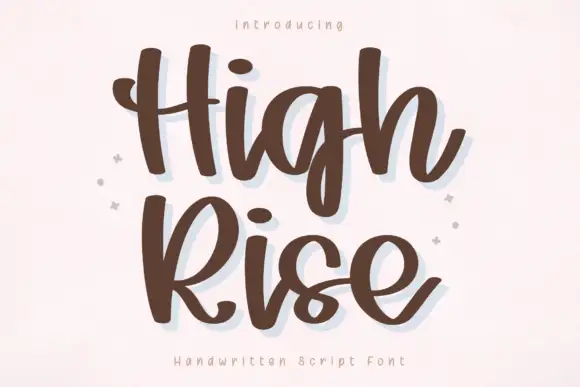
Thick relaxed script with broad strokes and deep descending loops
High Rise is a thick relaxed script with broad strokes, a loose fit and descenders that drop into deep open loops, so a two-word phrase fills a square panel comfortably.
Ideas for this font
Same independent foundry
Allow optional Google Analytics to measure visits and catalogue actions. Your search words and notes are not included. Privacy & storage