Modern Grotesque Body

Aureline + Hermano
Creates crisp high-hierarchy contrast beneath Aureline headlines across menus, websites and labels.
Inspect Hermano specimenDisclosure: MakerFileHub may earn a commission from qualifying purchases via paid links on this page. How our links work.
Fine high-contrast serif with thin stems and open elegance
Aureline is a fine serif in which the stems narrow to hairlines, the serifs spread thin and the bowls stay wide open, so a single name reads as a jewellery hallmark rather than as a headline.
Paid link
Get this fontProject & layout blueprintsAt-a-glance maker compatibility
Crisp hairline serifs shine on stationery, foil stamping, and packaging; add slight offset for small decals.
Visual anatomy & craft review
The A spreads a wide apex on two hairline stems, the u holds two thin strokes, the r finishes a fine arm, the e turns a light eye, the l rises on a narrow stem and the n turns a wide shoulder, all at a high contrast with unbracketed hairlines and an open fit. The fineness is the character: the face depends on proportion rather than weight, which is why the sample sets one name above a small ring and a letterspaced line. Because the hairlines are so thin, the face needs 30 pt upward and a coated stock, and it should not be set in a paragraph. The warm cream ground, the gold ring, the soft leaf shadow and the small caps line are presentation; the black serif name is the face.
Fine · High contrast · Refined
Two-font hierarchy recipes
Tested contrast partners — pairing Aureline with grounded secondary typography.
Aureline + Hermano
Creates crisp high-hierarchy contrast beneath Aureline headlines across menus, websites and labels.
Inspect Hermano specimen
Aureline + Welcome
Adds a warm human signature touch for 1-to-3-word callouts without competing against structured serif capitals.
Inspect Welcome specimenPractical applications
Concrete hierarchy, scale and production guidance tailored to Aureline’s stroke geometry.
The hairline serif gives a jeweller a mark with no weight to it, and the open fit keeps a short brand name clear at 24 pt on a card.
Hierarchy & layout recipe
Print an 85 by 55 mm card: set the brand name at 24 pt, set the address in a 6 pt caps sans at the foot, and keep 12 mm of white so the thin serifs have air around them.
Pre-production check
Hairline serifs printed on a matte card grey out; check one card and specify a coated stock if the stems lose density.
The fine contrast gives a luxury jewellery catalogue cover its restraint, and the hairlines hold at 90 pt on a coated sheet.
Hierarchy & layout recipe
Print an A4 cover: set the title at 90 pt across the upper third, keep a 30 mm margin all round, and set the season line in a 9 pt caps sans 26 mm beneath.
Pre-production check
Hairlines under 0.15 mm drop out on uncoated stock; check the proof and keep the title at 90 pt or above on a coated sheet.
The refined serif suits a quiet civil ceremony, and the open fit keeps both names on one line at 28 pt on a heavy cotton card.
Hierarchy & layout recipe
Print a 130 by 180 mm card: set both names at 28 pt on the centre line, set the date in an 8 pt caps serif 20 mm beneath, and keep 20 mm of margin so the wide serifs sit inside the trim.
Pre-production check
Wide serifs printed close to a fold can crack; check the folded card and keep the block below the crease.
Technical & licence verification
Confirm included OTF/TTF/WOFF formats, full glyph tables and licence coverage on the live store page before batch production.
Closest visual alternatives
Matched across letterform anatomy, stroke behaviour and craft applications.

High-contrast italic editorial serif
The Simple Editorial is a high-contrast italic serif in near-black on white: very fine hairlines, sharp serifs, a strong forward slant and a tall waist, shown in a full specimen with weight and width labels in a small caps grid around the display line.
Ideas for this font

Very tall condensed fashion serif with hairline serifs and a tight fit
Cervelique is a tall condensed serif in which the stems stretch upward, the serifs thin to hairlines and the letters sit almost shoulder to shoulder, so a word reads as a magazine masthead rather than as text.
Ideas for this font

Large contrasting mixed case with a very tall capital and a wide open e
Evoire is a high-contrast editorial serif in which one capital rises far above the lowercase, the bowls stay broad and round, the i dot is a large circle and the final e opens wide to the right, so a name reads as a fashion masthead.
Ideas for this font
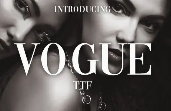
High-contrast didone with hairline serifs
Vogue is a high-contrast didone serif in white over a black-and-white beauty photograph: hairline serifs, a very thin crossbar on the A, a round O and a G with a fine spur, set in capitals as a magazine masthead.
Ideas for this font
Same independent foundry
Allow optional Google Analytics to measure visits and catalogue actions. Your search words and notes are not included. Privacy & storage