 #1 · Best Overall
Disclosure: MakerFileHub may earn a commission from qualifying purchases via paid links on this page. How our links work.
Holiday brush scripts, swashes & copperplate
21 Best Christmas Script & Calligraphy Fonts
Holiday script has to feel warm without becoming unreadable on a small tag. Santaheart and Christmas Family lead with connected and flourished forms, Wonderful Christmas and Christmas Scents add brush weight, and Everly Christmas and Merry Christmas keep the monoline wing tails that suit long phrases. Frosty Christmas covers the fine-pen signature register for tags.
Quick verdict
Santaheart is the safest holiday script for tags and cards, Christmas Scents brings the heaviest brush weight for signage, and Everly Christmas handles long phrases with swash tails. Frosty Christmas is the pick for small gift tags.
Quick answer
Top 3 Christmas scripts & calligraphy picks right now.
Short on time? Start with our three highest-rated Christmas scripts & calligraphy standouts before scrolling the full breakdown.
#1 · Best Overall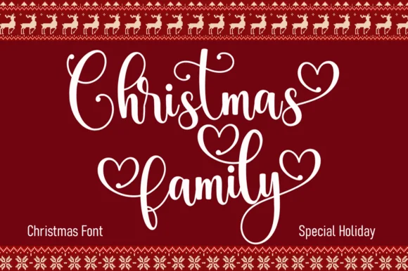 #2 · Runner-Up Pick
Christmas Family
Festive script with heart terminals and looped swashes
Get fontPaid link
Read review ↓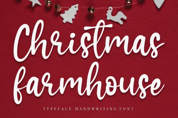 #3 · Editor's Choice
How we tested & selected these 21 fonts
We kept 21 of 178 candidates after checking each at 14 pt on a tag and 3 inches on a sign. Weighted connector integrity, swash access through documented keys, and whether the script holds in a single colour.
Side-by-side summary
Top 5 Christmas scripts & calligraphy picks at a glance.
Compare specimens, OpenType/PUA traits and primary project roles side by side.
| Rank & Font | Style & File Specs | Best Project Fit | Store Listing |
|---|---|---|---|
| ScriptAlternates & swashes · File formats | Kids' cocoa mug, ornament or holiday pajama shirt | Get fontPaid link | |
| ScriptLigatures · Alternates & swashes | Matching family Christmas shirt or ornament set | Get fontPaid link | |
| ScriptJoyful | Throw-pillow HTV transfer or rustic wood sign | Get fontPaid link | |
| ScriptPUA encoded · Ligatures · Alternates & swashes | Family photo holiday card, stocking tag & ornament | Get fontPaid link | |
| ScriptPUA encoded · Ligatures · Alternates & swashes | Holiday mug decal, gift sack & ornament lettering | Get fontPaid link |
Scripts & Calligraphy
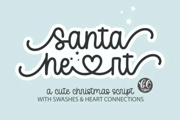
15 fonts#1 · Best OverallSantaheart
Santaheart weaves inline heart connectors and curled beginning and ending tails into a smooth monoline cursive for holiday mugs and children's gifts, where the thick even tubing keeps both standard cursive words and the heart-connected swash alternates durable for vinyl weeding.
The stroke stays one even width, the hearts sit inside the connectors, the tails curl out and the alternates are separate characters. That inline heart is the character: the greeting carries its own decoration, which is why the sample targets vinyl and mugs. The alternates need the character map, so check they open in your software, keep the tubing above 3 mm for weeding, and test a small curvy word first since closed counters are the hardest part to cut.
Recommended project & layout
Kids' cocoa mug, ornament or holiday pajama shirt — Use lowercase throughout to activate smooth baseline connections and heart ligatures.
Before you cut or print
PUA encoded; always Weld connected letters and swashes before cutting vinyl.
Best paired with
Get fontPaid link
#2 · Runner-Up PickChristmas Family
Christmas Family is a festive script in which the ascenders loop high, several terminals swell into hearts and the joins stay even, so a two-word greeting reads as something written on a holiday card.
The C opens a tall loop, the h rises on a slanted stem, the r finishes a curled arm, the s wobbles a shallow spine, the t raises a high bar and the y drops a wide tail, all at an even weight with heart-shaped terminals on a few letters and generous looping ascenders. The heart terminals are the character: they sit at the ends of strokes rather than as added decoration, which is why the sample sets two stacked words in white on deep red. Because the stroke is even, the face needs 26 pt upward and prints on smooth card; the loops need leading. The deep red panel, the reindeer border, the snowflake frames and the small labels are presentation; the white script words are the face.
Recommended project & layout
Matching family Christmas shirt or ornament set — Set family surname beneath in a clean tracked slab or sans.
Before you cut or print
Weld overlapping cursive strokes and check thin heart loops at small decal sizes.
Best paired with
Get fontPaid link
#3 · Editor's ChoiceChristmas Farmhouse
Christmas Farmhouse is an upright handwritten cursive in which the baseline dances, the ascenders rise tall and the brush-pen weight stays sturdy, so a porch sign reads across a yard without the formality of a connected script.
The C and h lift tall ascenders, the f and h repeat that height through the second word, the baseline shifts up and down by design and the brush-pen weight keeps a consistent thickset stroke with light joins. The dancing baseline is the character: it makes a painted sign feel hand-lettered rather than printed, which is why the sample suits a rustic board. Because the letters bounce, keep 18 mm between rows from 30 pt and check that the tallest ascender stays inside the panel. The farmhouse props are presentation; the cursive line is the face.
Recommended project & layout
Throw-pillow HTV transfer or rustic wood sign — Stack two words centrally with generous vertical clearance for tall ascenders.
Before you cut or print
Weld connected letters before cutting HTV or stencil film.
Best paired with
Get fontPaid link
 #4 · Top Maker Utility
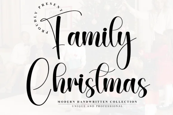
Family Christmas
Family Christmas is a tall, narrow modern calligraphy script with high-arching 'F' and 'C' capitals and rhythmic bouncing lowercase loops.
Family Christmas is a tall narrow bouncy holiday calligraphy script: a loaded brush stroke on a nearly vertical axis, high ascenders that loop once, joined letters and a bounce that lifts the middle of a word. The narrow width fits a long greeting in a tag, and the bounce grows the word vertically. It needs roughly 24 mm for the loop and the brush edge to read, and it is best in one deep ink on smooth card, or a fine gold on a dark ground where the loops print as bright lines.
Recommended project & layout
Family photo holiday card, stocking tag & ornament — Stack 'The [Surname]' and 'Christmas' in two centered rows at 42 pt with 1.05 leading over bright white photo mats.
Before you cut or print
Weld all cursive joins before vinyl cutting, and keep lowercase x-height above 0.65 in so fine hairline upstrokes stay intact.
Best paired with
Get fontPaid link
 #5 · Standout Silhouette
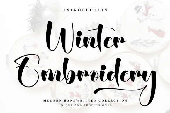
Winter Embroidery
Winter Embroidery is a bouncy modern calligraphy brush script—despite its name, it features smooth solid ink strokes rather than stitch textures.
Winter Embroidery is a thick-thin bouncy modern brush script: a high-contrast stroke with a swollen thick and a hairline-thin, letters that rise and fall along the baseline and joins that loop back into the word. It is the look of a machine-embroidered name, so it suits a patch or a knit more than a leaflet. The hairlines are the finest element and they break first, on thread and in print. It needs roughly 34 mm for the thick-thin contrast to read, and it is best one colour on a soft ground where the hairline holds.
Recommended project & layout
Holiday mug decal, gift sack & ornament lettering — Stack a two-word winter phrase with tight leading so the upper capital sits neatly above the wider lowercase second word.
Before you cut or print
Weld all cursive joins before vinyl cutting and keep x-height above 0.65 in so the thin upward connectors do not lift during weeding.
Best paired with
Get fontPaid link
 #6
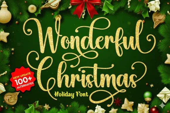
Wonderful Christmas
Wonderful Christmas builds tall looping calligraphy flourishes with spiral loops that crown the capitals and descenders across a two-line specimen, pairing fine hairlines with medium calligraphic downstrokes.
The downstrokes hold a medium weight, the hairlines thin away, the capitals open spiral crowns and the extra characters are encoded beyond a hundred alternates. The crowned capital is the character: the word begins with a drawn flourish that sets a formal tone, which is why the sample sets two lines for foil cards. Because the spirals are hairlines, keep 30 pt as the floor on coated stock and give the loops 20 mm above the line. The spiral crowns are hairlines: they snap in foil and silt below about 30 pt, so the crowned capitals belong on a coated card with 20 mm above the loop rather than on a curved tag.
Recommended project & layout
Foil-stamped family photo card overlay — Place the script over a quiet dark or cream area of the photo and keep family names in small caps.
Before you cut or print
Delicate hairline loops shine in print, digital cards and foil transfer; avoid cutting tiny decals below 2.5 inches.
Best paired with
Get fontPaid link
 #7
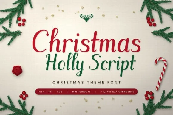
Christmas Holly
Christmas Holly ('Christmas Holly Script') is a crisp, upright brush script bundled in OTF, TTF & SVG with multilingual glyphs AND 12 holiday ornaments!
Christmas Holly is a clean upright holiday brush script with a dozen bonus ornaments: an even loaded stroke on a nearly vertical axis, joined letters, blunt flicked terminals and a small bounce that keeps the line from looking typed. The ornament set adds drawn berries, holly leaves, ribbons and frames cut to the same weight, so a tag can be decorated without a second family or a separate illustration. The upright axis reads as formal on a card while the ornaments carry the seasonal colour, and both share one ink so a set prints in a single pass. The script needs roughly 24 mm and the ornaments 22 mm for their detail to read.
Recommended project & layout
Personalized stocking tag, porch board & family pajama tee — Crown 2 stacked title-case lines (68–130 pt) with one of the 12 included holly-berry ornaments.
Before you cut or print
Weld overlapping cursive joins in Design Space—cuts and weeds fast on HTV, Oracal 651, and laser birch down to 0.85 in!
Best paired with
Get fontPaid link
 #8
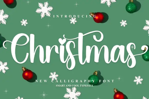
Christmas
Christmas shows a broad C, rounded joined letters, a long curled t bar and descending s loops, where the i carries a heart-shaped dot and baubles, snowflakes and small sparkles fill the sample around the word.
The script stands upright rather than slanting, the joins stay rounded, one bar curls long and a dot turns into a heart. That upright stance is the character: the word reads as a friendly seasonal signature rather than a formal hand, which is why the sample adds baubles. The ornaments are separate artwork, so check how the heart dot is typed, keep 28 pt for the joins and allow 20 mm beneath the s loops. The heart dot is the small piece that fails: it is a separate glyph, so it lifts during weeding and fills at foil, and the joins silt below about 28 pt.
Recommended project & layout
A Christmas invitation cover — Give Christmas its own wide line with together beneath in plain type; put time and address below the lowest curl.
Before you cut or print
Check the chosen alternates and avoid crossing practical details with swashes.
Best paired with
Get fontPaid link
 #9
Christmas
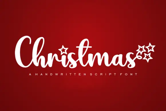
Christmas shows broad connected downstrokes with tall looped C and h shapes, an outlined star replacing the visible i dot and three more stars sitting near the final s.
The downstrokes stay thick, the loops rise high on the capitals, the connectors run short and the star marks sit where a dot or terminal would fall. The thick seasonal script is the character: the line reads as a warm written greeting, which is why the sample sets one word with star accents. Because the loops are tall and the strokes thick, keep 28 pt as the floor and cut from 1.1 inches of x-height so the joins weld cleanly on vinyl; the stars are decorative glyphs, not a separate icon set.
Recommended project & layout
A Christmas gathering sign — Place the title above a plain family-name and date line.
Before you cut or print
Check star placement in the actual phrase.
Best paired with
Get fontPaid link
 #10
Everly Christmas
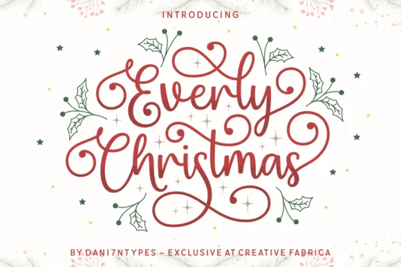
Everly Christmas is a joyful holiday calligraphy script weaving playful ribbon-smooth spiral flourishes above, below, and around stacked greetings!
Everly Christmas is a spiralled monoline calligraphy script in which the loops coil into tight spirals above the x-height and the joins are drawn as one continuous even line. The spirals grow the word tall, and the monoline keeps the face honest at small sizes where a contrast script would break. It needs roughly 24 mm for the spiral coil to read, and it is best in one warm ink on ivory, or a fine foil above 36 pt where the spiral stays open.
Recommended project & layout
Christmas card centerpiece, round ornament & cocoa mug — Stack 2 title-case words tight (68–135 pt) in berry red or metallic gold so top and bottom spirals frame an oval.
Before you cut or print
Weld overlapping cursive joins in Cricut Design Space—cuts cleanly on Oracal 651 and HTV at 1.15 inches+!
Best paired with
Get fontPaid link
 #11
Christmas Scents
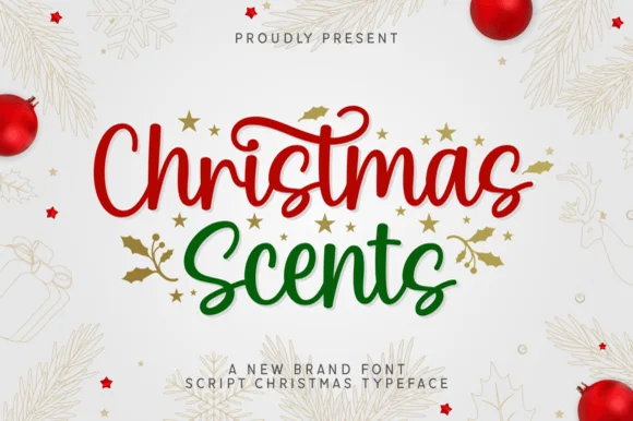
Christmas Scents is a plump, joyful holiday brush script sprouting delicate mistletoe/botanical leaf swashes off its outer letters!
Christmas Scents is a plump holiday brush script with thick rounded strokes, a bouncy baseline and small mistletoe sprigs growing off the outer letters rather than sitting behind them. The leaf swashes are drawn thin against the heavy letter, so the contrast keeps the word legible at 20 mm while the foliage reads at 40 mm. Because the sprigs extend outward, the layout must reserve space at the start and end of any line. It is a card, tag and label face, best in one deep green or red on a warm ground.
Recommended project & layout
Holiday soy-candle jar ('Fraser Fir', 'Spiced Cider') & soap — Stack 2 title-case words at 64–125 pt, triggering the botanical leaf swash alternates on the bottom word's outer edges.
Before you cut or print
Main thick script weeds in seconds on Cricut Oracal 651 & HTV (Weld joins!); print or cut leaf swashes at 1.4 in+.
Best paired with
Get fontPaid link
 #12
Frosty Christmas
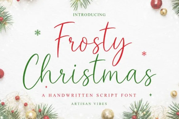
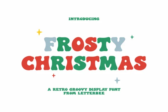
Frosty Christmas (by Artisan Vibes) is a light, upright fountain-pen signature script with tall 'F/C/t/h' loops and calm modern elegance.
Frosty Christmas is a hand-drawn Christmas display in which each letter wears a dusting of snow: the stems carry uneven caps of white, small icicles hang from the crossbars and the counters fill with drifts. The snow is drawn into the glyph rather than layered on, so a two-colour print needs the white to be bare paper, not an ink. It needs roughly 30 mm for the icicles and the drift to read, and it is best as one deep ink on white or pale blue, where the snow stays as paper.
Recommended project & layout
Cricut Pen holiday card envelope, gift tag & ribbon — Color row 1 cranberry red and row 2 forest green at 60–120 pt above wide-tracked serif micro-caps.
Before you cut or print
Draws crisply with 0.4 metallic Cricut Pens & Foil Quill; if blade-cutting vinyl, Weld joins and scale above 1.4 inches.
Best paired with
Get fontPaid link
 #13
Winter
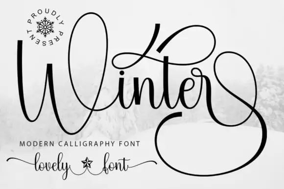
Winter surrounds its small joined middle with a tall W loop, a high t sweep and a very large lower terminal, where the final stroke returns in a wide loop beneath and beside the word and fills almost half of the square field around it.
The letters stay connected and medium weight, the initial loop rises high, the t sweeps wide and the closing stroke falls into a vast loop that wraps under the word. That terminal is the character: the silhouette is nearly square rather than a narrow strip, which is why the sample cannot be cropped into a banner. Snow imagery around the field is context. Keep 30 pt for the hairlines, plan a square or very wide area for the word and check the loop against your trim before committing.
Recommended project & layout
A winter concert programme cover — Give the title most of a square cover and set performers and venue on a plain inside page. Leave the lower terminal clear of the cover edge.
Before you cut or print
Try the real words before reserving a loop; the preview’s terminal may depend on a specific alternate.
Best paired with
Get fontPaid link
 #14
Kayla
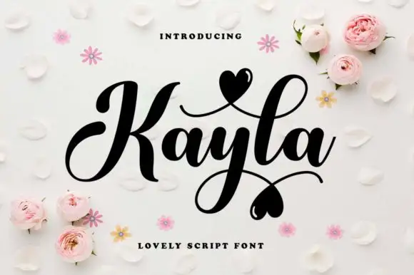
Kayla is a bold cursive in which the downstrokes carry weight, the capital loops high, the connected body stays compact and the swashes finish in small hearts above and below the word, so a name reads as a warm handwritten greeting.
The K opens a tall loop, the y drops a descending loop under the centre of the word, the connectors keep one heavy weight and the swash set adds strokes that cross above and below the baseline with hearts at their ends. The heavy body is the character: it keeps a bold line legible where a fine script would thin, which is why the sample sets one word with two crossing swashes. Because the loops overlap, the face needs 20 mm between baselines from 28 pt and the joins must be welded before cutting from 1.1 inches of x-height. The pale ground, the small hearts and the caption are presentation; the dark word and its swashes are the face.
Recommended project & layout
A couple's keepsake cover — Keep the phrase alone on the cover and put the date below the lowest heart in plain type.
Before you cut or print
Verify the actual heart alternates and ampersand.
Best paired with
Get fontPaid link
 #15
Hello
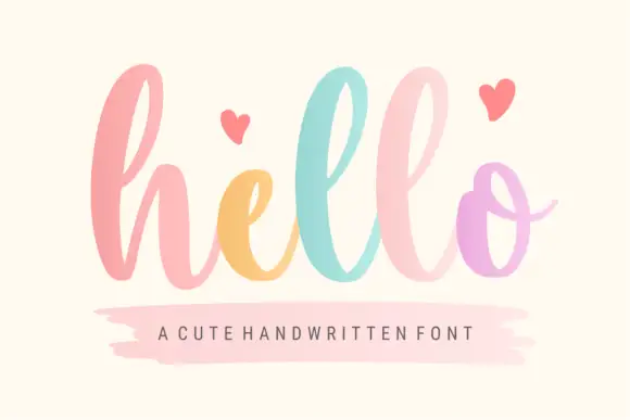
Hello shows a large lowercase h followed by tall repeated l loops and a rounded o with a thin exit stroke, and the source specifications list PUA-encoded extra characters available through Character Map and Font Book along with decorative entry and terminal swashes.
The lowercase stays broad, the ascenders repeat in a row of loops, the exit stroke thins and the extra swashes sit outside the standard mapping. That repetition is the character: a single word becomes a rhythm of loops, and the PUA entries let the ends extend further, which is why the listing points at a character map. Plan the swashes inside your layout, keep 26 pt for the hairlines and check that the extras appear in your software before the design depends on them.
Recommended project & layout
A short birthday greeting cover — Use hello as the main line and birthday in plain type beneath, with the recipient inside and no extra hearts required.
Before you cut or print
Check the actual loops and colour contrast at card size.
Best paired with
Get fontPaid link
Matched Font Duos & Packs
6 fonts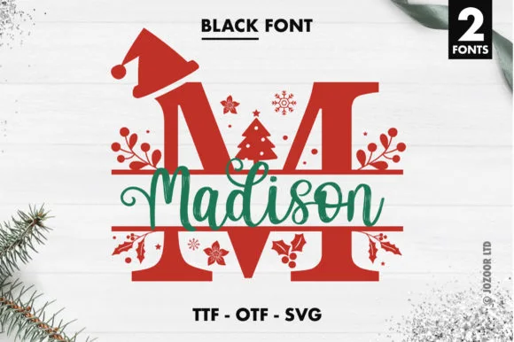 #16
Madison Christmas Split Monogram
Madison Christmas Split Monogram is a two-font holiday set pairing split-bar festive capitals (topped with Santa hats, holly, and trees) with a smooth name script.
Madison Christmas Split Monogram is a festive duo of a Santa-hat split-monogram serif and a script, supplied as font files plus vector cuts: the serif is a bold panel letter split down the middle so a name or an initial sits inside the gap, and the script supplies the second word. The hat and the split are the design, so the panel needs height and the gap must stay open. The split kerf is the finest element and it closes when the face is reduced. It needs roughly 40 mm for the split and the hat to read, and it is best one flat ink or one vinyl colour.
Recommended project & layout
Personalized family pajama crest, ornament & porch flag — Cut or print the split capital at 4.5–7 inches tall in holiday red and center the green or gold script name inside the split gap.
Before you cut or print
On vinyl or HTV, size the split monogram to at least 4.5 inches tall so the small snowflakes and holly berry cutouts weed cleanly.
Best paired with
Get fontPaid link
 #17
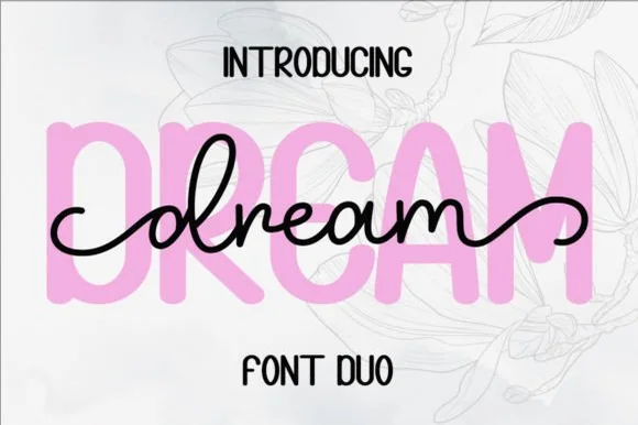
Dream Duo
Dream Duo combines a plump, soft-cornered uppercase sans-serif with a fluid monoline script that threads cleanly across wide titles.
Dream Duo pairs a chunky pastel rounded sans with a smooth monoline cursive: the sans is a fat even-width block with fully rounded corners and tight spacing for headlines, while the cursive is a soft even stroke with open loops and a gentle slant. The pair is built for a soft palette, so it loses its character when printed in a single harsh black. The monoline hairline is the finest element and it breaks first. The sans needs roughly 26 mm and the cursive 28 mm for their detail to read.
Recommended project & layout
Nursery wall name sign & sweet-sixteen acrylic backdrop — Scale the background sans to 3.5 inches tall in soft pastel and center the dark monoline script across the middle 60% height.
Before you cut or print
Weld all cursive joins before cutting vinyl, and use Cricut's Slice or a 0.07 in offset knockout if avoiding two-layer vinyl overlap.
Best paired with
Get fontPaid link
 #18
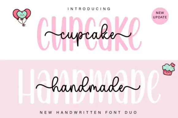
Cupcake Handmade Duo
Cupcake Handmade Duo places tall narrow rounded letters in pale pink behind a smaller connected script line in black, twice on one cover, where the script carries long outer tails and looped k and h forms while a balloon pair, a cupcake drawing and an update badge sit in the corners.
The caps stay tall and narrow, the script stays compact and continuous, the loops open large and the tails run wide past the caps on both sides. That size gap is the character, because the script sits inside the cap row rather than under it. The balloons, the cupcake and the badge are separate sample elements, so do not count them as part of the type. Keep 34 pt for the caps and 16 pt for the script, and check the k and h loops against your margins before locking the lockup.
Recommended project & layout
A cupcake-table heading — Place the capital title above, not behind, the script; put flavours and dietary information in a plain panel below.
Before you cut or print
Check both supplied styles and essential food information separately.
Best paired with
Get fontPaid link
 #19
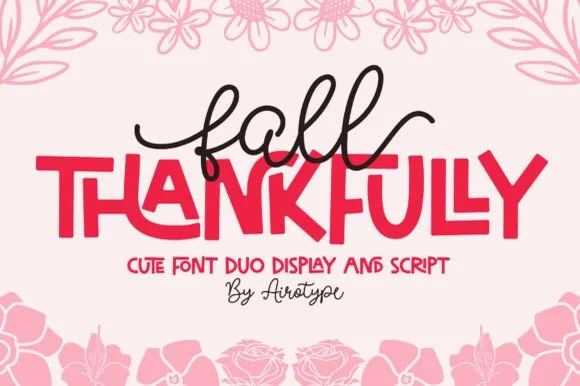
Fall Thankfully
Fall Thankfully pairs a looping monoline cursive script with a heavy, interlocking all-caps sans display face.
Fall Thankfully is a duo of a monoline tail script and a bouncy all-caps sans: the script runs an even stroke that finishes every word with a long lifted tail, while the sans is a chunky capital set whose baseline hops so a short line looks hand-set. The pair is built for autumn market goods, where one line is written and one is printed. The script tail is the finest element and it closes into a dot when reduced. The script needs roughly 28 mm and the sans 24 mm for their detail to read.
Recommended project & layout
Thanksgiving host apron & kitchen tea towel — Set the main family or harvest word in the heavy sans at 2.5 in cap height, then tuck a 1-word script lead-in slightly overlapping the upper-left letters.
Before you cut or print
Weld the overlapping script loops before cutting HTV, and peel away from the narrow 'f' and 'l' ascender counters slowly.
Best paired with
Get fontPaid link
 #20
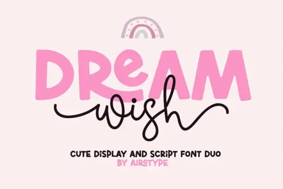
Dream Wish
Dream Wish contrasts chunky uneven capitals in a flat pink with a fine black looping script line beneath, where the script w begins in a long entry tail and the h finishes in a high sweeping exit that lifts above the cap height of the lower word.
The caps stay blocky and slightly uneven, the script stays thin and continuous, the entry and exit tails run long and the two rows overlap lightly. That overlap is the character: the script sits close enough to touch the caps, which is why the sample keeps both rows centred with nothing else competing. A rainbow arc above is cover artwork. Keep 46 pt for the caps and 20 pt for the script, leave 16 mm of clear ground between the rows and check the exit tail against your right margin.
Recommended project & layout
A birthday wish-card heading — Place a heavy first word over a short script line, keeping the personal note inside the card.
Before you cut or print
Confirm members and actual tail joins.
Best paired with
Get fontPaid link
 #21
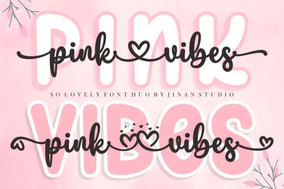
Pink Vibes Duo
Pink Vibes Duo pairs two fat rounded capital rows, drawn in white with a soft pink glow, with a small dark connected script that runs across them, and in the lower sample the script joins the words with heart shapes instead of a plain connector stroke.
The caps stay broad and inflated, the script stays thin and dark, the contrast between the two weights carries the pair and the hearts sit where a ligature would normally go. The upper sample sets the script over the caps without hearts, the lower inserts one heart between the words and a second heart cluster on the final s, so the decorative join is an option rather than the default. Branches in the corners are cover artwork. Check which connector glyphs your file carries before planning the heart link, keep 30 pt for the script strokes and set the caps in one colour so the pink glow does not come from the type.
Recommended project & layout
A two-level greeting — Keep capitals above script rather than overlapping; leave heart tails in open space.
Before you cut or print
Check connector variants and actual duo contents.
Best paired with
Get fontPaid link
Practical buyer checklist
Frequently asked questions.
Key cutting, printing and pairing answers before choosing a Christmas scripts & calligraphy typeface.
Which Christmas script works best in foil?
Mid-weight brush scripts with generous counters. Hairline copperplate fills in under foil, while very heavy scripts lose the fine detail that makes foil look expensive. Test one tag before running the batch.
Can a holiday script be used for a sign rather than a card?
Yes at 3 inches or more, where the connectors and swashes hold. Below that the script is a card face, and trying to scale it up later usually reveals spacing that only worked small.
How do I stop a Christmas script looking like last year's trend?
Choose a brush script rather than a novelty lettering face, keep the ornament to one element, and pair it with a plain serif. Traditional script ages well; seasonal quirks date within a year.
Do these scripts include a full alphabet with alternates?
Most include 200 to 600 glyphs with alternates on private-use keys. Anything under 150 glyphs is a simple script with no swash set, which limits how varied a phrase can look across a whole set of tags.
Keep exploring
Related collections & guides.
Explore adjacent maker roundups or check our practical pre-production checklists.
01 / Holidays & Seasons
Christmas
38 curated fonts · Previews & pairings

02 / Holidays & Seasons
Christmas display, snow & monograms
19 curated fonts · Previews & pairings
03 / Cricut & Craft
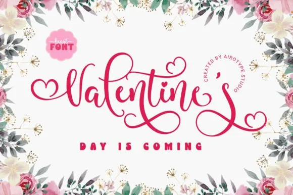
Heart swash & connecting heart fonts
19 curated fonts · Previews & pairings
04 / Occasions & Milestones
Bridal calligraphy & swash scripts
27 curated fonts · Previews & pairings
Guides: Invitation font checklist · Vinyl & cutting checklist · How to pair script & sans fonts