Editorial Serif Anchor

Hampers for Boys + Grandeur – Elegant Classic Serif
Anchors Hampers for Boys's fluid strokes with crisp Roman proportions on wedding suites, headers and packaging.
Inspect Grandeur – Elegant Classic Serif specimenDisclosure: MakerFileHub may earn a commission from qualifying purchases via paid links on this page. How our links work.
Loose brushed handwriting with slanted bodies and dry swept ends
Hampers for Boys is loose brushed handwriting in which the letters lean forward, the strokes sweep through each letter and the ends lift dry off the page.
Paid link
Get this fontProject & layout blueprintsAt-a-glance maker compatibility
Fine grain and micro-texture excel in 300 DPI print, sublimation, and screen print rather than small vinyl weeding.
Visual anatomy & craft review
The capital H is drawn as two swept stems joined quickly, and the letters after it keep that speed: the a closes a loose bowl, the m holds three uneven arches, the p and the r carry light stems and the y drops a curved tail that lifts at the tip. Nothing is ruled: the baseline drifts, the letter heights vary and the weight changes with the speed of the stroke, which is what makes the phrase read as written with a brush pen in one pass. Ends are dry and swept rather than rounded, and the joins are broken rather than connected. There is a second, lighter script in the sample for a supporting line, showing how the face is used as the louder of two. The coral ground, the black ink and the two small caption lines are presentation; the lettering is the words.
Loose · Brushed · Slanted
Two-font hierarchy recipes
Tested contrast partners — pairing Hampers for Boys with grounded secondary typography.
Hampers for Boys + Grandeur – Elegant Classic Serif
Anchors Hampers for Boys's fluid strokes with crisp Roman proportions on wedding suites, headers and packaging.
Inspect Grandeur – Elegant Classic Serif specimen
Hampers for Boys + Homies
Keeps small-scale dates, URLs, nutrition facts and care instructions crisp and legible below script titles.
Inspect Homies specimenPractical applications
Concrete hierarchy, scale and production guidance tailored to Hampers for Boys’s stroke geometry.
The loose brushed hand gives a feature a personal voice at the top of the page, and the dry swept ends keep it from looking like a tidy script.
Hierarchy & layout recipe
Set the header at 46 pt on the opening page, keep the body in a 10 pt serif at 13 pt leading, and hold 16 mm between the header and the first column of text.
Pre-production check
Dry swept ends under 1 mm can vanish on newsprint; check the page proof and thicken the smallest ends rather than shortening the strokes.
The loose hand reads as a note written in a hurry and still meant, which is the right tone for a family thank-you at 20 pt.
Hierarchy & layout recipe
Set the message at 20 pt on a 148 by 105 mm card, keep the sender in the same face at 11 pt, and leave the lower third of the card clear for a signature.
Pre-production check
A drifting baseline printed twice on one card looks careless; check the proof and keep the script to a single line.
The brushed lettering gives a gift box a hand-packed tone, and the uneven weight holds at 13 pt where a precise script would look manufactured.
Hierarchy & layout recipe
Set the brand at 13 pt on a 70 by 45 mm box label, keep the contents in a 6 pt sans, and leave 5 mm of margin so the swept ends stay inside the label edge.
Pre-production check
A dry end printed on kraft can break apart; print one label on the actual board and smooth the driest tip before the full run.
Technical & licence verification
Confirm included OTF/TTF/WOFF formats, full glyph tables and licence coverage on the live store page before batch production.
Closest visual alternatives
Matched across letterform anatomy, stroke behaviour and craft applications.
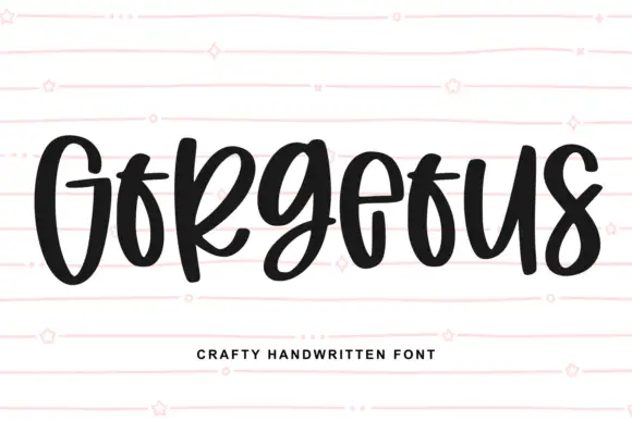
Heavy narrow handwriting with tight counters
Gorgeous is a heavy narrow handwriting that keeps a tall x-height and nearly closed counters, so a single word reads as a dense band with a lively, uneven baseline running under it.
Ideas for this font
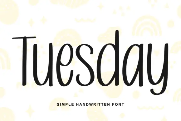
Simple unjoined handwriting with a light bounce
Tuesday is a simple handwritten face in black on white: a monoline, unjoined hand with tall ascenders, circular bowls and a slight bounce along the line, shown over pale yellow doodles of rainbows, stars and squiggles.
Ideas for this font
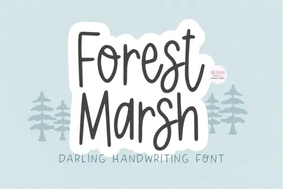
Loose upright handwriting with tall narrow frames and uneven baselines
Forest Marsh is loose upright handwriting in which the frames stay tall and narrow, the baselines drift a little and the strokes keep an even medium weight throughout.
Ideas for this font
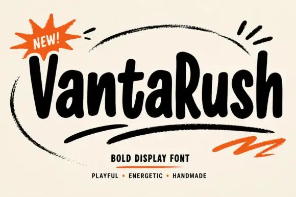
Bold playful hand display
Vanta Rush is a bold playful display in black on cream: fat rounded letters with uneven widths, a bouncy baseline, brush swooshes around the lockup and an orange burst badge, so the plate reads as a hand-painted market poster rather than a geometric face.
Ideas for this font
Same independent foundry
Allow optional Google Analytics to measure visits and catalogue actions. Your search words and notes are not included. Privacy & storage