Editorial Serif Anchor

Whimsical Retro + Gorga
Anchors Whimsical Retro's fluid strokes with crisp Roman proportions on wedding suites, headers and packaging.
Inspect Gorga specimenDisclosure: MakerFileHub may earn a commission from qualifying purchases via paid links on this page. How our links work.
Rounded upright letters with long curled terminals
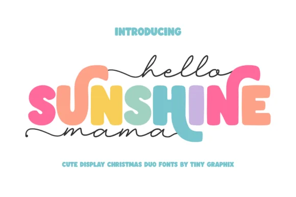
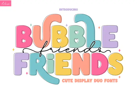
Whimsical Retro mixes soft upright letterforms with unusually long curled terminals, set over a pastel layered fill inside a thin outline on a warm paper ground.
Paid link
Get this fontProject & layout blueprintsAt-a-glance maker compatibility
Weld or Unite overlapping script joins into one continuous vector path before sending to the blade.
Visual anatomy & craft review
The lower-case keeps a tall x-height and generous round bowls, so the word reads as friendly rather than thin, while the l, r and y endings leave the baseline and curl back up in wide arcs. Each letter is built from stacked layers: a pale inner fill, a soft outline and a hint of shadow sitting slightly down and left, which is what produces the paper-cut depth on the cover. Spacing is open, so the curls sit in the gaps instead of overlapping their neighbours, and the capitals are only slightly taller than the lower-case. Small hearts and sparkles between words are artwork, not glyphs, and the tracked caps caption below is a separate label face.
Soft · Rounded · Ornamented
Two-font hierarchy recipes
Tested contrast partners — pairing Whimsical Retro with grounded secondary typography.
Whimsical Retro + Gorga
Anchors Whimsical Retro's fluid strokes with crisp Roman proportions on wedding suites, headers and packaging.
Inspect Gorga specimen
Whimsical Retro + Kohilo
Keeps small-scale dates, URLs, nutrition facts and care instructions crisp and legible below script titles.
Inspect Kohilo specimenPractical applications
Concrete hierarchy, scale and production guidance tailored to Whimsical Retro’s stroke geometry.
The round bowls and open fit read at a glance on a small card, and the curled endings give a plain name one point of interest.
Hierarchy & layout recipe
Print at 20 pt on a 90 by 50 mm tent card, keep eight characters maximum so the curls do not run into the fold, and leave 4 mm clear above the tallest ascender.
Pre-production check
Confirm which letters carry the long curled endings, since not every character offers one and a name without them changes the layout.
Soft upright letters suit a small retail identity, and the layered fill can be flattened to one colour for a cheap bag print.
Hierarchy & layout recipe
Set the heading at 3-inch width across a kraft bag face, keep it above the fold line, and drop the outline layer if the print budget allows one ink only.
Pre-production check
Inspect the name at its smallest planned use, because the layered detail disappears faster than the letter shapes do.
An open, rounded display face gives a maker feature a warm opener while the tracked caption line keeps the issue details quiet.
Hierarchy & layout recipe
Run the headline at 54 pt across two lines, put the caption in 8 pt capitals with 0.3 em tracking, and keep the column text at least 12 mm below the last curl.
Pre-production check
The curled terminals extend the line width, so measure the longest word against the text column before choosing line breaks.
Technical & licence verification
Confirm included OTF/TTF/WOFF formats, full glyph tables and licence coverage on the live store page before batch production.
Closest visual alternatives
Matched across letterform anatomy, stroke behaviour and craft applications.
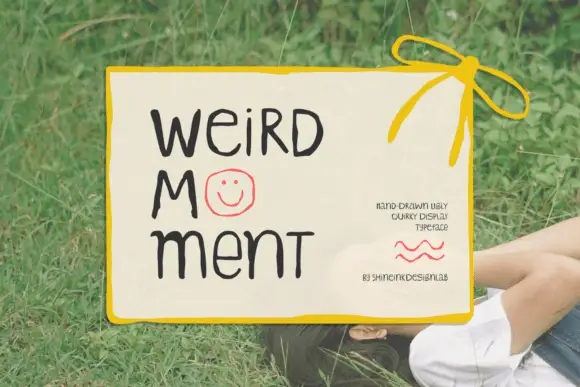
Display
Weird Moment is a hand-drawn display face with tall thin letters, a bouncing baseline and drawn-in jokes: the O is a smiley face, some letters lean, and the whole word looks written on a card with a marker.
Ideas for this font
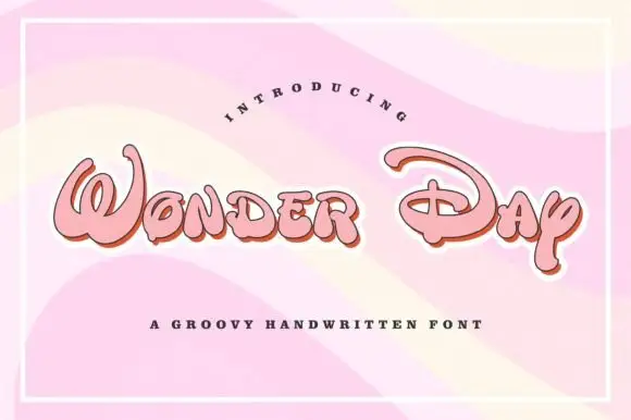
Groovy rounded hand lettering
Wonder Day is a groovy hand-lettered display in pink with a copper shadow and a thick white outline, set on a pastel wave ground: fat rounded letters with a strong forward lean and a roller-coaster bounce.
Ideas for this font
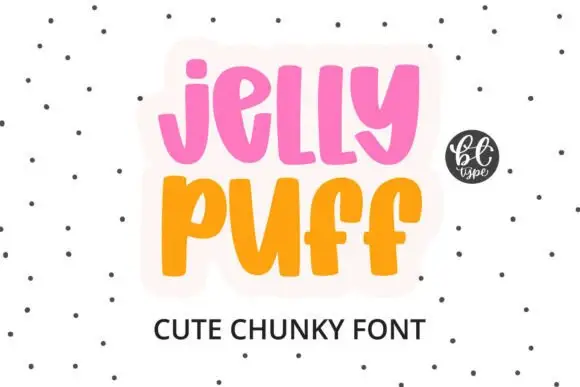
Chunky upright letters with curved lower ends and open counters
Jelly Puff is chunky upright lettering in which the strokes stay thick and even, the lower ends curl to one side and the counters stay open, so a word reads as something drawn with a fat marker.
Ideas for this font
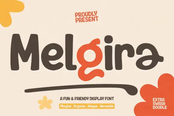
Heavy rounded display sans with a swash accent
Melgira draws a wide black rounded alphabet and then breaks its own rhythm with a lower-case pair whose descender swells into a long sweeping underline beneath the word.
Ideas for this font
Same independent foundry
Allow optional Google Analytics to measure visits and catalogue actions. Your search words and notes are not included. Privacy & storage