Editorial Serif Anchor

Make a Note + Glofi
Anchors Make a Note's fluid strokes with crisp Roman proportions on wedding suites, headers and packaging.
Inspect Glofi specimenDisclosure: MakerFileHub may earn a commission from qualifying purchases via paid links on this page. How our links work.
Tall neat monoline handwriting
Make a Note is a tall neat monoline handwriting in black on lined paper: high narrow letters, a small x-height, rounded terminals and an even spacing that keeps a paragraph legible at text size.
Paid link
Get this fontProject & layout blueprintsAt-a-glance maker compatibility
Weld or Unite overlapping script joins into one continuous vector path before sending to the blade.
Visual anatomy & craft review
The phrase is set on two lines with the second indented, and the face is a tidy hand: the M is a pair of narrow peaks, the a and the k are compact, the o and the e are small and round, the N of Note opens with a tall stem and the final e closes with a small tail, while nothing connects and the letters stand apart with an even gap. The stroke is monoline and medium, the ascenders are unusually tall against a small x-height, and the baseline is nearly straight, which is why the face reads as a careful hand rather than a decorative script. Two coloured notes at the foot show the same face set as paragraphs in different colours, which is the proof a buyer of a text hand actually needs. Make a Note suits notes, planners, labels and stationery, and it holds at ten points.
A tidy hand drawn on lined paper
Two-font hierarchy recipes
Tested contrast partners — pairing Make a Note with grounded secondary typography.
Make a Note + Glofi
Anchors Make a Note's fluid strokes with crisp Roman proportions on wedding suites, headers and packaging.
Inspect Glofi specimen
Make a Note + Prime Nordic
Keeps small-scale dates, URLs, nutrition facts and care instructions crisp and legible below script titles.
Inspect Prime Nordic specimenPractical applications
Concrete hierarchy, scale and production guidance tailored to Make a Note’s stroke geometry.
A tidy hand reads across a table and looks written rather than printed, and the narrow letters fit a long surname on a small card.
Hierarchy & layout recipe
Print a 70 by 40 mm place card: set the name at 15 pt on one line, keep 6 mm of clear ground beneath before the table number at 6 pt, and hold 5 mm of margin on all four sides.
Pre-production check
A small x-height closes up at fifteen points; print one card at the finished size and check the a and the e before the set.
A monoline hand keeps a note legible at small sizes, and the neat spacing keeps a printed message from looking like a scrawl.
Hierarchy & layout recipe
Print a 105 by 148 mm card: set the greeting at 24 pt on one line, keep 14 mm of clear ground beneath before the message at 10 pt, and hold 13 mm of margin on all four sides.
Pre-production check
A hand at ten points needs air; print one card on the intended stock and check the leading before the batch.
A text-sized hand suits a schedule a guest will read up close, and the even spacing keeps a list of times from looking crowded.
Hierarchy & layout recipe
Print an A5 schedule sheet: set the headings at 14 pt, set the times at 10 pt on a 14 pt leading, and hold 12 mm of margin on both sides of the printed sheet.
Pre-production check
A tall hand in a long list can look spidery; print one page at the finished size and check the weight before the run.
Technical & licence verification
Confirm included OTF/TTF/WOFF formats, full glyph tables and licence coverage on the live store page before batch production.
Closest visual alternatives
Matched across letterform anatomy, stroke behaviour and craft applications.
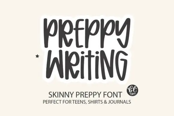
Tall skinny hand-lettered capitals
Preppy Writing is a tall skinny hand-lettering in charcoal on cream: narrow capitals with uneven stems, a small e and i, and a soft white outline that lifts the block off the ground.
Ideas for this font
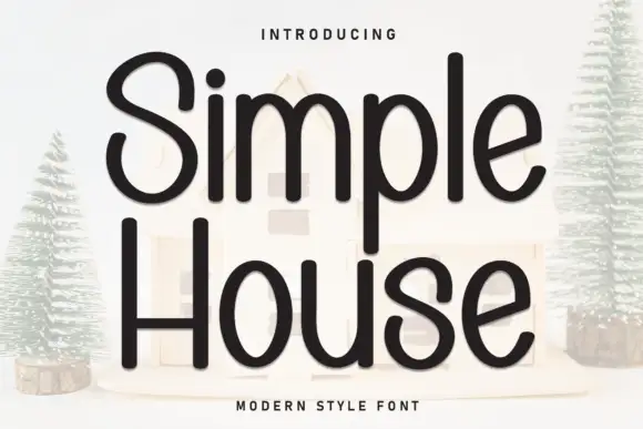
Rounded monoline handwritten sans
Simple House is a rounded monoline handwritten sans in near-black on a pale ground: wide geometric letters with fully rounded ends, an open counters and a light bounce that keeps a plain phrase from looking mechanical.
Ideas for this font
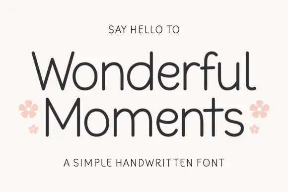
Thin rounded handwritten sans
Wonderful Moments is a thin rounded handwritten sans set in mixed caps: wide open letterforms, a light even stroke with rounded terminals and a small bounce that keeps the line from feeling ruled.
Ideas for this font
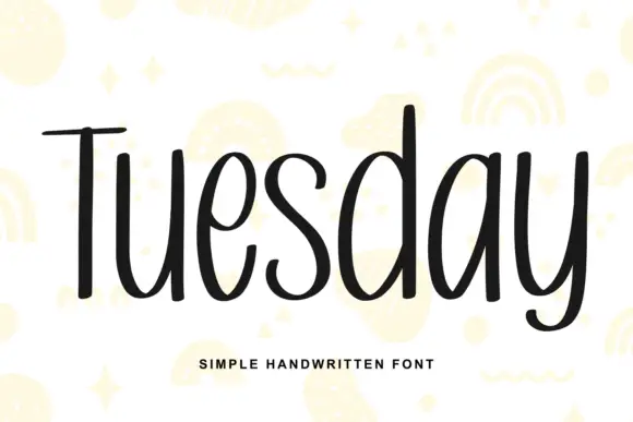
Simple unjoined handwriting with a light bounce
Tuesday is a simple handwritten face in black on white: a monoline, unjoined hand with tall ascenders, circular bowls and a slight bounce along the line, shown over pale yellow doodles of rainbows, stars and squiggles.
Ideas for this font
Allow optional Google Analytics to measure visits and catalogue actions. Your search words and notes are not included. Privacy & storage