Modern Grotesque Body

Triple + Swaraga
Creates crisp high-hierarchy contrast beneath Triple headlines across menus, websites and labels.
Inspect Swaraga specimenDisclosure: MakerFileHub may earn a commission from qualifying purchases via paid links on this page. How our links work.
Display
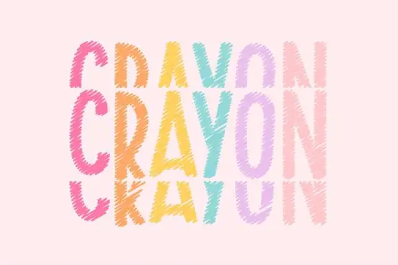
Triple is a handwritten display face built for stacking: the same soft capital is drawn three times, once filled and twice as outline, offset above and below, so a word looks like a hand-drawn sign layered on itself.
Paid link
Get this fontProject & layout blueprintsAt-a-glance maker compatibility
Cut solid base, outline, and shadow layers in separate vinyl colors and align on registration marks.
Visual anatomy & craft review
The word triple appears three times on the card: an outline version in brown at the top, a solid pink version in the middle and another outline at the bottom, each shifted a few millimetres so the shapes overlap and cross. The letters themselves are soft, rounded and slightly irregular, with a thick monoline and small counters, and the overlaps read as a printing mistake that has been kept on purpose. A script word sits above and a letter-spaced lowercase line below. The construction is unusual and specific: this is a face for a single word, a name or a logo where the layering is the design, and it works best on a pale ground with two colours, one solid and one outline.
A hand-drawn stacked alphabet with three offset outlines
Two-font hierarchy recipes
Tested contrast partners — pairing Triple with grounded secondary typography.
Triple + Swaraga
Creates crisp high-hierarchy contrast beneath Triple headlines across menus, websites and labels.
Inspect Swaraga specimen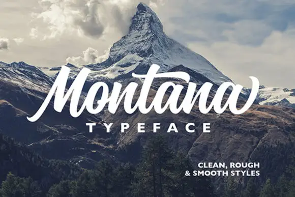
Triple + Montana
Adds a warm human signature touch for 1-to-3-word callouts without competing against structured serif capitals.
Inspect Montana specimenPractical applications
Concrete hierarchy, scale and production guidance tailored to Triple’s stroke geometry.
The stacked layering makes a short name look designed without artwork, and the two-colour construction prints cheaply on a home machine.
Hierarchy & layout recipe
Print a 105 by 148 mm card: stack three copies of the name at 40 pt with a 2 mm offset, keep 16 mm of clear ground beneath before the details at 8.5 pt, and hold 12 mm of margin at the card edge.
Pre-production check
Offsets that print unevenly look like a mistake; print one card on the actual printer and check the overlap before the batch.
A three-layer wordmark gives a one-word studio name a mark of its own, and the outline copies can be dropped for a single-colour version.
Hierarchy & layout recipe
Print a 85 by 55 mm card: set the wordmark at 22 pt in three offsets, keep 7 mm of clear ground beneath before the contact block at 6 pt, and hold 5 mm from the top outline to the card edge.
Pre-production check
At card size the offsets merge; print one card at the final size and check the counters before the order.
The layered look reads as hand-painted signage, which suits a stall where everything else is also drawn by hand and the sticker has to match the board beside it.
Hierarchy & layout recipe
Print a 80 mm round sticker: set the stall name at 24 pt in three offsets, keep 6 mm of clear ground between the outermost outline and the rim, and leave 8 mm beneath for the market name at 6 pt.
Pre-production check
Round dies clip the outer outline; print one sticker at the real size and cut it before the roll.
Technical & licence verification
Confirm included OTF/TTF/WOFF formats, full glyph tables and licence coverage on the live store page before batch production.
Closest visual alternatives
Matched across letterform anatomy, stroke behaviour and craft applications.
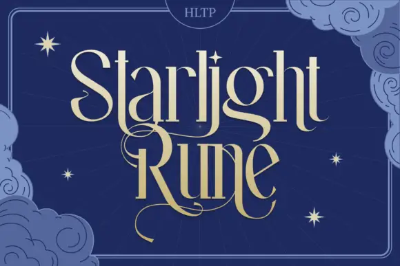
Tall fantasy serif with a long swash
Starlight Rune is a tall fantasy serif in gold on navy: elongated letters with hairline joins, a long swash that runs through the middle of the block, and a drawn night sky of clouds and stars behind it.
Ideas for this font
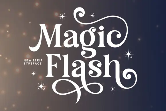
Contrasted serif with huge swash terminals
Magic Flash is a contrasted serif display in white on a dark ground: tall wide letters with hairline joins and enormous swash terminals that curl out of the M, the F and the h, with a scattering of drawn four-point stars.
Ideas for this font
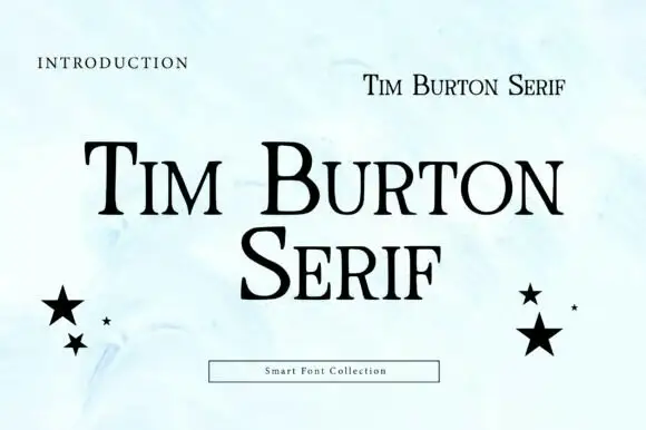
High-contrast serif with small capitals
Tim Burton Serif is a high-contrast serif in black on a pale watercolour page: thin bracketed serifs, a large contrast between stems and hairlines, mixed case with small capitals, and two black stars balanced at either side of the block.
Ideas for this font
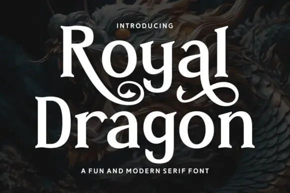
Modern serif with playful flourishes
Royal Dragon is a modern serif in cream on a dark dragon painting: moderate contrast, sturdy serifs, and flourishes that curl from the g and the l, so the word reads as a friendly editorial face with one decorative move.
Same independent foundry
Allow optional Google Analytics to measure visits and catalogue actions. Your search words and notes are not included. Privacy & storage