Editorial Serif Anchor

Weekend Parade + Marquis - Elegant Modern Serif
Anchors Weekend Parade's fluid strokes with crisp Roman proportions on wedding suites, headers and packaging.
Inspect Marquis - Elegant Modern Serif specimenDisclosure: MakerFileHub may earn a commission from qualifying purchases via paid links on this page. How our links work.
Narrow hand-drawn upright capitals
Weekend Parade is a set of tall narrow hand-drawn capitals with uneven stems, open counters and a baseline that drifts across the length of the line.
Paid link
Get this fontProject & layout blueprintsAt-a-glance maker compatibility
Weld or Unite overlapping script joins into one continuous vector path before sending to the blade.
Visual anatomy & craft review
The letters are drawn rather than constructed: stems vary in width, the A opens wide at the apex, and the paired words lean slightly toward each other instead of sitting square. Spacing is deliberately loose, so the line reads as a hand-painted sign rather than a tracked display face, and the counters stay generous even at the narrowest widths. The cut of the E and the short middle arm of the W are the two places where the hand shows most clearly. The photograph of a field and fence behind the sample supplies mood only; the typeface is flat and untextured, which is why it also works stripped back to a single colour on paper.
Quirky · Upright · Loose
Two-font hierarchy recipes
Tested contrast partners — pairing Weekend Parade with grounded secondary typography.
Weekend Parade + Marquis - Elegant Modern Serif
Anchors Weekend Parade's fluid strokes with crisp Roman proportions on wedding suites, headers and packaging.
Inspect Marquis - Elegant Modern Serif specimen
Weekend Parade + Bielchon
Keeps small-scale dates, URLs, nutrition facts and care instructions crisp and legible below script titles.
Inspect Bielchon specimenPractical applications
Concrete hierarchy, scale and production guidance tailored to Weekend Parade’s stroke geometry.
Loose hand-drawn capitals read as an announcement someone pinned up at short notice, which suits a parish walking club better than a clean grotesque would.
Hierarchy & layout recipe
Set the heading at 30 pt on A5, keep the route and meeting time in a plain sans at 11 pt, and let the drifting baseline show only in the heading itself.
Pre-production check
Test punctuation before you typeset a route list, because hand-drawn capitals often carry weak commas and full stops.
The uneven stems give a routine reminder the feel of a teacher's handwriting without giving up the distance legibility a wall poster needs.
Hierarchy & layout recipe
Keep the phrase to three words at 1.5-inch height, top-left aligned, and place the date in a plain face at the bottom right so the eye lands on the instruction first.
Pre-production check
Check the longest word at the real size before deciding line breaks, because these narrow forms grow quickly in width as you scale up.
The hand-drawn irregularity suits a temporary outdoor sign where a polished display face would feel out of place and slightly too formal for a farm gate.
Hierarchy & layout recipe
Cut the heading in 3-inch capitals on painted board, add the produce list in a plain sans at 1.5 inches beneath, and keep the two lines at least 2 inches apart so the drift does not read as a mistake.
Pre-production check
If this is cut from vinyl, the uneven stems mean some strokes fall below a millimetre, so check the thinnest stroke at finished size.
Technical & licence verification
Confirm included OTF/TTF/WOFF formats, full glyph tables and licence coverage on the live store page before batch production.
Closest visual alternatives
Matched across letterform anatomy, stroke behaviour and craft applications.
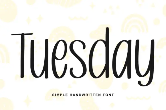
Simple unjoined handwriting with a light bounce
Tuesday is a simple handwritten face in black on white: a monoline, unjoined hand with tall ascenders, circular bowls and a slight bounce along the line, shown over pale yellow doodles of rainbows, stars and squiggles.
Ideas for this font
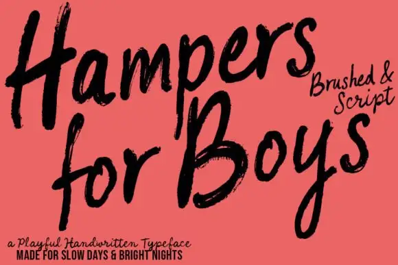
Loose brushed handwriting with slanted bodies and dry swept ends
Hampers for Boys is loose brushed handwriting in which the letters lean forward, the strokes sweep through each letter and the ends lift dry off the page.
Ideas for this font
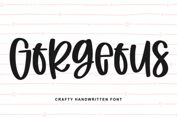
Heavy narrow handwriting with tight counters
Gorgeous is a heavy narrow handwriting that keeps a tall x-height and nearly closed counters, so a single word reads as a dense band with a lively, uneven baseline running under it.
Ideas for this font
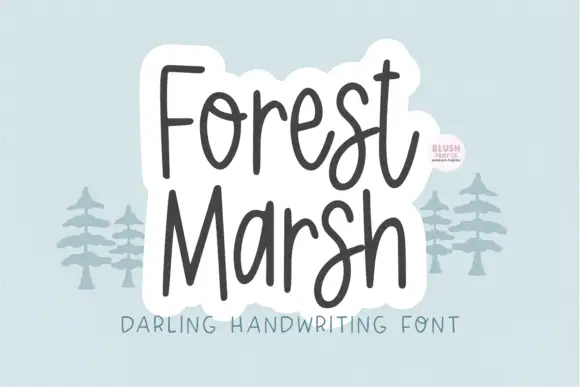
Loose upright handwriting with tall narrow frames and uneven baselines
Forest Marsh is loose upright handwriting in which the frames stay tall and narrow, the baselines drift a little and the strokes keep an even medium weight throughout.
Ideas for this font
Same independent foundry
Allow optional Google Analytics to measure visits and catalogue actions. Your search words and notes are not included. Privacy & storage