Editorial Serif Anchor

Lemon Dreams + Things
Anchors Lemon Dreams's fluid strokes with crisp Roman proportions on wedding suites, headers and packaging.
Inspect Things specimenDisclosure: MakerFileHub may earn a commission from qualifying purchases via paid links on this page. How our links work.
Quirky handwritten display
Lemon Dreams is a quirky handwritten display in navy on cream, surrounded by drawn lemons: a tall irregular hand with a straight-legged a, an open e and a hooked y, set in two lines with a small caps line above and a red banner beneath naming the category.
Paid link
Get this fontProject & layout blueprintsAt-a-glance maker compatibility
Weld or Unite overlapping script joins into one continuous vector path before sending to the blade.
Visual anatomy & craft review
The two words are stacked and the drawing is handwriting at a moderate weight: the strokes vary, the letters lean and bounce, and a few carry drawn details, which keeps the pair friendly without turning it into a script. Because the stroke is moderate, the face reads at label size and at poster size, and the open counters keep the word legible when it is printed small. The drawn lemons around the block belong to the product imagery rather than the letterforms, and the small caps line above and the red banner beneath are set in plain faces so the hand lettering stays the only expressive element. The palette is two inks on cream.
Handwritten, quirky, cheerful, organic
Two-font hierarchy recipes
Tested contrast partners — pairing Lemon Dreams with grounded secondary typography.
Lemon Dreams + Things
Anchors Lemon Dreams's fluid strokes with crisp Roman proportions on wedding suites, headers and packaging.
Inspect Things specimen
Lemon Dreams + Kohilo
Keeps small-scale dates, URLs, nutrition facts and care instructions crisp and legible below script titles.
Inspect Kohilo specimenPractical applications
Concrete hierarchy, scale and production guidance tailored to Lemon Dreams’s stroke geometry.
A quirky hand reads as a small-batch label, and the moderate stroke survives on a chilled bottle where a fine hand would fog and blur.
Hierarchy & layout recipe
Print a 60 mm round label: the flavour at 15 pt, the volume in a 6 pt sans, and a drawn lemon. Keep 4 mm inside the die and print two colours on a white stock.
Pre-production check
Check the 15 pt flavour on a curved bottle, where the outer letters distort; reduce the width. Confirm the 6 pt volume reads in the chiller and that the lemon clears the die.
A hand display reads as a painted board from across a market, and the quirky letterforms keep a small business from looking like a national chain.
Hierarchy & layout recipe
Paint a 900 by 400 mm board: the stand at 120 mm cap height, the prices in a 24 mm sans, and a 5 mm rule. Keep 25 mm margins and paint two colours on a light board.
Pre-production check
Check the board at four metres, where the bounce can make the name look crooked; align the first and last letters. Confirm the 24 mm prices read at two metres and that the rule clears the edge.
A cheerful hand suits a casual invitation, and the open counters keep the greeting readable at card size printed at home.
Hierarchy & layout recipe
A6 card: the greeting at 28 pt, the details in a 9 pt sans at 13 pt leading, and two small lemons. Keep 12 mm margins and print two colours on a white card so the joins stay open.
Pre-production check
Check the 28 pt greeting at home-print resolution, where a fine join can break; keep it above 0.5 mm. Confirm the 9 pt details keep a 4.5:1 contrast and that the lemons clear the trim.
Technical & licence verification
Confirm included OTF/TTF/WOFF formats, full glyph tables and licence coverage on the live store page before batch production.
Closest visual alternatives
Matched across letterform anatomy, stroke behaviour and craft applications.
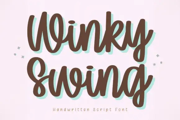
Bold handwriting with a coloured drop shadow
Winky Swing is a bold handwritten script in brown on cream: fat rounded letters with open loops, a tilted baseline and a mint shadow offset behind them, with two small sparkles either side and a tracked caption below.
Ideas for this font
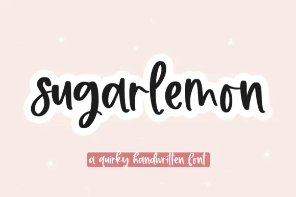
Thick bouncing rounded script
Sugarlemon is a thick bouncing script in black on blush: fat rounded strokes, a strong bounce between letters, tall narrow loops and a soft white sticker outline around the whole word.
Ideas for this font

Heavy calligraphy with large curled terminals
Thick Black combines heavy rounded stems with large looping T, B and k forms, where two stacked words sit with tight middle counters and sweeping outer terminals, and a faint landscape runs behind the lettering as separate artwork.
Ideas for this font
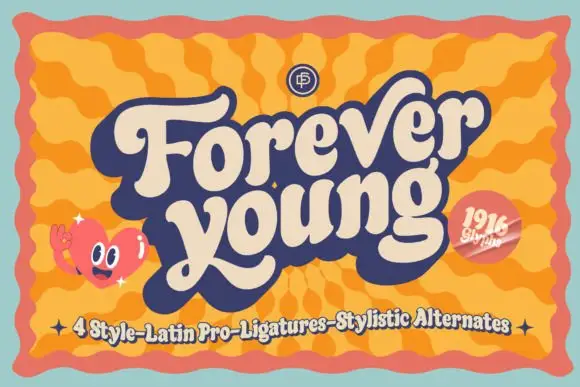
Heavy retro script with broad curled terminals and a tight rhythm
Forever Young is a heavy retro script with broad strokes, curled terminals and a tight rhythm, drawn so two stacked words read as a single filled shape with no gaps between letters.
Ideas for this font
Same independent foundry
Allow optional Google Analytics to measure visits and catalogue actions. Your search words and notes are not included. Privacy & storage