Editorial Serif Anchor

North Hiking + Evoire
Anchors North Hiking's fluid strokes with crisp Roman proportions on wedding suites, headers and packaging.
Inspect Evoire specimenDisclosure: MakerFileHub may earn a commission from qualifying purchases via paid links on this page. How our links work.
Heavy informal lettering with oversized looping N and H initials
North Hiking paints its words with one heavy rounded brush line, then lets the first letters break out into wide loops that travel above and below the rest of the word.
Paid link
Get this fontProject & layout blueprintsAt-a-glance maker compatibility
Weld or Unite overlapping script joins into one continuous vector path before sending to the blade.
Visual anatomy & craft review
NORTH over HiKING is drawn in a dark brown that reads as ink on a photograph of snowy ridges, the N throwing a long loop over the O and the H of Hiking curling away to the left below the line. Strokes keep a constant weight with round terminals, the i and the dots stay circular, and letter spacing is loose enough that the loops never touch. A red underline swash and a small circular badge sit around the words, with a studio credit under them. The hand is informal but confident, so the face works at large sizes where the loops are the whole point and struggles when a long phrase has to fit a narrow space.
Heavy informal lettering with oversized looping N and H initials
Two-font hierarchy recipes
Tested contrast partners — pairing North Hiking with grounded secondary typography.
North Hiking + Evoire
Anchors North Hiking's fluid strokes with crisp Roman proportions on wedding suites, headers and packaging.
Inspect Evoire specimen
North Hiking + Bareum
Keeps small-scale dates, URLs, nutrition facts and care instructions crisp and legible below script titles.
Inspect Bareum specimenPractical applications
Concrete hierarchy, scale and production guidance tailored to North Hiking’s stroke geometry.
The loops feel painted on a board rather than printed, and the heavy stroke holds up outdoors where a thin script would disappear in the weather.
Hierarchy & layout recipe
Print a 700 by 400 mm panel: set the trail name at 66 mm on one row, keep 30 mm of clear ground beneath before the distance line at 18 pt, and keep 34 mm of border so the loops stay clear of the frame.
Pre-production check
Loops reach well outside the letter width; check the layout at final size before the panel is cut.
One heavy line survives a screen print on cotton, and the looping initials give a club shirt a mark that looks drawn by a member rather than bought.
Hierarchy & layout recipe
Print an A3 tee front: set the club name at 72 pt across one row, keep 26 mm of clear ground beneath before the year at 14 pt, and keep 30 mm from the art to the collar seam for the screen frame.
Pre-production check
Fine joins in the loops may fill on a coarse mesh; check a test print before the shirt run.
The rough painted lettering suits a brand that sells trail gear and camp coffee, and the short word keeps the loops readable on a small bag.
Hierarchy & layout recipe
Print a 90 by 150 mm bag label: set the brand at 28 pt on one row, keep 12 mm of clear ground beneath before the roast note at 7 pt, and keep 8 mm to the bag edge so the swash is not clipped.
Pre-production check
The underline swash is a separate element; check the supplied files before planning it into the label.
Technical & licence verification
Confirm included OTF/TTF/WOFF formats, full glyph tables and licence coverage on the live store page before batch production.
Closest visual alternatives
Matched across letterform anatomy, stroke behaviour and craft applications.
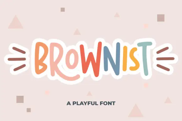
Irregular tall playful capitals in alternating colours with uneven weights
Brownist is playful capital lettering in which each letter is drawn at a different height and weight, with rounded corners and small banners on both sides of the word.
Ideas for this font
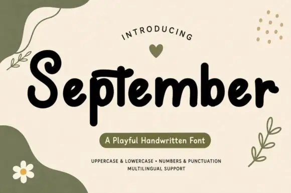
Chunky playful print with organic shapes
September is a chunky playful handwritten print in black on cream, surrounded by soft olive shapes, leaves and a daisy, with a pill caption in the same palette.
Ideas for this font
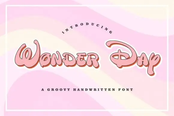
Groovy rounded hand lettering
Wonder Day is a groovy hand-lettered display in pink with a copper shadow and a thick white outline, set on a pastel wave ground: fat rounded letters with a strong forward lean and a roller-coaster bounce.
Ideas for this font
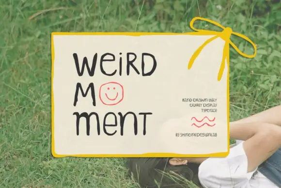
Display
Weird Moment is a hand-drawn display face with tall thin letters, a bouncing baseline and drawn-in jokes: the O is a smiley face, some letters lean, and the whole word looks written on a card with a marker.
Ideas for this font
Same independent foundry
Allow optional Google Analytics to measure visits and catalogue actions. Your search words and notes are not included. Privacy & storage