Editorial Serif Anchor

Gorgeous + Bulgary
Anchors Gorgeous's fluid strokes with crisp Roman proportions on wedding suites, headers and packaging.
Inspect Bulgary specimenDisclosure: MakerFileHub may earn a commission from qualifying purchases via paid links on this page. How our links work.
Heavy narrow handwriting with tight counters
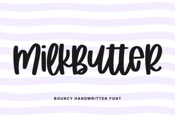
Gorgeous is a heavy narrow handwriting that keeps a tall x-height and nearly closed counters, so a single word reads as a dense band with a lively, uneven baseline running under it.
Paid link
Get this fontProject & layout blueprintsAt-a-glance maker compatibility
Weld or Unite overlapping script joins into one continuous vector path before sending to the blade.
Visual anatomy & craft review
The one word on the card shows the proportions plainly: a large G with an entry stroke that spirals inward before it commits to the bowl, o and e with counters so tight they almost fill with ink at small sizes, and an r whose arm lifts high before dropping into the join. Letters touch instead of overlapping, the baseline rises through the middle of the word and the final s dips and releases a short tail. Weight is heavy and even, the terminals are blunt and round, and the slant stays modest, which is why the band of text sits square on the dashed rule behind it. Those rules, the small circles and the faint floral pattern are the card design; the tracked caption under the word is a separate label face and not part of the alphabet.
Bold · Narrow · Bouncy
Two-font hierarchy recipes
Tested contrast partners — pairing Gorgeous with grounded secondary typography.
Gorgeous + Bulgary
Anchors Gorgeous's fluid strokes with crisp Roman proportions on wedding suites, headers and packaging.
Inspect Bulgary specimen
Gorgeous + Modern Limited
Keeps small-scale dates, URLs, nutrition facts and care instructions crisp and legible below script titles.
Inspect Modern Limited specimenPractical applications
Concrete hierarchy, scale and production guidance tailored to Gorgeous’s stroke geometry.
A heavy narrow word holds its shape on a curved, glossy cup where a light script would break up in the fold, and the density makes a two-word name read from across a counter.
Hierarchy & layout recipe
Set the name at 24 pt to fill roughly half the cup's height, keep the milk and size marks in a small sans beneath it, and leave 12 mm from the last letter to the lid seam so the final tail never wraps out of view.
Pre-production check
Wrap a blank cup with the printed sheet first: the tight e and o counters are the first thing to disappear once the artwork follows the curve.
A dense handwritten word carries the weight of a cover headline on a thin, inexpensive stock, and its uneven baseline keeps the cover from looking like a corporate report.
Hierarchy & layout recipe
Place the word at 90 pt across the upper third of an A5 cover, set the issue number in a tracked sans at 9 pt to one side, and keep the lower half clear for the illustration so the descender of the final s has room.
Pre-production check
Print a laser proof: at 90 pt the joins between letters can fill in and turn a lively word into a solid smear on uncoated paper.
The narrow proportions fit a long name plus an age into a shallow band around a box lid, and the thick stroke stays readable when the band is printed small and wrapped.
Hierarchy & layout recipe
Set the name at 16 pt and the age at 26 pt on a 45 mm band, keep the two elements 8 mm apart, and repeat the word once across a 300 mm wrap so it never has to stretch or letterspace.
Pre-production check
Check the join between the two words where the band folds: a heavy script will double over itself at the corner if the repeat is not planned at the fold line.
Technical & licence verification
Confirm included OTF/TTF/WOFF formats, full glyph tables and licence coverage on the live store page before batch production.
Closest visual alternatives
Matched across letterform anatomy, stroke behaviour and craft applications.
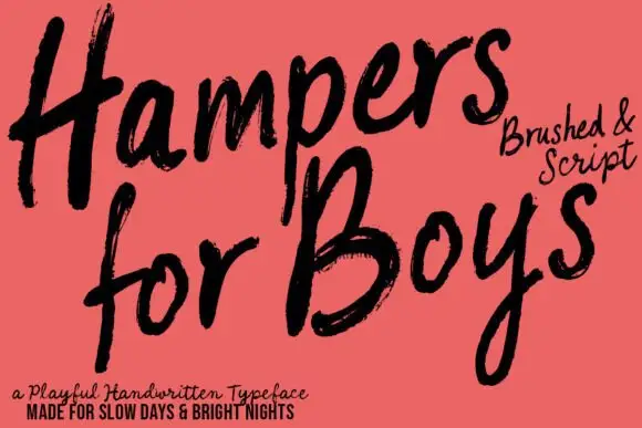
Loose brushed handwriting with slanted bodies and dry swept ends
Hampers for Boys is loose brushed handwriting in which the letters lean forward, the strokes sweep through each letter and the ends lift dry off the page.
Ideas for this font
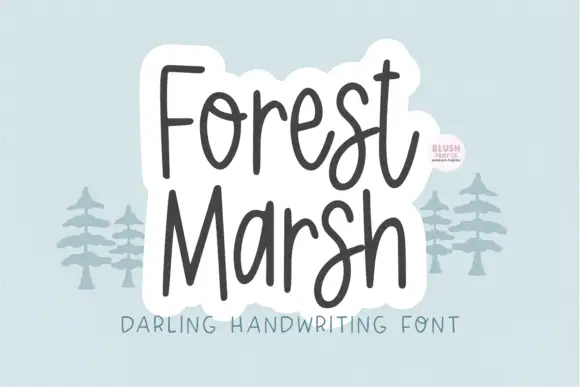
Loose upright handwriting with tall narrow frames and uneven baselines
Forest Marsh is loose upright handwriting in which the frames stay tall and narrow, the baselines drift a little and the strokes keep an even medium weight throughout.
Ideas for this font
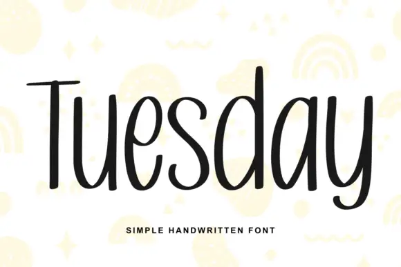
Simple unjoined handwriting with a light bounce
Tuesday is a simple handwritten face in black on white: a monoline, unjoined hand with tall ascenders, circular bowls and a slight bounce along the line, shown over pale yellow doodles of rainbows, stars and squiggles.
Ideas for this font
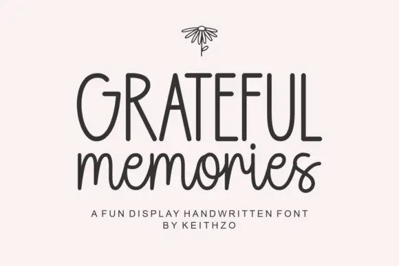
Tall handwritten capitals over a rounded script with a bouncing baseline
Grateful Memories is a handwritten display alphabet in which tall rounded capitals sit above a bouncy connected script, with even weights and fully rounded ends throughout.
Ideas for this font
Same independent foundry
Allow optional Google Analytics to measure visits and catalogue actions. Your search words and notes are not included. Privacy & storage