Editorial Serif Anchor

Haunted Mansion + Kernova
Anchors Haunted Mansion's fluid strokes with crisp Roman proportions on wedding suites, headers and packaging.
Inspect Kernova specimenDisclosure: MakerFileHub may earn a commission from qualifying purchases via paid links on this page. How our links work.
Tall rounded Halloween lettering
Haunted Mansion shows tall softly irregular letters built as narrow white strokes inside a heavy dark surrounding shape, with rounded humps, looped descenders and a bat and small sparkles sitting outside the lettering.
Paid link
Get this fontProject & layout blueprintsAt-a-glance maker compatibility
Weld or Unite overlapping script joins into one continuous vector path before sending to the blade.
Visual anatomy & craft review
The inner stroke stays thin and pale, the outer shape carries the weight, the humps round off unevenly and the descenders curl into loops. The pale-inside-dark construction is the character: the letter reads as a cut-out silhouette rather than a drawn line, which is why the sample sets two rows with a bat beside them. Because the inner stroke is narrow, keep 30 pt before it closes, and treat the bat and sparkles as decoration rather than part of the alphabet.
Rounded · Outlined · Halloween
Two-font hierarchy recipes
Tested contrast partners — pairing Haunted Mansion with grounded secondary typography.
Haunted Mansion + Kernova
Anchors Haunted Mansion's fluid strokes with crisp Roman proportions on wedding suites, headers and packaging.
Inspect Kernova specimen
Haunted Mansion + Modern Limited
Keeps small-scale dates, URLs, nutrition facts and care instructions crisp and legible below script titles.
Inspect Modern Limited specimenPractical applications
Concrete hierarchy, scale and production guidance tailored to Haunted Mansion’s stroke geometry.
The outlined letters read at a doorway, and the dark surround holds a two-word title at 56 pt on a printed A3 sheet. The silhouette also keeps two rows readable at a doorway.
Hierarchy & layout recipe
Print an A3 poster: set the title at 56 pt on two rows, keep the pale inner stroke at 2 mm minimum, and keep 24 mm of margin so the loops stay inside the trim. Keep the two rows clearly apart.
Pre-production check
A pale inner stroke under 1.5 mm closes at poster size; check the film and keep the title at 46 pt or above. Ask for the film at 100 percent.
The rounded letters suit a small tag, and the dark surround stays solid at 20 pt on a 45 mm card. The rounded humps also keep a small tag friendly. The dark surround also carries the shape at small size.
Hierarchy & layout recipe
Print a 45 by 75 mm tag: set the word at 20 pt, punch a 4 mm hole 9 mm from the top edge, and keep 6 mm between that hole and the tallest hump. Keep the tag to one word. Set the string after the hole is marked.
Pre-production check
A hole punched beside a heavy surround leaves a thin bridge; check the die and move the hole 4 mm lower. Print one tag before the batch.
The silhouette letters read through glass, and the tall shapes hold a single word at 80 mm on a clear decal. The tall shapes also read from a path. The pale stroke also keeps the silhouette legible on glass.
Hierarchy & layout recipe
Print an 80 mm tall decal: keep the dark surround at 3 mm minimum, keep the inner stroke at 1 mm, and place the decal so the word sits at eye level. Keep the decal flat on the glass.
Pre-production check
A thin inner stroke lifts on glass at the corners; check the weeded sample and thicken the stroke rather than the surround.
Technical & licence verification
Confirm included OTF/TTF/WOFF formats, full glyph tables and licence coverage on the live store page before batch production.
Closest visual alternatives
Matched across letterform anatomy, stroke behaviour and craft applications.
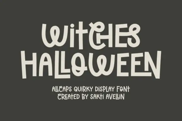
Quirky hand-drawn mixed-width display
Witches Halloween is a quirky hand-drawn display in cream on charcoal: letters of wildly different widths, some built from stacked strokes, a flipped E, a heart-like O, and a bounce that moves each character on the line, so the pair reads as hand lettering by a confident amateur rather than as a drawn alphabet.
Ideas for this font
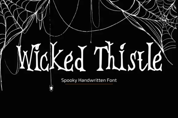
Thin uneven spooky hand
Wicked Thistle Font is a thin uneven handwritten face in bone on black: tall letters with forked and curled terminals, uneven stems and a spidery rhythm, set in one line above a small plain caption, with drawn cobwebs and a hanging spider framing the corners.
Ideas for this font
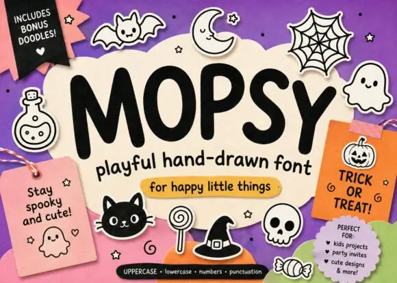
Heavy soft Halloween print
Mopsy is a heavy soft hand-drawn print in black on cream: fat rounded letters, small counters and a playful bounce, surrounded by drawn bats, ghosts, spiders and pumpkins.
Ideas for this font
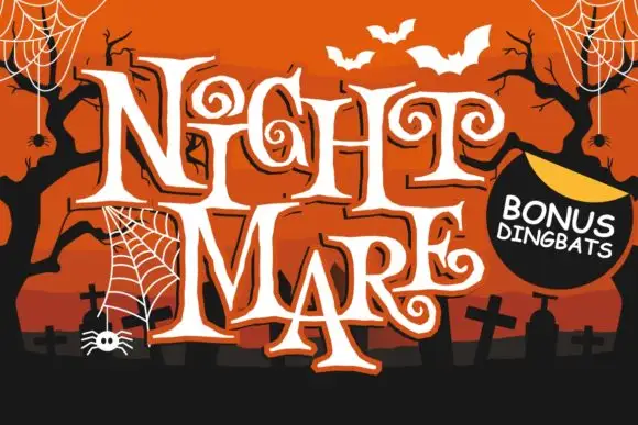
Angular spiral-terminal horror serif
Night Mare is an angular decorative serif in which the letters stay uneven, the feet come to points and the terminals coil inward in tight spirals, so a stacked title reads as gothic horror lettering rather than a clean historical blackletter.
Ideas for this font
Same independent foundry
Allow optional Google Analytics to measure visits and catalogue actions. Your search words and notes are not included. Privacy & storage