Editorial Serif Anchor

Wonder Day + Grandeur – Elegant Classic Serif
Anchors Wonder Day's fluid strokes with crisp Roman proportions on wedding suites, headers and packaging.
Inspect Grandeur – Elegant Classic Serif specimenDisclosure: MakerFileHub may earn a commission from qualifying purchases via paid links on this page. How our links work.
Groovy rounded hand lettering
Wonder Day is a groovy hand-lettered display in pink with a copper shadow and a thick white outline, set on a pastel wave ground: fat rounded letters with a strong forward lean and a roller-coaster bounce.
Paid link
Get this fontProject & layout blueprintsAt-a-glance maker compatibility
Weld or Unite overlapping script joins into one continuous vector path before sending to the blade.
Visual anatomy & craft review
Wonder sits above Day in a fat rounded hand, and each word is built from a thick monoline that swells at the curves: the W opens into a wide loop, the o and the d sit at different heights, the D of Day curls back on itself and the y finishes with a tail that swings under the word. The whole line bounces between three heights, which is what gives it the seventies poster feel, and each word is contoured in white with a copper shadow offset to the right, so the lettering reads as a printed sticker. The ground is a soft pastel wave in pink and cream inside a white frame. The face is a retro display for cards, posters and apparel: the bounce and the shadow are the design, it needs size, and it should be kept to two or three words.
A groovy hand with drawn shadow
Two-font hierarchy recipes
Tested contrast partners — pairing Wonder Day with grounded secondary typography.
Wonder Day + Grandeur – Elegant Classic Serif
Anchors Wonder Day's fluid strokes with crisp Roman proportions on wedding suites, headers and packaging.
Inspect Grandeur – Elegant Classic Serif specimen
Wonder Day + Corven
Keeps small-scale dates, URLs, nutrition facts and care instructions crisp and legible below script titles.
Inspect Corven specimenPractical applications
Concrete hierarchy, scale and production guidance tailored to Wonder Day’s stroke geometry.
The groovy bounce and the copper shadow say the decade without a photograph, and one card carries the whole theme of the party.
Hierarchy & layout recipe
Print a 120 by 120 mm square card: set the greeting at 36 pt across two rows, keep 15 mm of clear ground beneath before the details at 8.5 pt, and hold 13 mm of margin on all sides.
Pre-production check
The offset shadow can clip on a square card; print one at the finished size and check the right edge before the batch.
A groovy display sets a period for a feature on design history, and the heavy outline holds against a tinted page where a thin script would not.
Hierarchy & layout recipe
Print a 230 by 300 mm opener: set the heading at 64 pt across two rows, keep 20 mm of clear ground beneath before the standfirst at 10.5 pt, and hold 18 mm of margin on both sides.
Pre-production check
Two bouncing rows can look like decoration rather than a title; print one opener and check the words read as one heading before the issue.
A groovy banner photographs well behind a cake table, and the pastel palette prints cleanly on a home machine without a special ink.
Hierarchy & layout recipe
Print a 900 by 400 mm banner: set the greeting at 150 pt across two rows, keep 30 mm of clear ground beneath before the name at 30 pt, and hold 26 mm of border on all four sides.
Pre-production check
Pastel inks on a wide banner look washed out; print one at the final size and check the contrast before the order.
Technical & licence verification
Confirm included OTF/TTF/WOFF formats, full glyph tables and licence coverage on the live store page before batch production.
Closest visual alternatives
Matched across letterform anatomy, stroke behaviour and craft applications.
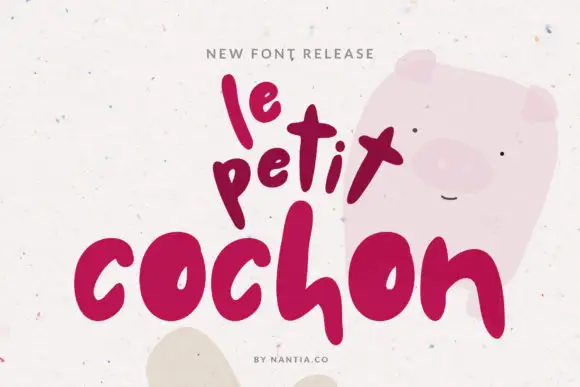
Very heavy rounded marker letters
Le Petit Cochon is a very heavy rounded hand in berry pink on speckled cream: fat rounded strokes, letters of deliberately different sizes and a baseline that bounces so the phrase looks stacked by hand.
Ideas for this font
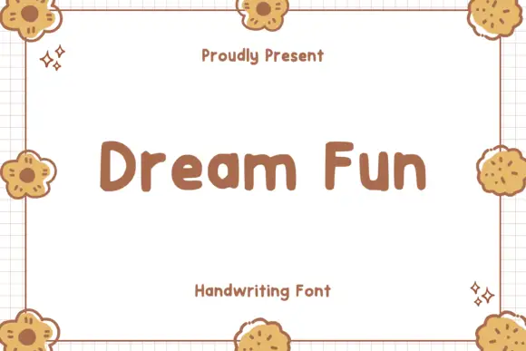
Soft chunky separate letters
Dream Fun sets soft chunky letters as separate rounded shapes, with even weight, generous counters and a playful hand-drawn edge that never turns into a script.
Ideas for this font
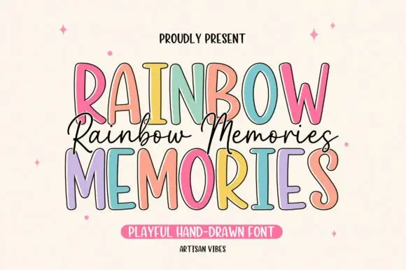
Tall irregular display capitals
Rainbow Memories is a tall irregular display capital hand in mixed pastels with a dark outline: letters of different widths and heights, a light monoline stroke and a small connected script that runs between the two capital lines.
Ideas for this font
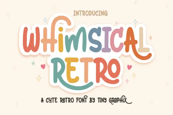
Rounded upright letters with long curled terminals
Whimsical Retro mixes soft upright letterforms with unusually long curled terminals, set over a pastel layered fill inside a thin outline on a warm paper ground.
Ideas for this font
Same independent foundry
Allow optional Google Analytics to measure visits and catalogue actions. Your search words and notes are not included. Privacy & storage