 #1 · Best Overall
Disclosure: MakerFileHub may earn a commission from qualifying purchases via paid links on this page. How our links work.
Fine-pen planner print & Apple Pencil lettering
19 Best Digital Planner & GoodNotes Fonts
A digital planner is read at arm's length on a 10 inch screen, so body text sits around 9 to 11 pt and any flourish becomes a smudge. Planner Highland and Tippy Tappy Type keep the slab-printed look crisp at that size, Simplify Notation and Digital Planner supply the single-stroke prints, and My Daily Journal and Simple Planner handle the neat bullet-journal register. Life Planner Duo covers headings and body in one download.
Quick verdict
Planner Highland is the most readable planner print, Simplify Notation the cleanest for dense weekly pages, and Life Planner Duo covers a whole planner from headings to notes. My Daily Journal suits a softer bullet-journal look.
Quick answer
Top 3 digital planner & GoodNotes picks right now.
Short on time? Start with our three highest-rated digital planner & GoodNotes standouts before scrolling the full breakdown.
#1 · Best Overall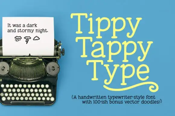 #2 · Runner-Up Pick
Tippy Tappy Type
Light irregular typewriter-style slabs with rounded feet and a curled flourish
Get fontPaid link
Read review ↓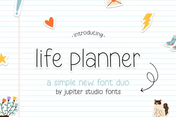 #3 · Editor's Choice
Life Planner Duo
Planner duo pairing a thin rounded sans with a bolder cut
Get fontPaid link
Read review ↓How we tested & selected these 19 fonts
We kept 19 of 348 candidates after rendering each at 10 pt on a simulated 264 ppi iPad screen. Weighted counter legibility at small sizes, stroke consistency across a full page of text, and whether the font installs cleanly through a font-manager app on iPadOS.
Side-by-side summary
Top 5 digital planner & GoodNotes picks at a glance.
Compare specimens, OpenType/PUA traits and primary project roles side by side.
| Rank & Font | Style & File Specs | Best Project Fit | Store Listing |
|---|---|---|---|
| Slab SerifWarm | Digital planner tab header, KDP journal cover or classroom binder spine | Get fontPaid link | |
| Slab SerifPUA encoded · Alternates & swashes · File formats | A playful writing journal cover | Get fontPaid link | |
| DisplayMinimal | GoodNotes digital planner template, habit tracker or minimalist label | Get fontPaid link | |
| HandwrittenTidy | IPad planner weekday tabs, sticker pack or classroom slide deck | Get fontPaid link | |
| DisplayNeat | Pen-drawn label set or greeting card body text | Get fontPaid link |
Serifs & Slab Serifs
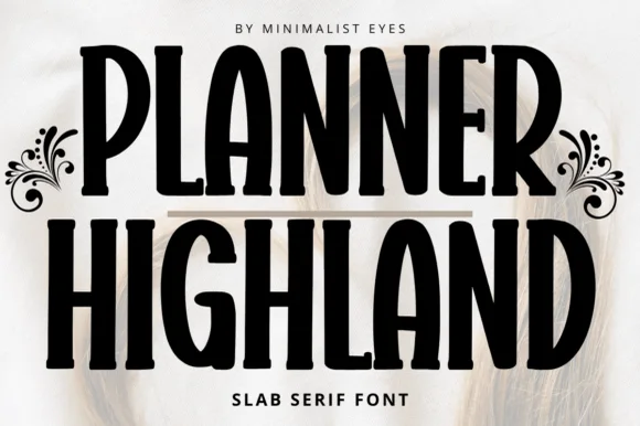
2 fonts#1 · Best OverallPlanner Highland
Planner Highland blends tall, space-saving condensed proportions with warm, softly rounded slab serifs, built for KDP covers, journals and labels where the high vertical efficiency lets longer section titles fit neatly into narrow planner columns and pantry labels.
The stems stay tall and close, the serifs round off, the proportions compress and the weight stays friendly. That vertical efficiency is the character: a long section title fits a narrow column without dropping below a readable size, which is why the sample targets planners and spines. KDP covers need bleed and a safe margin, so build the layout at trim size, keep 14 pt as the floor on a spine and check how the rounded feet behave under 12 pt.
Recommended project & layout
Digital planner tab header, KDP journal cover or classroom binder spine — Set all-caps or Title Case headers above clean minimalist sans body copy.
Before you cut or print
Smooth solid contours cut cleanly on vinyl binder labels and stencils.
Best paired with
Get fontPaid link
#2 · Runner-Up PickTippy Tappy Type
Tippy Tappy Type shows yellow mixed-case lettering on blue in three stacked rows, where broad round bowls and uneven little feet give the line a handwritten rhythm and the final row carries a long curled underline-like flourish beneath it.
The strokes stay slab-ended, the bowls stay round, the feet wobble from letter to letter and the baseline drifts slightly. That wobble is the character: the sample reads as typing rather than typesetting, which is why the three rows stack tightly. The typewriter photograph, the weather doodles and the bonus-vector caption belong to the cover, and neither monospacing nor a doodle count is shown. Keep 30 pt so the feet stay distinct, check that your file has the flourish and set the rows tight only on a plain ground.
Recommended project & layout
A playful writing journal cover — Place Tiny Tales near the top of a pale-blue cover, with a plain author line at the bottom and no flourish until its source is checked.
Before you cut or print
Verify the lowercase y and any alternate or underline mechanism in the actual files.
Best paired with
Get fontPaid link
Clean Sans & Handwritten Print
13 fonts#3 · Editor's ChoiceLife Planner Duo
Life Planner is a two-cut family in which a thin rounded sans carries the headline and a bolder cut sets the supporting line, so a simple layout gets hierarchy from one family.
The l rises on a thin stem, the i carries a floating dot, the f turns a light arm, the e closes a round eye, the p drops a thin stem and the a stays a single-storey oval, all at a thin monoline weight with fully rounded ends and wide open counters; the bold cut thickens every stroke without changing the skeleton. The pairing is the character: the two cuts share proportions, which is why the sample sets a place-holder title in the thin cut with a subtitle in the bold beneath. Both hold from 20 pt and print cleanly on plain paper. The lined notebook ground, the small stickers and the arrow doodle are presentation; the black sans lines are the family.
Recommended project & layout
GoodNotes digital planner template, habit tracker or minimalist label — Use lowercase for approachable daily headers and tracked caps for month tabs.
Before you cut or print
Best for digital planners, KDP printables and pen-plotted labels.
Best paired with
Get fontPaid link
 #4 · Top Maker Utility
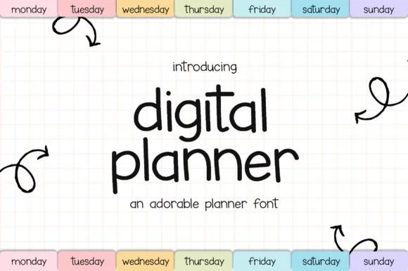
Digital Planner
Digital Planner mimics neat felt-tip handwriting, keeping a medium upright weight that stays crisp on tablet planner tabs, sticker sheets, flashcards and teacher slides rather than turning wiry at small size.
The strokes hold one medium weight, the letters stand upright without much slant, the bowls stay round and the ascenders remain modest. That even marker weight is the character: the writing looks like a careful hand on a page but survives a screen, which is why the sample lists small-format uses. Those uses come from the source rather than a test, so proof the actual characters at 12 pt and check the punctuation you need before trusting it with a full planner entry.
Recommended project & layout
IPad planner weekday tabs, sticker pack or classroom slide deck — Pair lowercase tab labels with soft pastel pill backgrounds.
Before you cut or print
Clean disconnected print letters cut neatly on vinyl supply labels too.
Best paired with
Get fontPaid link
 #5 · Standout Silhouette
Simplify Notation
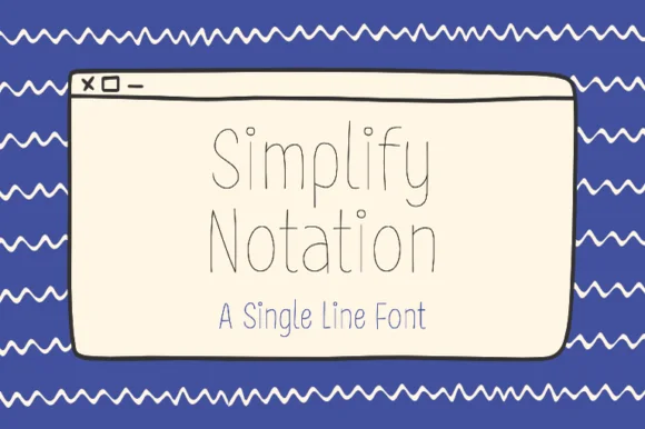
Simplify Notation is a single-line sans in which every letter is drawn as one even hairline with open joins, so a word reads as a wireframe sketch rather than as printed type.
The S keeps a shallow spine, the i carries a floating dot, the m turns two even shoulders, the p drops a hairline stem, the l rises as a plain line and the y splays two hairlines, all at one unchanging weight with joins left slightly open. The single line is the character: there is no thick stroke anywhere, which is why the sample sets a two-word title inside a drawn window frame with no other decoration. Because the line is very fine, the face needs 30 pt upward and a smooth ground, and it disappears at caption sizes. The blue ground, the drawn browser window, the wavy borders and the caption beneath are presentation; the hairline words are the face.
Recommended project & layout
Pen-drawn label set or greeting card body text — Pair beneath a flourished calligraphy headline to handle dates, addresses and body lines.
Before you cut or print
Use Draw/Pen toolpath rather than Cut.
Best paired with
Get fontPaid link
 #6
Sweetbell
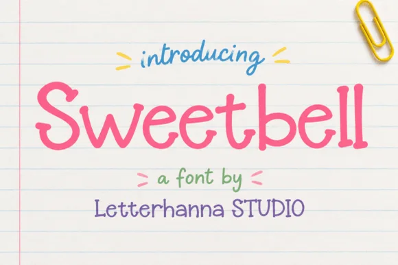
Sweetbell is a neat upright print in which the letters stand apart, the strokes stay even and the counters stay generous, so a word reads as careful handwriting rather than as a printed face.
The capital S reverses through two even curves and the w follows with three shallow valleys, then the letters settle into a regular rhythm: the e loops back through a wide counter, the double l keeps two plain stems and the b closes a round bowl against a thick stem. Nothing is connected, nothing is slanted and the weight is a consistent medium with rounded terminals, which is what makes the face read as something written with a good pen at a sensible pace. The x-height is tall, so at 12 pt it behaves like a rounded sans and stays legible on a price card. The ruled paper ground, the paper clip, the small arrows and the three caption lines are presentation; the lettering is the word.
Recommended project & layout
Classroom worksheet header, kids' snack packaging or sticker sheet — Use in Mixed Case for friendly headers, labels and short body callouts.
Before you cut or print
Disconnected clean letters cut and weed effortlessly on vinyl at small sizes.
Best paired with
Get fontPaid link
 #7
Birthday Planner
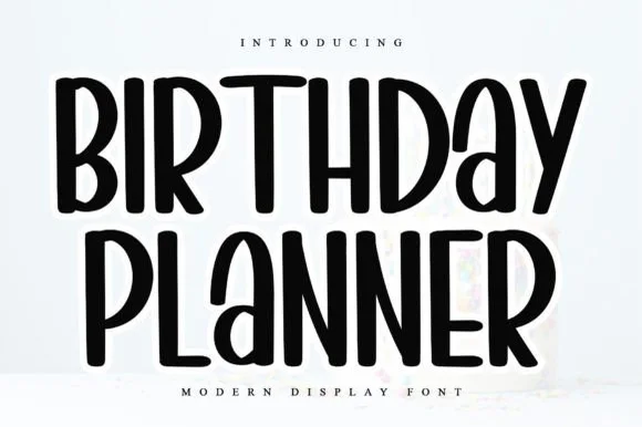
Birthday Planner is a tidy, tall hand-lettered marker display font with softly rounded stem tips and friendly vertical rhythm.
Birthday Planner is a tall rounded marker all-caps planner face: narrow upright caps with fully rounded ends, an even medium stroke, wide even spacing and a height that fits a single line inside a planner box. The rounded ends are the only warmth and the caps keep a label shouty but readable. It needs roughly 20 mm for the rounded end and the counter to read, and it is best in one bright ink on white paper, or a single dark colour on pastel card.
Recommended project & layout
Kids' party itinerary sign, milestone chalkboard & invite — Stack centered uppercase headers at 36–54 pt and use smaller 18 pt lines for time-slot bullet items.
Before you cut or print
Smooth, even marker strokes with zero thin serifs weed quickly and cleanly on Cricut vinyl, HTV, and acrylic signs down to 0.6 in.
Best paired with
Get fontPaid link
 #8
Lilac and Linen
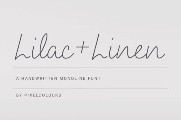
Lilac and Linen is an ultra-clean, slender monoline handwritten font blending tall open capitals with airy semi-connected pen lowercase.
Lilac and Linen is an airy fine-pen architectural monoline handwritten face: a very light even stroke, wide open counters, tall ascenders and letters drawn as if by a fine technical pen with small lift gaps at the joins. The thin line is the whole character and it is the first thing to break on textured stock or at small sizes. It needs roughly 22 mm for the fine stroke and the lift gap to read, and it is best in one dark ink on smooth or coated paper, or a single ink on tracing-weight stock where the line stays continuous.
Recommended project & layout
Linen home-fragrance label, ceramic stamp & apothecary box — Center 'Brand + Scent' in charcoal ink on textured white cotton labels above 1 px hairline divider rules.
Before you cut or print
Fine hairline stroke weight is built for flat printing, Foil Quill, and Cricut Pen drawing—avoid tiny blade-cut vinyl.
Best paired with
Get fontPaid link
 #9
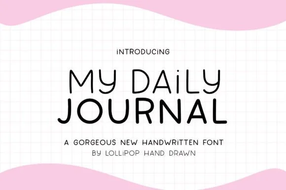
My Daily Journal
My Daily Journal is a crisp, even-weight monoline print sans pairing wide geometric 'O/D/U' bowls with friendly rounded pen tips.
My Daily Journal is a neat geometric monoline bullet-journal print sans: an even fine stroke, perfectly round bowls, generous even spacing and small lift gaps at the joins, drawn to sit inside a ruled grid. The monoline keeps the face crisp at small sizes, and the round bowls are the only warmth. It needs roughly 20 mm for the round bowl and the lift gap to read, and it is best in one fine ink on smooth or dot-grid paper, or a single dark colour where the thin line still carries.
Recommended project & layout
Habit-tracker printable, bullet-journal stencil & spice jar — Stack 2 centered words at 52–100 pt with +6 tracking, mixing in lowercase 'i' ('DAiLY') for a cute dotted accent.
Before you cut or print
Draws like a dream with 0.4 Cricut fine-point pens and cuts cleanly on Oracal 651 & Smart Vinyl down to 0.65 inches!
Best paired with
Get fontPaid link
 #10
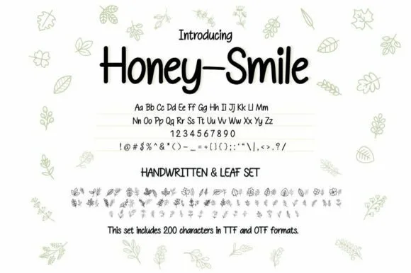
Honey–smile
Honey–smile ('Honey-Smile') is a clean tall handwritten print sans bundled with matching botanical leaf illustrations across 200 characters (TTF & OTF)!
Honey-smile is a neat tall handwritten print sans paired with a botanical leaf dingbat bundle: an even hand-printed stroke, slightly narrow letters, small lift gaps and blunt pen ends, plus a set of drawn leaves and stems at the same line weight. The print stays readable at small sizes where a script would not, and the dingbats let a page be decorated without a second font. The print needs roughly 20 mm and the leaves 24 mm for their detail to read.
Recommended project & layout
Raw-honey jar label, herbal salve tin & farmers-market tag — Set product title in Honey-Smile print (56 pt) flanked or bordered by typed botanical leaf glyphs.
Before you cut or print
Main print letters cut and weed in seconds on Cricut Oracal 651 down to 0.6 in—and leaf dingbats draw beautifully with Cricut Pens!
Best paired with
Get fontPaid link
 #11
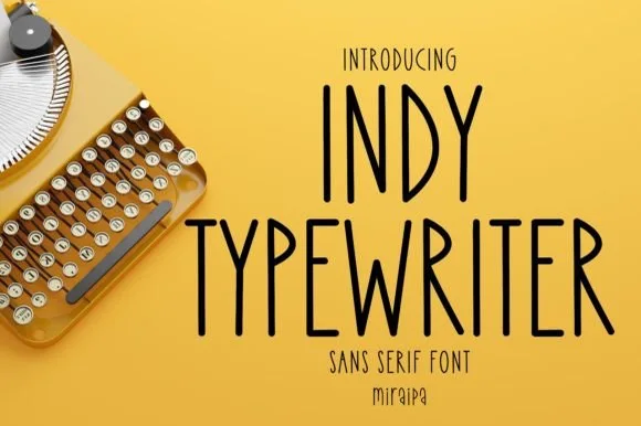
Indy Typewriter
Indy Typewriter is actually a tall, friendly monoline handwritten sans serif—zero serifs or mechanical slabs despite the 'Typewriter' name!
Indy Typewriter is a tall condensed monoline handwritten sans with rounded stroke ends, airy spacing and no serifs at all despite the name, so a heading reads as neat hand printing rather than typing. The even monoline keeps it legible at 9 pt in a narrow column, and the condensed stance fits a long label in a small space. It needs roughly 14 pt for the rounded ends to read, and it is best in ink black on cream or in one pale ink on dark card.
Recommended project & layout
Pantry canister decal, planner tab & minimalist mug — Stack 1 or 2 uppercase words at 42–84 pt with +6 tracking in matte black vinyl on clear glass.
Before you cut or print
Uniform monoline rounded strokes cut and weed in seconds on Cricut Oracal 651, HTV, and Joy Smart Vinyl—and draw great with pens!
Best paired with
Get fontPaid link
 #12
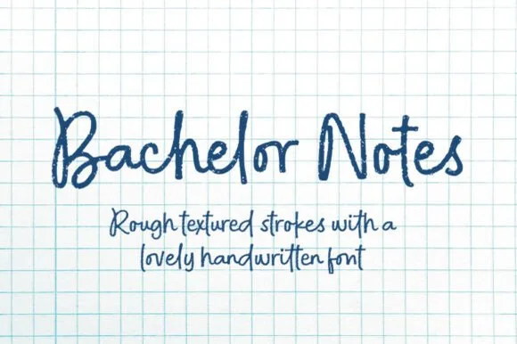
Bachelor Notes
Bachelor Notes is an organic, lightly-textured felt-pen handwriting font capturing real ballpoint/marker lecture notes on quad graph paper!
Bachelor Notes is a felt-pen handwriting face with real fibre texture, uneven pressure and a lively baseline, drawn to look like notes taken quickly on quadrille paper. The letters are mixed case, tall and slightly slanted, with the pen's lift points visible, and the texture is baked in so a page reads as photographed rather than typeset. It needs roughly 9 mm to look like legible handwriting and holds up to 40 mm before the fibre starts to look like dirt. It is a prop, journal and heading face, and it should not be set as long body copy.
Recommended project & layout
Study-gram thumbnail, lab-notebook cover & zine — Set titles at 64–125 pt above 2 rows of 32 pt handwritten body notes in navy or dark charcoal ink.
Before you cut or print
Organic rough edge micro-texture is designed for printables, digital planners, DTF shirts, and sublimation (not small vinyl weeding!).
Best paired with
Get fontPaid link
 #13
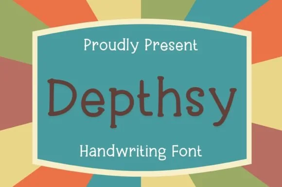
Depthsy
Depthsy is actually a clean, friendly monoline handwritten print sans (zero typewriter serifs despite seller copy!) built for everyday legibility.
Depthsy is a neat rounded monoline print alphabet in mixed case, upright and disconnected, with open counters and a warm, even weight that reads as careful handwriting rather than a typewriter. Because the stroke never varies, it prints cleanly from a school copier, cuts in vinyl and holds at 8 mm on a small label, while the open counters keep a long word legible at 40 mm on a badge. It is a functional hand for journals, labels and everyday signage, not a display face.
Recommended project & layout
Elementary flashcard, reading worksheet & cubby name tag — Set clean mixed-case vocabulary words or subheaders at 28–72 pt on high-contrast pastel cards.
Before you cut or print
Uniform, sturdy monoline strokes cut and weed in seconds on Cricut vinyl/HTV down to 0.55 in—and draw smoothly with Cricut Pens!
Best paired with
Get fontPaid link
 #14
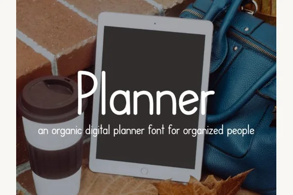
Planner
Planner is a tidy, upright monoline print font engineered specifically to look like neat Apple-Pencil handwriting inside GoodNotes & Notability planners!
Planner is a monoline print alphabet tuned to look like tidy Apple-Pencil handwriting: tall x-height, upright stems, evenly spaced letters and a light single weight, so a full page reads as organised rather than decorative. Because there is no contrast, the shapes stay crisp at screen resolution and print at 8 pt without clogging, and because the letters are unjoined, a template can be edited, re-flowed or translated without breaking connections. It is a functional face for planners, forms and digital templates rather than a display choice, and it wants a short measure and generous leading.
Recommended project & layout
GoodNotes / iPad digital planner, study notes & habit tracker — Use 36–60 pt for monthly tab headers and 14–18 pt for daily to-do checklists.
Before you cut or print
Draws single-line-style strokes cleanly with Cricut Pens on paper planners, and cuts vinyl labels at 0.85 in+!
Best paired with
Get fontPaid link
 #15
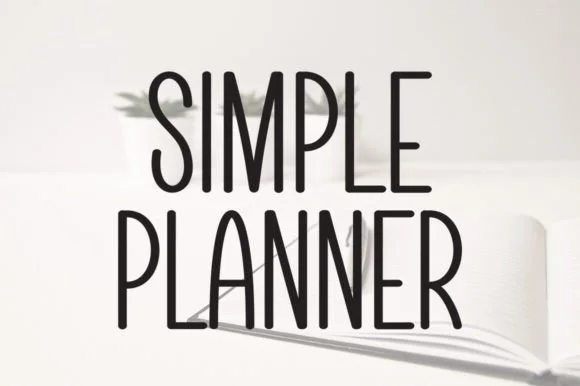
Simple Planner
Simple Planner is a tall, slender minimalist handwritten sans packing long headings neatly into narrow planner columns and spine labels.
Simple Planner is a tall slender monoline handwritten sans with high-waisted A, P and R bowls, rounded stroke ends and generous spacing, so a heading reads as careful printing in a notebook rather than as a display face. The narrow stance packs a long heading into a planner column at 9 pt, and the even mono line keeps it legible after a photocopy. It needs roughly 12 pt for the high waist to read, and it is best in ink black on cream or in one pale ink on dark card.
Recommended project & layout
Narrow binder-spine decal, spice jar & bullet-journal tab — Stack 2 centered uppercase words at 64–125 pt with +4 tracking in matte black on white or clear labels.
Before you cut or print
Draws like a dream with 0.4 fine-point Cricut Pens and cuts cleanly on Oracal 651 & Smart Vinyl at 0.75 in+!
Best paired with
Get fontPaid link
Matched Font Duos & Packs
4 fonts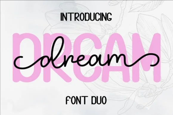 #16
Dream Duo
Dream Duo combines a plump, soft-cornered uppercase sans-serif with a fluid monoline script that threads cleanly across wide titles.
Dream Duo pairs a chunky pastel rounded sans with a smooth monoline cursive: the sans is a fat even-width block with fully rounded corners and tight spacing for headlines, while the cursive is a soft even stroke with open loops and a gentle slant. The pair is built for a soft palette, so it loses its character when printed in a single harsh black. The monoline hairline is the finest element and it breaks first. The sans needs roughly 26 mm and the cursive 28 mm for their detail to read.
Recommended project & layout
Nursery wall name sign & sweet-sixteen acrylic backdrop — Scale the background sans to 3.5 inches tall in soft pastel and center the dark monoline script across the middle 60% height.
Before you cut or print
Weld all cursive joins before cutting vinyl, and use Cricut's Slice or a 0.07 in offset knockout if avoiding two-layer vinyl overlap.
Best paired with
Get fontPaid link
 #17
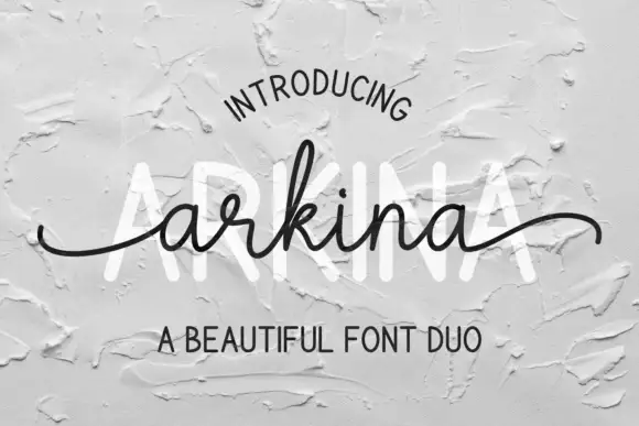
Arkina Duo
Arkina Duo layers a very low looping connected script over tall narrow capitals that read as engraved lettering pressed into plaster, with entry strokes starting well left of the first letter.
The specimen is embossed into a grey wall, so the shapes are read through shadow rather than colour: the script sits at roughly half the height of the capitals, with a tall k ascender, an oval tittle and entry strokes that begin well left of the first letter. The capital line is narrow and even, spaced widely enough that each letter stands alone, which is what produces the architectural signage feel. The script's exit stroke finishes in a slow upward curve instead of a sharp flick, so it pairs cleanly with a rule or a border. The plaster texture belongs to the photograph; the typeface itself is smooth and carries no grit.
Recommended project & layout
A maker stationery heading — Stack sans above script instead of overlapping; place contact text in a plain footer.
Before you cut or print
Confirm both members and actual tail access.
Best paired with
Get fontPaid link
 #18
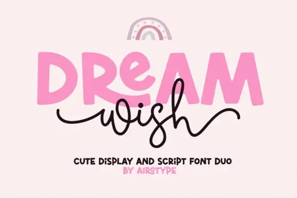
Dream Wish
Dream Wish contrasts chunky uneven capitals in a flat pink with a fine black looping script line beneath, where the script w begins in a long entry tail and the h finishes in a high sweeping exit that lifts above the cap height of the lower word.
The caps stay blocky and slightly uneven, the script stays thin and continuous, the entry and exit tails run long and the two rows overlap lightly. That overlap is the character: the script sits close enough to touch the caps, which is why the sample keeps both rows centred with nothing else competing. A rainbow arc above is cover artwork. Keep 46 pt for the caps and 20 pt for the script, leave 16 mm of clear ground between the rows and check the exit tail against your right margin.
Recommended project & layout
A birthday wish-card heading — Place a heavy first word over a short script line, keeping the personal note inside the card.
Before you cut or print
Confirm members and actual tail joins.
Best paired with
Get fontPaid link
 #19
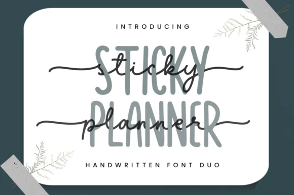
Sticky Planner
Sticky Planner pairs a tall narrow organiser sans with a horizontal-tailed script and encodes the extra characters, so a planner cover can stack two matched weights into one header without hunting for a second face.
The sans cut stays narrow and upright with even stems, the script runs a light body with a tail that extends horizontally and carries a small heart at the end, and the two share a similar x-height when stacked. The matched pair is the character: one line organises and the other signs off, which is why the sample layers them on stationery. Because the script tail travels, keep 18 mm at the right from 24 pt, and check the encoded alternates before relying on the heart.
Recommended project & layout
Custom notepad header, teacher gift tag or binder cover — Set the tall sans in muted grey/sage and layer dark script slightly offset.
Before you cut or print
PUA encoded; weld cursive joins if cutting vinyl binder decals.
Best paired with
Get fontPaid link
Practical buyer checklist
Frequently asked questions.
Key cutting, printing and pairing answers before choosing a digital planner & GoodNotes typeface.
How do I install a planner font in GoodNotes?
Install the font through a manager app on iPadOS, enable it in Settings, and restart GoodNotes. The face then appears in the text tool's font list. Some apps require you to use the styled text tool rather than handwriting conversion.
What size is readable in a digital planner?
Between 9 and 11 pt for body entries on a standard iPad screen, with headings at 16 to 20 pt. Below 9 pt, fine monoline prints turn grey and the page becomes hard to scan when zoomed out.
Can I use a script font for digital planner notes?
Only for headings or accents. Scripts lose legibility at planner sizes and are slow to read across a full week spread. Use one script for the month title and keep daily entries in a print face.
Do planner fonts work for printed pages too?
Yes, and often better, because print resolution exceeds a tablet's. Keep the same sizes for consistency, and check that thin strokes survive on uncoated paper if you print your own planner inserts.
Keep exploring
Related collections & guides.
Explore adjacent maker roundups or check our practical pre-production checklists.
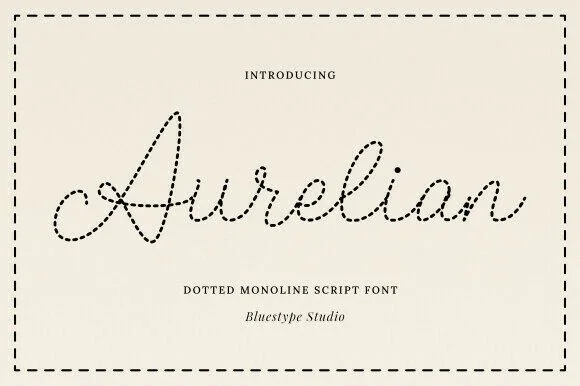
01 / Cricut & Craft
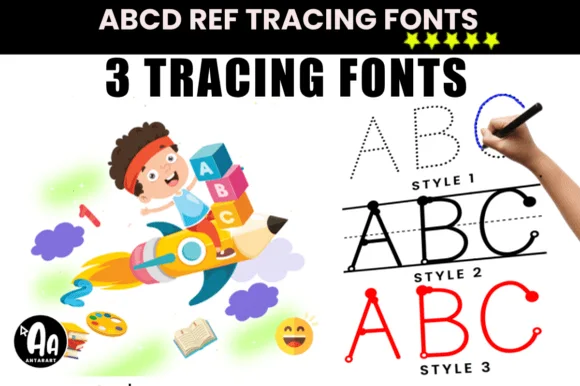
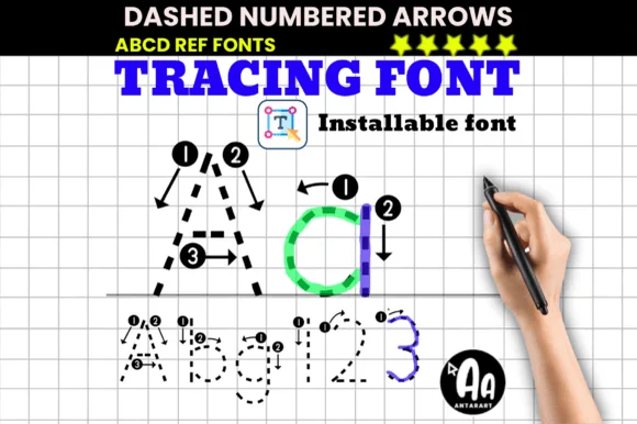
Dotted tracing & worksheet fonts
16 curated fonts · Previews & pairings
02 / Branding & Print
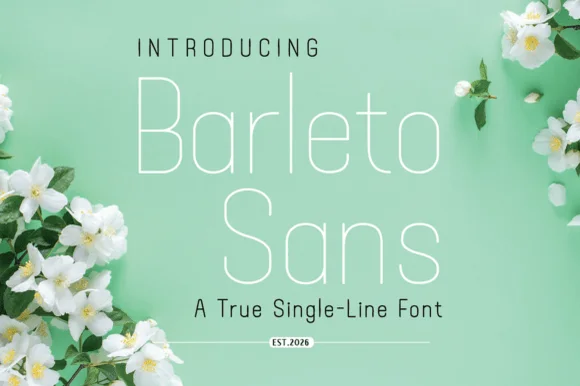
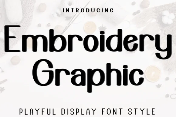
Minimalist & geometric sans
31 curated fonts · Previews & pairings
03 / Occasions & Milestones
Classroom & school
32 curated fonts · Previews & pairings

04 / Type Styles
Cute bubble & kawaii
30 curated fonts · Previews & pairings
Guides: Invitation font checklist · Vinyl & cutting checklist · How to pair script & sans fonts