Editorial Serif Anchor

Hunky Christmas + The Bilstein Editorial
Anchors Hunky Christmas's fluid strokes with crisp Roman proportions on wedding suites, headers and packaging.
Inspect The Bilstein Editorial specimenDisclosure: MakerFileHub may earn a commission from qualifying purchases via paid links on this page. How our links work.
Tall monoline rounded print
Hunky Christmas is a neat upright monoline print face in which the h and k climb tall, the k closes a curled loop inside its arm, the bowls stay open and round, and no letters join, so a short holiday phrase reads as tidy hand printing.
Paid link
Get this fontProject & layout blueprintsAt-a-glance maker compatibility
Weld or Unite overlapping script joins into one continuous vector path before sending to the blade.
Visual anatomy & craft review
The strokes hold one even monoline width, the ascenders rise well above the bowls, the k carries a curled internal loop and the letters stand separately with clear spacing. The monoline print is the character: it reads as careful handwriting rather than a script, which is why the sample sets a phrase in one tidy row. Because the stroke is even and light, keep 20 pt as the floor on smooth card, and give the tall ascenders 14 mm of clearance in a heading block. The sample lists swashes among the extras, so any flourish is a separate access step.
Monoline · Tall · Rounded
Two-font hierarchy recipes
Tested contrast partners — pairing Hunky Christmas with grounded secondary typography.
Hunky Christmas + The Bilstein Editorial
Anchors Hunky Christmas's fluid strokes with crisp Roman proportions on wedding suites, headers and packaging.
Inspect The Bilstein Editorial specimen
Hunky Christmas + Homies
Keeps small-scale dates, URLs, nutrition facts and care instructions crisp and legible below script titles.
Inspect Homies specimenPractical applications
Concrete hierarchy, scale and production guidance tailored to Hunky Christmas’s stroke geometry.
The tidy print suits a warm holiday card, and the even stroke keeps a two-word greeting clear at 26 pt on an A6 sheet. The tall ascenders also give a card a tidy vertical rhythm.
Hierarchy & layout recipe
Print an A6 card: set the greeting at 26 pt, set the family name at 14 pt in a light sans beneath with 12 mm of clear ground, and keep 14 mm of margin all round the card. Keep the fold clear of the greeting.
Pre-production check
A monoline stroke printed at 18 pt on a textured card breaks; check the proof and keep the greeting at 24 pt on a smooth stock.
The tall print fits a gift tag, and the separate letters stay readable at 18 pt on a 40 mm kraft tag with a punched hole. The even stroke also keeps a kraft tag from looking rough.
Hierarchy & layout recipe
Print a 40 by 80 mm kraft tag: set the name at 18 pt along the centre, punch a 4 mm hole 10 mm from the top edge, and keep 6 mm between that hole and the tallest ascender. Keep the tag to one row.
Pre-production check
A tall ascender cut by the tag edge loses its top; check the layout and keep 5 mm of clear card above the row.
The hand printing softens a box label, and the even weight holds the shop name at 22 pt on a 90 mm label. The plain stroke also keeps a printed box from looking busy.
Hierarchy & layout recipe
Print a 90 by 50 mm label: set the shop name at 22 pt, set the phrase at 16 pt in the same face beneath with 8 mm of clear ground, and keep 8 mm of border at each end. Keep the label panel flat.
Pre-production check
Two hand-printed rows at the same size flatten the tone; check the proof and keep the second row lighter or smaller.
Technical & licence verification
Confirm included OTF/TTF/WOFF formats, full glyph tables and licence coverage on the live store page before batch production.
Closest visual alternatives
Matched across letterform anatomy, stroke behaviour and craft applications.
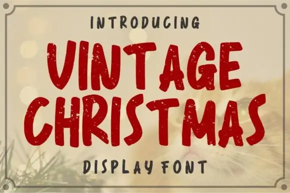
Distressed rounded seasonal display
Vintage Christmas is a distressed rounded display in deep red on a warm bokeh ground: fat rounded caps with an uneven, chipped outline, a slight bounce and a hand-cut edge, framed by a fine double rule with corner notches, and a tracked label above and beneath.
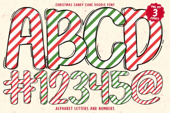
Tall rounded sketch capitals crossed by red-green diagonal candy stripes
Christmas Candy Cane Doodle uses tall rounded capitals crossed by red, green and white diagonal bands, with loose black double outlines wandering just outside the bodies and short extra marks that make the forms look sketched rather than machined.
Ideas for this font
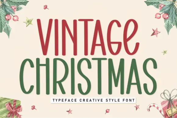
Tall condensed festive display
Vintage Christmas is a tall condensed display in red and green on cream: narrow rounded letters with a hand-drawn edge, uneven stems, small loops on the C and the S, and generous counters, presented inside a watercolour wreath of holly and gifts, so the pair reads as a hand-painted seasonal sign.
Ideas for this font

Tall narrow separate Christmas print
Santa Christmas is a tall thin hand-drawn print: narrow rounded letters with long ascenders and a crossbar lifted high on the T, set in a black outline over a faded photograph of Santa and a tree.
Ideas for this font
Same independent foundry
Allow optional Google Analytics to measure visits and catalogue actions. Your search words and notes are not included. Privacy & storage