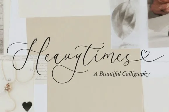
 #1 · Best Overall
Isabella Monroe
Fluid slanted ink-pen script with fine joins and a soft even flow
Get fontPaid link
Read review ↓Disclosure: MakerFileHub may earn a commission from qualifying purchases via paid links on this page. How our links work.
Invitation suites, welcome signs & place cards
A wedding suite is a hierarchy exercise repeated across five items: invitation, RSVP, details card, welcome sign and place card. Isabella Monroe and Luxury Romantic lead the script side, Adellisa and Romantic Touch keep the strokes fine for letterpress, and August Wedding, Elegant Wedding and Wedding Nayla add PUA swashes for long names. Bunglon bridges formal copperplate and modern script.
Quick verdict
Isabella Monroe is the most versatile name script, Luxury Romantic covers the formal register, and August Wedding handles long names with swash alternates. Romantic Touch is the pick for letterpress where hairlines must stay open.
Quick answer
Short on time? Start with our three highest-rated wedding standouts before scrolling the full breakdown.
#1 · Best OverallFluid slanted ink-pen script with fine joins and a soft even flow
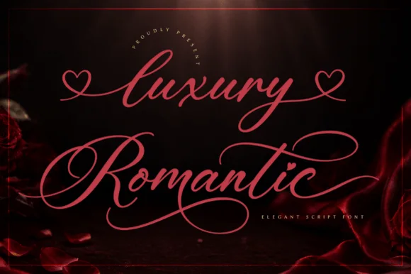 #2 · Runner-Up Pick
Heart-swash formal calligraphy with heavy stems and wide open loops
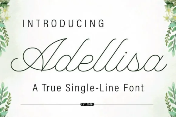 #3 · Editor's Choice
True single-line formal calligraphy with even weight and open loops
We kept 36 of 2,233 candidates after testing each at the sizes a suite actually uses: 8 pt for details, 24 pt for names, 3 inches for a welcome sign. Weighted connector continuity, swash access through standard keys, and how the script holds on textured cardstock.
Side-by-side summary
Compare specimens, OpenType/PUA traits and primary project roles side by side.
| Rank & Font | Style & File Specs | Best Project Fit | Store Listing |
|---|---|---|---|
| ScriptOrganic | Classic invitation suite, author signature or boutique tag | Get fontPaid link | |
| ScriptAlternates & swashes | Anniversary gift box, acrylic sign or wedding hanger | Get fontPaid link | |
| ScriptContinuous | Plotter-drawn place cards or foil vow cover | Get fontPaid link | |
| ScriptAlternates & swashes | Garden wedding invitation, fantasy novel cover or botanical tea tin | Get fontPaid link | |
| ScriptPUA encoded · Ligatures · Alternates & swashes | Save-the-date or thank-you card headline | Get fontPaid link |
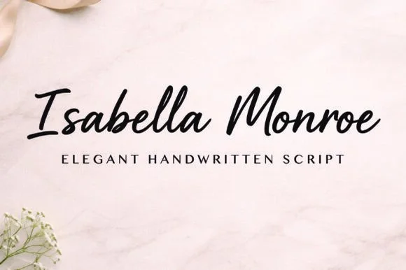
#1 · Best OverallIsabella Monroe is a fluid slanted script in which the strokes flow with a light ink-pen weight, the joins stay fine and the letters lean together as one line of handwriting.
The capital I opens with a narrow looped stem and the letters after it run in an unbroken rhythm: the s reverses through two soft curves, the a closes a small bowl, the b rises into a plain stem, the l loops high and the second capital follows with a wide sweep. Weight varies only slightly between downstrokes and joins, which keeps the line light and even rather than calligraphic. The slant is consistent, so a two-word name reads as one continuous piece of writing at 26 pt and holds at 12 pt on a label. Because the joins are fine, the face needs a smoother stock and a decent print size to stay clean. The marble surface, the black ink, the small botanical element in the corner and the tracked caption are presentation; the script is the two words.
Classic invitation suite, author signature or boutique tag — Pair with classic Garamond/Didone small caps on textured cotton paper.
Medium-fine strokes excel in print, letterpress and digital branding.
#2 · Runner-Up PickLuxury Romantic is a formal calligraphy script in which the heavy stems alternate with fine hairlines, the capitals open into wide heart-shaped swashes and the loops run far beyond the letter body.
The capital L opens with a broad looped stem that crosses itself and finishes in a heart-shaped swash, and the capital R repeats the gesture on the second word, which is what gives the composition its symmetry. The lowercase keeps a strong contrast: thick downstrokes, hairline upstrokes, small loops on the l and the d and a long curved descender on the y that sweeps under the line. Because the loops leave the letter body, the pair fills a wide format without extra ornament. The hairlines are the fragile part — they need a coated stock and a generous size, and at 30 pt the counters still open cleanly. The dark rose ground, the pink ink and the small arched caption are presentation; the script is the two words.
Anniversary gift box, acrylic sign or wedding hanger — Apply heart tails only on the outer start and end letters of a line.
Fine copperplate hairlines suit print, foil and laser engraving; add a slight offset for vinyl.
#3 · Editor's ChoiceAdellisa is a true single-line formal calligraphy in which every stroke is the same weight, the loops stay open and the joins cross cleanly on a level baseline.
The capital A opens with a loop that rises above the cap line and closes into a narrow bowl, and the letters after it hold a formal rhythm: the d and the l rise into tall open loops, the e loops back through its own bowl, the s reverses tightly and the i carries a small round dot. Because the line is a true single weight, there is no contrast at all: the joins, the stems and the loops are all drawn at one thickness, which is what makes the face suitable for engraving, monoline plotting and foil where a shaded script would fill in. The loops stay open enough to read at 18 pt, and the ends taper slightly. The botanical corners, the pale ground and the two caption lines are presentation; the calligraphy is the word.
Plotter-drawn place cards or foil vow cover — Set Operation to Draw/Foil and test pen pressure on a spare envelope first.
True single-line font: may look open/unclosed in standard word processors until rendered as a stroke path.
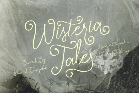 #4 · Top Maker Utility
Wisteria Tale is a whimsical handwritten script in which the capitals climb into corkscrew curls, the joins stay monoline and the terminals spiral, so a two-word title reads as something written with a fine pen on a card.
The W opens into two tall curls, the i carries a light dot, the s wobbles a shallow spine, the t crosses a high bar, the e turns a round eye and the final a finishes a spiral, all at a monoline weight with tall ascenders and generous loops. The curls are the character: they add height rather than weight, which is why the sample sets two stacked words with wide leading and lets the spirals fill the space. Because the stroke is even, the face holds at 22 pt and prints in one colour, but the spirals need a smooth stock to survive. The tulle photograph, the small italic credit lines and the studio note are presentation; the cream script words are the face.
Garden wedding invitation, fantasy novel cover or botanical tea tin — Set at generous display scale over muted sage, charcoal or parchment.
Fine organic pen strokes excel in print, foil and digital art.
 #5 · Standout Silhouette
Bunglon is a modern copperplate script in which the downstrokes carry weight, the hairlines stay fine and generous swashes arch above the x-height and below the baseline, so a single name reads as formal calligraphy.
The B opens a wide upper loop, the bowls swell on the downstroke and thin on the join, the ascenders carry tall loops and the swash set adds long arcs that clear the word above and below. The overhead swashes are the character: they frame a name without a border, which is why the sample sets one couple's name on a plain card. Because the swashes are long, a line needs 20 mm of clearance at both ends, and the joins must be welded before cutting from 1.1 inches of x-height. The pale ground, the fine rules and the small caps line are presentation; the dark calligraphic name is the face.
Save-the-date or thank-you card headline — Use swashed forms sparingly on first and last letters and keep event logistics in a clean serif.
Fine hairlines suit print and foil; thicken with a small offset path if adapting for large vinyl signs.
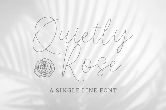 #6
Quietly Rose is a single-line script in which the stroke never changes width, the loops open wide and the letters lean gently, so a phrase reads as a pencil line drawn quickly over a photograph.
The Q drops a wide curled tail, the u holds two even shoulders, the i carries a small dot, the e turns a light eye and the y finishes a long open loop, all at one hairline weight with a modest slant and generous spacing. The single line is the character: there is no thick and thin at all, so the face depends entirely on proportion and rhythm, which is why the sample sets it over a soft image rather than on a plain ground. Because the stroke is a hairline, it needs 30 pt on screen and a smooth stock in print; on a textured paper it breaks at 12 pt. The washed palm shadow, the line drawing of the rose, the letter-spaced caption and the small credit are presentation; the hairline script is the face.
Foil-quill wedding envelope addressing — Switch Cricut/Silhouette operation from Basic Cut to Pen or Foil before sending to the machine.
Designed for Pen, Foil Quill and laser scoring — do not blade-cut in vinyl.
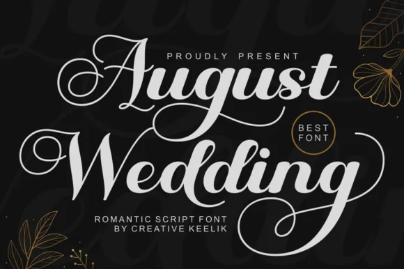 #7
August Wedding is a PUA-encoded modern bridal calligraphy script pairing thick, vinyl-sturdy downstrokes with sweeping 'A/W/g' swash loops!
August Wedding is a lush bridal calligraphy script with thick vinyl-sturdy downstrokes, tall swash loops on the A, W and g and a PUA alternate set, so a name reads as engraved stationery rather than a casual hand. The heavy downstroke survives a cutting machine and a foil, while the swashes extend the word at both ends and need clearance. It needs roughly 24 mm for the swashes to read, and it is best in white on matte black or a fine gold foil on ivory.
Frosted-acrylic wedding welcome sign, mirror decal & invite — Stack 2 title-case words at 68–135 pt in white or champagne-gold vinyl on dark smoked or frosted acrylic.
Copy PUA swash alternates via Character Map/Font Book, then Weld overlapping cursive joins before cutting Oracal 651!
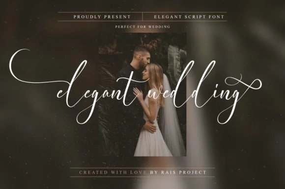 #8
Elegant Wedding is a PUA-encoded wispy fine-art calligraphy script stretching dramatic horizontal wing swashes from lowercase initial and final letters.
An ultra-delicate bridal script floating in crisp white across a moody couple portrait: airy upright cursive with sweeping fine-line flourishes that extend left and right, PUA-encoded so the swashes are reachable in any application rather than through a glyph panel. The hairlines are the whole character of the face, which sets a high size floor, and the upright axis keeps a long word readable across a photograph where a slanted script would fight the composition. The portrait is staging. Uses are save-the-dates, foil invitations, album covers and boutique packaging where a delicate line is affordable to print or plot.
Save-the-date photo overlay, foil invitation & gallery album — Set all-lowercase words at 56–110 pt centered horizontally across dark moody portraits.
PUA-encoded swashes work in all apps; ultra-thin hairline weight is best for flat print, foil press, Cricut Pens, and 1.8 in+ large sign vinyl.
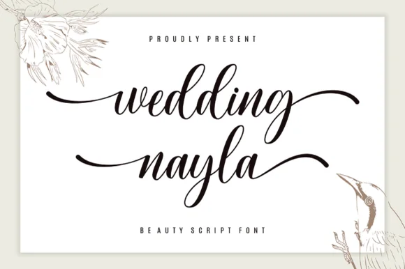 #9
Wedding Nayla is a romantic modern bridal script featuring long, graceful horizontal entry and exit tails built for signs, hangers, and invitations.
Wedding Nayla is a modern wedding calligraphy script with sweeping lead-in and end tails: a light-to-medium contrast, a wide oval axis, a modest slant and tails that extend well past the word on both sides. The tails mean a centred layout needs side clearance, and the hairlines are the first thing to break on textured stock. It needs roughly 24 mm for the lead-in and the tail to read, and it is best in one warm ink on smooth ivory, or a foil impression above 38 pt where the tail can still carry.
Acrylic wedding welcome sign, bridesmaid box & table name — Set lowercase names at 60–115 pt with sweeping left/right end tails above ultra-wide-tracked (+450) serif micro-caps.
Weld overlapping cursive joins in Cricut Design Space before cutting permanent Oracal 651 or HTV, and size above 1.2 in!
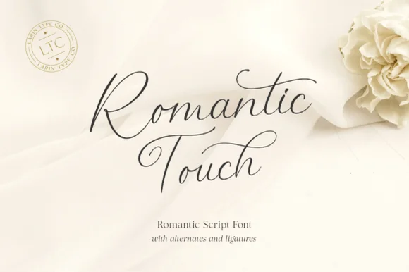 #10
Romantic Touch is a feather-light, fluid handwritten script featuring wide looped capitals, flying t-crossbars, and delicate nib movement.
Romantic Touch is an ultra-fine fountain-pen script with wide looped capitals, flying t crossbars and delicate nib movement, so a name reads as written with a light hand on good paper rather than as engraved calligraphy. The hairlines are the design, which means the face needs size and a smooth stock, and the flying crossbar extends past the letter. It needs roughly 24 mm for the hairlines to hold and 10 mm in a card, and it is best in one fine dark ink on ivory or as a light foil on matte board.
Vellum invitation wrap, silk-ribbon print & vow booklet — Center 2 stacked words at 42–64 pt with 1.15 line spacing and wide 1.25-inch margins.
Hairline fountain-pen strokes belong in flat print, letterpress, Foil Quill, or Cricut Pen addressing—not cut vinyl.
 #11
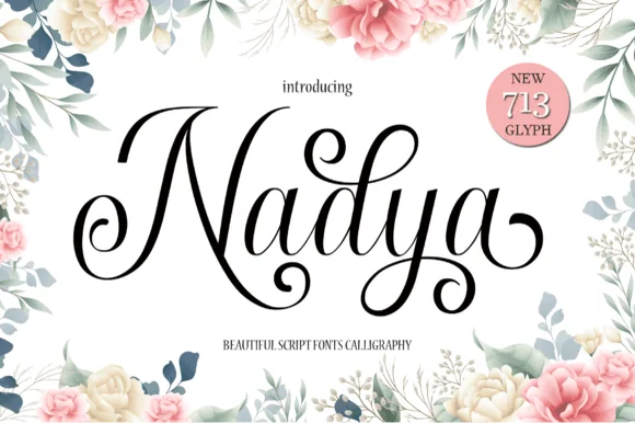
Nadya is an expressive upright calligraphy script packed with 713 glyphs, spiraled terminal droplets, and soaring looped ascenders.
Nadya is a romantic upright calligraphy script with more than seven hundred glyphs and curls: a moderate contrast stroke on a nearly vertical axis, wide oval bowls, joined letters and curled entries that turn back over the word. The glyph count means a phrase can be tuned with alternates so no two joins repeat, and the curls need side clearance. It needs roughly 26 mm for the curl and the join to read, and it is best in one fine ink on smooth card, or a foil impression above 38 pt where the curls still turn.
Floral bridal shower sign, invitation suite & menu title — Spotlight first names at 48–68 pt centered inside botanical borders, paired with 9 pt tracked serif dates underneath.
Hairline upstrokes and delicate spiral droplets reproduce best via flat printing, foil, or large 2.5 in+ acrylic sign decals.
 #12
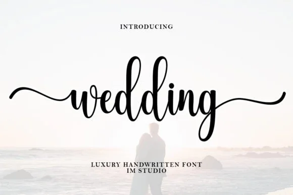
Wedding (by IM Studio) is a graceful bouncy handwritten script featuring tall twin 'd-d' loops and sweeping horizontal beginning/ending tails.
Wedding is a tall-looped bouncy bridal script with long horizontal wing tails: high double ascenders, a light contrast stroke, a soft bounce and tails that run horizontally well past the word on both sides. The wings need side clearance in any centred layout and they are the first thing to be trimmed. It needs roughly 26 mm for the loop and the wing to read, and it is best in one warm ink on smooth ivory, or a foil impression above 38 pt where the wing keeps its taper.
Bridal-party hanger decal, acrylic sign & champagne flute — Set lowercase bridal titles ('wedding', 'bridesmaid', 'forever') with both PUA entry and exit tails turned on.
Always Weld all overlapping cursive joins before cutting vinyl or HTV; medium-thin strokes cut cleanly at 1.1 in+ height.
 #13
Lovely sets a fine signature script in a single dark weight over a pale city photograph, where a wide entry curve opens low at the left, the letters rise into tall slender loops through the middle and a large descending y plus an extended closing sweep make the lower right part of the footprint.
The stroke stays thin and even, the loops stay tall, the entry runs wide and the exit sweeps out. That asymmetry is the character: the word is wider at the right than the left, which is why the sample sits on a generous square field rather than a strip. The building behind it is scenery, not part of the type. Keep 26 pt as the floor, allow 25 mm of clear space at the right for the exit sweep and check the y loop against any line placed beneath.
A quiet wedding invitation heading — Use a single script heading above the names. Keep a clear band beneath its lowest strokes, then set the venue and time in plain text.
Print at invitation size and check contrast on the chosen paper. Do not use the fine script for the address or RSVP instructions.
 #14
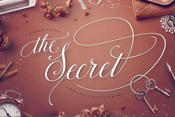
The Secret is luxury calligraphy in which a broad swash carries across the whole phrase, the stems are shaded and thin and the ornament is drawn at the same weight as the joins.
The opening article is set small and fine above the word, and the capital S below it opens with a heavy shaded stem before the letters settle into a formal rhythm: the e and the c close tight bowls, the r keeps a fine arm, the t is crossed lightly and the final t lifts into a swash that climbs and curls away. The organising gesture is the long loop that leaves the top of the phrase and travels above the words before returning, which is what gives the composition its luxury feel at 40 pt and above. Contrast is high, the ends taper to points and the joins are hairline, so the face needs a coated stock and a decent size to hold. The warm ground, the white ink, the small objects scattered around and the two tracked captions are presentation; the calligraphy is the words.
A formal name-and-vow folio — Reserve most of the cover for script and put names/date in a plain footer below the lowest sweep.
Verify the precise swash alternates and hairline reproduction.
 #15
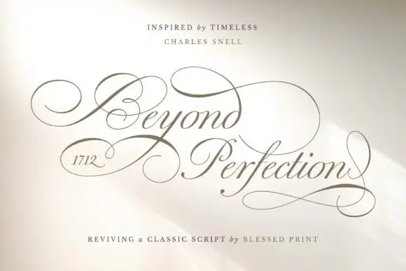
Beyond Perfection is a delicate calligraphic script in which the capitals open into wide enclosing loops, the hairlines stay fine, the joins run unbroken and the final letter returns a stroke beneath the line, so a name reads as copperplate on an invitation.
The B wraps a broad left loop around its stem, the lowercase keeps a narrow body with fine ascending loops, the connectors hold one weight from letter to letter and the closing n sends a return stroke that travels under the whole word. The enclosing loop is the character: it wraps the first letter, which is why the sample sets one name and a second short line. The family ships over four hundred alternates, swashes and ligatures, so a maker can swap a terminal per project rather than accept the default. Because the hairlines are fine, the face wants 20 pt in print and welds before cutting from 1.1 inches of x-height. The pale field and the fine rules are presentation.
A ceremonial programme cover — Leave broad outside margins around the title and put the running order on a plain interior page.
Check the selected alternates in the actual programme title.
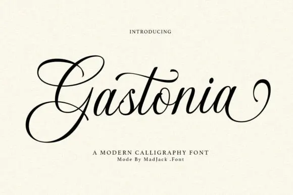 #16
Gastonia Script leads with a large double-looped G that extends far above and below the lowercase body, a long crossbar arcs across the central t and the final stroke climbs into a separate loop on the right.
The downstrokes stay dark and thick, the joins thin to hairlines, the capital opens two loops and one crossbar reaches across the middle of the word. The oversized capital is the character: the word begins with a drawn shape that sets the height for everything after it, which is why the sample sets a single name. Because the capital travels up and down and the last stroke loops away, keep 22 mm above and 20 mm below from 28 pt. The extra characters are encoded, so any added flourish is a deliberate step.
A reception menu title — Place the heading above a generous gap, then list courses in plain type. Keep the lower G loop out of the first course line.
Proof the two-word phrase and check whether the final flourish can be shortened on a narrow menu.
 #17
Stylish is a fine slanted calligraphy in which the S opens very wide, the l and h lift tall loops, the connectors run thin and the y drops a long low stroke, so a short phrase reads as modern pointed-pen writing.
The S sweeps a broad open curve, the l and h raise narrow loops, the joins thin before they thicken on the downstroke and the y finishes in a stroke that travels well below the baseline on a gently changing slant. The open S is the character: it gives the first word a wide entry, which is why the sample sets a phrase with a plain light ground. Because the descenders are long, a layout needs 20 mm under the line from 26 pt and the joins must be welded before cutting from 1.1 inches of x-height; swashes are encoded. The pale ground and the small caption are presentation; the dark calligraphic phrase is the face.
A personal-styling appointment card — Place the title in a clear top band and put appointment fields in plain type below the y, leaving the S open at the left.
Try the full heading and proof fine connectors at card size.
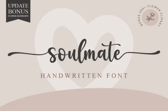 #18
Soulmate sets a balanced modern cursive in a single dark weight on a warm neutral field, where moderate stroke contrast and tidy x-height proportions keep the word clear while horizontal s and e extensions run far out to both sides and frame the name symmetrically.
The strokes stay even and moderate, the letters stay upright and connected, the tails run horizontal and long, and the word stays centred inside them. Those side tails are the character, because they turn a single word into a rule that can hold a whole layout. A pale heart sits behind the word and a corner note advertises flower clipart, both as cover treatment. Keep 26 pt so the joins stay open, allow 25 mm at each side for the tails and check the middle letters against a long name before committing.
Engraved keepsake box or vow book cover — Set in lowercase with side swashes on a single line above a small ceremony date.
PUA encoded; weld script joins and check thin outer tail tips before cutting small adhesive vinyl.
 #19
Silken Luxe is a formal calligraphy script with a steep slant, broad lower sweeps and hairlines that thin almost to nothing, drawn so two words build an ornamental diagonal across the plate.
The capital S opens with a wide looped stem that leans hard to the right, and the lowercase that follows keeps the same angle: the i and the l rise into narrow loops, the k splays into a looped arm, the e closes a fine bowl and the x crosses with a sweeping stroke that runs under the letters. The lower sweeps are the signature gesture — long flat curves that leave the word body and carry the eye across the format. Contrast is extreme, with heavy downstrokes and hairlines that need a coated stock and a generous size to survive printing. Because the face is so slanted, it wants to be set on its own line rather than mixed with upright type. The cream ground, the dark red ink, the small ornament and the two caption lines are presentation; the script is the two words.
A formal pair-of-names cover — Use a wide centre band and keep the date below the full lower sweep. Increase the side margins rather than copying the preview’s edge-reaching terminal.
Check actual capital variants and ampersand.
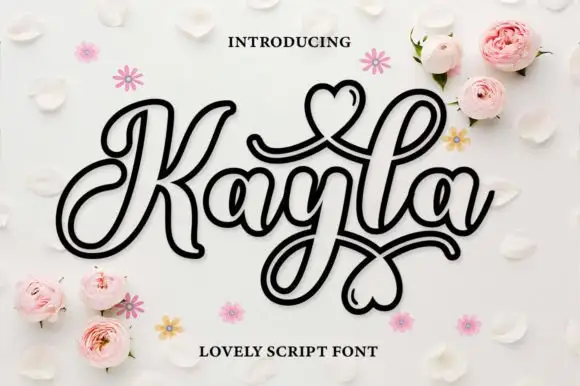 #20
Kayla is an outlined decorative script in which every stroke is drawn as a double line and the loops close into hearts, so a name reads as a paper cut-out rather than as a written word.
The K opens a wide loop with a heart inside, the a closes a round bowl, the y drops a hooked tail, the l rises on a narrow stem and the final a finishes with a heart-shaped terminal, all at a monoline weight drawn as an outline with a consistent gap between the two lines. The outline is the character: the inner line follows the same path, so the face works as a sticker, a cut file or a printed decoration. Because the gap is narrow, the face needs 30 pt before the double line stays open, and it prints best in one dark ink on a light ground. The white petals, the pink roses, the small daisies and the two caps lines are presentation; the outlined black script is the face.
An outlined name greeting — Give the name a wide central panel without an extra enclosing heart border.
Check actual heart variants and fine interior gaps.
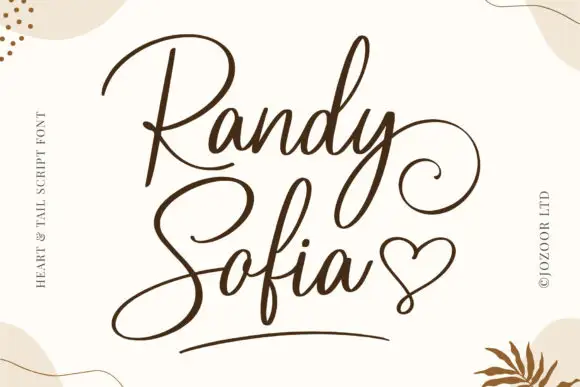 #21
Randy and Sofia form a two-line composition with large opening capitals, where the upper R carries a broad open bowl, the lower S sweeps down and to the left, the y curls out to the right of the top line and a drawn heart plus a short underline occupy the bottom right of the pale field.
The strokes stay monoline and slim, the opening capitals stay large, the tails curl wide and the y drops into a long loop. Those tails are the character: the two words interlock through the descenders rather than sitting apart, which is why the composition needs a square area rather than a tight text box. The heart and the underline may be separate graphics, and the cover marks them as part of the drawn set. Keep 30 pt for the hairlines, plan 25 mm on all sides for the tails and check the heart in your file.
An invitation with stacked names — Offset the lower name slightly left so the upper tail has room at the right. Start the ceremony text below the entire lower flourish.
Check the two real names together; a different descender may change the spacing and alignment.
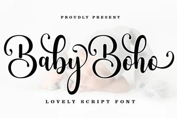 #22
Baby Boho is a casual modern calligraphy script in which the capitals sit large, the downstrokes stay broad, the entry curls thin away and the final o lifts a rising tail, so a name reads as written quickly but carefully.
The B closes a wide upper loop, the b repeats it in the lowercase, the y descends in a long loop under the word and the o finishes with a tail that climbs back toward the cap line. The repeated capital loop is the character: two large B shapes set the rhythm, which is why the sample stacks a capital row over a descending word. Because the descender is long, a layout needs 18 mm under the baseline from 26 pt, and swashes and ligatures are encoded so a maker can vary the exits. The pale ground and the small caption are presentation; the dark script name is the face.
A paired-name invitation — Place names on a broad clear panel and date beneath the y-like descenders.
Check the actual B variants and ampersand.
 #23
Hailey is a beauty script in which the strokes stay medium in weight, the ascenders loop high and long swashes enter and leave the word, so a single name reads as a written logo on a soft ground.
The h climbs a tall loop, the a closes a round bowl, the i carries a light dot, the l rises into a second loop, the e turns a light eye and the y drops a wide tail, all at a medium brush weight with generous entry and exit swashes and a gentle slope. The swashes are the character: they sit outside the word and take as much width as the letters, which is why the sample sets one name across a circular panel. Because the downstrokes are medium, the face holds from 26 pt and prints on smooth stock. The blush circle, the botanical sprig, the arched lettering above and the small caps beneath are presentation; the dark script name is the face.
A floral guest-book name cover — Keep the name alone in the centre, with a small plain date well below its lowest loop; put floral art in one distant corner.
Confirm the exact swash variants and leave ample vertical space.
 #24
Brown Carolina Duo contrasts broad high-contrast capitals with a much finer narrow slanted script, set dark on a plain cream field, where the capital R legs sweep below the neighbouring letters and the script carries long tails that run past the ends of both words.
The caps keep thin cross strokes and heavy uprights, the script keeps one fine weight, and the two voices sit in a strict stack: script, two cap rows, script. That alternating order is the character, because the fine lines frame the heavy block like a rule above and below. Both treatments appear on a plain light field, so the cover gives no clue about texture or shadow. Keep 34 pt for the caps before the thin strokes break up, keep 20 pt as the floor for the script and check the R leg before setting a line of capitals.
A boutique stationery front — Use the capital name centrally and a small script descriptor below, leaving the R sweep clear of contact information in a plain footer.
Confirm both styles and the actual capital alternates.
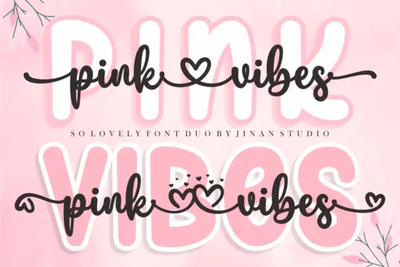 #25
Pink Vibes Duo pairs two fat rounded capital rows, drawn in white with a soft pink glow, with a small dark connected script that runs across them, and in the lower sample the script joins the words with heart shapes instead of a plain connector stroke.
The caps stay broad and inflated, the script stays thin and dark, the contrast between the two weights carries the pair and the hearts sit where a ligature would normally go. The upper sample sets the script over the caps without hearts, the lower inserts one heart between the words and a second heart cluster on the final s, so the decorative join is an option rather than the default. Branches in the corners are cover artwork. Check which connector glyphs your file carries before planning the heart link, keep 30 pt for the script strokes and set the caps in one colour so the pink glow does not come from the type.
A two-level greeting — Keep capitals above script rather than overlapping; leave heart tails in open space.
Check connector variants and actual duo contents.
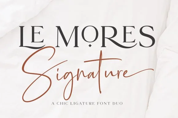 #26
Le Mores Signature pairs an editorial ligature serif—highlighted by cradled base loops—with a brisk copper-toned signature cursive.
Le Mores Signature pairs a ligature-rich editorial serif with a slanted signature script: the serif is a moderate-contrast face with true ligatures and oldstyle figures for running text, while the script is a fast slanted signature with a looping capital and a heavy exit stroke. The pair is how a printed magazine signs a page, so the serif carries the body and the signature carries the name. The signature's thin connectors are the finest element and they break first. The serif needs roughly 20 mm and the signature 30 mm for their detail to read.
Boutique fashion hangtag, perfume box & atelier logo — Set the primary brand name in tracked-open serif capitals at 36 pt and overlap a single script subword across the lower-left stem.
Keep the slender signature script in print, hot foil, or larger 2.5 in+ decals rather than tiny blade-cut vinyl.
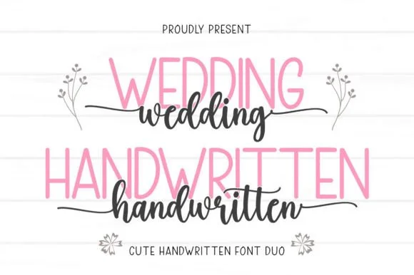 #27
Wedding Handwritten pairs a tall, narrow rounded sans-serif with a lively thick-thin calligraphy script sporting symmetrical side tails.
Wedding Handwritten pairs a tall slender sans with a tailed calligraphy script: the sans is a narrow even-width capital set for details and directions, while the script runs a high-contrast stroke with long ascenders and a tail that lifts off the last letter. The pair is a stationery set, so both cuts have to survive one ink and a matte stock. The script tail is the finest element and it breaks first. The sans needs roughly 20 mm and the script 30 mm for their detail to read.
Save-the-date card, acrylic table sign & seating chart — Set table numbers or 'SAVE THE DATE' in 1.8 in blush or gold sans and center couple names across the lower half in charcoal script.
Weld the script letters before cutting vinyl for acrylic wedding signs, and handle the fine horizontal outer tails gently on transfer tape.
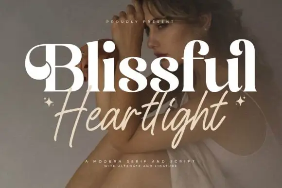 #28
Blissful Heartlight shows a pale heavy Blissful line with round bowls and curled upper entries over a portrait, where the serifs swell into bulges at the joins and a thinner right-leaning Heartlight script sits beneath with long loose strokes and extended ascenders and descenders plus two small stars at the outer edges.
The serif stays heavy and soft, the script stays thin and leaning, the ascenders rise high and the descenders drop low while the two rows overlap slightly at the centre. That swelling serif is the character: the caps look inflated at the joins rather than cut, which is why the sample relies on a photographic ground for contrast. The stars are styling, and the cover notes alternates and ligatures without showing them. Keep 44 pt for the serif and 26 pt for the script, and check the overlap for contrast before printing.
A serif-and-handwritten invitation pairing — Keep the handwritten line clear of the practical invitation text.
Verify both members and exact joins.
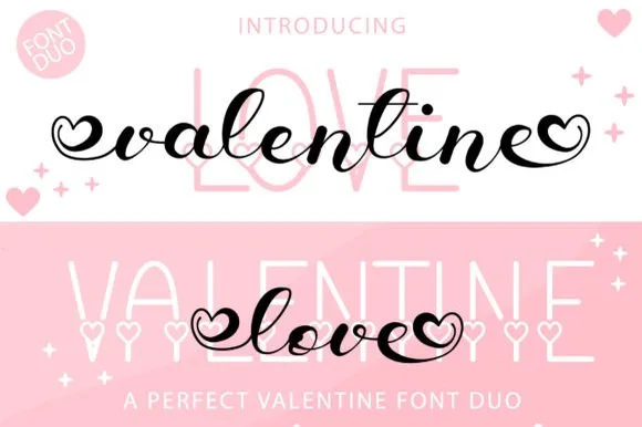 #29
Valentine Love Duo teams a bold bouncy brush script—with open heart terminal loops—with a tall slim sans accented by tiny baseline hearts.
Valentine Love Duo pairs a heart-tipped calligraphy script with a heart-accented tall sans: the script runs a moderate contrast stroke on a shallow slant with swashes that finish in a drawn heart tip, while the sans is a narrow block whose i dots are small hearts. The pair gives one card two voices and two heart placements from a single palette, so an invitation, a seal and a sleeve can be printed as one set. The hearts are the finest elements and both close into dots as soon as the face shrinks, and the script's hairlines are the first thing to lose on textured stock. The script needs roughly 26 mm and the sans 22 mm for their detail to read.
Galentine tumbler decal, wine tote & pajama set — Use the heart-ended black or red script at 4.5 inches wide across the center of tall pale-pink sans background capitals.
Weld all script letters before cutting vinyl, and use fine tweezers to weed the small interior heart loops at both ends.
 #30
Country Kitchen is a two-cut duo in which narrow upright capitals set the plain line and a darker connected script carries the warm one, so a kitchen sign can separate a heading from a phrase without a third family.
The capital cut stands narrow and unjoined with even strokes and tight counters, while the script cut connects through tall k and h loops and long low entry and exit strokes at a heavier weight. The contrast in join is the character: one member is printed, one is written, which is why the sample pairs a thin cap line with a dark script beneath it. Set the caps at 16 pt and the script at 22 pt for a balanced pair, and weld the script before cutting from 1.1 inches of x-height. The photographed interior, the boards and the props are presentation; the lettered sign is the duo.
A farm-kitchen menu header — Place the capitals above the script with a clear gap, then start dishes and prices in plain type below both tails.
Check the actual pair and leave menu details undecorated.
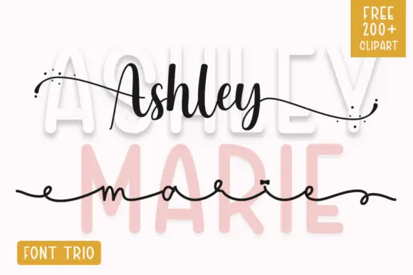 #31
Ashley Marie shows tall broad sans letters set very pale behind a darker connected Ashley line and a much finer extended marie line, where the upper script swells in the middle of the word, scattered dots sit at the ends of long outer strokes and a yellow corner badge advertises a font trio.
The pale sans stays wide and airy, the first script keeps a swelling thick-thin rhythm, the second stays hairline and extended, and the dots punctuate the tails. That three-layer build is the character, because the sample uses the sans as a background rather than as a reading row. The badge promises a trio plus clipart, so confirm what actually installs before planning a three-part lockup. Keep the hairline script at 22 pt or above and test the pale layer against your ground colour first.
A name-and-occasion invitation cover — Use the broad name above the script instead of overlapping them, then put date and venue in plain type below all tails.
Confirm the actual supplied styles and any clipart rights.
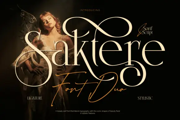 #32
Saktere shows pale high-contrast serif forms with huge looping extensions that rise over the middle of the word and fall below the final letters, while a much finer slanted script line crosses the lower part of the composition.
The serif cut carries thick-heavy contrast with enormous loops leaving several letters, and the script cut draws a fine slanted line that sits beneath and across the serif row. The oversized loop is the character: one extension can double the height of the word, which is why the sample layers a fine script underneath. Because the loops travel both up and down, keep 24 mm above and 22 mm below from 28 pt, and hold the script 16 mm clear of the serif row.
A single-name invitation centrepiece — Leave generous top and bottom clearance with plain details below.
Check the exact name and alternate mappings.
 #33
Orvelia is a high-contrast display serif in which the stems alternate thick and hairline weights, the R, V and A end in curved swash legs and the bowls stay sculpted, so a name reads as a crest for a perfume box or a masthead.
The R tucks its leg into a curve, the V splits into two swashed strokes, the A carries a curling leg and the bowls close against fine joins that thin to a hairline at every junction. The swash leg is the character: three capitals carry the ornament while the rest of the alphabet stays quiet, which is why the sample frames one word for formal stationery. Because the hairlines are fine, the face wants coated stock from 16 pt and gains from hot foil on signage; the display cut ships with swashes as separate glyphs. The pale ground and the small frame rules are presentation; the dark display word is the face.
Formal wedding suite monogram & header — Track supporting lines (FOREVER BEGINS HERE) wide in a simple roman serif beneath the main display name.
Delivered as OTF; best suited to print, foil stamping and digital branding due to fine serif hairlines.
 #34
Amilea shows pale yellow high-contrast letters with fine tapered serifs and broad rounded lowercase over a dark portrait, where a thin loop curves below the capital A and a tall upper flourish crosses the central ascender before sweeping right.
The uprights stay heavy, the joins thin to hairlines, the serifs taper to points and two drawn flourishes cross the word above and below. Those crossing flourishes are the character: the sample is a lockup rather than a plain setting, which is why the names sit on a photograph with a raised hand. The source notes PUA extras, ligatures and alternates, so check how the flourishes are reached. Keep 40 pt for the hairlines, reserve 25 mm above and below and do not set a paragraph.
A names-led invitation accent — Leave clear space above and below the title with plain details beneath.
Verify exact letters and alternate access.
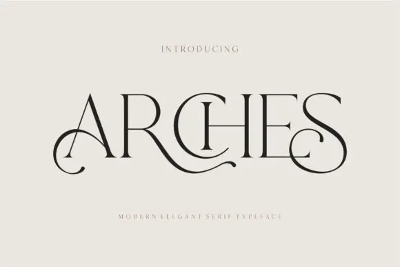 #35
Arches sets one word in dark ink on a warm neutral field, where wide flat serifs sit on hairline cross strokes, the A climbs to a sharp apex, the R leg sweeps into a long horizontal tail that runs beneath the following letters and the S closes with an extended curl.
The uprights stay thin, the serifs stay flat and wide, the contrast is extreme and two letters throw strokes sideways instead of down. Those sideways strokes are the character: the word reads as a piece of engraved editorial typography rather than a headline, which is why the sample leaves a wide cream margin around it. The small introduction line above and the caption below are separate cover text. Keep 44 pt before the hairlines vanish, allow 30 mm at each end for the sweep and check the R tail against any text you put underneath.
A beauty studio identity — Use a short studio name with a broad clear margin around its lower curls. Put the service descriptor and booking details beneath in plain type rather than threading them through the swashes.
Test the actual studio name; the preview’s “Arches” composition may not transfer to other letters.
 #36
Sparky Dream sets two gold rows of curled serif lettering on a night sky, where large spirals rise above the words, a wide curl sits between the rows and a low figure-eight flourish drops beneath the second word so the outer silhouette fills most of the square field.
The strokes stay moderate, the serifs curl into spirals, the flourishes reach above and below the letters and the two rows nearly touch. That silhouette is the character: the flourish builds the shape and the letters sit inside it, which is why the sample cannot be squeezed into a narrow banner. The star field and the cloud are context. Keep 40 pt so the spirals stay open, reserve at least 25 mm above and 30 mm below the block and keep practical details outside the flourish.
An evening-reception invitation — Try a short heading in the upper half and reserve a clean band below the lowest flourish. Put the couple’s names, date and venue in that band with a clear reading order.
Check the actual characters and swash access before designing around a particular curl. Leave enough margin for trimming.
Practical buyer checklist
Key cutting, printing and pairing answers before choosing a wedding typeface.
Two, occasionally three. One script for names, one text face for details, and a small caps face only if you need a third level. Every additional face makes the suite look less considered and harder to print consistently.
Names usually sit at 24 to 32 pt, the ceremony details at 8 to 10 pt, and the RSVP deadline at 8 pt. On a 5 by 7 inch card, that leaves the white space which makes the layout look expensive.
Yes, and it is where the swashes earn their keep. At 3 inches and up, high-contrast calligraphy works. Scale the swashes with the lettering and check that the tails do not run into the edge of the frame.
Most include them, but the numeral set is often the weakest part. Test the date glyphs specifically, since a script 2 or 7 can look like an accident next to the carefully drawn letters.
Keep exploring
Explore adjacent maker roundups or check our practical pre-production checklists.
27 curated fonts · Previews & pairings
23 curated fonts · Previews & pairings
22 curated fonts · Previews & pairings
19 curated fonts · Previews & pairings
Guides: Invitation font checklist · Vinyl & cutting checklist · How to pair script & sans fonts
Allow optional Google Analytics to measure visits and catalogue actions. Your search words and notes are not included. Privacy & storage