High-Contrast Display Serif

Saktere + Grandeur – Elegant Classic Serif
Pairs sculptural editorial warmth with Saktere's clean modern geometry.
Inspect Grandeur – Elegant Classic Serif specimenDisclosure: MakerFileHub may earn a commission from qualifying purchases via paid links on this page. How our links work.
Fine serif lettering with oversized loops above a thin script
Saktere shows pale high-contrast serif forms with huge looping extensions that rise over the middle of the word and fall below the final letters, while a much finer slanted script line crosses the lower part of the composition.
Paid link
Get this fontProject & layout blueprintsAt-a-glance maker compatibility
Weld or Unite overlapping script joins into one continuous vector path before sending to the blade.
Visual anatomy & craft review
The serif cut carries thick-heavy contrast with enormous loops leaving several letters, and the script cut draws a fine slanted line that sits beneath and across the serif row. The oversized loop is the character: one extension can double the height of the word, which is why the sample layers a fine script underneath. Because the loops travel both up and down, keep 24 mm above and 22 mm below from 28 pt, and hold the script 16 mm clear of the serif row.
Duo · Oversized loops · Fine script
Two-font hierarchy recipes
Tested contrast partners — pairing Saktere with grounded secondary typography.
Saktere + Grandeur – Elegant Classic Serif
Pairs sculptural editorial warmth with Saktere's clean modern geometry.
Inspect Grandeur – Elegant Classic Serif specimen
Saktere + I Heart You
Introduces organic movement on pull-quotes, signatures and gift tags.
Inspect I Heart You specimenPractical applications
Concrete hierarchy, scale and production guidance tailored to Saktere’s stroke geometry.
The oversized loops give a formal suite its signature gesture, and the serif row keeps two names readable at 26 pt on heavy card. The fine script underneath adds a second voice without competing.
Hierarchy & layout recipe
Print a 130 by 180 mm card: set the names at 26 pt in the serif cut, keep 22 mm above for the loops and 20 mm below for the fall, and set the script line at 18 pt in the lower third.
Pre-production check
A loop printed at 20 pt collapses into a thick hook; check the proof and keep the names at 24 pt or above on coated stock.
The fine serif with its long loops sets a bridal opening, and the layered script gives the page a handwritten second voice at 40 pt and 20 pt. The layered script gives an opening page a handwritten note.
Hierarchy & layout recipe
Print a 210 mm spread: set the heading at 40 pt, place the script line 16 mm below in the outer margin, and keep the loops clear of the image edge by 20 mm. Keep the script in the outer margin.
Pre-production check
A loop crossing into a photograph loses its thin end; check the page and keep the heading on the plain column.
The fine loop and the thin script make a soft valentine, and the pair keeps a short phrase readable at 30 pt on an A6 card. The loops give a small card its movement.
Hierarchy & layout recipe
Print an A6 card: set the phrase at 30 pt in the serif cut, set one script line at 20 pt beneath with 16 mm of clear ground, and keep 18 mm of card at each end for the loops. Keep the script to one line only.
Pre-production check
Two looped rows on one small card tangle at the edges; check the card and use the script only once. Print the serif row on coated stock.
Technical & licence verification
Confirm included OTF/TTF/WOFF formats, full glyph tables and licence coverage on the live store page before batch production.
Closest visual alternatives
Matched across letterform anatomy, stroke behaviour and craft applications.
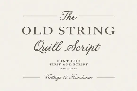
Serif and quill script duo
The Old String is a duo in soft grey-brown on cream: a wide classical serif in caps for the main line, a quill script with fine hairlines and long tails for the second, and small tracked notes between hairline rules, with the script repeated at the foot in a smaller size.
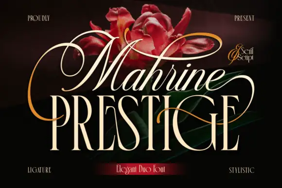
Looping slanted upper lettering above narrow serif capitals
Mahrine Prestige shows a pale slanted upper word with thin connected-looking strokes and large loops, while tall narrow PRESTIGE capitals form a more upright base crossed by a fine sweeping extension, and red flowers with gold flourishes fill the dark background.
Ideas for this font
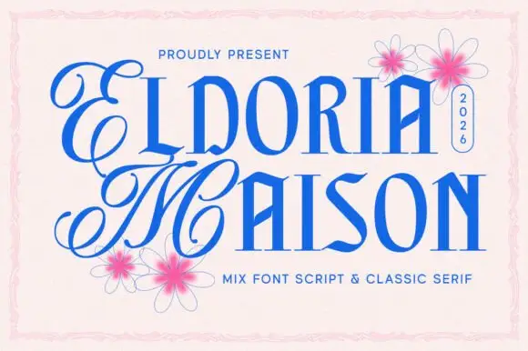
Looping script initials paired with narrow angular capitals
Eldoria Maison pairs looping script initials with narrow angular capitals, so a word can open with an ornamental monogram and continue in a tall condensed face that holds the rest of the line.
Ideas for this font
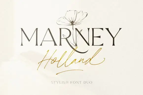
Fine serif and loose signature duo
Marney Holland pairs a tall high-contrast serif capital cut with a loose thin script: the R curls its leg below the serif line, the script runs light through its joins and a long low exit stroke closes the written line.
Ideas for this font
Same independent foundry
Allow optional Google Analytics to measure visits and catalogue actions. Your search words and notes are not included. Privacy & storage